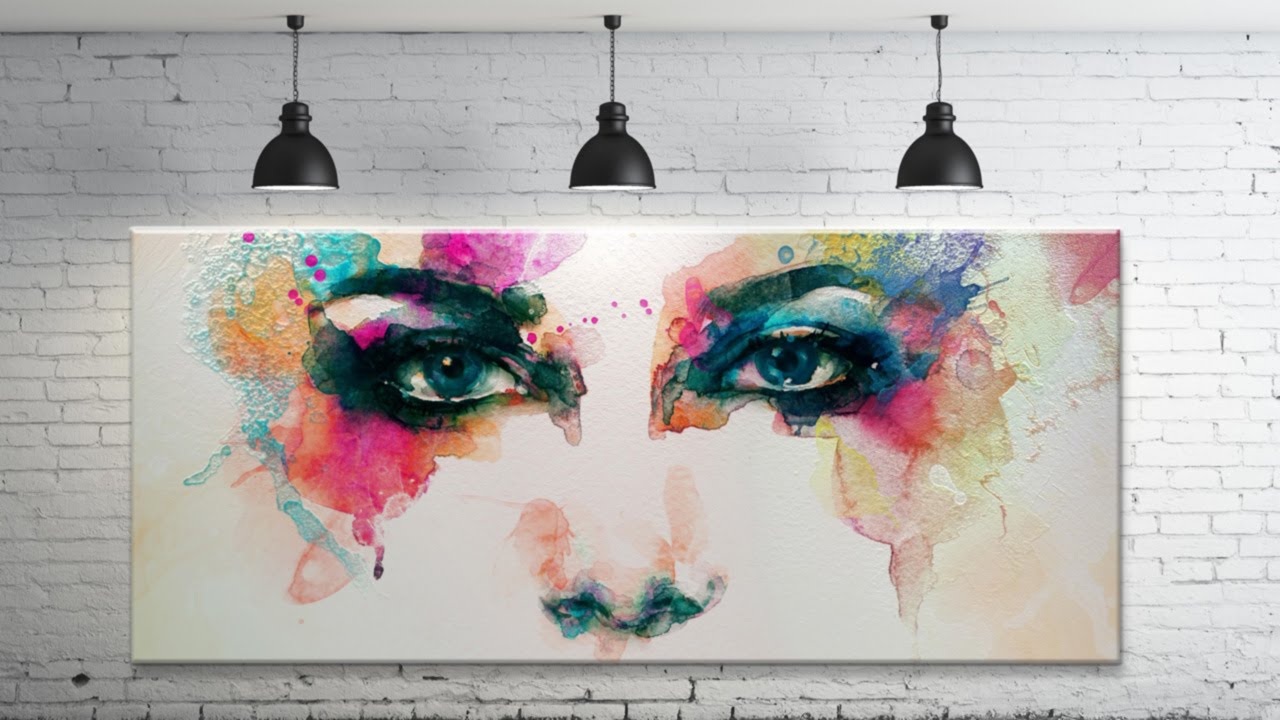
Compositing is one of those skills that separates photographers who can shoot from photographers who can deliver. I shoot a lot of commercial work where the final image is built from multiple elements captured at different times, and the single thing that kills a composite faster than anything else is inconsistent light. If the light on your subject doesn’t match the light on the environment, the whole image reads as fake before the viewer can even articulate why. That’s the problem Photoshop’s Lighting Effects filter was built to solve, and it’s one I reach for more often than most people expect.
In this Aaron Nace tutorial from PHLEARN (Watch the full tutorial on YouTube), Aaron walks through a composite where a piece of artwork is placed on a wall that already has three practical lights mounted on it. The challenge is making the painting look like it was always there, actually illuminated by those lights. The technique he demonstrates is clean, methodical, and directly applicable to any situation where you’re placing a flat element into a scene with existing light sources.
What I appreciate about this tutorial specifically is that Aaron doesn’t treat Lighting Effects as a magic button. He builds toward it, sets up the composite correctly first, and then uses the filter as the final layer of convincingness. That’s exactly how it should work in a professional context.
Step 1: Combine Your Images Into a Single Document
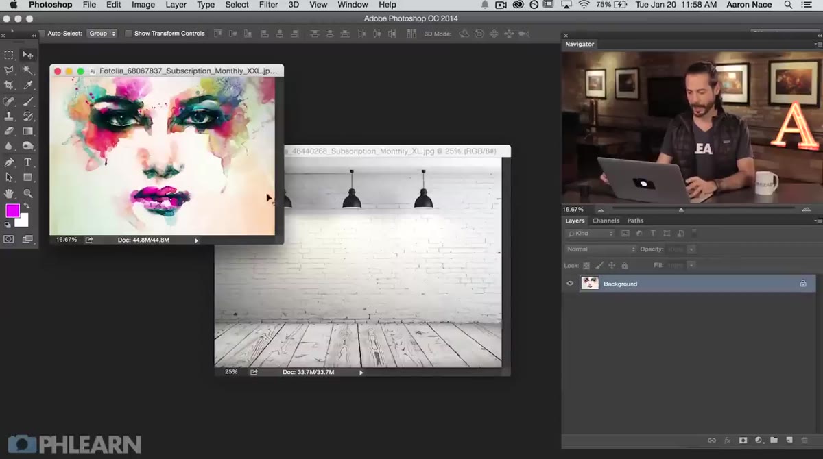 Moving artwork layer onto wall background using the Move tool
Start with your two source images open in Photoshop. Grab the Move tool, hold Shift to center the layer on the destination document, and drag your top element from one image into the other. The Shift key keeps everything aligned to the canvas center, which saves you from having to reposition by hand. Once both layers live in the same document, close the original source file. You’re working with one clean document from here on.
Step 2: Mask the Artwork to Fit the Scene
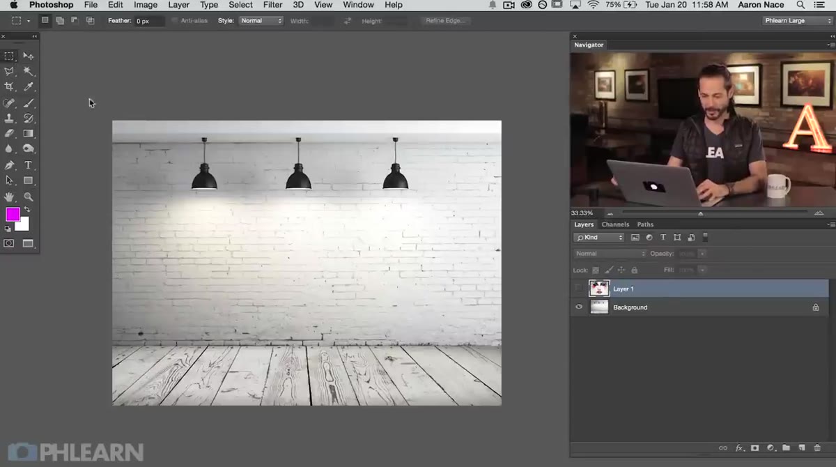 Rectangular Marquee selection drawn around the wall space between lights
Grab the Rectangular Marquee tool and draw a selection over the area of the wall where your artwork will sit. In this case, Aaron centers the selection between the three wall-mounted lights, which is a deliberate compositional choice, not an accident. With that selection active, click on your artwork layer and add a Layer Mask by clicking the mask icon at the bottom of the Layers panel. Photoshop converts your selection directly into a mask, leaving only the portion of the artwork that sits within that rectangle visible.
Step 3: Reposition the Layer Independently of Its Mask
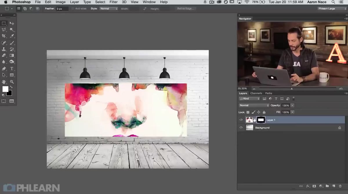 Unlinking layer from layer mask by clicking the chain icon
Here’s a step a lot of photographers skip and then wonder why their composite looks off. After creating the mask, click the small chain link icon between the layer thumbnail and the mask thumbnail in the Layers panel. This unlinks them so you can move or transform the artwork independently without shifting the mask. Use the Move tool to slide the image around within the masked window, or hit Command/Ctrl+T to scale it. You’re essentially treating the mask as a fixed frame and the image as the content you’re deciding to show through that frame.
Step 4: Convert the Layer to a Smart Object Before Applying the Filter
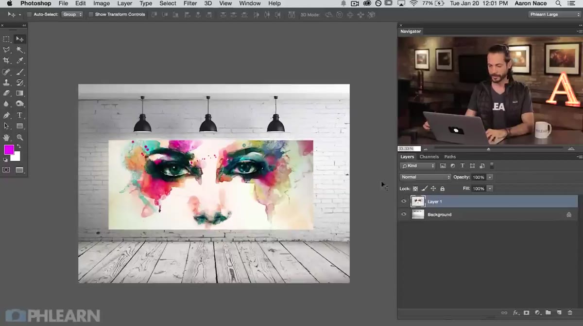 Selecting the artwork layer before accessing the Filter menu
Before you go anywhere near the Lighting Effects filter, right-click on your artwork layer and convert it to a Smart Object. Aaron doesn’t belabor this point in the tutorial, but it matters. Running Lighting Effects as a Smart Filter means the effect stays editable. If the direction of the light looks wrong after you’ve applied it, or if the client asks for a change two weeks later, you can double-click the filter and go back in. Without the Smart Object, that filter is baked in permanently. I’ve made that mistake on deadline and it costs you time you don’t have.
Step 5: Open Lighting Effects and Set Your Light Type
 Lighting Effects dialog open showing spotlight, point light, and infinite light options
Go to Filter, then Render, then Lighting Effects. The filter opens in its own full-screen workspace. At the top of the panel you’ll see three light type options: Spot Light, Point Light, and Infinite Light. A Spot Light projects a cone of light from a specific direction, which is what you want when you’re matching wall-mounted fixtures. A Point Light radiates outward in all directions from a center point, like a bare bulb. An Infinite Light simulates something like sunlight, where the rays are essentially parallel and have no single origin point. For a scene with directional practical lights, Spot Light is your starting point.
Step 6: Position and Adjust Your Light Source
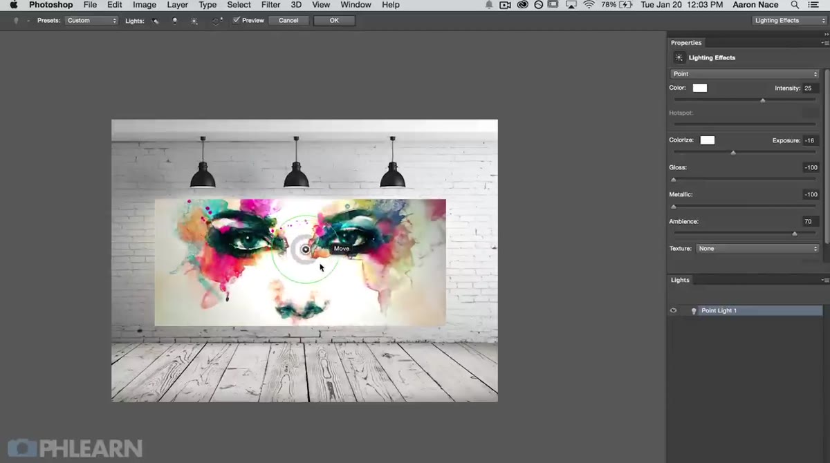 Spotlight handle being dragged to match the position of a wall-mounted fixture
Once you’ve selected Spot Light, you’ll see a set of handles in the preview. The center point controls the origin of the light. The outer ellipse controls the spread and direction. Drag the center point to match the position of the actual light source visible in your background image. Adjust the spread of the cone so it falls across the painting the way a real spot at that angle would. In the properties panel to the right, you have sliders for Intensity, Color, and Hotspot. Intensity controls how bright the light is. Hotspot controls the softness of the falloff at the edge of the cone. Push Hotspot lower for a harder edge, higher for a broader soft wash.
Step 7: Use Texture Channel to Add Dimension
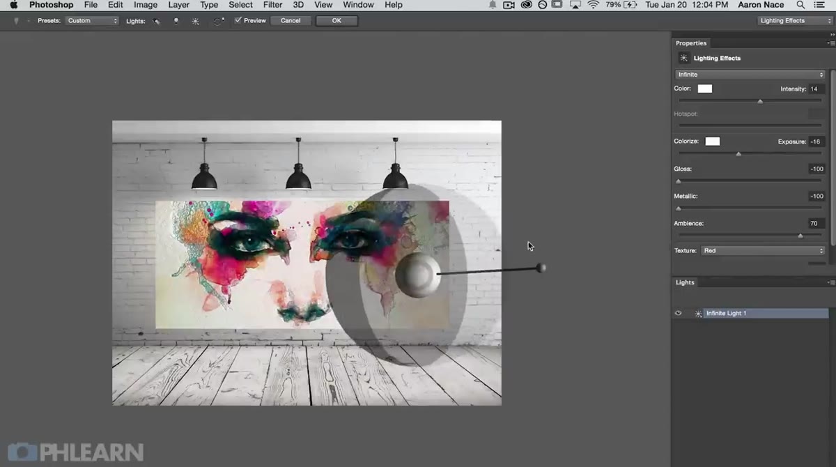 Texture section of Lighting Effects panel showing channel selector and height slider
This is the step that most people overlook, and it’s the one that takes a flat, obviously digital-looking element and gives it physical believability. In the Lighting Effects panel, scroll down to the Texture section. Set the Texture Channel to Red, Green, Blue, or any channel that carries good contrast in your image. The light will then interact with that channel as if it were a bump map, creating subtle highlights and shadows that suggest the painting has actual surface texture. The Height slider controls how pronounced that effect is. Keep it subtle for a smooth canvas, push it further for something with heavy brushwork or grain.
From the Studio: Match the Light Color, Not Just the Direction
The technical steps above will get you a convincing composite, but there’s one thing I always do that I want to flag. The color temperature of the light matters as much as its position. I ruined an early editorial composite because I matched the direction of the light perfectly but left the color at a neutral white, while the practical lights in the scene were a warm tungsten amber. The painting looked like it was lit by a different sun. Before I finalize any Lighting Effects pass, I sample the actual color of the light source in the background image using the Eyedropper, then apply that sampled color to my synthetic light. It takes thirty seconds and closes the last gap between convincing and correct.
The most useful thing this tutorial demonstrates is that Lighting Effects isn’t about adding drama for its own sake. It’s about making elements that exist in the same frame feel like they were actually lit by the same light. When you get that right, the viewer stops analyzing the image and starts believing it.
Watch the full tutorial on YouTube to see Aaron walk through the complete composite from start to finish, including the layer styles portion where drop shadow and bevel emboss add the final physical grounding to the artwork.
Comments (2)
I tried this on a client project yesterday and the results were way better than expected.
Just subscribed. If the rest of your content is this good, I'm in.
Leave a Comment