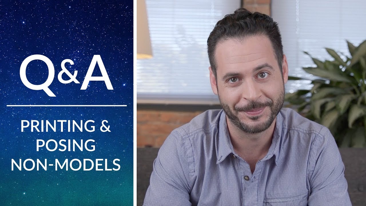
Print day is humbling. You’ve nailed the shoot, the edit looks clean on your calibrated monitor, and you send the file off to the lab expecting something you could frame and sell. What comes back is muddy, too dark, or weirdly magenta in the skin tones. I’ve been there more times than I’d like to admit. Early in my commercial work, I ruined a full editorial run by ignoring the lab’s color profile and assuming my screen was gospel. That mistake cost me a reprint, a delay, and a client conversation I still think about.
So when I came across this Aaron Nace (PHLEARN) tutorial covering both print preparation and posing non-models, I paid attention. Watch the full tutorial on YouTube. Aaron has a practical, no-fluff approach to these topics that cuts through the anxiety new photographers feel when they transition from screen work to physical output. What follows is my breakdown of the key steps, expanded with what I’ve learned applying these same principles in a commercial studio context.
Step 1: Set Realistic Expectations for Your First Print
 Aaron explains that first prints rarely come out right
Your first print will probably not look the way you want it to. That’s not a flaw in your process, it’s just the nature of moving from a backlit screen to reflected light on paper. The gap between what you see on a monitor and what ink looks like on a physical surface is real and it takes calibration to close it. Think of the first print as a diagnostic, not a finished product.
Aaron explains that first prints rarely come out right
Your first print will probably not look the way you want it to. That’s not a flaw in your process, it’s just the nature of moving from a backlit screen to reflected light on paper. The gap between what you see on a monitor and what ink looks like on a physical surface is real and it takes calibration to close it. Think of the first print as a diagnostic, not a finished product.
Once you accept this, the process becomes systematic rather than frustrating. You’re not failing, you’re gathering data about your specific workflow, your machine or lab, and your file’s behavior in print.
Step 2: Decide Whether You’re Printing at Home or Using a Lab
 Aaron comparing home printing versus using a professional print lab
Home printing gives you immediate feedback. You can tweak brightness, pull saturation, adjust the reds, hit print, and hold the result in your hand within minutes. That tight feedback loop is genuinely useful for learning. The tradeoff is cost per print and the ceiling on print size and quality.
Aaron comparing home printing versus using a professional print lab
Home printing gives you immediate feedback. You can tweak brightness, pull saturation, adjust the reds, hit print, and hold the result in your hand within minutes. That tight feedback loop is genuinely useful for learning. The tradeoff is cost per print and the ceiling on print size and quality.
Using a professional lab raises that ceiling significantly, but it also introduces variables you can’t control directly. The machine, the paper stock, the operator calibration. This is why choosing the right lab matters so much. Aaron recommends working with reputable companies that will actually communicate with you when something goes wrong. In my own workflow, I treat the first order with any new lab as a test run. I ask questions upfront, I get the specs in writing, and I don’t hand over a job I can’t afford to reprint.
Step 3: Contact the Lab and Get Their Color Profile
 Aaron discussing color profiles and matching printers
Every printer, commercial or home, interprets color differently. A lab running an Epson wide-format with one ink set will render your file differently than a lab running a Fuji Frontier. Neither is wrong. They’re just different machines with different color profiles. Your job is to match your file to their machine, not the other way around.
Aaron discussing color profiles and matching printers
Every printer, commercial or home, interprets color differently. A lab running an Epson wide-format with one ink set will render your file differently than a lab running a Fuji Frontier. Neither is wrong. They’re just different machines with different color profiles. Your job is to match your file to their machine, not the other way around.
Call the lab, or check their website, and find out exactly what equipment they’re running. Then download and install the ICC color profile they provide. In Photoshop, you soft-proof your image against that profile before you export. This means you’re looking at a simulation of how the lab’s printer will interpret your file. What looks slightly washed out in soft proof mode will often come back from the lab looking exactly right. I keep a folder on my desktop labeled by lab name with their current profiles. Every time I get a new profile from a lab, I test it the same day.
Step 4: Export Multiple Exposure Variations for Your Test Print
 Aaron recommending saving several brightness variations before ordering
Before you send anything to the lab, save out at least three versions of your file: one at your intended exposure, one slightly brighter, and one slightly darker. If you’re unsure about saturation, add a version with the color dialed back a touch. This is not redundant work. It’s the fastest way to dial in your print settings without ordering five separate jobs.
Aaron recommending saving several brightness variations before ordering
Before you send anything to the lab, save out at least three versions of your file: one at your intended exposure, one slightly brighter, and one slightly darker. If you’re unsure about saturation, add a version with the color dialed back a touch. This is not redundant work. It’s the fastest way to dial in your print settings without ordering five separate jobs.
On the practical side, I use naming conventions like “filename_bright,” “filename_neutral,” and “filename_dark” so there’s no confusion on my end or the lab’s end. A test print sheet with three small images tells you more than one large print ever could. It shows you exactly where your file sits relative to the lab’s output, and it costs you almost nothing compared to a large-format reprint.
Step 5: Start Small Before You Order the Large Print
 Aaron advising to order a small test print before the final large format
This is the step most people skip because they’re impatient, and it’s the step that costs them the most money. If you want a 24x36 inch print, order an 8x10 first. Use the test variations from the previous step. Look at the result under consistent lighting, ideally the same lighting conditions the final print will be displayed in.
Aaron advising to order a small test print before the final large format
This is the step most people skip because they’re impatient, and it’s the step that costs them the most money. If you want a 24x36 inch print, order an 8x10 first. Use the test variations from the previous step. Look at the result under consistent lighting, ideally the same lighting conditions the final print will be displayed in.
Once you have the small print dialed in, you know your offset. If your neutral file came back 15% too dark, you know to add brightness before the final order. If the reds are pulling orange, you know to correct them in the profile. This test-first approach turns an unpredictable process into a repeatable one. I’ve applied this same logic to canvas, metallic paper, and fine art matte stock, and it works across all of them.
What I’d Add From My Own Experience
The tutorial covers the technical pipeline cleanly, but there’s a human side to printing that I think gets underestimated. The relationship with a lab’s customer service team is a real professional asset. Over the years, I’ve built working relationships with two labs where I can call and say “this came back off” and they’ll investigate their end and reprint without argument. That trust takes time to build and it starts with being a clear, specific communicator when something goes wrong, not just upset. Tell them what you expected, show them your file, describe what came back differently. Specifics get results.
Also: your monitor calibration is the upstream problem most people ignore. Before any of this matters, your display needs to be hardware-calibrated with a colorimeter on a regular schedule. I run mine every two weeks. If your monitor is lying to you, your soft proofs are lying to you, and no amount of test printing will fix that at the source.
The single most actionable thing from this tutorial is the test strip approach. Order small, order multiple variations, compare the results, then order your final print with confidence. It’s the difference between hoping the print looks good and knowing it will.
Watch the full tutorial on YouTube for Aaron’s complete walkthrough, including his breakdown of posing non-models, which is equally worth your time if you’re working with clients who aren’t professional subjects.
Comments (1)
Just used this on a wedding shoot edit. Client was thrilled.
Leave a Comment