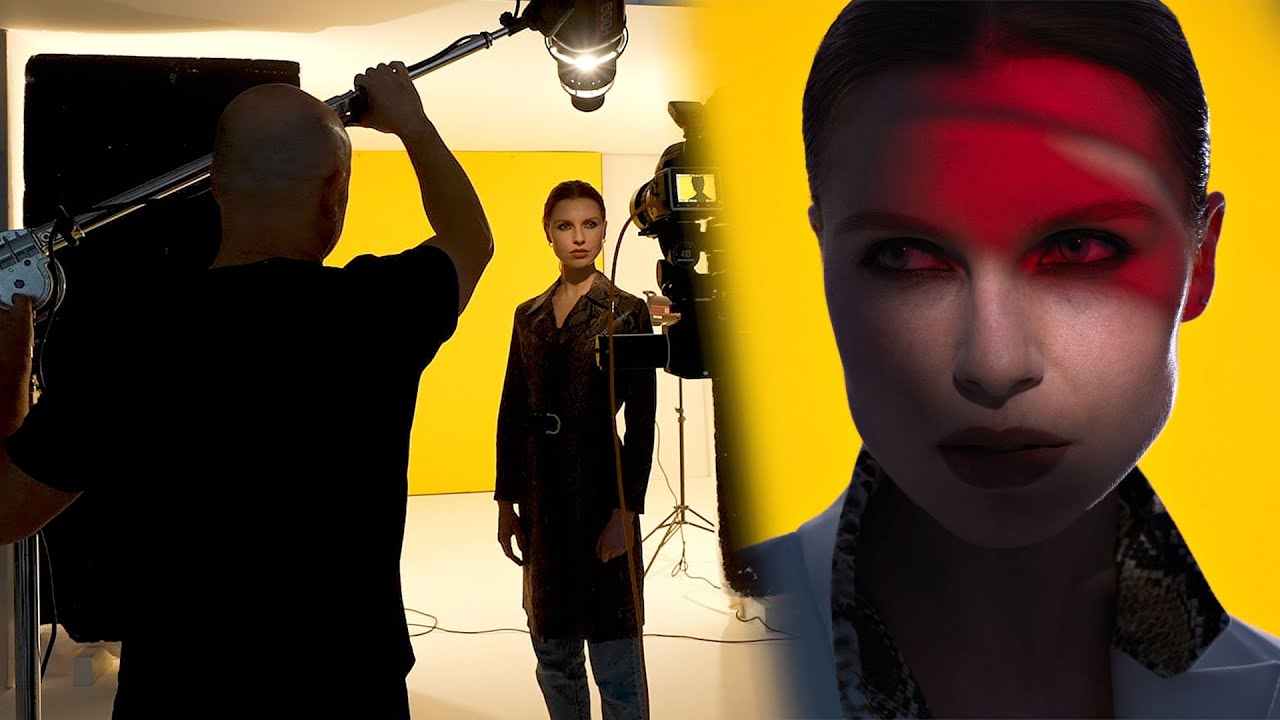
Every few months I’ll be mid-prep on an editorial shoot and realize the background problem is going to eat my whole morning. Seamless paper with uneven tension reads as dark bands under direct light. A plain wall works until you try to make it feel like something. I’ve jury-rigged solutions for years, sketching them into my lighting journal after the fact and vowing to refine the approach next time. So when I came across Karl Taylor’s step-by-step portrait breakdown from Visual Education, I stopped what I was doing and watched it twice. Watch the full tutorial on YouTube
In this Visual Education tutorial, Taylor dissects a striking editorial portrait: a model against a saturated yellow background with a hard, mysterious red cast falling across her face. It looks like a composite. It isn’t. Everything was captured in camera, and the logic behind each decision is exactly the kind of methodical, build-one-layer-at-a-time thinking I try to bring to my own commercial work. What follows is my walkthrough of his approach, with the details you need to actually replicate it.
Step 1: Build Your Background Light Rig with V-Flats and Bare Bulbs
 Two poly boards forming an L-shape with bare bulb light
Take two large poly boards (V-flats) and arrange them into an L-shape, with the reflective white sides facing inward. Place a bare bulb strobe, meaning a studio head with no modifier attached, inside the corner of that L, aimed into the junction where the two boards meet. The bare bulb fires light in every direction simultaneously: up, forward, sideways. All of that output bounces off the interior surfaces of the V-flat and floods back toward the background wall as a single enormous, featureless light source.
Two poly boards forming an L-shape with bare bulb light
Take two large poly boards (V-flats) and arrange them into an L-shape, with the reflective white sides facing inward. Place a bare bulb strobe, meaning a studio head with no modifier attached, inside the corner of that L, aimed into the junction where the two boards meet. The bare bulb fires light in every direction simultaneously: up, forward, sideways. All of that output bounces off the interior surfaces of the V-flat and floods back toward the background wall as a single enormous, featureless light source.
This matters because size equals softness, and the V-flat method turns a single small bulb into something closer to a four-foot panel. Taylor uses two of these rigs positioned on either side of the background gap, and the result is a background with no hot spots, no gradients, no wrinkles showing. If you’re working with colored seamless and the paper has tension ripples, this technique will flatten them out more effectively than any softbox aimed directly at the background.
Step 2: Set Your Background Color and Exposure Independently
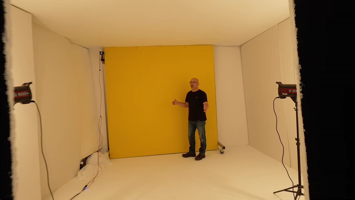 Yellow background visible with two bare bulb lights in frame
The background in Taylor’s shot is a flat yellow wall, but the technique applies equally to colored seamless paper. The key discipline here is treating background exposure as a completely separate variable from your subject exposure. Dial in the background lights first, with your subject stepped out of frame, and get the color and brightness exactly where you want them. Taylor’s yellow reads as fully saturated and vibrant, which means the background is slightly overexposed relative to a middle gray, but the V-flat method keeps the light even enough that it doesn’t blow out unevenly.
Yellow background visible with two bare bulb lights in frame
The background in Taylor’s shot is a flat yellow wall, but the technique applies equally to colored seamless paper. The key discipline here is treating background exposure as a completely separate variable from your subject exposure. Dial in the background lights first, with your subject stepped out of frame, and get the color and brightness exactly where you want them. Taylor’s yellow reads as fully saturated and vibrant, which means the background is slightly overexposed relative to a middle gray, but the V-flat method keeps the light even enough that it doesn’t blow out unevenly.
Once the background is set, don’t touch those lights again. They should never interact with your subject’s face. The gap between the two V-flat rigs is your shooting window, and keeping that gap tight helps contain spill.
Step 3: Position Your Subject Inside the Background Gap
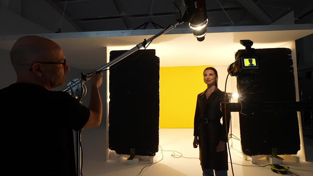 Subject standing in frame with camera and key light visible
Place your subject in the opening between the two V-flat rigs so that the yellow background fills the frame behind them without any of the rig hardware showing. Taylor shows the camera position directly opposite the subject, with the background compressed cleanly behind her. The subject is close enough to the background to avoid a dark falloff between the two zones, but not so close that background light wraps around her and contaminates the foreground.
Subject standing in frame with camera and key light visible
Place your subject in the opening between the two V-flat rigs so that the yellow background fills the frame behind them without any of the rig hardware showing. Taylor shows the camera position directly opposite the subject, with the background compressed cleanly behind her. The subject is close enough to the background to avoid a dark falloff between the two zones, but not so close that background light wraps around her and contaminates the foreground.
This placement is a balancing act. Too close to the background and the background exposure starts to affect how her skin reads. Too far and you lose the color intensity. Work with your subject’s feet first, mark the floor with tape, and don’t let them drift during the shoot.
Step 4: Choose a Projection Attachment for Your Key Light
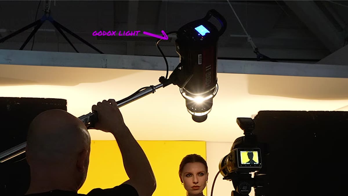 Hard defined light patch on model’s face from projection attachment
Taylor’s key light is a Godox strobe fitted with a projection attachment, sometimes called a Gobo or optical snoot. This modifier uses a lens system to throw a hard, defined beam of light onto a precise area, like a spotlight on a stage. The shadow under the nose in his image is razor-sharp, and the circle of light on her face has a clean, controllable edge. No softbox creates this. A grid gets you close but not there.
Hard defined light patch on model’s face from projection attachment
Taylor’s key light is a Godox strobe fitted with a projection attachment, sometimes called a Gobo or optical snoot. This modifier uses a lens system to throw a hard, defined beam of light onto a precise area, like a spotlight on a stage. The shadow under the nose in his image is razor-sharp, and the circle of light on her face has a clean, controllable edge. No softbox creates this. A grid gets you close but not there.
Set the projection attachment so the circle of light is roughly the same size as the face. Taylor mentions this explicitly: you want coverage over the features without significant spill onto the neck or chest. The hard falloff at the edge of the beam is what gives the image its theatrical, mysterious quality. Meter the face at your target exposure after the background is locked in, and confirm the shadow directions are reading the way you want before you add anything else.
Step 5: Interrupt the Beam with a Colored Transparent Object
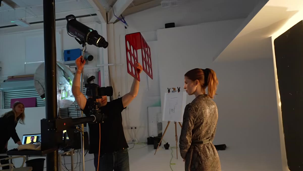 Karl Taylor holding red acrylic wine rack in front of key light
Here is where the shot becomes something more than a clean studio portrait. Taylor holds a transparent red acrylic wine rack directly in front of the projection attachment’s beam. The light passes through the red perspex and through the circular cutouts in the rack, casting patterned red shadows and color-shifted light across the face simultaneously. The effect is organic, slightly unpredictable, and completely impossible to fake convincingly in post.
Karl Taylor holding red acrylic wine rack in front of key light
Here is where the shot becomes something more than a clean studio portrait. Taylor holds a transparent red acrylic wine rack directly in front of the projection attachment’s beam. The light passes through the red perspex and through the circular cutouts in the rack, casting patterned red shadows and color-shifted light across the face simultaneously. The effect is organic, slightly unpredictable, and completely impossible to fake convincingly in post.
The object itself doesn’t matter as much as its properties: it needs to be transparent or translucent, colored if you want a color cast, and it needs to have some structural variation (holes, texture, irregular edges) if you want pattern. Colored glass, theatrical gel stretched over a frame, or stacked acrylic panels would all work. Hold the object at different distances from the light head to control how sharp or diffused the pattern reads on the face. Closer to the light gives a softer, more blended color wash. Closer to the subject sharpens the projected pattern.
What I’d Do Differently in a Commercial Context
The wine rack works beautifully for editorial, but on a client shoot I’d want more repeatability. My version of this step would be to cut patterns into black foamcore and gel the key light separately, so I can reproduce the exact same effect for a reshoot or a second look. I keep a labeled folder in my studio kit with gel swatches and foamcore cutouts from previous jobs, each piece tagged with the shoot date and the modifier it was used with. Spontaneous props like Taylor’s wine rack are great for personal work and test shoots. For anything with a deliverable, build the version you can rebuild.
The single most important thing this tutorial reinforced for me: complex, layered images don’t require complex simultaneous setups. Taylor builds this shot in discrete stages, confirming each element before adding the next. Background first. Subject position second. Key light character third. Color effect fourth. That sequence is the real lesson. If you try to troubleshoot all of it at once, you won’t know which variable is causing the problem.
Watch the full tutorial on YouTube to see the behind-the-scenes frames that show exactly how each rig is positioned in the studio.
Comments (3)
Been doing this wrong for years apparently. Thanks for the wake-up call.
Been doing this wrong for years apparently. Thanks for the wake-up call.
Well explained. I think my audience would really benefit from this — mind if I link to it?
Leave a Comment