
Every photographer I know has a modifier graveyard. A pile of softboxes, grids, and beauty dishes that got bought, used twice, and shelved because nothing about the results made sense. The problem isn’t the gear. The problem is that most of us compare modifiers in the worst possible way: switching from one to another across different shoots, different subjects, different distances, and then wondering why we can’t draw any useful conclusions. I’ve been guilty of this myself. I have a lighting journal where I sketch every setup after a shoot, and flipping back through early entries is humbling. There are notes like “strip box felt harder than umbrella” with zero context for what I actually measured or controlled.
This Visual Education tutorial cuts straight to the root of that problem, and it does it with a method I wish someone had handed me ten years ago. Watch the full tutorial on YouTube before or after reading this. Either way, the breakdown below is designed so you can follow the logic and start applying it in your own studio immediately.
Step 1: Choose a Benchmark Modifier Before You Test Anything
 Octabox 150 positioned as the reference light source
Before any comparison is meaningful, you need a fixed reference point. The tutorial establishes this immediately, and it’s the move that makes everything else work. The instructor selects a 150cm octabox as the benchmark. The reasoning is practical rather than romantic: it’s affordable, widely available, flattering on most subjects, and sits in the middle of the modifier spectrum. It isn’t the softest light you can produce and it isn’t the hardest. That middle-ground position is exactly what makes it useful as a baseline.
Octabox 150 positioned as the reference light source
Before any comparison is meaningful, you need a fixed reference point. The tutorial establishes this immediately, and it’s the move that makes everything else work. The instructor selects a 150cm octabox as the benchmark. The reasoning is practical rather than romantic: it’s affordable, widely available, flattering on most subjects, and sits in the middle of the modifier spectrum. It isn’t the softest light you can produce and it isn’t the hardest. That middle-ground position is exactly what makes it useful as a baseline.
Pick your benchmark based on the same logic. It doesn’t have to be an octabox. It should be whatever modifier you reach for most often and know best. The point is consistency. Every other modifier you test gets compared against this one, at the same distance, with the same subject, in the same position. Write it down. Mine is taped to the wall of my studio with a strip of masking tape labeled “REF.”
Step 2: Use a Comparison Tool to Eliminate Memory-Based Judgments
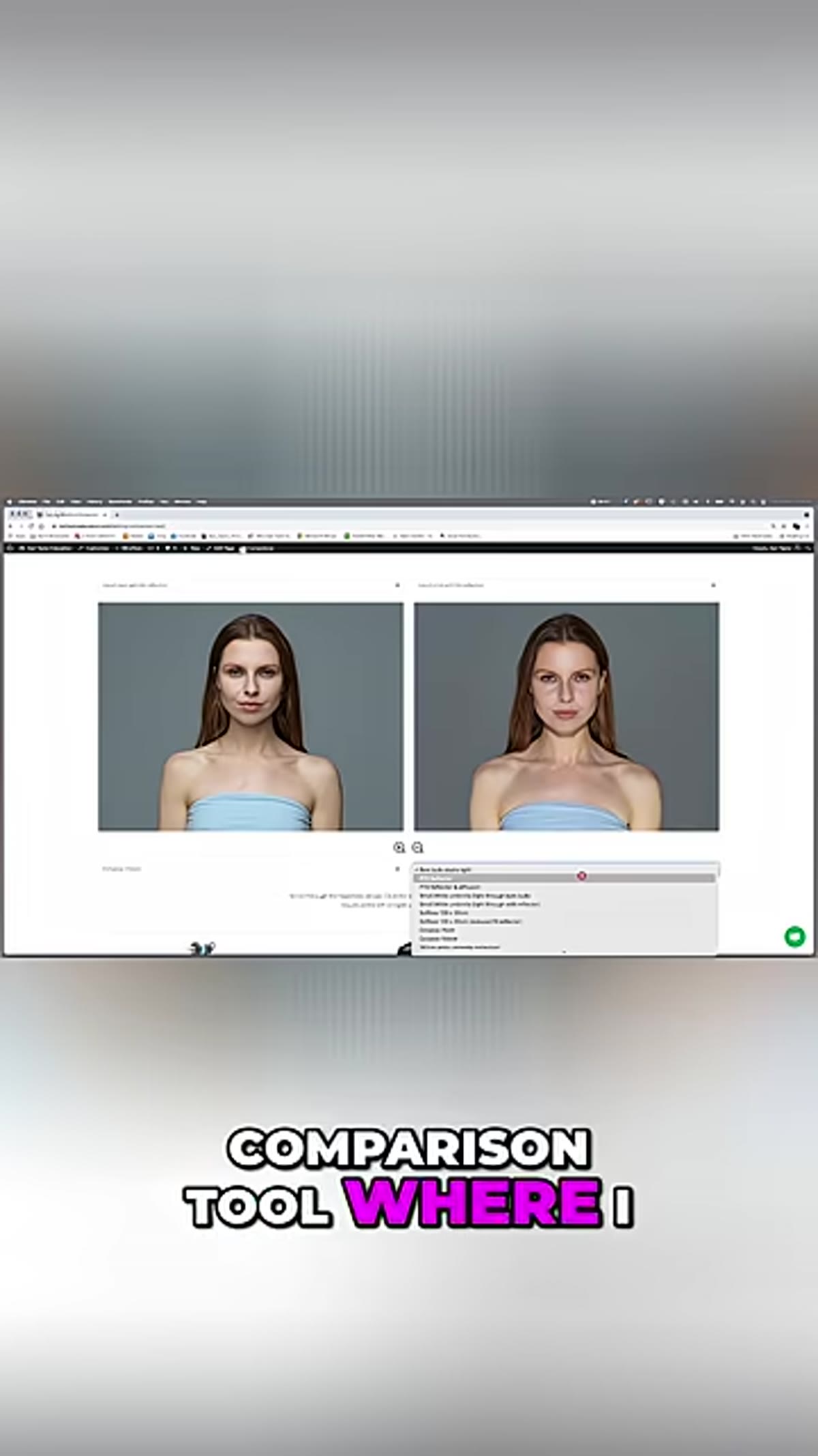 Lighting comparison tool interface showing modifier selection panel
The tutorial introduces a dedicated lighting comparison tool that lets you select different modifiers and examine the results side by side. This is the part where most photographers either nod along or get frustrated that they don’t have access to the same software. But the underlying principle matters more than the specific tool. The goal is to eliminate the gap between testing session A and testing session B. When you rely on memory to compare how a parabolic umbrella felt versus a softbox you used last Tuesday, you’re not comparing light. You’re comparing impressions.
Lighting comparison tool interface showing modifier selection panel
The tutorial introduces a dedicated lighting comparison tool that lets you select different modifiers and examine the results side by side. This is the part where most photographers either nod along or get frustrated that they don’t have access to the same software. But the underlying principle matters more than the specific tool. The goal is to eliminate the gap between testing session A and testing session B. When you rely on memory to compare how a parabolic umbrella felt versus a softbox you used last Tuesday, you’re not comparing light. You’re comparing impressions.
If you don’t have access to a formal comparison tool, replicate the logic with a contact sheet. Shoot your benchmark modifier first, shoot your test modifier second, and review them at the same zoom level in Lightroom or Capture One with no adjustments applied. The discipline of reviewing them together, immediately, is what matters.
Step 3: Examine Shadow Quality as Your Primary Diagnostic
 Side-by-side portrait results showing shadow transition differences
Once the benchmark is established, the tutorial directs attention toward shadow behavior as the clearest indicator of what a modifier is actually doing. Not brightness, not color, not coverage. Shadows. Specifically, the transition from lit areas to unlit areas on the face. A gradual, smooth transition signals a large effective light source. A sharp, abrupt cutoff signals a smaller or more focused one.
Side-by-side portrait results showing shadow transition differences
Once the benchmark is established, the tutorial directs attention toward shadow behavior as the clearest indicator of what a modifier is actually doing. Not brightness, not color, not coverage. Shadows. Specifically, the transition from lit areas to unlit areas on the face. A gradual, smooth transition signals a large effective light source. A sharp, abrupt cutoff signals a smaller or more focused one.
When I’m evaluating a new modifier on a test shoot, I’m looking at the shadow under the nose and along the jawline first. Those two areas show the character of the light more honestly than any other part of the face. A modifier that looks impressive on paper can reveal itself as unflattering the moment you see how it carves out the jaw. Conversely, a basic rectangular softbox can look surprisingly beautiful when you see how gently it transitions across the cheek.
Step 4: Note How Specular Highlights Differ Between Modifiers
 Close-up comparison of catchlights and highlight quality on skin
Shadow transitions tell you about softness. Specular highlights tell you about the modifier’s shape and internal structure. The tutorial points to the catchlights in the eyes as one quick read on this, but the more revealing information shows up in the skin texture of the forehead and cheekbones. A modifier with a reflective interior produces a different quality of highlight than one with a diffused or matte surface.
Close-up comparison of catchlights and highlight quality on skin
Shadow transitions tell you about softness. Specular highlights tell you about the modifier’s shape and internal structure. The tutorial points to the catchlights in the eyes as one quick read on this, but the more revealing information shows up in the skin texture of the forehead and cheekbones. A modifier with a reflective interior produces a different quality of highlight than one with a diffused or matte surface.
This distinction matters enormously in beauty and skincare work. I once had a brief for a moisturizer campaign where the client wanted “dewy, healthy skin.” My standard octabox gave me soft, even light but not enough specular pop on the skin to suggest luminosity. Switching to a modifier with a more defined, shaped highlight completely changed the read of the image. I wouldn’t have known to make that call if I hadn’t already spent time understanding what each modifier’s highlight signature looked like.
Step 5: Compare Coverage and Fall-Off at Consistent Distances
 Full-length modifier comparison showing light fall-off toward the edges of frame
The final comparison point in the tutorial is coverage: how the light behaves across the full frame, not just at the center. Some modifiers are remarkably even across a wide area. Others hot-spot at the center and fall off quickly toward the edges. Neither is wrong, but not knowing which you’re dealing with creates unpredictable results as soon as you move the subject or reframe the shot.
Full-length modifier comparison showing light fall-off toward the edges of frame
The final comparison point in the tutorial is coverage: how the light behaves across the full frame, not just at the center. Some modifiers are remarkably even across a wide area. Others hot-spot at the center and fall off quickly toward the edges. Neither is wrong, but not knowing which you’re dealing with creates unpredictable results as soon as you move the subject or reframe the shot.
Test this by shooting a plain gray or white background and examining the gradient across the frame with no subject in the shot. If your benchmark modifier produces a particular evenness, use that as your reference for judging how much fall-off any other modifier introduces. This becomes especially important when you’re shooting multiple subjects in a single frame or doing any work where consistent exposure across the full image matters.
What I’d Add From My Own Studio Work
The tutorial focuses on comparing modifiers at a fixed distance, which is exactly right for building initial understanding. Where I’d extend the lesson is distance variation. The same modifier at 60cm versus 150cm can behave so differently that they almost read as different tools. My personal practice is to test every new modifier at three distances before I use it on a real job: close, medium, and far. I sketch all three in my lighting journal next to the modifier’s specs.
The other caveat worth naming: modifier comparisons done with strobes don’t always transfer directly to continuous LED sources. The output character can shift enough to throw off your expectations. If you shoot with both, benchmark both separately.
The single most important idea in this tutorial is the benchmark. Everything else, the comparison tool, the shadow analysis, the highlight examination, follows from that one decision to anchor your testing to a known reference point. Without it, you’re collecting impressions. With it, you’re building knowledge you can actually use on the next shoot.
Watch the full tutorial on YouTube to see the comparisons in motion and explore the full range of modifiers the Visual Education team runs through.
Comments
Leave a Comment