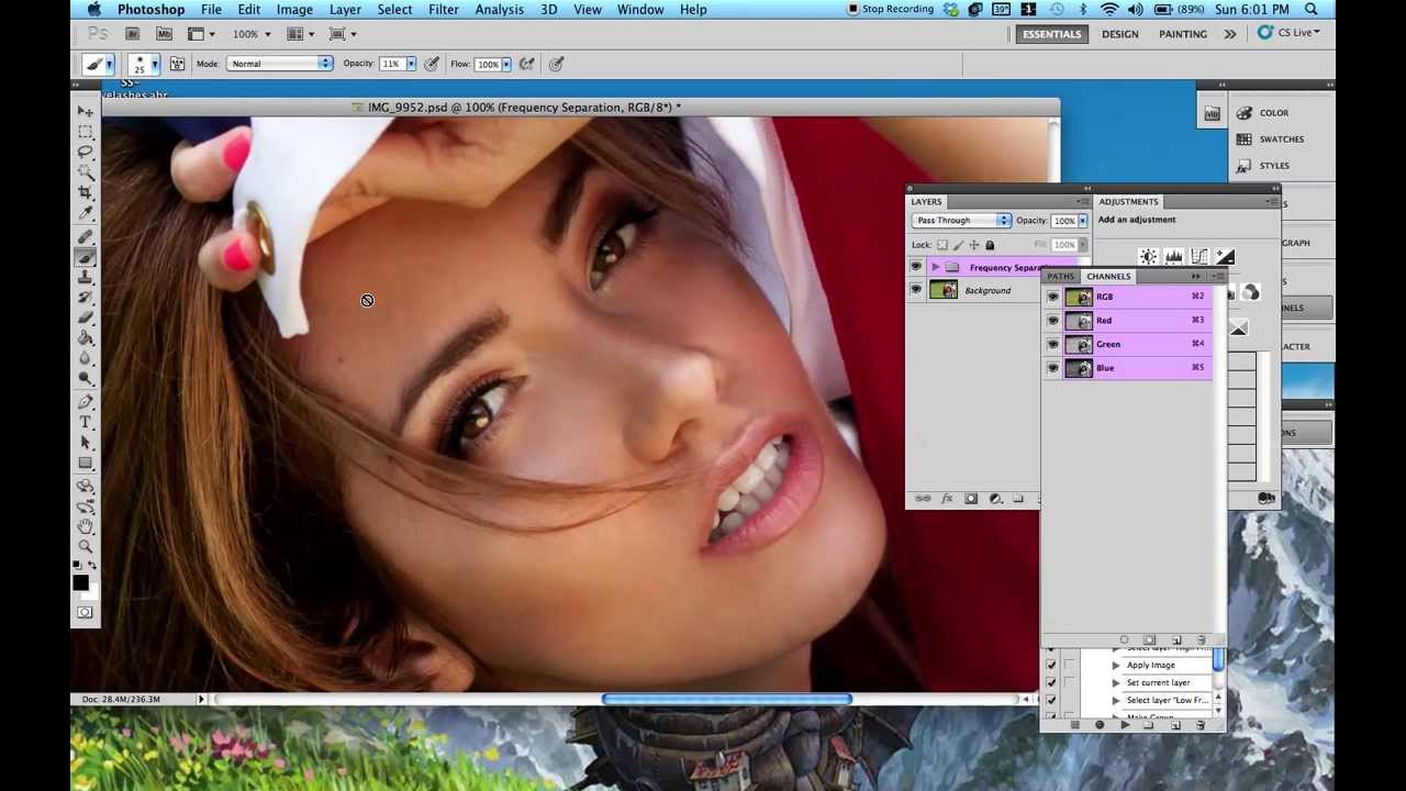
Most of my work happens under controlled light. I design the setup, I know where the highlights are going to land before I ever fire a strobe, and I keep a lighting journal with sketches from every shoot so I can rebuild a look six months later. But even with all of that, there are moments where a shot comes back from a session and the light is technically correct but visually flat. The modeling isn’t reading the way it did in the room. Skin that looked sculptural under the softbox just looks even and dull on screen. That gap between what I saw and what the sensor recorded is where post-production techniques like this one become genuinely useful.
In this Jessica Kobeissi tutorial, Watch the full tutorial on YouTube, she walks through a non-destructive method for adding highlights and shadows to a portrait using a 50% gray layer set to Soft Light. It is one of those techniques that sounds almost too simple, and then you try it and realize it is the cleanest, most controllable way to do this kind of work without touching the actual pixel data of your image. I have used variations of this approach for beauty retouching and fashion work for years, and watching her break it down so clearly reminded me why it should be part of every studio photographer’s post workflow.
Step 1: Create a New Layer and Fill It with 50% Gray
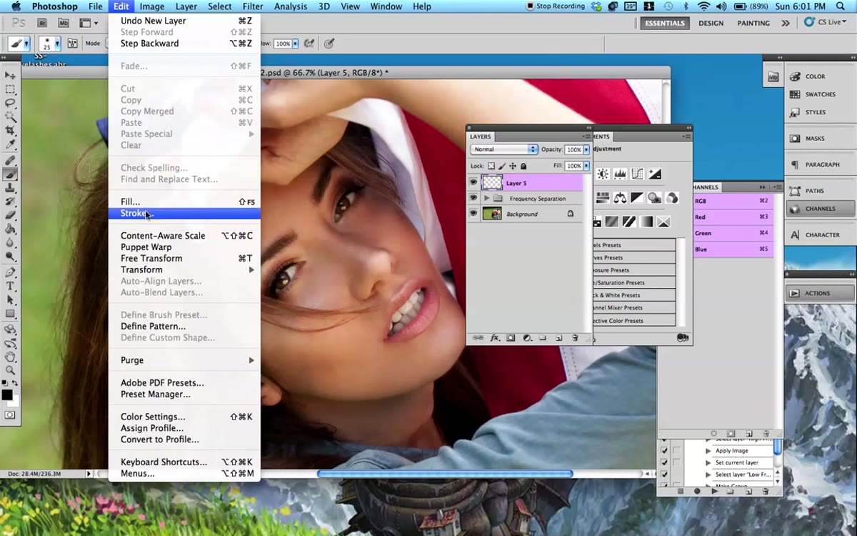 New layer created above the portrait in Layers panel
Start by creating a new layer above your image in the Layers panel. Then go to Edit, choose Fill, and select 50% Gray from the Contents dropdown. Set the opacity of the fill to 100% and click OK. The canvas will appear to go gray for a moment, which can feel alarming if you have not done this before.
New layer created above the portrait in Layers panel
Start by creating a new layer above your image in the Layers panel. Then go to Edit, choose Fill, and select 50% Gray from the Contents dropdown. Set the opacity of the fill to 100% and click OK. The canvas will appear to go gray for a moment, which can feel alarming if you have not done this before.
The key is what happens next: change the blending mode of that layer from Normal to Soft Light. The gray disappears completely. The image looks exactly as it did before you added the layer. That is the point. A 50% gray value is neutral under the Soft Light blending mode, meaning it adds nothing until you paint on top of it with either black or white.
Step 2: Set Your Brush and Color Defaults
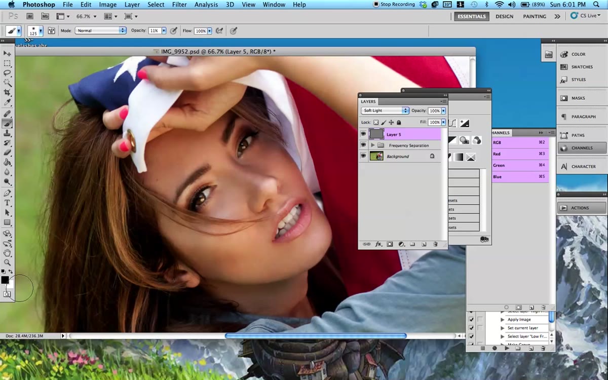 Brush tool selected with foreground color set to black
Before you touch the image, get your brush settings right. Press D to reset your foreground and background colors to their defaults, which gives you black in front and white behind. Select the Brush tool, set the hardness to 0%, and start with a size around 125 to 150 pixels. You will adjust size constantly throughout this process, so keep your bracket keys handy.
Brush tool selected with foreground color set to black
Before you touch the image, get your brush settings right. Press D to reset your foreground and background colors to their defaults, which gives you black in front and white behind. Select the Brush tool, set the hardness to 0%, and start with a size around 125 to 150 pixels. You will adjust size constantly throughout this process, so keep your bracket keys handy.
The two settings that matter most here are opacity and flow. Kobeissi keeps opacity at 11% and flow around 70%. Those numbers are worth honoring, especially on your first pass. The low opacity is what makes this method forgiving. You are building up tone in thin layers, not stamping it in all at once, which means you can course-correct without starting over.
Step 3: Paint Black Over the Shadow Areas
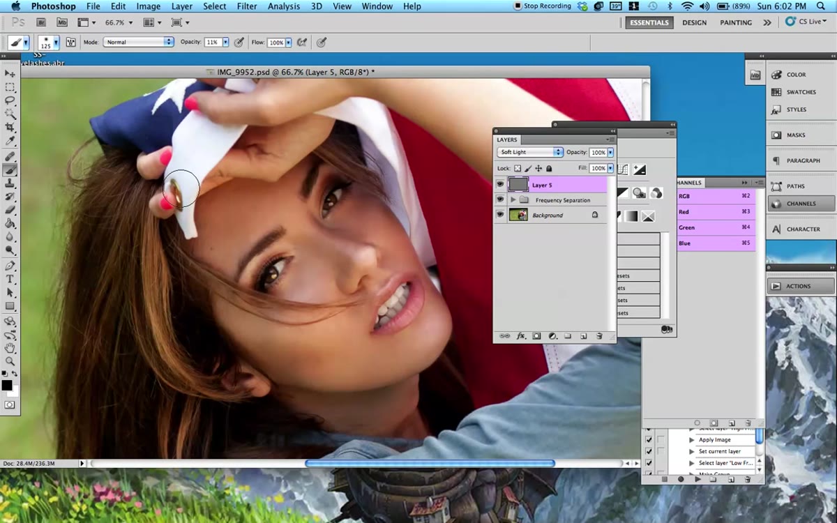 Black brush strokes applied over darker facial areas
With black as your foreground color, begin painting over the areas of the face that are naturally in shadow: under the chin, along the sides of the nose, the hollows under the cheekbones, the crease of the eyelids. You are not inventing shadows. You are reinforcing what the light already started. Think of it as turning up the contrast on what is already there.
Black brush strokes applied over darker facial areas
With black as your foreground color, begin painting over the areas of the face that are naturally in shadow: under the chin, along the sides of the nose, the hollows under the cheekbones, the crease of the eyelids. You are not inventing shadows. You are reinforcing what the light already started. Think of it as turning up the contrast on what is already there.
Switch to a smaller brush for tighter areas like the nose bridge or the corners of the mouth. Because your opacity is so low, you can make multiple passes over the same area to deepen the effect gradually. If something goes too far, just switch to white and paint back over it on the same layer. The gray layer acts as its own built-in eraser.
Step 4: Switch to White and Paint the Highlight Areas
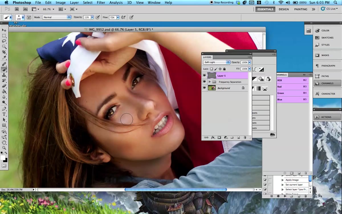 White brush strokes applied to highlight zones on face
Press X to swap your foreground and background colors, bringing white to the front. Now work through the areas where light naturally peaks: the top of the nose, the center of the forehead, the brow bone, the cupid’s bow, the high points of the cheeks. You are essentially mimicking what a beauty dish or a well-placed reflector would do to skin.
White brush strokes applied to highlight zones on face
Press X to swap your foreground and background colors, bringing white to the front. Now work through the areas where light naturally peaks: the top of the nose, the center of the forehead, the brow bone, the cupid’s bow, the high points of the cheeks. You are essentially mimicking what a beauty dish or a well-placed reflector would do to skin.
Stay disciplined about scale here. Use a smaller brush around the lips and nose, a larger brush across broader planes like the forehead or cheekbones. The goal is not to redraw the face but to give the light more presence. Kobeissi uses the phrase “a little wider” when talking about expanding highlight zones, and that restraint is exactly right. You want the effect to read as light, not as painting.
Step 5: Reduce the Layer Opacity Until It Reads as Subtle
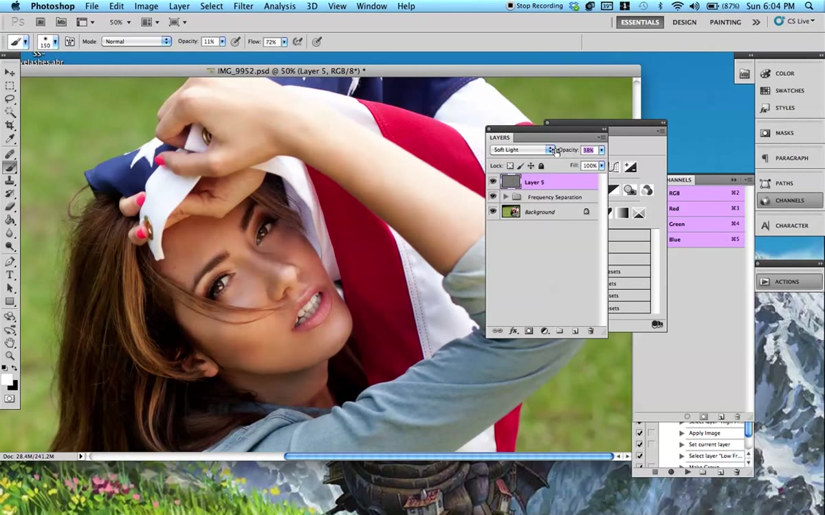 Layer opacity slider being reduced in Layers panel
Once you have finished painting, step back and look at the full image. It will almost certainly look overdone at 100% layer opacity. That is normal and expected. Now drag the opacity of the entire gray layer down until the effect becomes subtle. Kobeissi lands somewhere around 44%, but the right number depends on your image. You are looking for the point where the sculpting reads as light rather than retouching.
Layer opacity slider being reduced in Layers panel
Once you have finished painting, step back and look at the full image. It will almost certainly look overdone at 100% layer opacity. That is normal and expected. Now drag the opacity of the entire gray layer down until the effect becomes subtle. Kobeissi lands somewhere around 44%, but the right number depends on your image. You are looking for the point where the sculpting reads as light rather than retouching.
If you want more control, you can duplicate the approach on a second gray layer and push specific areas further, like adding a bit more definition around the lips or brightening the teeth, without affecting the overall layer opacity you have already dialed in.
What I Do Differently in My Own Work
When I use this technique on beauty or fashion work, I tend to create two separate gray layers instead of one: one dedicated to shadows, one dedicated to highlights. It adds a small amount of setup time but gives me the ability to reduce or increase the shadow pass and the highlight pass independently. In beauty work especially, where the brief often specifies how much dimension the skin should show, that granular control matters.
I also pay attention to the color temperature of the highlights I am reinforcing. If the key light in the original shot was a warm strobe through a large softbox, I will occasionally add a subtle warm tint to the highlight layer using a Color Balance adjustment clipped to it. It keeps the added highlights from reading as a generic bright rather than as an extension of the actual light that was in the room. That connection between the post work and the original lighting setup is what separates retouching that looks like retouching from retouching that just looks like good light.
The single most important thing this technique teaches is the difference between editing and sculpting. You are not fixing the image. You are finishing what the light started, giving it more intention and more presence than the camera captured on its own. That mindset is what makes the difference between a flat catalog shot and a portrait that has real dimension.
Watch the full tutorial on YouTube and follow along with your own image open. The technique takes less than ten minutes to learn and will change how you think about the relationship between your studio lighting and your post workflow.
Comments
Leave a Comment