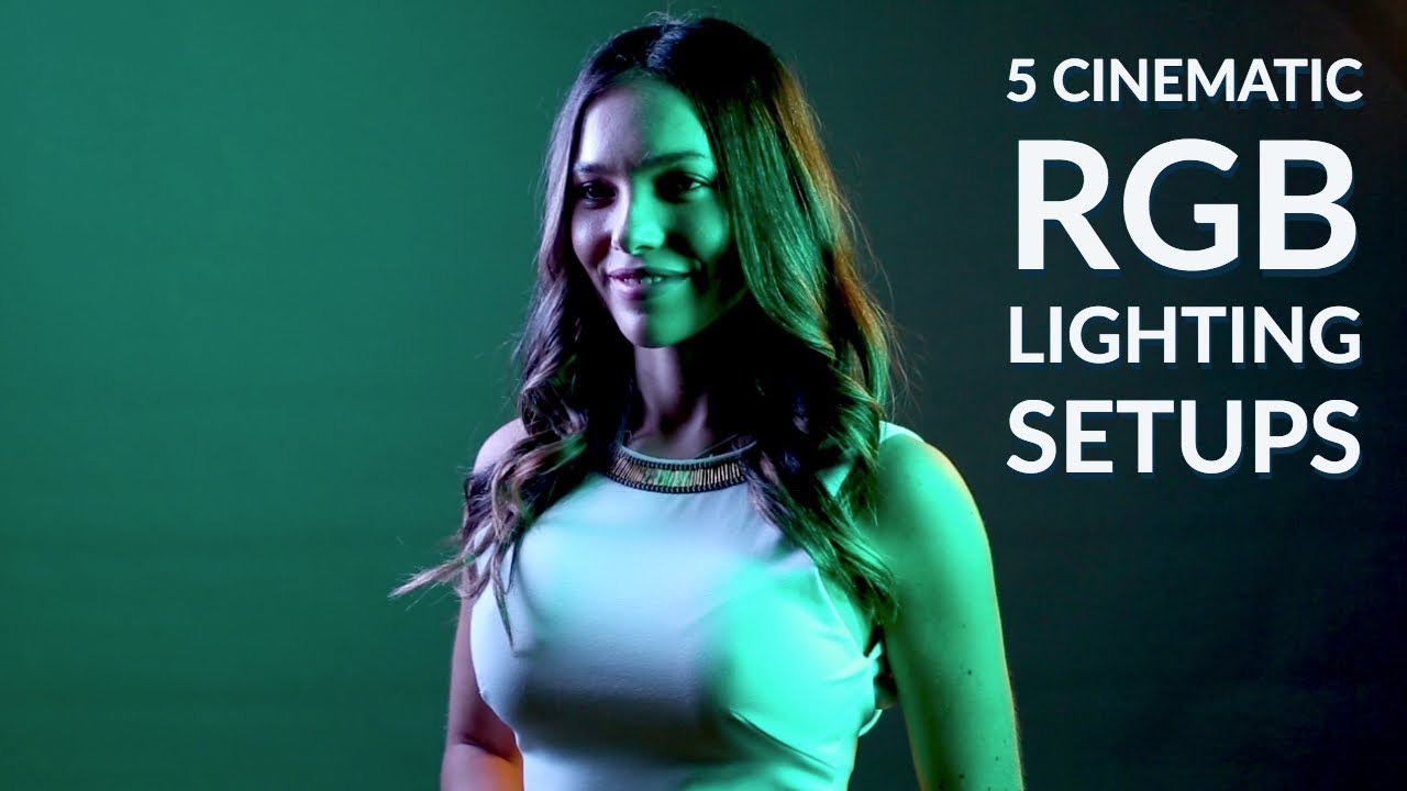
There’s a problem I run into on nearly every fashion or beauty shoot where the client wants “something moody, something cinematic” but the brief stops there. They want deep, saturated color. They want the frame to feel like a still from a film. And for years, that meant packing an entire pelican case full of gels, clipping them to lights in the dark, and hoping the color read the way I imagined it would. It was slow, it was imprecise, and more than once I’ve pulled a gel off mid-shoot because it wasn’t working and had no clean backup option.
RGB LED lights have changed that workflow in a way I didn’t fully appreciate until I started treating them seriously as tools rather than toys. Watch the full tutorial on YouTube - JP Morgan of The Slanted Lens lays out five practical cinematic setups using RGB panels, and the breakdown is tight enough that I sketched most of it into my lighting journal during a single viewing. What follows is my own walkthrough of his method, expanded with the details I found most useful.
Step 1: Understand the Additive Color System Before You Touch a Light
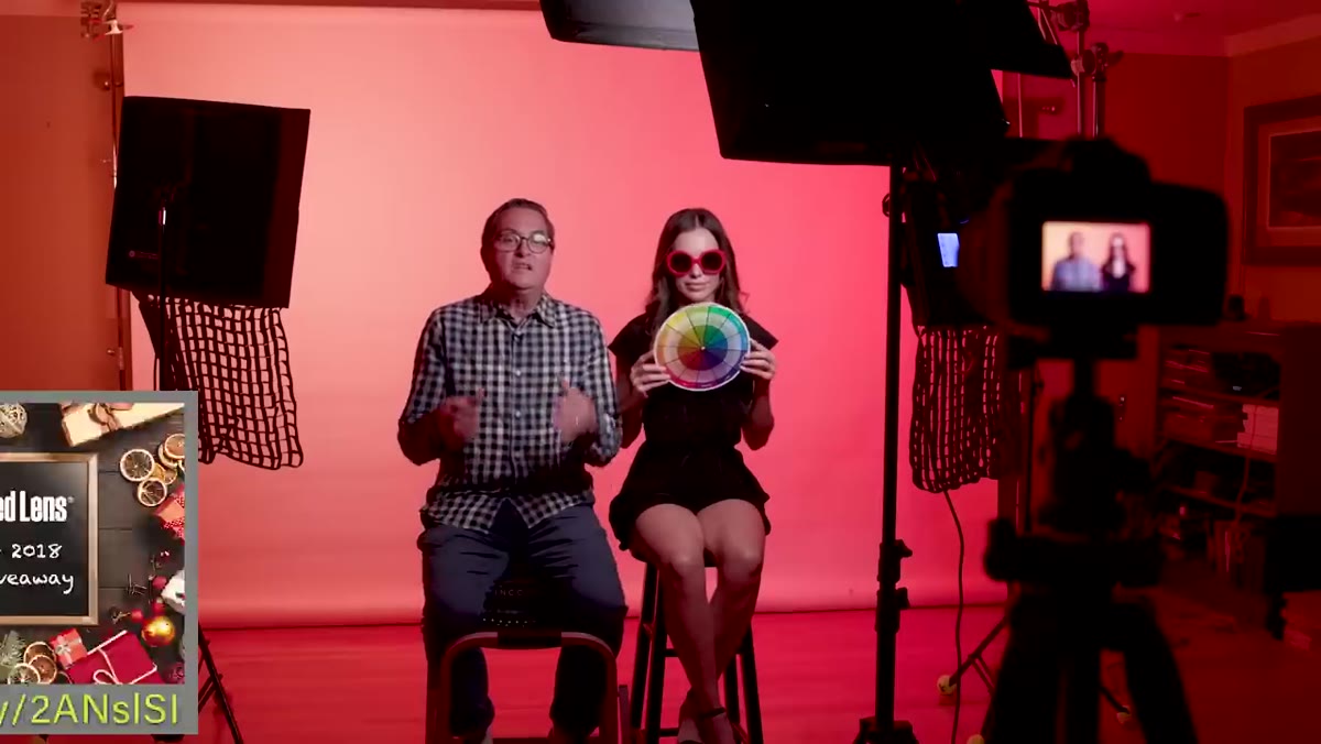 Color wheel diagram showing red, green, and blue primaries
RGB lighting runs on an additive color model. Red, green, and blue are the primaries, and you mix them by adding channels together rather than subtracting, the way paint works. Red plus green gives you yellow. Red plus blue gives you magenta. Blue plus green gives you cyan. All three at equal intensity give you white light. That last point matters more than people realize.
Color wheel diagram showing red, green, and blue primaries
RGB lighting runs on an additive color model. Red, green, and blue are the primaries, and you mix them by adding channels together rather than subtracting, the way paint works. Red plus green gives you yellow. Red plus blue gives you magenta. Blue plus green gives you cyan. All three at equal intensity give you white light. That last point matters more than people realize.
If you understand those six relationships, you can steer your color intentionally instead of just scrolling through a wheel and guessing. Want your background to push warmer toward amber? Increase the red channel and bring green up a bit. Want a cooler, more clinical teal? Pull down red and balance green and blue. I keep a small color wheel taped inside the door of my lighting cabinet for exactly this reason.
Step 2: Separate Your Subject Light From Your Background Light
 Single key light with grid aimed at subject, background dark
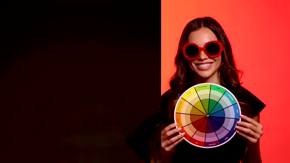
The first setup in the tutorial is the one I find most useful for commercial work: light the subject and the background as two completely independent systems. JP starts with a key light on the subject fitted with a grid. The grid is doing critical work here. It’s controlling spill and keeping that foreground light from washing out the background.
Single key light with grid aimed at subject, background dark
The first setup in the tutorial is the one I find most useful for commercial work: light the subject and the background as two completely independent systems. JP starts with a key light on the subject fitted with a grid. The grid is doing critical work here. It’s controlling spill and keeping that foreground light from washing out the background.
This matters because any white light hitting a colored background will desaturate it. You’re essentially diluting the RGB color with neutral light. The tighter you contain your key, the richer your background color will be. Flag aggressively. JP brings a flag in just above the subject’s head line to cut the spill. I’d add: check your background in Live View before you introduce any color. If the background looks bright or milky from the key alone, your RGB lights are already fighting a losing battle.
Step 3: Dial Down RGB Intensity to Increase Saturation
 RGB panel at full power showing washed, overexposed red background
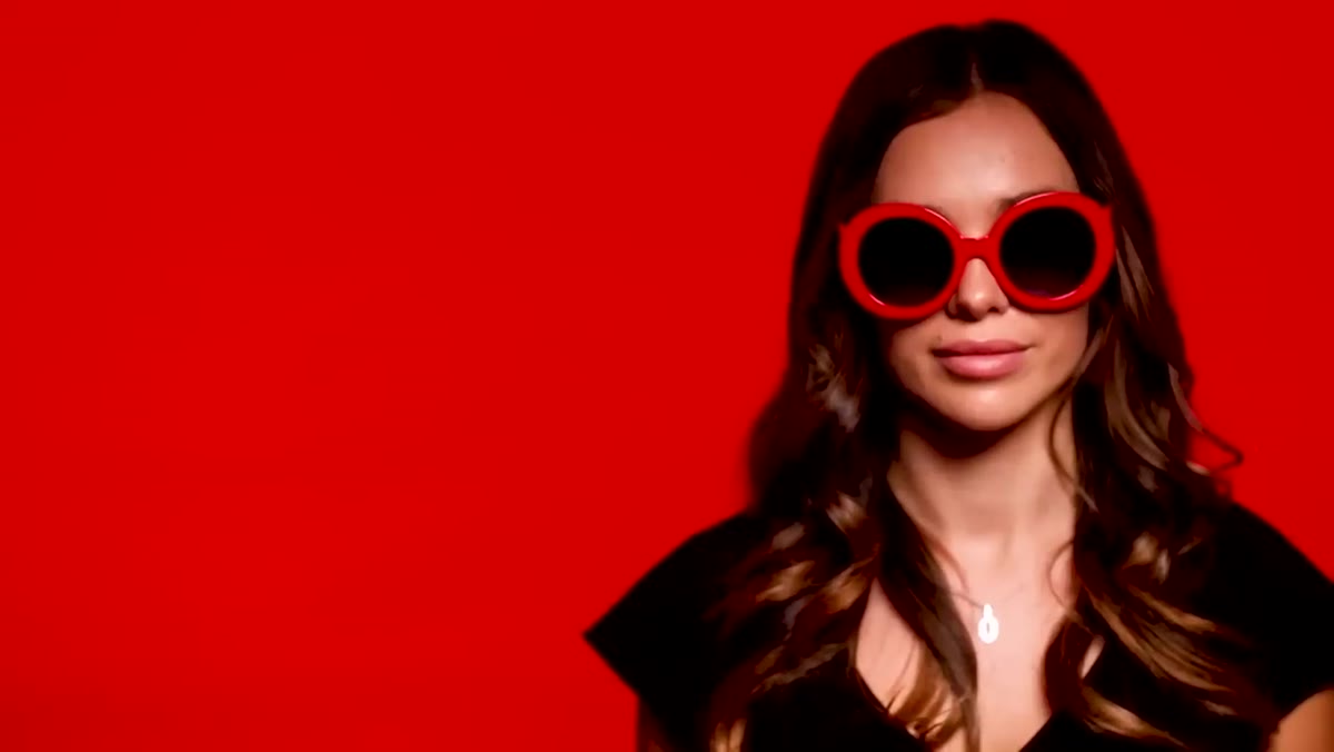
This is the counterintuitive move that the tutorial handles really well. When JP first sets the background RGB panels to full output, the red looks washed out and pale rather than deep and cinematic. The instinct is to think the lights aren’t powerful enough. The actual fix is to dim them.
RGB panel at full power showing washed, overexposed red background
This is the counterintuitive move that the tutorial handles really well. When JP first sets the background RGB panels to full output, the red looks washed out and pale rather than deep and cinematic. The instinct is to think the lights aren’t powerful enough. The actual fix is to dim them.
As you reduce the output on an RGB panel, the color becomes more saturated. At full blast, you’re essentially overdriving the channel and the result reads closer to bright pink than to rich red. Pull it back toward the 150-to-175 range on a 0-255 scale and the color deepens significantly. Then adjust your camera exposure to match, rather than compensating by pushing ISO or opening your aperture. The exposure should serve the color, not the other way around.
Step 4: Add a Reflector to Manage Shadow Without Adding Another Light
 White reflector positioned under subject’s chin to open shadows
Once the key and background are balanced, there’s often a shadow problem under the chin and jaw. The clean solution JP uses is a simple white reflector positioned below the subject, angled to bounce some of the key light back up into the underside of the face. No additional powered light, no color contamination, no second set of exposure decisions.
White reflector positioned under subject’s chin to open shadows
Once the key and background are balanced, there’s often a shadow problem under the chin and jaw. The clean solution JP uses is a simple white reflector positioned below the subject, angled to bounce some of the key light back up into the underside of the face. No additional powered light, no color contamination, no second set of exposure decisions.
I’ve started doing this on nearly every single-light setup I run. The reflector gives you a soft, natural-looking fill that doesn’t fight the mood of the image. If you use a silver reflector here, it gets too snappy and starts to look like a second light source. White is almost always the right call for this position.
Step 5: Place RGB Lights Directly on the Subject for Color Split Looks
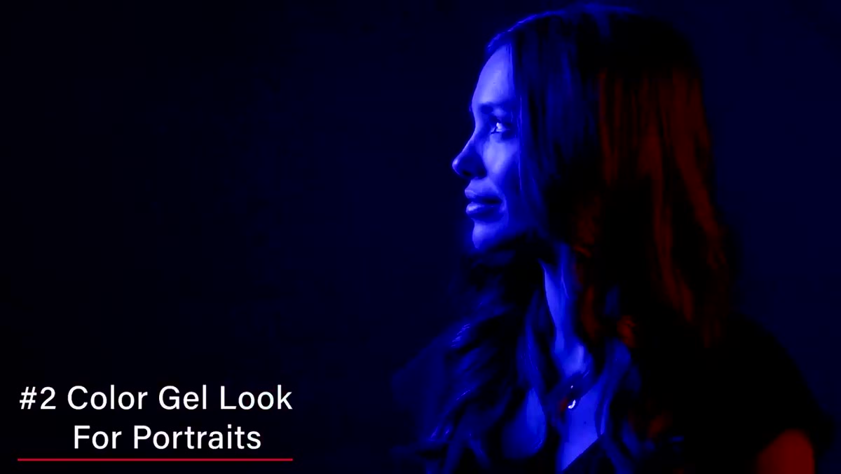 Two RGB panels aimed at subject from opposite sides, blue and red split
The second major setup in the tutorial moves the color from the background onto the subject’s face directly. Two RGB panels come in from opposite sides, one blue and one red, creating a split-color portrait. This is a heavier, more stylized approach and it’s worth being intentional about when you use it.
Two RGB panels aimed at subject from opposite sides, blue and red split
The second major setup in the tutorial moves the color from the background onto the subject’s face directly. Two RGB panels come in from opposite sides, one blue and one red, creating a split-color portrait. This is a heavier, more stylized approach and it’s worth being intentional about when you use it.
The key technical note is aperture-driven exposure. At a tighter aperture like f/11, you may need to push the panels close to full output to get enough light on the subject. At wider apertures you have more room to pull the intensity back and let the color deepen. Work the aperture first to set your depth of field intent, then dial your panel output to match. Don’t let the lights drive your aperture if you can avoid it.
From My Own Kit: Test Your Background Material First
I learned this one the hard way on a beauty shoot about three years ago. I was using a paper backdrop I’d had in the studio for a while and assumed it was neutral white. It wasn’t. It had yellowed slightly from age and UV exposure, and under the RGB blue I was throwing at it, the background read as a muddy green on camera. The color science was right but the substrate undermined everything.
Before any RGB-heavy shoot, I now test my backdrop material with a quick exposure check under the lights I plan to use. A true white paper or vinyl will read cleanly. Anything with an age cast or a texture that scatters light differently will shift your color in unpredictable ways. If your background is behaving strangely, the backdrop itself is usually the first place to look, not the lights.
The single most important thing I took from JP’s tutorial is the relationship between light intensity and color saturation on RGB panels. Dimmer is richer. That runs against the way most photographers think about output, but once you internalize it, these lights become genuinely precise tools rather than just a gimmick.
Watch the full tutorial on YouTube to see all five setups in sequence, including the practical window-light variation that rounds out the session.
Comments
Leave a Comment