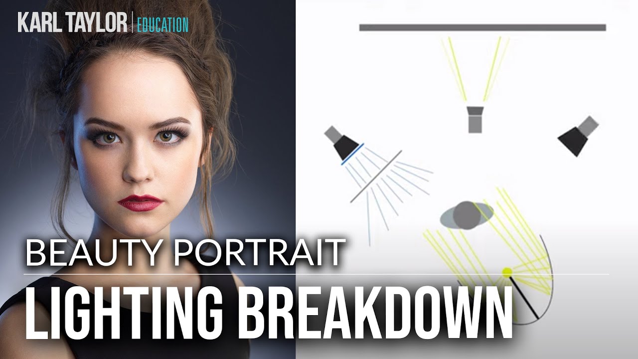
Every few months I come across a tutorial that makes me pause and actually sketch something into my lighting journal. Most videos rehash the same three-light setups I could draw from memory. This one stopped me. Watch the full tutorial on YouTube before or after you read this, because the image of model Alex Kelly that opens it is worth studying on its own.
In this Visual Education tutorial, photographer Carl walks through a headshot setup he shot live, in front of an audience, which immediately tells you something about how confident he is in this particular configuration. The setup uses four light sources, a dark gray background, and one detail, a blue-gelled rim with diffusion material, that I had honestly never thought to combine that way. I’ve been shooting studio headshots for over fifteen years and I still came away with a note taped to the shelf above my P70s.
What makes this tutorial worth your time isn’t the gear list. It’s the reasoning behind each placement decision, specifically how Carl works outward from what he wants the catchlights to look like and then positions everything else around that anchor point. That’s exactly how I approach a setup, and seeing another working pro frame it the same way confirmed for me that this is a method, not a habit.
Step 1: Choose Your Background and Set Your Distance
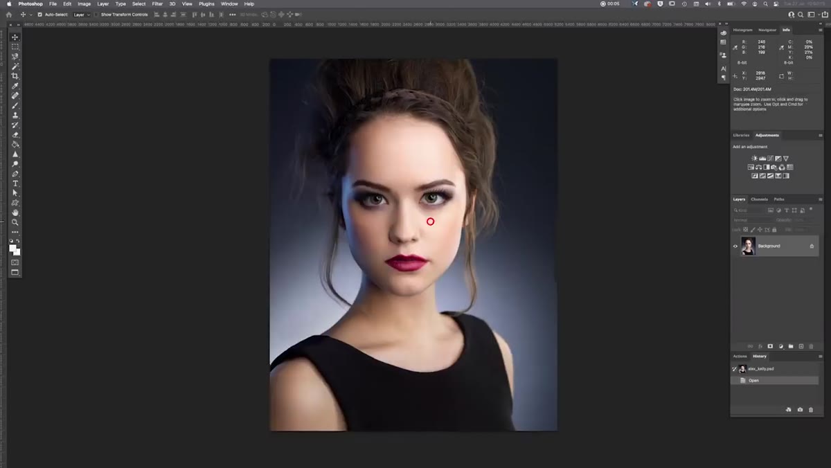 Lighting diagram open with dark gray background paper indicated
Carl shot on a dark gray Colorama paper roll, specifically a granite or charcoal tone. The model was positioned roughly two meters in front of the background. That distance is deliberate. Too close and your background light wraps around the subject and kills separation. Too far and you’re fighting light falloff to get any glow at all. Two meters is a reliable starting point for a tight upper-body crop where you’re not dealing with full-length falloff issues.
Lighting diagram open with dark gray background paper indicated
Carl shot on a dark gray Colorama paper roll, specifically a granite or charcoal tone. The model was positioned roughly two meters in front of the background. That distance is deliberate. Too close and your background light wraps around the subject and kills separation. Too far and you’re fighting light falloff to get any glow at all. Two meters is a reliable starting point for a tight upper-body crop where you’re not dealing with full-length falloff issues.
If you don’t have Colorama, any non-reflective dark gray paper or canvas works. What matters is that the base tone is dark enough for the background light to show graduation rather than just brightening a mid-tone surface into a muddy gray blob.
Step 2: Place the Background Light Behind the Model
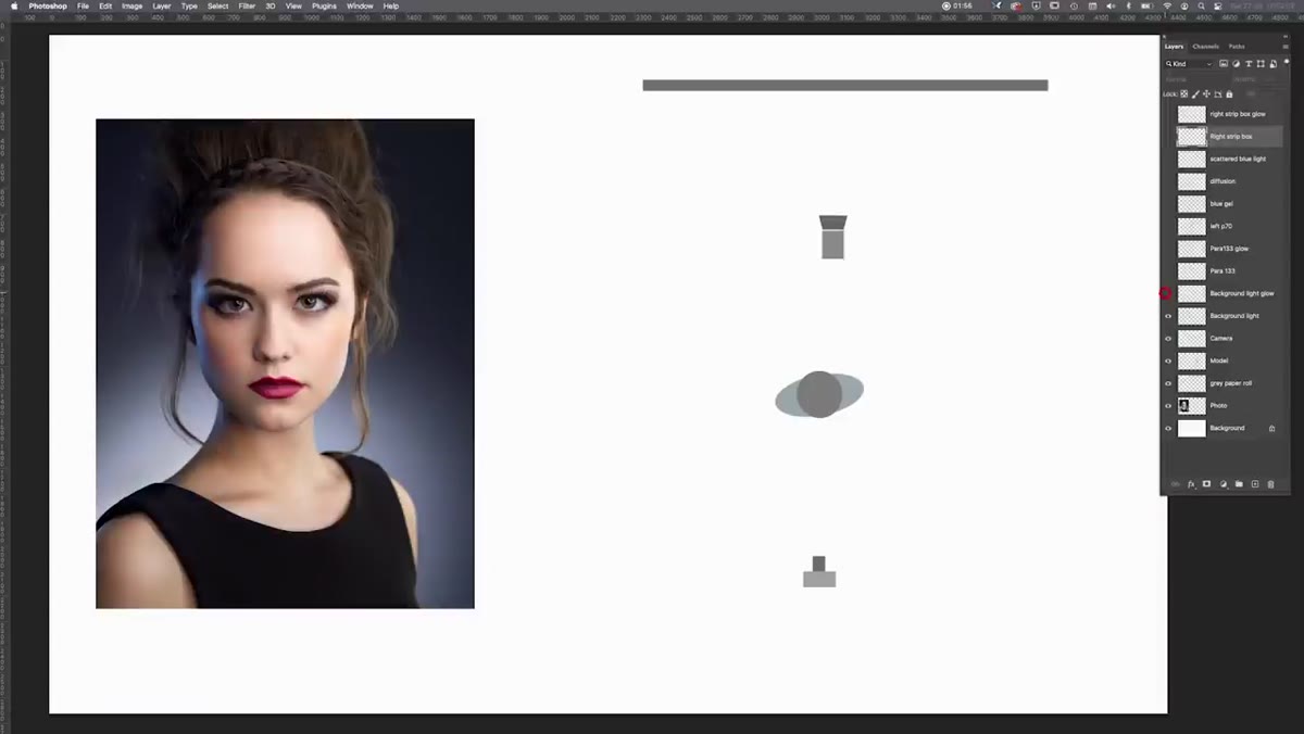 Diagram showing P70 reflector positioned behind model, aimed at backdrop
Carl used a standard P70 70-degree reflector on a strobe, hidden directly behind Alex’s body so the stand and head aren’t visible to camera. This placement does two things at once. It creates a graduated glow that rises from behind the subject and vignettes naturally toward the top edges of the frame. And it keeps the source invisible, so the background reads as having organic depth rather than an obvious hotspot.
Diagram showing P70 reflector positioned behind model, aimed at backdrop
Carl used a standard P70 70-degree reflector on a strobe, hidden directly behind Alex’s body so the stand and head aren’t visible to camera. This placement does two things at once. It creates a graduated glow that rises from behind the subject and vignettes naturally toward the top edges of the frame. And it keeps the source invisible, so the background reads as having organic depth rather than an obvious hotspot.
The key word here is “graduated.” A bare reflector pointed straight at a backdrop from the side gives you a circle. Hiding it directly behind the subject and letting the body partially block the lower spread gives you a column of light that softens as it rises. That’s the look you’re after.
Step 3: Set the Key Light with a Para 133
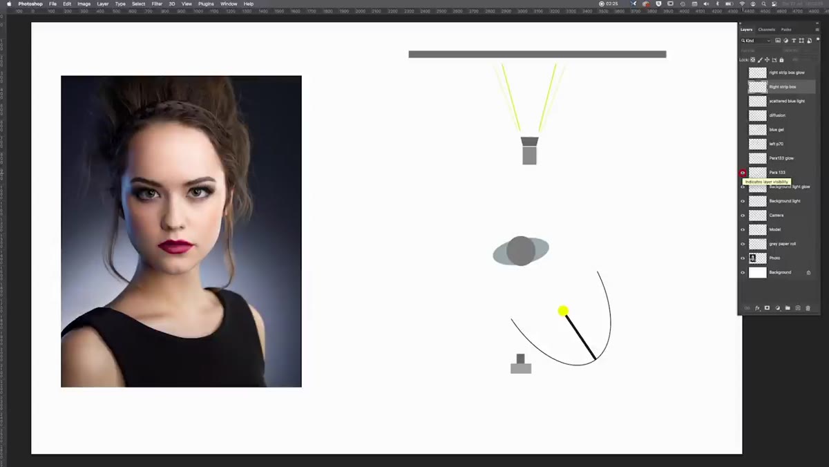 Para 133 position shown in diagram above and in front of model
The key light here is a Broncolor Para 133, positioned at roughly a 45-degree angle above the model but notably lower than Carl would typically place it. He mentions shooting nearly underneath the modifier, which means the Para 133 was angled down at a shallower pitch than standard. You can confirm this by looking at the catchlights in the final image. The reflection of the Para’s ring sits lower in the eye than you’d see from a high 45-degree placement.
Para 133 position shown in diagram above and in front of model
The key light here is a Broncolor Para 133, positioned at roughly a 45-degree angle above the model but notably lower than Carl would typically place it. He mentions shooting nearly underneath the modifier, which means the Para 133 was angled down at a shallower pitch than standard. You can confirm this by looking at the catchlights in the final image. The reflection of the Para’s ring sits lower in the eye than you’d see from a high 45-degree placement.
The Para 133 produces a very specific quality of light, a hard center with a defined specular ring around the outer edge created by the 24 individual reflective segments. It sculpts facial structure aggressively. If you don’t have a Para, a deep silver beauty dish gets you closer to this look than any softbox will. The defining characteristic you’re chasing is that hard-edged catchlight ring combined with rapid falloff into shadow on the non-lit side of the face.
Step 4: Add a Blue-Gelled Rim Light with Diffusion
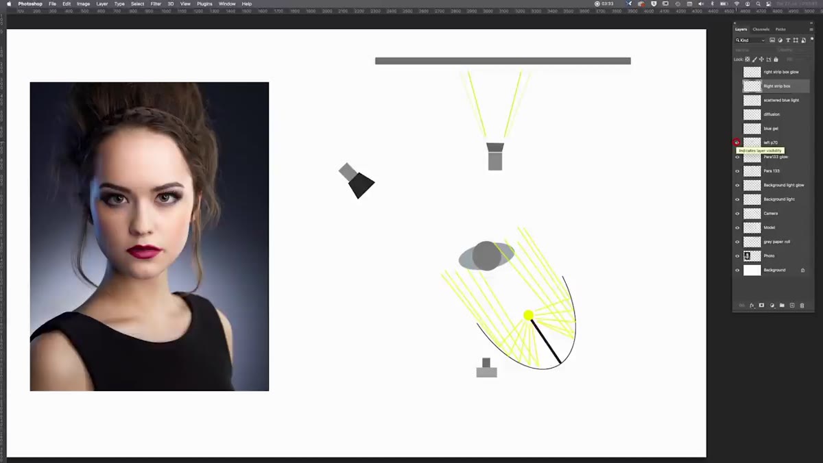 Diagram showing gelled P70 with diffusion sheet on camera-left rear
This is the detail that makes the image. Carl placed a second P70 reflector behind and to the side of the model to create a rim light on the cheekbone and shoulder edge. He added a blue gel to the head, which alone would have produced a harsh, directional slash of cold color. But then he placed a sheet of diffusion material in front of the gelled head.
Diagram showing gelled P70 with diffusion sheet on camera-left rear
This is the detail that makes the image. Carl placed a second P70 reflector behind and to the side of the model to create a rim light on the cheekbone and shoulder edge. He added a blue gel to the head, which alone would have produced a harsh, directional slash of cold color. But then he placed a sheet of diffusion material in front of the gelled head.
That diffusion layer scatters the colored light so it wraps slightly rather than cutting in with a hard edge. The result is a soft blue accent that reads as sophisticated rather than theatrical. Without the diffusion, the blue would fight the skin tone. With it, the color appears to bleed into the edge of the face organically. If you’re trying this, start with a quarter-stop to half-stop less power than your instinct suggests. Colored light reads hotter than white light at the same exposure value.
Step 5: Read the Image Before You Touch the Lights
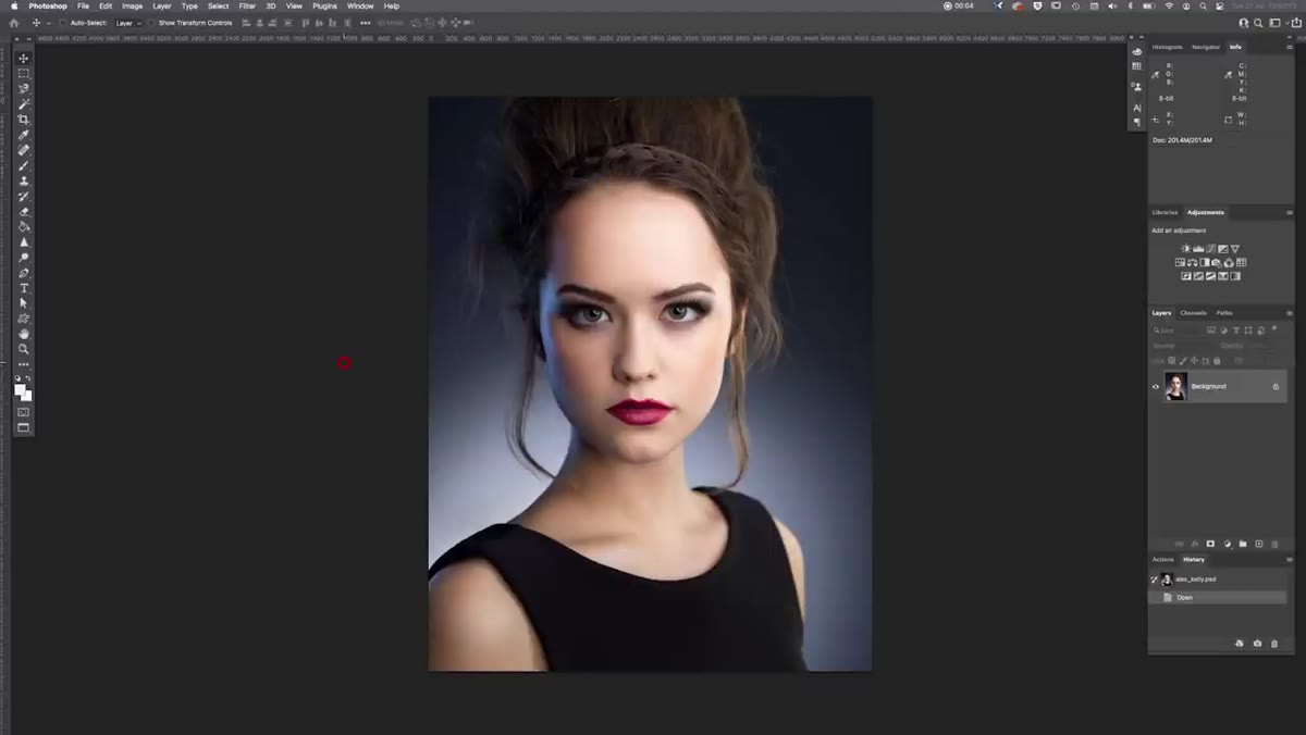 Final image of model Alex Kelly displayed full-screen for analysis
Carl opens by asking viewers to study the finished image before revealing the diagram, and I think that’s the most instructive part of the whole video. He’s training a habit. Before you fire a single test exposure on your next setup, look at reference images at the level of: where is the catchlight sitting, which side of the nose bridge is lit, where does the shadow edge fall on the neck.
Final image of model Alex Kelly displayed full-screen for analysis
Carl opens by asking viewers to study the finished image before revealing the diagram, and I think that’s the most instructive part of the whole video. He’s training a habit. Before you fire a single test exposure on your next setup, look at reference images at the level of: where is the catchlight sitting, which side of the nose bridge is lit, where does the shadow edge fall on the neck.
I do this with every editorial brief I receive. I sketch the inferred lighting diagram from the reference before I touch a single stand. It’s slow at first. After a few months it becomes automatic, and you start seeing light everywhere, in restaurant windows, in car showroom glass, in your phone screen reflecting off someone’s face on the subway. That habit is worth more than any modifier you’ll ever buy.
What I’d Do Differently in My Own Studio
Carl’s setup is tight and elegant, but I’d add one change for beauty and skincare clients specifically. I’d swap the background paper for a slightly lighter warm gray and balance the blue rim against it intentionally, so the background reads cooler in contrast and the skin appears warmer by comparison. Color temperature relationships between background and subject are something I started mapping deliberately after a catalog shoot years ago where I mixed tungsten and strobe without checking and burned through an entire afternoon re-shooting. Now I calibrate every source before the model is even in the room.
I’d also flag that the Para 133 is a significant investment, and the technique Carl is describing doesn’t require that specific tool. The principle is a focused, directional key light with a readable specular pattern in the catchlight. A silver-lined medium beauty dish at a similar angle gets you 80 percent of the way there at a fraction of the cost. Learn the principle first, then decide if the specific hardware earns its place in your kit.
The single most important thing this tutorial teaches is that a sophisticated image doesn’t require complexity. Four light sources, a clear hierarchy between them, and one deliberate color decision produce a result that looks like it took twice as much gear. Study the catchlights, position your key light around what they tell you, and treat the rim as an accent rather than a feature.
Watch the full tutorial on YouTube and pause on the lighting diagram section. Draw it yourself. Then light it.
Comments
Leave a Comment