I keep a lighting journal. Every setup from every shoot gets a rough sketch, a note about the modifier, and a one-line summary of what the light was actually doing to the subject. I have notebooks going back twelve years. The reason I do it is simple: lighting decisions that feel obvious in the moment become invisible six months later, and you end up reinventing the same wheel on every job. So when a tutorial cuts through to the underlying logic of why a setup works, I write it down.
That happened recently while watching a CreativeLive tutorial with Lindsay Adler. Watch the full tutorial on YouTube - it’s worth your time even if you think you already know clamshell lighting. What she demonstrates isn’t the standard beauty setup most of us default to. She builds a version of clamshell specifically for a muscular subject, and she shows the wrong version first, deliberately. That move alone tells you you’re watching someone who teaches from the inside out, not from a checklist.
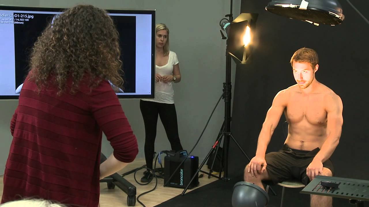
The core problem she’s solving is one I’ve bumped into on fitness and athletic shoots: if you light a muscular body the same way you’d light a face for a beauty shot, you kill the definition you’re trying to celebrate. Flat front light fills in the shadows between muscle groups and makes a bodybuilder look soft. Her setup flips the logic of clamshell to preserve shadow where it matters, while still keeping the face readable. Here’s how she builds it, step by step.
Step 1: Establish the “Wrong” Version First - Monster Light From Below
 Low light source aimed upward at male subject’s face
Before building the setup she wants, Adler demonstrates what she’s trying to avoid. She places a light source below the subject’s eyeline, angled upward. This is the classic horror or “monster light” configuration. Without a compensating source above, the upward raking light creates unflattering shadows on the face while giving the body a slightly dramatic but incomplete look. Most photographers know not to do this, but seeing it demonstrated on a muscular subject clarifies exactly why: light from below doesn’t flatter the musculature either. It just looks wrong from all angles. Understanding the failure mode is half the lesson.
Low light source aimed upward at male subject’s face
Before building the setup she wants, Adler demonstrates what she’s trying to avoid. She places a light source below the subject’s eyeline, angled upward. This is the classic horror or “monster light” configuration. Without a compensating source above, the upward raking light creates unflattering shadows on the face while giving the body a slightly dramatic but incomplete look. Most photographers know not to do this, but seeing it demonstrated on a muscular subject clarifies exactly why: light from below doesn’t flatter the musculature either. It just looks wrong from all angles. Understanding the failure mode is half the lesson.
Step 2: Replace the Below-Light With a Reflector
 Reflector positioned below subject, no frontal strobe
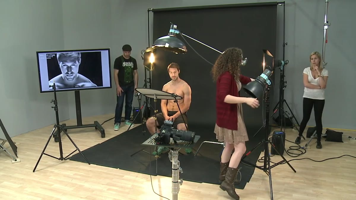
Rather than using a powered strobe below the subject, Adler swaps it for a reflector. This is a meaningful distinction. A reflector below the face bounces back whatever the primary overhead light throws down, which keeps the fill softer and subordinate to the key. You’re not introducing a competing hard source from below. You’re recycling existing light. The result is that the face gets some fill without competing with the directional quality of the overhead key. For subjects with strong facial structure, this is almost always the better call.
Reflector positioned below subject, no frontal strobe
Rather than using a powered strobe below the subject, Adler swaps it for a reflector. This is a meaningful distinction. A reflector below the face bounces back whatever the primary overhead light throws down, which keeps the fill softer and subordinate to the key. You’re not introducing a competing hard source from below. You’re recycling existing light. The result is that the face gets some fill without competing with the directional quality of the overhead key. For subjects with strong facial structure, this is almost always the better call.
Step 3: Position the Key Light Overhead
 Overhead light positioned above and behind subject’s head
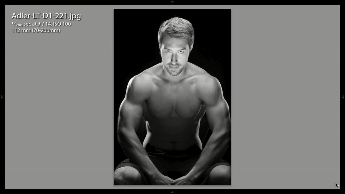
This is where the setup departs from traditional clamshell, which places the key light in front of the subject at roughly face height. Here, Adler moves the primary light above and slightly behind the subject. The overhead angle does two things simultaneously. It produces a hair light effect, which adds separation and depth to the top of the frame. More importantly, it rakes light across the shoulders, chest, and arms at an angle that carves out muscle definition rather than filling it in. The shadows that fall between muscle groups are intentional information. They’re doing the job that shading does in a figure drawing. If you light from the front and lose those shadows, you lose the story.
Overhead light positioned above and behind subject’s head
This is where the setup departs from traditional clamshell, which places the key light in front of the subject at roughly face height. Here, Adler moves the primary light above and slightly behind the subject. The overhead angle does two things simultaneously. It produces a hair light effect, which adds separation and depth to the top of the frame. More importantly, it rakes light across the shoulders, chest, and arms at an angle that carves out muscle definition rather than filling it in. The shadows that fall between muscle groups are intentional information. They’re doing the job that shading does in a figure drawing. If you light from the front and lose those shadows, you lose the story.
Step 4: Add Rim Lights for Edge Definition
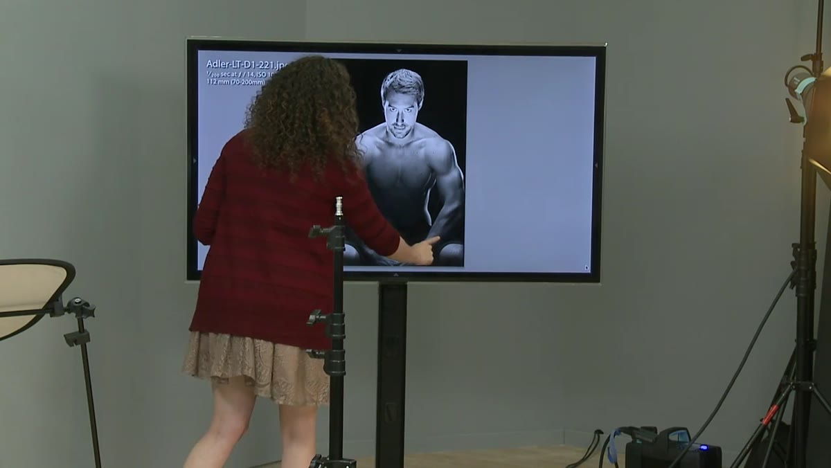 Rim lights visible on subject’s sides, defining arm and shoulder edges
To push the three-dimensionality even further, she uses rim lights positioned behind and to the sides of the subject. These create bright edges along the arms, shoulders, and hair. On a muscular physique, rim lights are doing serious work: they separate the subject from the background, yes, but they also trace the outline of muscle groups in a way that reads clearly even in reproduction. This matters more than most photographers realize. A shot that looks great on a 27-inch monitor sometimes flattens out when it runs at half-column width in print. Strong edge definition survives that compression.
Rim lights visible on subject’s sides, defining arm and shoulder edges
To push the three-dimensionality even further, she uses rim lights positioned behind and to the sides of the subject. These create bright edges along the arms, shoulders, and hair. On a muscular physique, rim lights are doing serious work: they separate the subject from the background, yes, but they also trace the outline of muscle groups in a way that reads clearly even in reproduction. This matters more than most photographers realize. A shot that looks great on a 27-inch monitor sometimes flattens out when it runs at half-column width in print. Strong edge definition survives that compression.
Step 5: Introduce the Gridded Silver Dish for the Face
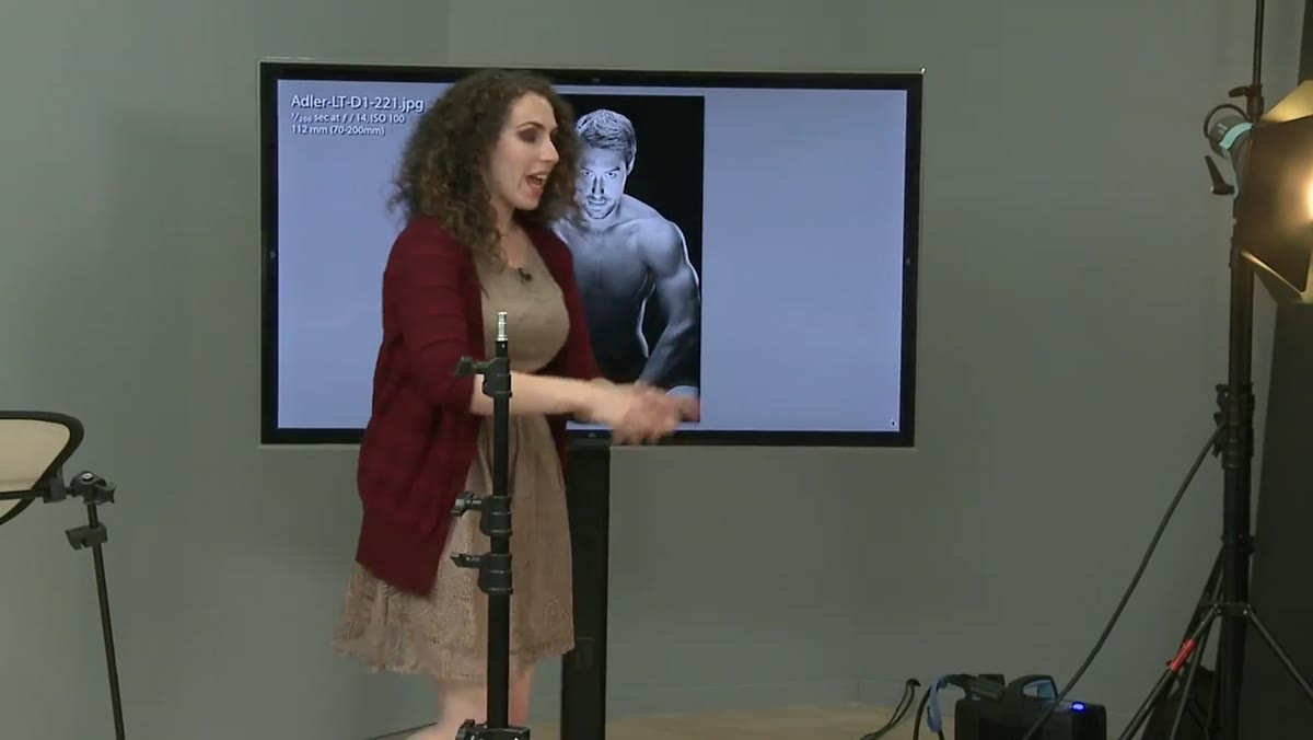 Silver dish with grid angled up toward subject’s face
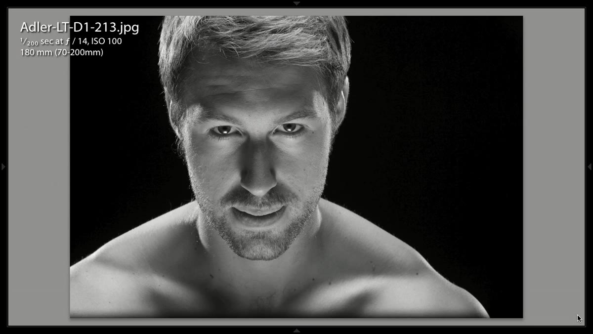
The challenge at this point is that the overhead key and the rim lights do a good job on the body but leave the face underlit. Lighting the face from the front with a large, soft modifier would solve the exposure problem but undo all the muscle definition work by bouncing fill light all over the torso. Adler’s solution is precise: a silver dish with a 10-degree grid, angled upward specifically to light the face without spilling light onto the chest and shoulders. The grid restricts the beam so it goes where she points it and not an inch further. The silver dish gives it a slightly harder, more specular quality than a white dish would, which holds up well against the harder overhead key. The face gets exposure and life. The muscles keep their shadows.
Silver dish with grid angled up toward subject’s face
The challenge at this point is that the overhead key and the rim lights do a good job on the body but leave the face underlit. Lighting the face from the front with a large, soft modifier would solve the exposure problem but undo all the muscle definition work by bouncing fill light all over the torso. Adler’s solution is precise: a silver dish with a 10-degree grid, angled upward specifically to light the face without spilling light onto the chest and shoulders. The grid restricts the beam so it goes where she points it and not an inch further. The silver dish gives it a slightly harder, more specular quality than a white dish would, which holds up well against the harder overhead key. The face gets exposure and life. The muscles keep their shadows.
Step 6: Dial In the Power Balance and Confirm With Test Shots
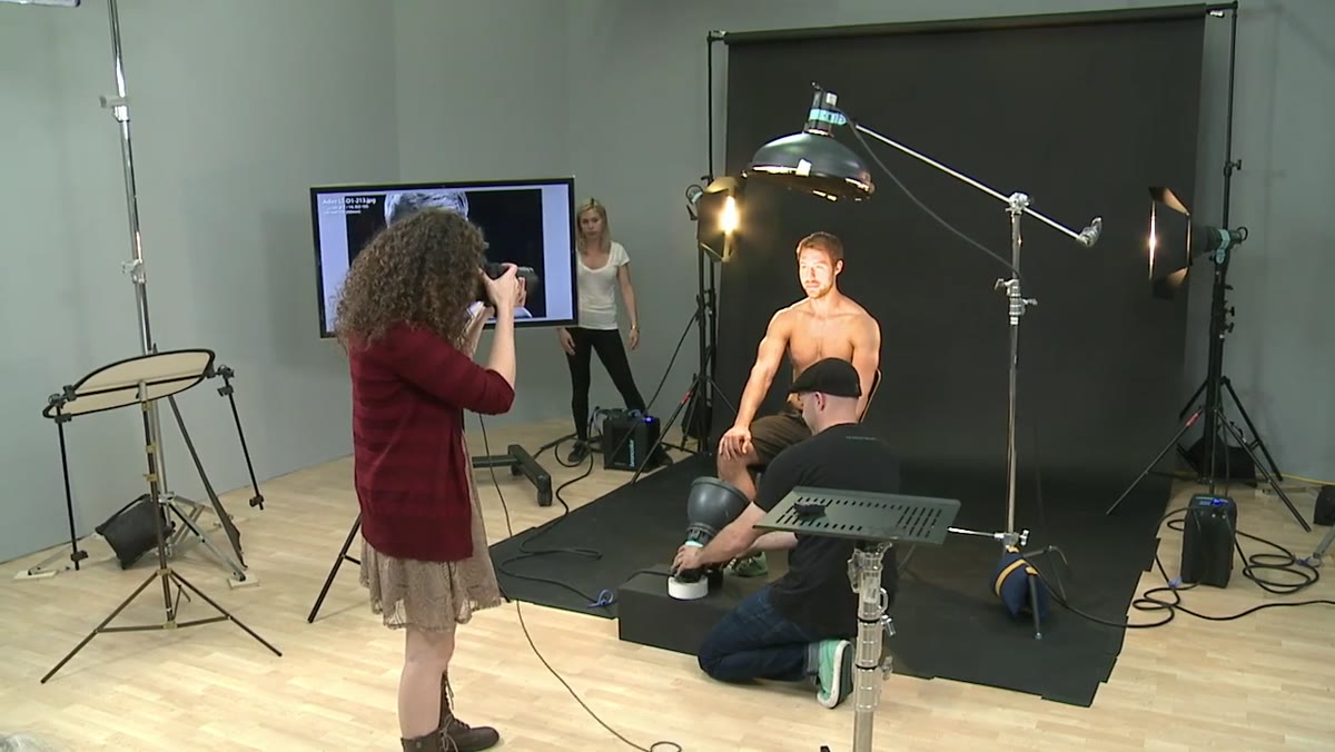 Test shot being reviewed, chin-down direction given to subject
Adler asks the subject to angle his chin down slightly and look into the face light during testing. This is a good habit to build into the workflow. The chin-down position extends the neck and prevents the overhead key from creating too heavy a shadow under the jaw. She also adjusts the power on the face light upward incrementally until the exposure balances with the body. There’s no shortcut here: you’re managing three or four separate light sources with different modifiers, and the only way to verify the relationship between them is to shoot test frames and look at the histogram and shadow detail together. Trusting the back-of-camera preview alone will get you into trouble.
Test shot being reviewed, chin-down direction given to subject
Adler asks the subject to angle his chin down slightly and look into the face light during testing. This is a good habit to build into the workflow. The chin-down position extends the neck and prevents the overhead key from creating too heavy a shadow under the jaw. She also adjusts the power on the face light upward incrementally until the exposure balances with the body. There’s no shortcut here: you’re managing three or four separate light sources with different modifiers, and the only way to verify the relationship between them is to shoot test frames and look at the histogram and shadow detail together. Trusting the back-of-camera preview alone will get you into trouble.
What I’d Add From My Own Work
The setup Adler demonstrates works cleanly for physique and athletic subjects, but I’ve adapted the core principle for fashion work as well. Heavily textured fabrics, leather, sequins, anything with surface interest, want the same overhead-raking logic. A flat front key murders texture the same way it murders muscle definition. When I’m shooting a structured jacket or an embossed leather piece, I’ll often pull my key up and back to get that raking angle, then use a gridded dish or even a small beauty dish with a grid to hold the face without polluting the garment. The same rule applies: keep the fill subordinate, let the shadows tell the story, and use a modifier narrow enough to put light exactly where you need it without losing control of where it isn’t.
The single most important thing this tutorial reinforces is that clamshell lighting isn’t a fixed recipe. It’s a relationship between a key above and fill below, and you have full control over the angle, quality, and power of each. Move the key overhead and you’re sculpting. Add a grid to your fill and you’re targeting. Understanding what each element actually does, rather than following a preset configuration, is what lets you adapt on a real job when the subject or the brief changes. Go watch Adler build the full setup herself: Watch the full tutorial on YouTube. She explains the “wrong” version with the same care she gives the right one, which is exactly how good teaching works.
Comments (2)
Great breakdown. The step-by-step approach really helps.
This saved me so much time on my last edit. Wish I'd found this sooner.
Leave a Comment