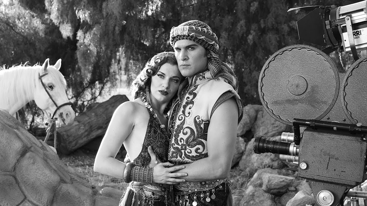
Black and white strips away the safety net. In color work, you can lean on a warm gel, a complementary background hue, or a saturated wardrobe to create visual separation. Take all of that away and the image has to survive on light alone. That’s a discipline I had to learn the hard way, and it’s one I still think about every time a client asks for a monochrome treatment on a shoot that wasn’t originally planned for it. The rules change. The margin for error shrinks.
Watch the full tutorial on YouTube
In this The Slanted Lens tutorial, photographer Jay P. Morgan takes a full cast, a horse, period costumes, and a vintage Mitchell camera into the San Fernando Valley heat to recreate the aesthetic of 1920s silent film photography, specifically the Rudolph Valentino era. It’s a styled shoot with a clear cinematic target, and the lighting decisions Jay makes under deadline pressure are exactly the kind of practical, fast-moving choices that separate working photographers from people who only shoot when conditions are perfect. Here’s what I pulled from it and how I’d apply it in a studio or location context.
Step 1: Define the Visual Reference Before You Light Anything
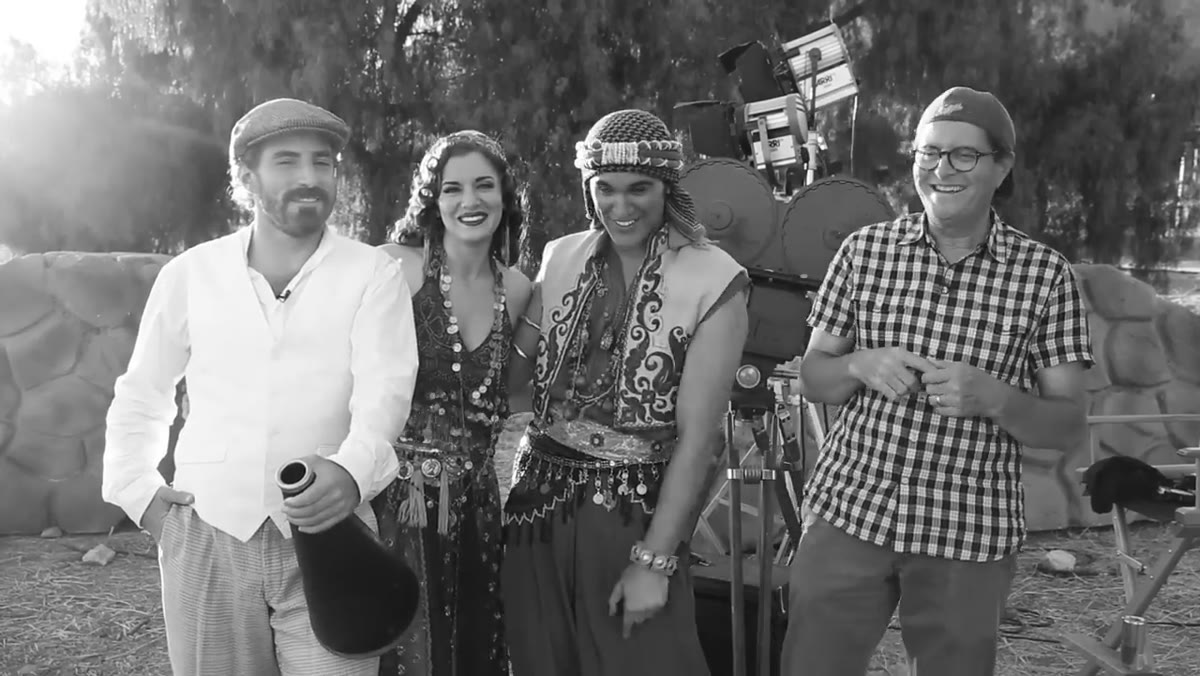 Jay describing the Rudolph Valentino “Son of the Sheik” concept
Jay opens by naming the visual reference explicitly: Rudolph Valentino, “Son of the Sheik,” silent film era. That single decision governs every lighting choice that follows. Before a single modifier goes up, everyone on set knows the target aesthetic, high contrast, dramatic, cinematic, with a feeling of weight and shadow.
Jay describing the Rudolph Valentino “Son of the Sheik” concept
Jay opens by naming the visual reference explicitly: Rudolph Valentino, “Son of the Sheik,” silent film era. That single decision governs every lighting choice that follows. Before a single modifier goes up, everyone on set knows the target aesthetic, high contrast, dramatic, cinematic, with a feeling of weight and shadow.
This is a habit I’ve built into every shoot I run. I sketch the intended look in my lighting journal before I book the studio time. If I’m going for something theatrical and hard-edged, I’m already thinking single-source, minimal fill, strong directional key. If I’m going cinematic and soft, that’s a different modifier list entirely. Naming your reference out loud, whether it’s a film, a photographer, or a specific decade, keeps every decision tethered to something concrete instead of drifting.
Step 2: Set the Camera to Display Black and White While Shooting RAW
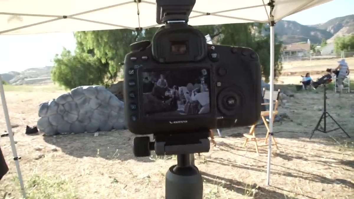 Jay explaining the black and white JPEG preview while shooting RAW
Jay’s camera is set to render black and white JPEGs in the viewfinder and on the LCD, but he’s capturing RAW files underneath. This gives him a live monochrome preview on set without locking him into a black and white file in post. The RAW file retains all color channel data, which matters enormously when you get to Lightroom or Capture One and want to use luminosity adjustments to separate tones.
Jay explaining the black and white JPEG preview while shooting RAW
Jay’s camera is set to render black and white JPEGs in the viewfinder and on the LCD, but he’s capturing RAW files underneath. This gives him a live monochrome preview on set without locking him into a black and white file in post. The RAW file retains all color channel data, which matters enormously when you get to Lightroom or Capture One and want to use luminosity adjustments to separate tones.
In practice, set your Picture Style or Picture Control to Monochrome in-camera, then confirm you’re shooting RAW+JPEG or RAW only. The JPEG previews in black and white on your screen. The RAW file is full color. This workflow lets you make real-time lighting decisions based on what the final image will actually look like, not a color version you have to mentally convert while standing on a hot location. I use this on every shoot where the deliverable is black and white. It changes how you see contrast while you’re still in a position to fix it.
Step 3: Treat Light and Shadow as Your Only Source of Contrast
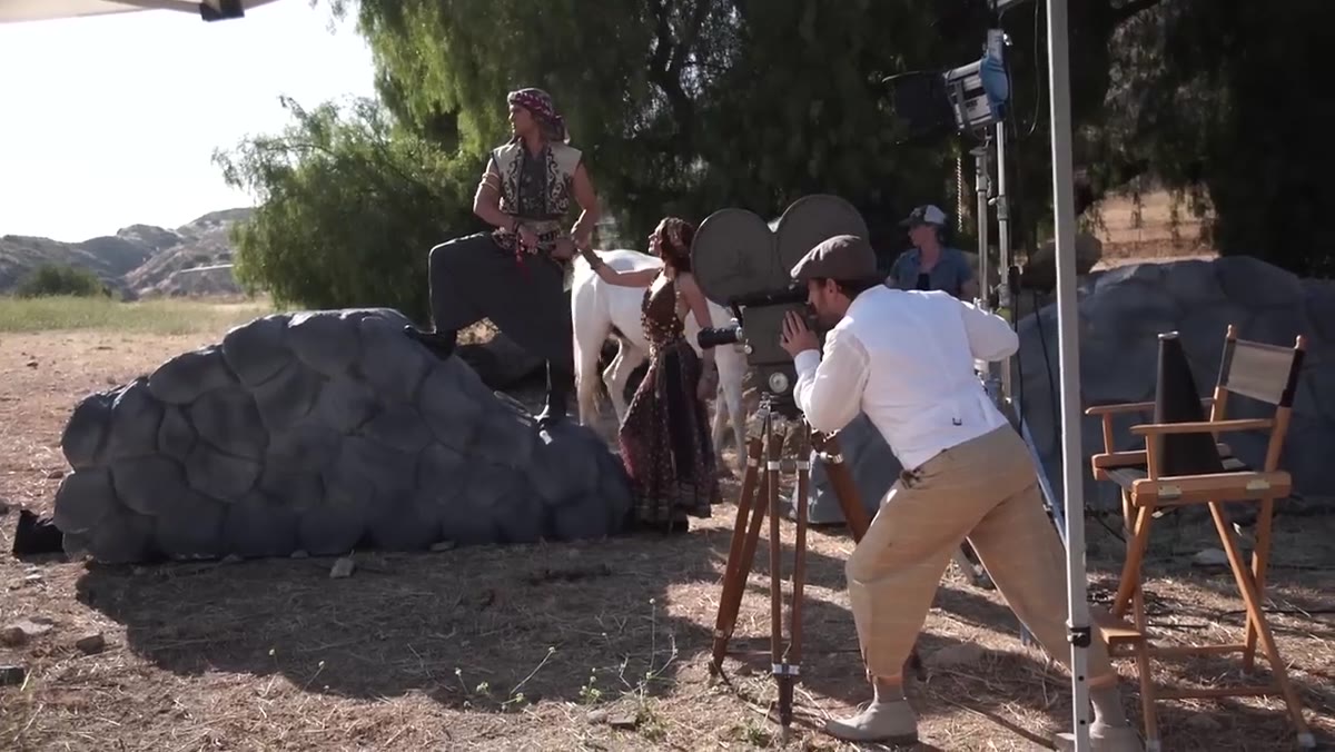 Jay explaining highlights and shadows replacing color contrast
This is the central idea of the whole tutorial and worth sitting with. In color photography, contrast comes from multiple sources: hue differences, saturation, value. In black and white, only value remains. That means two objects that look completely distinct in color can merge into identical gray tones the moment you desaturate. A red scarf against a green jacket reads as two vivid, separated colors. In black and white, they can photograph as nearly identical midtones.
Jay explaining highlights and shadows replacing color contrast
This is the central idea of the whole tutorial and worth sitting with. In color photography, contrast comes from multiple sources: hue differences, saturation, value. In black and white, only value remains. That means two objects that look completely distinct in color can merge into identical gray tones the moment you desaturate. A red scarf against a green jacket reads as two vivid, separated colors. In black and white, they can photograph as nearly identical midtones.
Jay’s solution is straightforward: place highlights against shadows deliberately. Position your subject so that bright areas of the frame sit adjacent to dark areas. A lit face against a shadowed wall. A white garment catching a rim light against a dark background. You are constructing separation through luminosity alone. I think of it as building the image in pencil before the color paint goes on. If it doesn’t read in grayscale, the color version was hiding a structural problem.
Step 4: Use Negative Fill to Recover Contrast From Overlit Areas
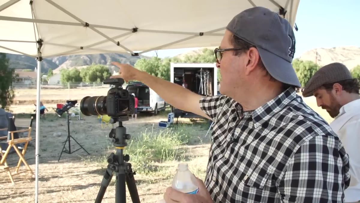 Jay discussing the black flag to reduce light on the white vest
Jay spots a specific problem on set: an actor in a white vest positioned near a bright edge light, and the vest is blowing out without any graduation or texture. The solution isn’t to reduce the key light across the whole scene. It’s to add a black flag, a piece of black foam board or a dedicated negative fill panel, positioned to block the spill light hitting the vest from behind.
Jay discussing the black flag to reduce light on the white vest
Jay spots a specific problem on set: an actor in a white vest positioned near a bright edge light, and the vest is blowing out without any graduation or texture. The solution isn’t to reduce the key light across the whole scene. It’s to add a black flag, a piece of black foam board or a dedicated negative fill panel, positioned to block the spill light hitting the vest from behind.
Negative fill is one of the most underused tools in studio work. Photographers instinctively add light when something isn’t working. But sometimes the problem is that there’s too much light in a specific zone, not too little everywhere else. A black flag placed close to the subject absorbs reflected light that would otherwise bounce back and flatten the shadow side. The result is a steeper contrast ratio in exactly the area you need it. I keep two 24x36 inch black foamcore panels in my studio at all times. They go up on almost every shoot, labeled with tape on the back so I can grab the right size without thinking.
Step 5: Work the Clock and Build a Shooting Rhythm Under Time Pressure
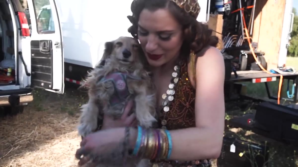 Jay noting they have one hour and fifteen minutes before losing the light
Jay calls out the time constraint directly on camera: an hour and fifteen minutes before the light is gone. This isn’t incidental. Managing a shooting window is a technical skill the same way metering is. On location especially, you have to sequence your setups in order of light sensitivity. Shots that depend on the natural light angle go first. Setups you can control artificially go last.
Jay noting they have one hour and fifteen minutes before losing the light
Jay calls out the time constraint directly on camera: an hour and fifteen minutes before the light is gone. This isn’t incidental. Managing a shooting window is a technical skill the same way metering is. On location especially, you have to sequence your setups in order of light sensitivity. Shots that depend on the natural light angle go first. Setups you can control artificially go last.
In a studio, the equivalent is booking your most complex multi-light setups for when your subject is freshest and your team is sharpest, usually the first third of the session. I plan my shoot order the night before and build in buffer time for adjustments. A setup that looks simple on paper, one key and a background light, can eat 20 minutes when the model’s wardrobe needs adjusting or a modifier isn’t sitting right. Time pressure and good black and white lighting don’t mix well. You need space to look at the shadows.
What I’d Add From My Own Studio Work
The tutorial focuses on location shooting, which means available architectural elements become part of the lighting plan. In a controlled studio setting, you have to build those elements deliberately. When I’m going for a cinematic monochrome look on a white cyc or a neutral gray backdrop, I use a grid-spotted hair light angled to just catch the top of the shoulder and fade off fast. That creates the same highlight-to-shadow edge that the desert walls and natural light were giving Jay on location. The principle transfers; the tools change.
I’d also push harder on the RAW color channel strategy in post. Once you have that full-color RAW file, pulling the orange channel down in black and white mix darkens skin tones dramatically and creates a more dramatic, almost orthochromatic look that reads as genuinely old. Combined with a slight grain overlay, it matches the silent film reference Jay was after without any gimmicky filters.
The single most important takeaway from this tutorial is one sentence Jay says early in the shoot: without color, you use light for contrast. Everything else follows from that. Your lighting ratios, your flag placement, your background choice, your wardrobe direction, all of it has to work in service of luminosity separation. Once that clicks, black and white stops feeling like a constraint and starts feeling like a precise tool.
Watch the full tutorial on YouTube
Comments
Leave a Comment