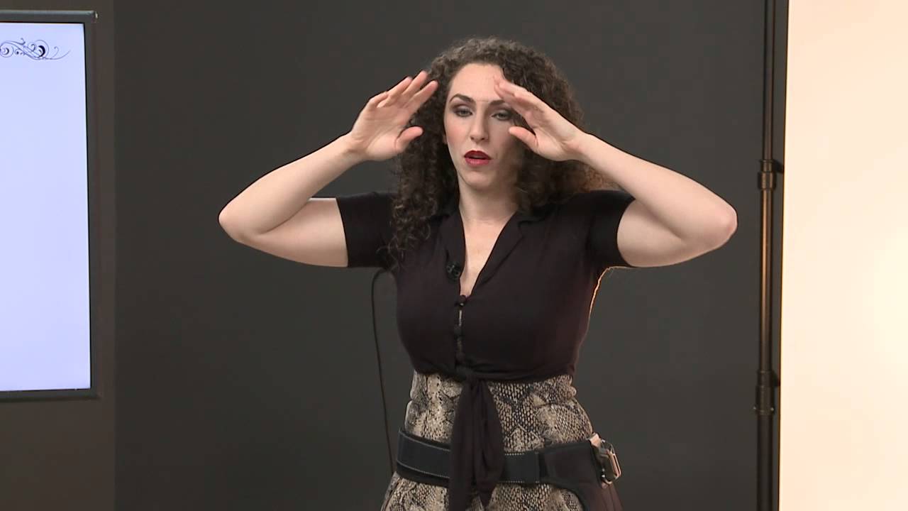
Senior portrait work doesn’t get nearly enough respect in commercial photography circles. I’ll admit I used to dismiss it as a stepping stone genre, something photographers do before they land “real” clients. Then I spent a Saturday watching Lindsay Adler walk through her posing framework for high school senior girls in a CreativeLive tutorial, and I came away with notes I’ve since applied to fashion and editorial sessions. The principles are transferable in ways that surprised me. Watch the full tutorial on YouTube
The core problem Adler solves is one I recognize from my own studio work: the more creative you try to get with posing, the faster you lose the subject’s expression. You’re thinking about geometry, they’re thinking about whether they look weird, and the shot falls apart. Adler has a clear, repeatable system that keeps expression front and center while still producing images that don’t look like every other senior photo taken in the last thirty years.
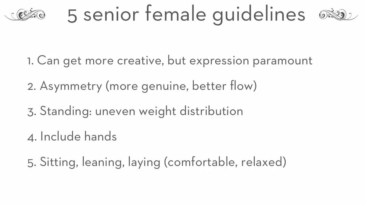
What follows is my breakdown of her five guidelines, written so you can apply them without watching first, though I strongly recommend watching afterward.
Step 1: Protect the Expression Before You Chase the Pose
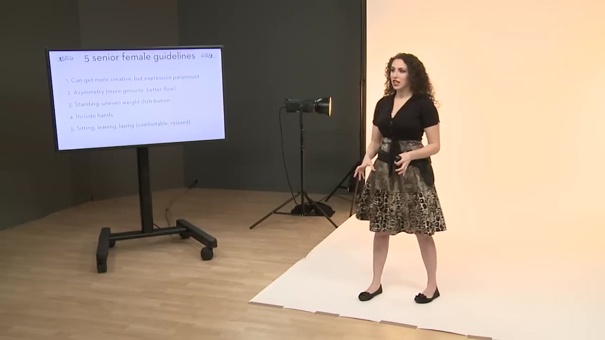 Lindsay explaining that expression is the priority for senior portraits
In fashion work, you can get away with a blank, severe face. The clothes carry the image. Senior portraits don’t work that way. The family is buying a picture of their daughter, not a study in composition. Adler’s first guideline is essentially a constraint: never let your creative ambition cost you the subject’s expression.
Lindsay explaining that expression is the priority for senior portraits
In fashion work, you can get away with a blank, severe face. The clothes carry the image. Senior portraits don’t work that way. The family is buying a picture of their daughter, not a study in composition. Adler’s first guideline is essentially a constraint: never let your creative ambition cost you the subject’s expression.
The practical application is simple. Establish comfort before complexity. If you notice the subject starting to look stiff or uncertain as you push into a more unconventional pose, back off immediately. A technically interesting pose with a dead expression is a deleted file.
Step 2: Go Safe First, Then Push the Envelope
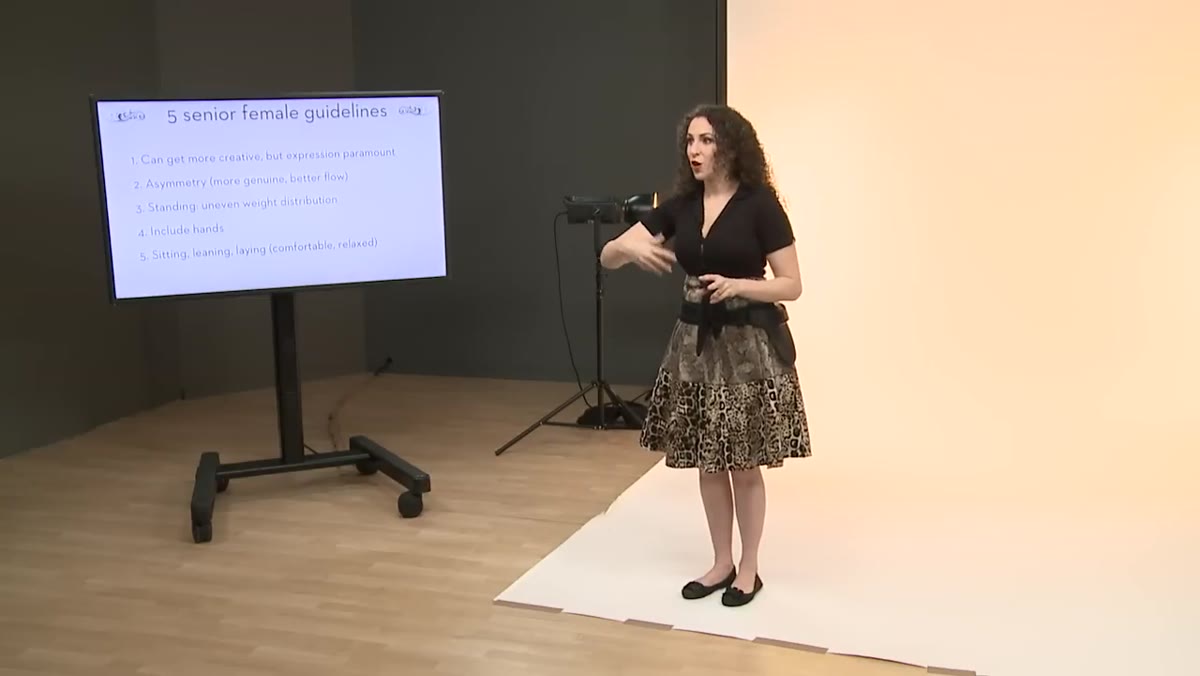 Lindsay describing the sequence from safe shots to creative ones
Adler’s session structure is something I’ve since borrowed for editorial shoots with less experienced talent. She always opens with a conventional anchor shot: subject leaning toward camera, hands on a chair or surface, genuine smile. It’s the shot grandma wants framed on the wall, and getting it out of the way early does two things. It relaxes the subject because they’ve already succeeded at something, and it protects your deliverables before you start experimenting.
Lindsay describing the sequence from safe shots to creative ones
Adler’s session structure is something I’ve since borrowed for editorial shoots with less experienced talent. She always opens with a conventional anchor shot: subject leaning toward camera, hands on a chair or surface, genuine smile. It’s the shot grandma wants framed on the wall, and getting it out of the way early does two things. It relaxes the subject because they’ve already succeeded at something, and it protects your deliverables before you start experimenting.
Once that safe shot is locked, you have permission to go strange. Lying on the floor, unconventional angles, props, movement. The sequence matters as much as the poses themselves. I used to jump straight to the interesting stuff and wonder why my subjects looked anxious in the early frames.
Step 3: Build Asymmetry Into Every Pose
 Lindsay demonstrating symmetrical versus asymmetrical arm positions
Symmetry reads as static. Two hands on hips at the same height, two arms extended at the same angle, a body centered and squared to the camera, these are all technically correct and visually inert. Adler’s second guideline is to break the mirror wherever it appears.
Lindsay demonstrating symmetrical versus asymmetrical arm positions
Symmetry reads as static. Two hands on hips at the same height, two arms extended at the same angle, a body centered and squared to the camera, these are all technically correct and visually inert. Adler’s second guideline is to break the mirror wherever it appears.
The fix is usually small. If both arms are up, lower one slightly. If the hands are on the hips, drop one hand lower than the other. Even a few centimeters of difference changes the visual rhythm of the pose from rigid to alive. I think of it the same way I think about light ratios: a perfectly even split is clean but flat. A 3:1 ratio has dimension. Asymmetry is the posing equivalent of that ratio.
Step 4: Get the Subject Off Their Heels
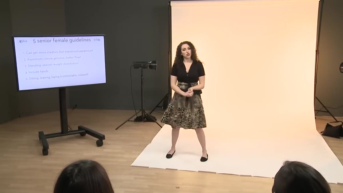 Lindsay explaining weight distribution and avoiding flat-footed stances
A flat-footed subject looks rooted and uncomfortable, even when their upper body is doing everything right. Adler’s guideline here is about weight distribution: shift it off center. If the subject is facing the camera directly, move their weight onto the back foot. If they’re turned at an angle, have them load one hip.
Lindsay explaining weight distribution and avoiding flat-footed stances
A flat-footed subject looks rooted and uncomfortable, even when their upper body is doing everything right. Adler’s guideline here is about weight distribution: shift it off center. If the subject is facing the camera directly, move their weight onto the back foot. If they’re turned at an angle, have them load one hip.
This does two things simultaneously. It creates a more natural silhouette through the hips and legs, and it gives the subject something physical to think about, which often releases tension in the face and shoulders. I use a similar cue in studio: I’ll ask a subject to shift their weight and then wait three seconds before I shoot. The pose settles into itself in that pause.
Step 5: Use Hands to Frame and Define the Shot
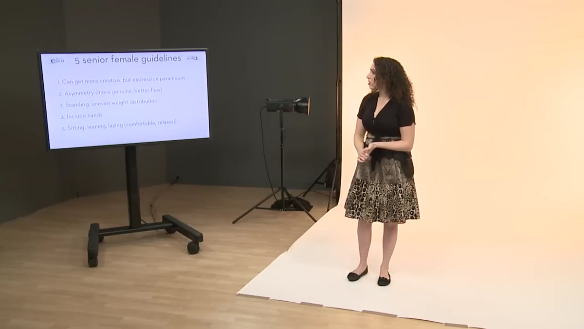 Lindsay discussing hand placement framing the face and body
Adler spends more time directing hands in senior sessions than in almost any other genre she works in, and I think the reason is that senior portrait work rewards expressiveness in a way that corporate headshots or catalog work does not. Hands that frame the face or move through the hair add energy and personality. Hands hanging at the sides add nothing.
Lindsay discussing hand placement framing the face and body
Adler spends more time directing hands in senior sessions than in almost any other genre she works in, and I think the reason is that senior portrait work rewards expressiveness in a way that corporate headshots or catalog work does not. Hands that frame the face or move through the hair add energy and personality. Hands hanging at the sides add nothing.
The technical rule she reinforces: avoid showing the palm directly to camera. The side profile of the hand reads as elegant and natural. A flat palm facing the lens looks stiff and draws attention to itself. If you want to get better at posing hands generally, senior portraits are the training ground. The genre tolerates experimentation, the subjects are usually willing, and the feedback loop is immediate when you’re reviewing shots together.
Step 6: Build a Mental Shot List by Position
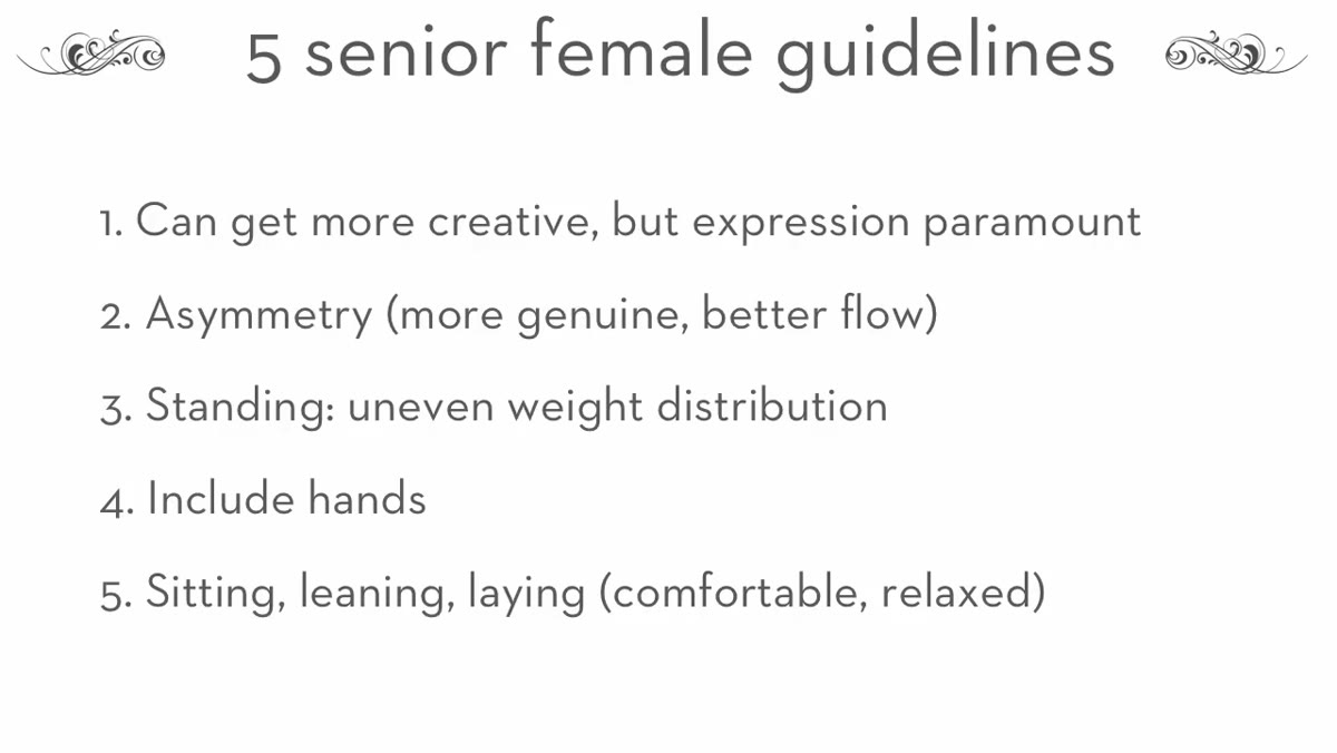 Lindsay noting standing as an obvious starting point for organizing poses
Adler’s fifth guideline is organizational rather than aesthetic, and it’s the one I find most useful for managing a busy session. She categorizes poses by the subject’s physical position: standing, sitting, lying down, leaning. Thinking in categories keeps you from running dry mid-session.
Lindsay noting standing as an obvious starting point for organizing poses
Adler’s fifth guideline is organizational rather than aesthetic, and it’s the one I find most useful for managing a busy session. She categorizes poses by the subject’s physical position: standing, sitting, lying down, leaning. Thinking in categories keeps you from running dry mid-session.
Before a senior session, I now sketch a quick matrix in the lighting journal I keep on set: three standing variations, two seated, one or two floor-based. It prevents the mental blank that hits when you’ve been shooting for ninety minutes and suddenly can’t remember a single pose. The categories don’t constrain creativity, they give it a structure to push against.
What I’d Add from the Studio Side
Adler’s framework is primarily about body mechanics and session flow, which is exactly what it should be. What I’d layer on top, particularly for indoor studio sessions, is light position relative to the asymmetry she builds into each pose. When you shift a subject’s weight onto one hip and lower one shoulder, you’ve created a natural high point and low point in the frame. Place your key light so it’s skimming across that diagonal, not washing over it evenly. A beauty dish at a 45-degree angle off the raised shoulder side will follow the line Adler builds into the pose and add depth that a straight-on soft box would flatten out.
I learned this the hard way on an editorial shoot where the posing was strong but the light was symmetrical. The images looked oddly lifeless despite good poses, and I didn’t understand why until I started cross-referencing my lighting diagrams against the actual pose geometry. Now it’s the first thing I check.
The single most transferable idea from Adler’s tutorial is the session sequencing: safe shot first, permission to experiment after. It removes the pressure from the subject at exactly the moment they’re most self-conscious, and it gives you a safety net so creative risk-taking doesn’t feel like gambling with a client’s money.
Watch the full tutorial on YouTube and pay attention to the moments where Adler physically demonstrates the difference between a symmetrical and asymmetrical version of the same pose. Seeing the comparison in motion is worth more than any written description of it.
Comments
Leave a Comment