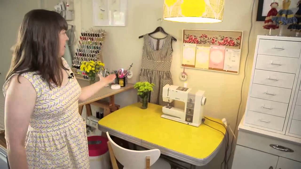
There’s a version of “studio organization” content that’s really just tidiness porn. Pretty shelves, color-coded everything, good lighting, nothing actually useful. I’ve sat through enough of it. What I look for instead is how working professionals structure their physical environment to support the actual mechanics of their craft. That’s why this CreativeLive tutorial featuring pattern maker and sewing teacher Christine Haynes stuck with me. Watch the full tutorial on YouTube – it’s short, but it’s dense with practical thinking.
Haynes works out of her Los Angeles apartment, and what she demonstrates here isn’t just how her studio looks. It’s how she made deliberate decisions about every corner so that transitioning from daily life into deep creative work has almost no friction. As someone who also works out of a home studio in LA, I recognize that problem immediately. The gap between “I should work” and “I am working” can eat an entire morning if the space doesn’t pull you in. Haynes has clearly thought hard about closing that gap.
What follows is my breakdown of her approach, step by step, with the specific decisions that actually matter.
Step 1: Accept the Blend Between Life and Work as a Feature, Not a Bug
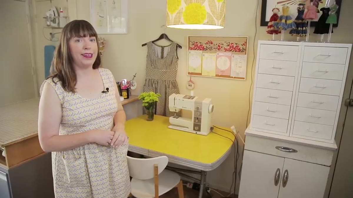
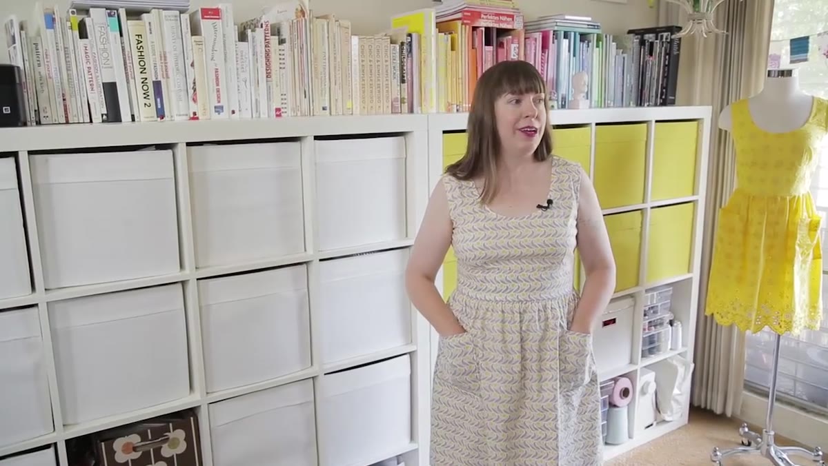 Christine Haynes introducing her home studio space
Haynes opens by naming something most home-based creatives treat as a problem: the blurred line between living space and work space. Her framing flips it. For her craft, being able to move between kitchen, office, and sewing machine at any hour isn’t a distraction risk. It’s a workflow advantage. The work of pattern making doesn’t always happen at the sewing machine. It happens in the shower, over coffee, mid-conversation. A home studio makes capturing those moments easier, not harder.
The practical implication here is that you don’t need to wall off your studio from your life. You need to make sure the studio is always ready to receive you. No chair piled with fabric, no machine that needs clearing before it’s usable. Constant low-level readiness is the actual design goal.
Step 2: Use Aesthetic Choices as Functional Anchors
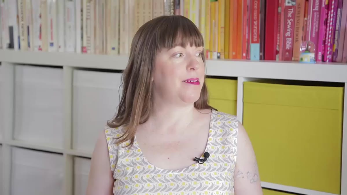 Color-coordinated bookshelves and vintage chandelier in studio corner
Haynes mentions a color-coordinated bookshelf and a vintage Italian chandelier she sourced from Craigslist. I want to push back on the instinct to read this as mere decoration. For anyone doing design work, the visual environment is constantly feeding or starving the creative process. Haynes has surrounded herself with objects that reinforce the specific aesthetic she’s trying to produce: feminine, vintage-inspired, modern but not costume-y.
This is a calibration tool. When you’re mid-project and second-guessing whether a detail feels right, the room itself gives you a reference point. I do something similar in my own studio – I keep printed tearsheets from shoots I admire on the wall near my key light position. They remind me what I’m aiming for before I ever fire a strobe.
Step 3: Build a Physical Reference Library You Can Actually Touch
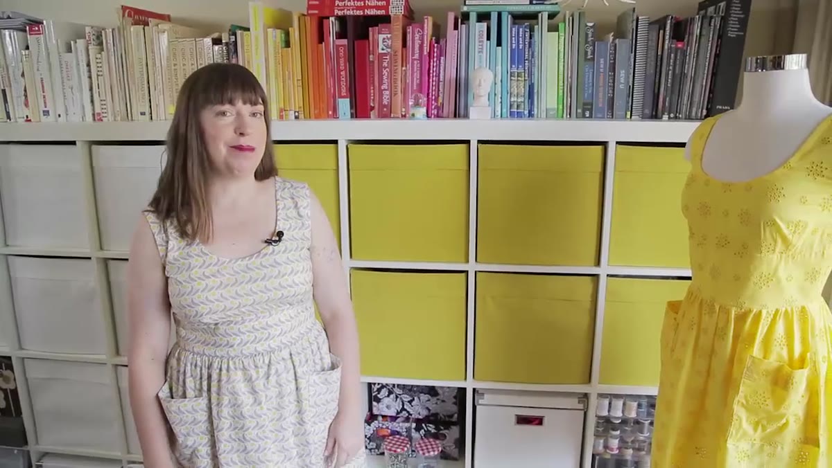 Ikea shelving bins filled with vintage sewing patterns
The IKEA Expedit shelving (now called Kallax, for anyone sourcing this) holds the real infrastructure of Haynes’ studio: hundreds of vintage sewing patterns from the 1950s through 1970s, including a set of Bernina patterns from Amsterdam. She calls this her personal reference library. That framing matters. These aren’t collectibles. They’re working documents she pulls from when designing new patterns.
The specific value is tactile and historical. Modern ready-to-wear has largely abandoned the small collar details, button placements, and silhouette proportions that defined mid-century garment construction. Haynes uses the original patterns as a source document to extract those details and translate them into contemporary designs. The key discipline she names: vintage-inspired, never costumey. The difference lives in which details you borrow and how you scale them against modern minimalism.
If you’re in any design discipline, ask yourself whether your reference library is actually accessible during the work. References locked in a hard drive folder you never open aren’t references. They’re archives.
Step 4: Position Your Primary Workspace So It Demands Intention
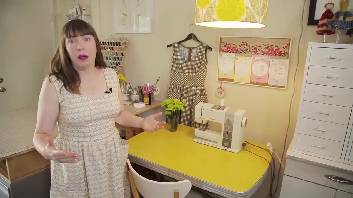
 Christine Haynes at her sewing machine workspace area
Haynes is direct about her sewing area: because it’s where she does most of her work, she has to love being there. That sounds obvious. It isn’t. Most people optimize their workspace for the work and ignore how it feels to inhabit. Haynes treats those as the same problem.
The practical expression of this: she positions meaningful objects within her sightline at the machine. The little dresses her grandmother crocheted for her mother’s Barbies, displayed on small dress forms, sit at the top of her cabinets. That’s not nostalgia as distraction. It’s a constant reminder of the generational lineage of craft she’s participating in. For anyone doing long, detail-intensive work, that kind of anchor is worth identifying and physically placing in the room.
Step 5: Use a Bulletin Board as a Dynamic Mood Document
 Bulletin board with pattern designs and vintage floral references
The bulletin board above her machine is deliberately low-commitment. It changes with each project. When she’s designing a new pattern, it fills with images that set the emotional tone for that specific collection: the decade she’s drawing from, the formality level, the balance of casual versus dressy. When giving a studio tour, she swaps in finished work for visibility.
The mechanism here is worth copying. Mood boards that live on your computer are easy to ignore. A physical board in your direct sightline while you work is unavoidable. It keeps the intended feeling of a project present during the execution phase, when it’s easiest to drift into solving technical problems and forget the original creative intent.
What I’d Add: Light the Space, Not Just the Work Surface
Haynes doesn’t go deep on lighting in this tour, understandably. But from where I sit, lighting is the one element that can undo everything else a well-designed studio achieves. The vintage chandelier she mentions is a smart instinct. Overhead directional light from a bare bulb or fluorescent strip kills the warmth a creative space needs.
In my own studio, I keep a secondary lamp on a dimmer near my editing station – separate from the controlled strobes. Its only job is to make the room feel good when I’m not shooting. The quality of ambient light affects how long I stay in the space and how willing I am to start something uncertain. I’d bet Haynes’ chandelier is doing similar work, even if she’d describe it as an aesthetic choice rather than a lighting decision. Those two things aren’t as separate as people think.
The single most important thing Haynes demonstrates is that every element in a working creative studio should earn its place by either supporting the work directly or making you more willing to do the work. Decoration and function aren’t opposites. The best studio objects do both simultaneously.
Watch the full tutorial on YouTube and pay attention to how she talks about each corner. The language she uses reveals how consciously she’s made these choices.
Comments
Leave a Comment