Architectural interiors have humbled me more than once. You walk into a room, you see five visible surfaces all bouncing light off each other in different directions, and the instinct is to just flood everything with a big soft source and call it done. The result is always the same: flat walls, a ceiling that disappears into the background, and a floor that looks like a sheet of gray paper. It’s the interior equivalent of slapping a ring light in front of a face and hoping for the best.
In this The Slanted Lens tutorial on lighting the inside of a room, Jay P. Morgan breaks down what he calls the “inside of a cube” problem as part of his ongoing Laws of Light series. Watch the full tutorial on YouTube before or after reading this. The core idea is deceptively simple: a room is just a cube you’re standing inside, and the same rules that govern lighting any geometric shape apply here. What changes is the scale, the number of visible surfaces, and the complexity of keeping each one tonally separated. Morgan walks through it methodically, starting with a single light and a bare wall, and builds from there.
I sketch every major lighting setup I do into a dedicated journal, and I added this one the same afternoon I watched it. The framework is that transferable.
Step 1: Understand the Geometry Before You Touch a Light
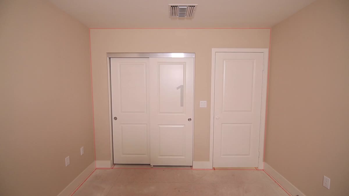 Diagram or explanation of five visible room surfaces
A room gives you up to five visible surfaces: two side walls, a back wall, the ceiling, and the floor. You almost never see all six because the camera itself blocks the sixth wall (the one behind you). Morgan’s first point is to stop thinking of a room as a “location” and start thinking of it as a cube with an open face. That mental shift changes how you plan your light placement because now you’re asking the same question you’d ask about a box: which face do I want to be the brightest, and how do I make each one a different value?
Diagram or explanation of five visible room surfaces
A room gives you up to five visible surfaces: two side walls, a back wall, the ceiling, and the floor. You almost never see all six because the camera itself blocks the sixth wall (the one behind you). Morgan’s first point is to stop thinking of a room as a “location” and start thinking of it as a cube with an open face. That mental shift changes how you plan your light placement because now you’re asking the same question you’d ask about a box: which face do I want to be the brightest, and how do I make each one a different value?
Before you set anything up, stand in the shooting position and identify each surface by its tonal role. Decide which wall will read as the lightest, which will fall off into shadow, and where the ceiling sits in that hierarchy. If you know what you want before you rig, you won’t spend an hour chasing problems you created yourself.
Step 2: Identify the Window and Decide How to Use It
 Light positioned near window to demonstrate key light placement
Most interior spaces have at least one window, and that window is either your biggest asset or your biggest problem, depending on what you do with it. Morgan’s approach is to make a deliberate choice early: either use the window as a key light, or control it by diffusing or blocking it. What you cannot do is ignore it and expect your artificial lights to overpower it cleanly.
Light positioned near window to demonstrate key light placement
Most interior spaces have at least one window, and that window is either your biggest asset or your biggest problem, depending on what you do with it. Morgan’s approach is to make a deliberate choice early: either use the window as a key light, or control it by diffusing or blocking it. What you cannot do is ignore it and expect your artificial lights to overpower it cleanly.
If the window is behind the camera, it acts like a flat on-axis source, which is exactly the lighting position that produces the least separation between surfaces. If the window is to the side, it starts doing useful work for you by raking light across the walls and creating natural fall-off. Map the window position relative to your camera angle before you add a single artificial light.
Step 3: Move the Light Off Camera Axis to Create Wall Separation
 Camera angle shift showing wall contrast change
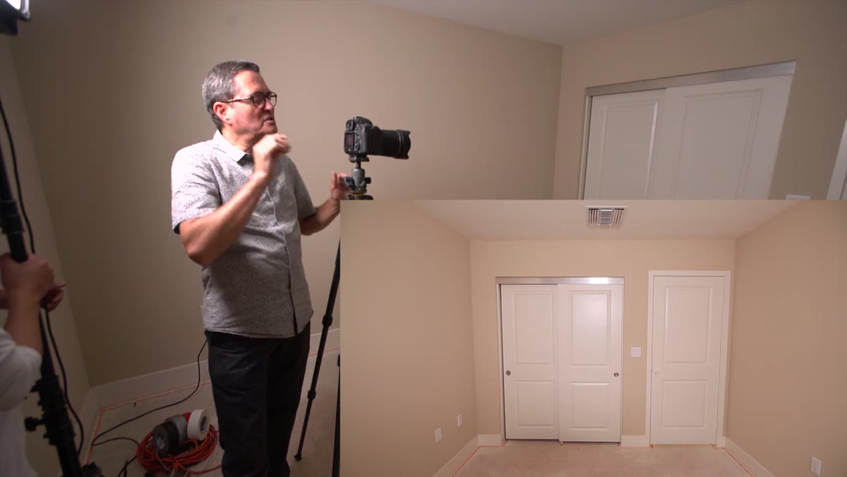
This is the core technique and the one I see interior photographers skip most often. Morgan demonstrates that as you move a light source away from the camera axis, the walls perpendicular to the lens begin to darken relative to the front-facing surfaces. The angle of incidence changes, and that difference in brightness is what gives a room its sense of depth and dimension.
Camera angle shift showing wall contrast change
This is the core technique and the one I see interior photographers skip most often. Morgan demonstrates that as you move a light source away from the camera axis, the walls perpendicular to the lens begin to darken relative to the front-facing surfaces. The angle of incidence changes, and that difference in brightness is what gives a room its sense of depth and dimension.
Think of it like lighting a portrait: a light directly in front of a face flattens it. Move that light to 45 degrees, and the cheekbones appear. The same principle applies here, except your “face” is 12 feet wide and 9 feet tall. A light placed deep into the frame, far from the camera position, can still produce this angular separation. You don’t need to stay within the conventional 45-degree zone. The room is deep enough that the light can be placed well into the scene and still produce strong directional contrast.
Step 4: Control Vertical Light Position to Separate Ceiling and Floor
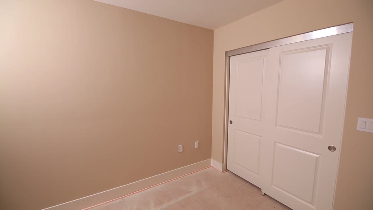 Light moved to floor level showing floor brightness increase
Where you place the light vertically is just as important as where you place it horizontally. Morgan shows this by moving a light from a high position down toward floor level and demonstrating what happens to the room’s tonal balance. When the light is high, the ceiling gets a hit of brightness and the floor falls into relative shadow. When the light drops to floor level, the floor brightens dramatically and the ceiling loses its detail.
Light moved to floor level showing floor brightness increase
Where you place the light vertically is just as important as where you place it horizontally. Morgan shows this by moving a light from a high position down toward floor level and demonstrating what happens to the room’s tonal balance. When the light is high, the ceiling gets a hit of brightness and the floor falls into relative shadow. When the light drops to floor level, the floor brightens dramatically and the ceiling loses its detail.
For most interior work, you want the ceiling to stay lighter than the floor because that matches how we naturally read a lit room (light tends to come from above). A light positioned at roughly eye level, angled upward slightly toward the ceiling, will often give you the most natural-looking tonal distribution. Use the ceiling as a secondary bounce surface rather than a surface you’re trying to light directly.
Step 5: Use Color Contrast Between Surfaces as a Separation Tool
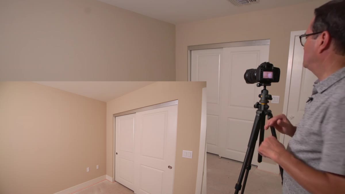 White ceiling versus tan walls showing color separation
Morgan points out that a white ceiling against tan or beige walls already gives you separation without any additional lighting work. This is something I always note when I scout an interior: surfaces that differ in color or reflectivity will separate even under relatively flat light, which means you can spend your energy solving the harder problems.
White ceiling versus tan walls showing color separation
Morgan points out that a white ceiling against tan or beige walls already gives you separation without any additional lighting work. This is something I always note when I scout an interior: surfaces that differ in color or reflectivity will separate even under relatively flat light, which means you can spend your energy solving the harder problems.
When all the surfaces are the same color or tone, you have to do all the separation work through light placement alone. When there’s inherent contrast between materials, finishes, or colors, the room does some of that work for you. Note the surface relationships during your scout and factor them into how aggressively you need to light for separation.
Step 6: Build Up from One Light, Don’t Start with Everything On
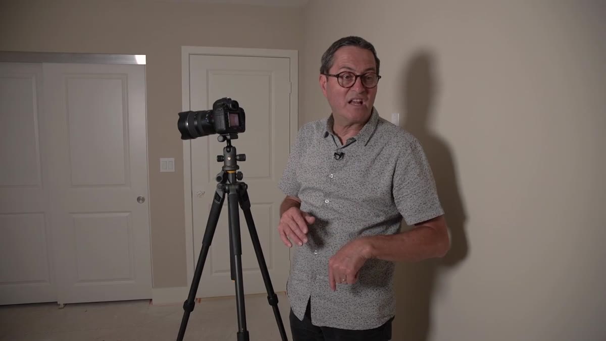 Morgan moving to kitchen to demonstrate multi-light buildup
Morgan’s workflow is to establish a single key light first, evaluate what it does to each surface, and only then add secondary sources. This is the same discipline I apply in the studio: one light tells you the truth about the room. Multiple lights at once just create confusion about which source is causing which problem.
Morgan moving to kitchen to demonstrate multi-light buildup
Morgan’s workflow is to establish a single key light first, evaluate what it does to each surface, and only then add secondary sources. This is the same discipline I apply in the studio: one light tells you the truth about the room. Multiple lights at once just create confusion about which source is causing which problem.
Start with your primary source, check the separation on all five visible surfaces, and identify the weakest areas. Then add a second light to address a specific deficit, like a dark back wall or a floor that’s losing detail. Every light you add should solve a named problem, not just “make it brighter.”
What I’d Add from My Own Work
Morgan’s framework is solid for natural light and standard artificial setups, but color temperature management in interiors needs its own mention. Rooms often mix sources: tungsten practicals, daylight from windows, and whatever strobes you bring in. I’ve gelled strobes to match window color temperature when the window was playing a significant role, and I’ve gelled them to match tungsten practicals when I wanted the room to feel warm. The tonal separation techniques here still apply either way, but they fall apart if your sources are fighting each other in Kelvin before they’ve even started fighting for position.
Label your gels the same way you’d label a diagram. Know which window you’re matching and what the gap is before you start shooting.
The single most important idea in this tutorial is that off-axis placement is not just about portraits. Any surface, at any scale, separates better when light hits it at an angle. A room is just a very large subject. Apply the same discipline you’d use to light a face, and the room will reward you with the same kind of depth.
Watch the full tutorial on YouTube to see Morgan demonstrate the vertical light movement and wall separation in real time. The visual comparison between camera-axis light and off-axis light is worth seeing in motion.
Comments (1)
Wow, I had no idea you could do this. Mind blown.
Leave a Comment