
I shoot commercial work out of a proper studio most of the time, but I’ve lost count of how many times a client has needed something quick, somewhere inconvenient, in a space that looked absolutely hopeless. A garage. A spare bedroom with mismatched furniture. A hotel suite with that particular shade of beige that seems specifically designed to ruin photographs. The question is never really “is this room good enough?” The question is whether you understand your frame well enough to make it not matter.
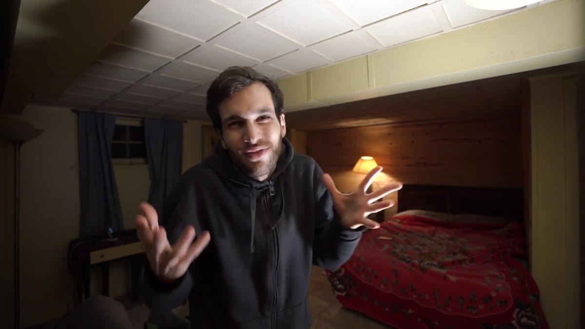
That’s why I kept coming back to this tutorial. In this Pierre T. Lambert tutorial on turning an ugly room into a home studio, Lambert works through a genuinely messy space, a dim room with a bed in the middle, uneven floors, random furniture, and very little light, and pulls a clean, professional-looking setup out of it. The techniques he uses are not workarounds. They are fundamental. I recognized every one of them from my own working practice, and watching him apply them in sequence reminded me how systematic this process should be.
What I want to do here is walk through his method step by step, with enough specificity that you can apply it in your own space without needing to rewatch the video three times.
Step 1: Read the Room Before You Move Anything
 Messy room with bed, shelves, and uneven floor visible
Before Lambert touches a single piece of furniture, he does a full visual audit of the space. He identifies what is potentially useful (a wooden accent wall with natural texture), what is in the way (a bed, shelving), and what is simply absent (adequate light). This triage step is the one most people skip. They start rearranging immediately and then wonder why nothing looks right. Walk the room first. Identify one area, just one, that has something worth keeping in frame, whether that’s an interesting wall, a window with good directional light, or a clean corner. Build toward that anchor point. Everything else either supports it or gets moved out.
Step 2: Control Your Frame, Not the Whole Room
 Camera framing shows a clean portion while clutter remains outside the shot
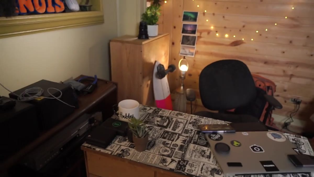
This is the insight Lambert puts the most emphasis on, and he’s right to. You are not decorating a room. You are controlling a rectangle. Once he identifies the wooden wall as his background, his entire effort focuses on making that specific portion of the room frame-worthy. The surrounding mess, the uneven floor, the random objects, none of it matters as long as it stays outside the camera’s field of view. This is the mental shift that changes everything. You don’t need a perfect room. You need a perfect slice of a room.
Step 3: Use a Longer Focal Length to Compress and Clean Up the Background
 70-200mm lens shown next to camera body on a table
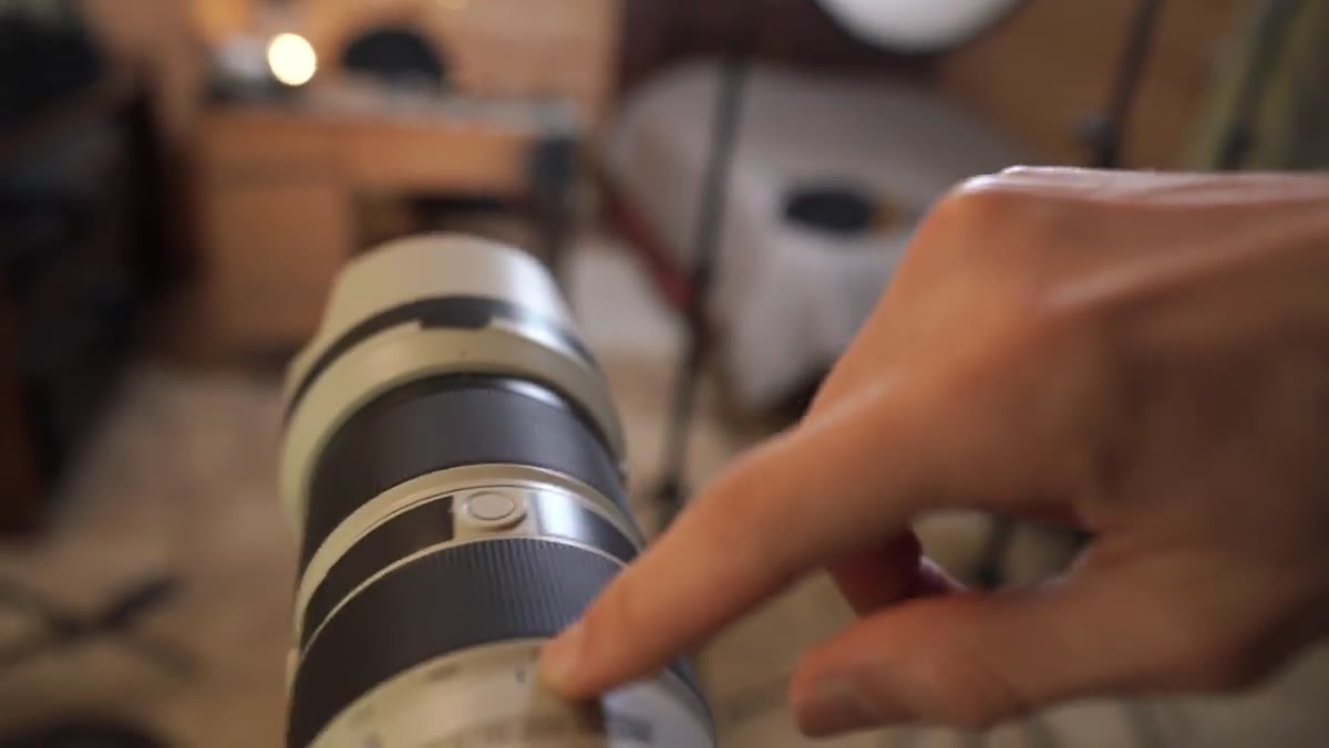
Lambert tests a wide angle first, around 16-35mm at the wider end, and the result immediately shows the problem: more of the room enters the frame, the background reads as cluttered, and the spatial relationship between subject and environment becomes unflattering. He switches to a 70-200mm f/2.8 and settles at roughly 80mm. The compression that a longer focal length produces does two things simultaneously. It narrows the visible slice of background, and it softens and blurs whatever is back there into an impressionistic wash. If you are working in a small or imperfect space, a 70-200 or even an 85mm prime is not optional. It is the tool that makes the space possible. I keep a piece of masking tape on my 70-200 that just says “ugly room lens” because this exact situation comes up so often.
Step 4: Accept That Distance Is a Variable You Control
 Wide shot showing full room with distance between camera and subject
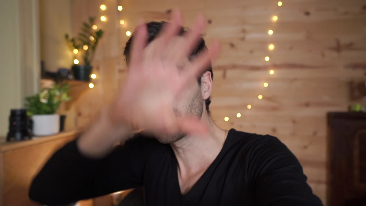
One detail Lambert mentions almost in passing is that he wishes he could place the camera even further back from the subject. This matters. The further your camera is from the subject while maintaining the same focal length, the more pronounced the background compression becomes, and the less intrusive any near-background distractions will read. In a small room you may not have 15 feet to work with, but even gaining an extra three or four feet by pushing furniture to the walls or shooting diagonally across a room can shift the result meaningfully. Think about distance as a lighting variable, not a fixed constraint.
Step 5: Identify and Supplement Your Light Sources
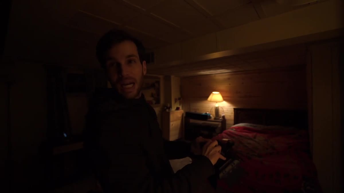 Two windows visible in the room providing limited natural light
The room Lambert starts with has two small windows and a projector being used as a makeshift light source. Neither is sufficient on its own. His approach is to identify what natural light exists and understand its direction and quality before adding anything artificial. Windows give you a color temperature around 5500-6500K depending on time of day, which is useful as a starting point but inconsistent. Whatever supplemental lights you bring in need to be matched to that baseline or the mix will look muddy. I learned this the hard way on an editorial shoot early in my career where I mixed tungsten practicals with strobe fill and the skin tones came out looking like a hardware store. Calibrate first, add light second.
Step 6: Use the Wooden Wall as an Active Background, Not a Neutral One
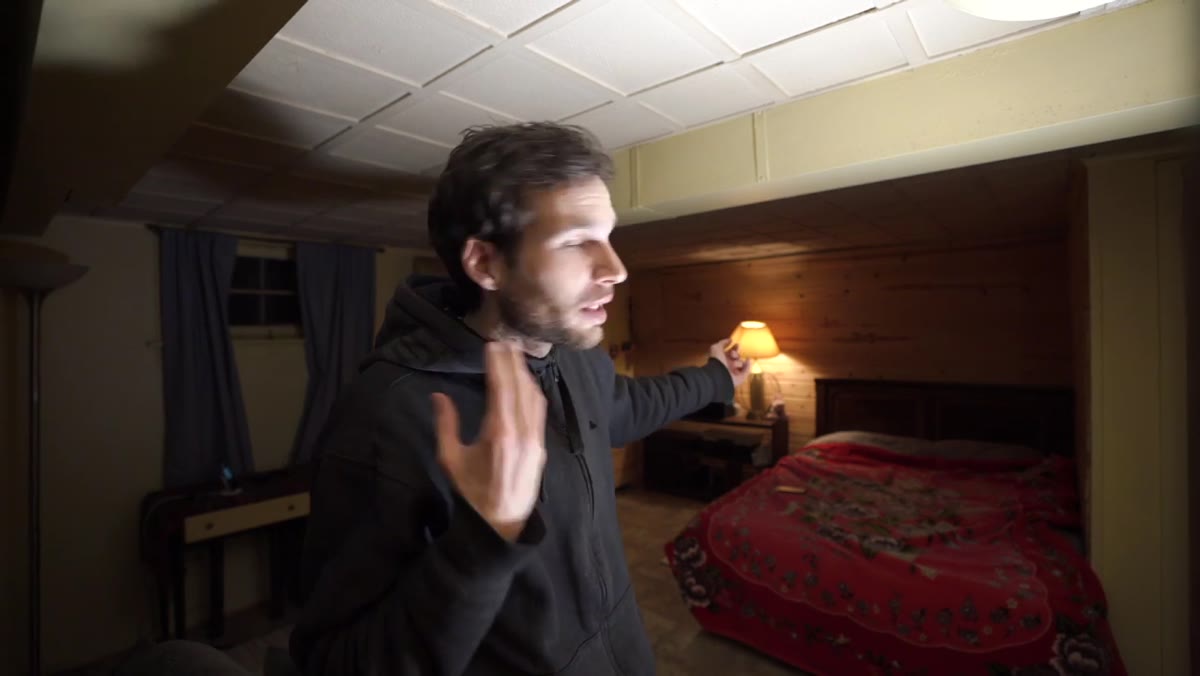 Wooden accent wall behind the cleared shooting position
Lambert’s wooden wall works because it has visual texture and warmth without competing with the subject. He frames it intentionally so the grain and tone read as deliberate art direction rather than accidental backdrop. When you are scouting your own space for a usable background, look for surfaces with a single dominant tone and natural texture, exposed brick, painted concrete, a bookshelf with some negative space. Avoid anything with logos, patterns, or strong contrast that will pull focus. Then light the background separately if you can, even a small accent light raking across a textured wall adds dimension that a bare wall will never have.
One Thing I’d Add: Negative Space Is a Light Modifier
Lambert’s setup is clean partly because he removes clutter, but what he’s actually doing when he clears the area is controlling negative space around the subject. In studio work I do this deliberately by flagging off walls with black v-flats when I need to deepen shadows on one side of a face. You can do the same thing in a home setup using black foam board or even a dark blanket hung just outside the frame. The room’s existing ambient light will bounce off light-colored walls and flatten your subject. Dark surfaces absorb that bounce and give you more shape. It costs almost nothing and the difference on skin is immediate.
The single most important idea in Lambert’s tutorial is one that sounds almost too simple: you are not transforming the room, you are transforming the frame. Everything else, the focal length choice, the furniture rearrangement, the light placement, is in service of that one controlled rectangle the camera sees. Get that rectangle right, and the rest of the room becomes irrelevant.
Watch the full tutorial on YouTube to see Lambert work through the transformation in real time, including how he stages the final frame for video recording work.
Comments
Leave a Comment