
There is a specific kind of commercial brief that makes photographers nervous: shoot someone looking genuinely furious, on a white or neutral background, and make it feel like a real person, not a Halloween mask. The expression has to land, yes. But the lighting either sells the emotion or kills it. Flat, even light turns anger into mild annoyance. The wrong rim can make a scowling face look like a horror poster. Getting the balance right takes a setup that feels intentional from every angle.
That is exactly why I kept coming back to this Visual Education tutorial by Carl Taylor. Watch the full tutorial on YouTube — it is a sketch-walkthrough format, meaning Taylor draws the diagram over the finished image and explains each decision as he goes. What I appreciated most is that he does not just name the lights. He explains why the light behaves the way it does on the body, which is the part most tutorials skip. I sketched the whole setup into my lighting journal the first time I watched it, and I have pulled that page out twice since for client jobs.
Step 1: Understand the Concept Before You Touch a Light Stand
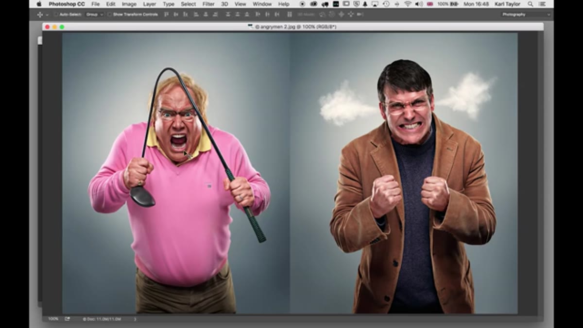 Carl Taylor explaining the campaign brief for frustrated buyers
Taylor opens by explaining the campaign concept: people who discovered they overpaid for something and are genuinely furious about it. That context matters technically, not just creatively. If you know you are shooting frustration and disappointment, you know you need directional light that carves the face, deepens eye sockets, and puts shadows under the jaw. You are not shooting a beauty campaign. You do not want flattering. You want structure and a little bit of menace. Decide that before you set up a single modifier, because every choice downstream follows from it.
Carl Taylor explaining the campaign brief for frustrated buyers
Taylor opens by explaining the campaign concept: people who discovered they overpaid for something and are genuinely furious about it. That context matters technically, not just creatively. If you know you are shooting frustration and disappointment, you know you need directional light that carves the face, deepens eye sockets, and puts shadows under the jaw. You are not shooting a beauty campaign. You do not want flattering. You want structure and a little bit of menace. Decide that before you set up a single modifier, because every choice downstream follows from it.
Step 2: Read the Finished Image Before You Build the Setup
 Taylor zooming into the subject’s eye to locate the catch light
Taylor does something I now do with every reference image I study: he goes to the eyes first. The catch light tells you almost everything about what the key light is and roughly where it sat. In this image there is a clear circular highlight sitting high in the eye, which immediately signals a beauty dish positioned above camera and angled down toward the subject’s forehead. There is also a faint secondary reflection lower in the eye, which he notes is subtle and nearly lost at screen resolution. Train yourself to read catch lights this way. Before you even know what modifiers Taylor used, the eye has already told you the key light shape, its height, and its angle. That is a skill worth building independently of any single tutorial.
Taylor zooming into the subject’s eye to locate the catch light
Taylor does something I now do with every reference image I study: he goes to the eyes first. The catch light tells you almost everything about what the key light is and roughly where it sat. In this image there is a clear circular highlight sitting high in the eye, which immediately signals a beauty dish positioned above camera and angled down toward the subject’s forehead. There is also a faint secondary reflection lower in the eye, which he notes is subtle and nearly lost at screen resolution. Train yourself to read catch lights this way. Before you even know what modifiers Taylor used, the eye has already told you the key light shape, its height, and its angle. That is a skill worth building independently of any single tutorial.
Step 3: Set the Key Light - 70cm Beauty Dish on a Boom, Angled Down
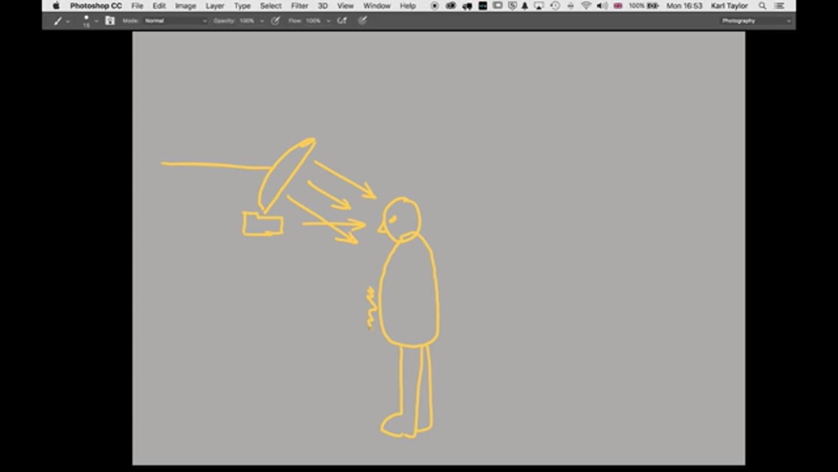
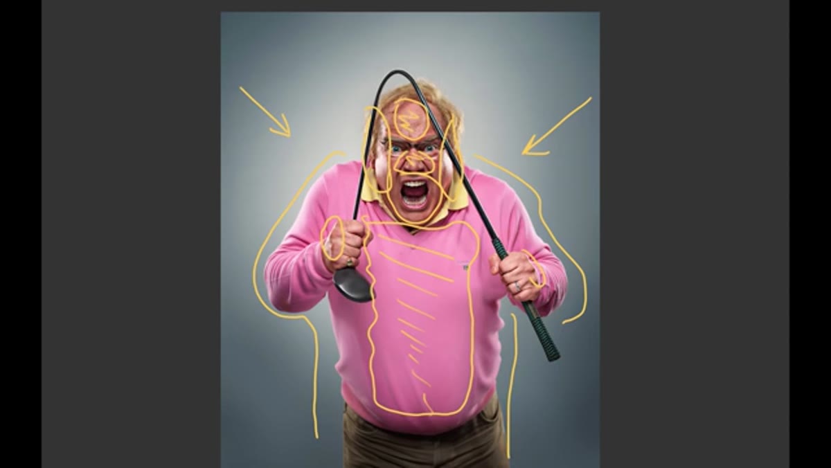 Diagram showing beauty dish position relative to the subject’s head
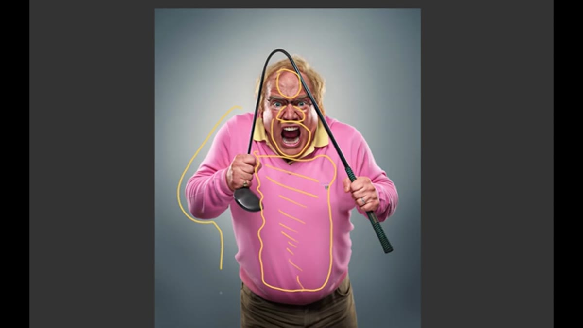
The key light is a 70-centimeter beauty dish mounted on a boom arm (Taylor calls it a giraffe stand) positioned above the camera and angled down toward the subject’s forehead. Camera height is level with the subject. The beauty dish is not enormous by commercial standards, which is part of why this setup reads as dramatic rather than soft. A larger octabox at the same position would wrap light around the face and lose the shadow fall-off that makes this image feel tense. The 70cm dish at that angle creates a clear gradient: bright across the forehead and nose, then progressively dimmer down the chest, genuinely dark at the belt and trousers. That fall-off is doing emotional work. Let it.
Diagram showing beauty dish position relative to the subject’s head
The key light is a 70-centimeter beauty dish mounted on a boom arm (Taylor calls it a giraffe stand) positioned above the camera and angled down toward the subject’s forehead. Camera height is level with the subject. The beauty dish is not enormous by commercial standards, which is part of why this setup reads as dramatic rather than soft. A larger octabox at the same position would wrap light around the face and lose the shadow fall-off that makes this image feel tense. The 70cm dish at that angle creates a clear gradient: bright across the forehead and nose, then progressively dimmer down the chest, genuinely dark at the belt and trousers. That fall-off is doing emotional work. Let it.
Step 4: Add a Tri-Reflector Low to Kick Light Back Into the Body
 Taylor describing the tri-reflector positioned low beneath the subject
Because the beauty dish is angled down, the lower body goes quite dark without any fill. Taylor’s solution is a tri-reflector placed low, in front of and below the subject. A tri-reflector is a three-panel reflector where each panel can be angled independently. By tilting the side panels inward, you concentrate the bounced light and push it upward into the mid-body. This is not a dramatic fill. It is a subtle lift that keeps detail in the torso without flattening the overall gradient. The key distinction here is that the reflector is not fighting the shadow, it is just preventing the lower body from dropping into pure black. If you do not own a tri-reflector, a standard V-flat laid at an angle below the subject will approximate it. The physics are the same.
Taylor describing the tri-reflector positioned low beneath the subject
Because the beauty dish is angled down, the lower body goes quite dark without any fill. Taylor’s solution is a tri-reflector placed low, in front of and below the subject. A tri-reflector is a three-panel reflector where each panel can be angled independently. By tilting the side panels inward, you concentrate the bounced light and push it upward into the mid-body. This is not a dramatic fill. It is a subtle lift that keeps detail in the torso without flattening the overall gradient. The key distinction here is that the reflector is not fighting the shadow, it is just preventing the lower body from dropping into pure black. If you do not own a tri-reflector, a standard V-flat laid at an angle below the subject will approximate it. The physics are the same.
Step 5: Place Rim Lights Behind the Subject on Both Sides
 Taylor pointing out the rim light wrapping around the subject’s shoulders and knuckles
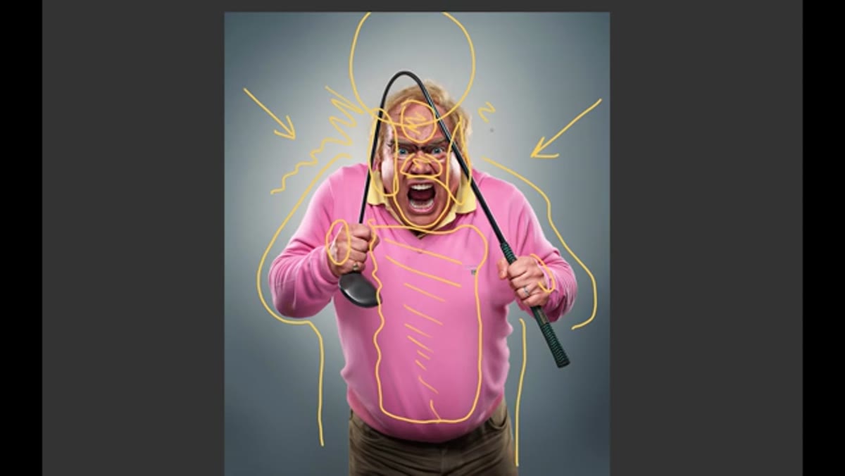
The rim lights are positioned behind the subject, one on each side, aimed back toward the camera. These create the bright edge you can see tracing the shoulders, the outer arms, and the sides of the face. Taylor specifically calls out how visible the rim is on the knuckles where the hands are raised, and on the side of the jaw. Those are high-contrast areas that read clearly even at smaller image sizes, which matters in commercial and advertising work where the image may appear at thumbnail scale or in a compressed digital layout. The rim lights here are not hair lights or kickers angled from slightly behind, they are genuinely raking from behind, which is why the rim is hard and defined rather than soft and transitional.
Taylor pointing out the rim light wrapping around the subject’s shoulders and knuckles
The rim lights are positioned behind the subject, one on each side, aimed back toward the camera. These create the bright edge you can see tracing the shoulders, the outer arms, and the sides of the face. Taylor specifically calls out how visible the rim is on the knuckles where the hands are raised, and on the side of the jaw. Those are high-contrast areas that read clearly even at smaller image sizes, which matters in commercial and advertising work where the image may appear at thumbnail scale or in a compressed digital layout. The rim lights here are not hair lights or kickers angled from slightly behind, they are genuinely raking from behind, which is why the rim is hard and defined rather than soft and transitional.
Step 6: Use a Background Light to Separate Subject from the Set
 Glow visible around the subject’s head and shoulders from the background light
Behind the subject, Taylor adds a light aimed at the background itself. The result is a soft luminous glow that you can see bleeding around the head, shoulders, and upper body. This serves a precise function: it separates the dark edges of the subject from the background so the figure reads clearly as three-dimensional. Without it, the dark side of the body could merge into the background and the rim light alone would not be enough to hold the silhouette. In post-heavy commercial work this can be corrected, but doing it in-camera is cleaner and faster, and it means the image reads correctly at the moment of capture, which saves you from guessing on set.
Glow visible around the subject’s head and shoulders from the background light
Behind the subject, Taylor adds a light aimed at the background itself. The result is a soft luminous glow that you can see bleeding around the head, shoulders, and upper body. This serves a precise function: it separates the dark edges of the subject from the background so the figure reads clearly as three-dimensional. Without it, the dark side of the body could merge into the background and the rim light alone would not be enough to hold the silhouette. In post-heavy commercial work this can be corrected, but doing it in-camera is cleaner and faster, and it means the image reads correctly at the moment of capture, which saves you from guessing on set.
What I Would Do Differently in My Own Studio
The one thing I would adjust from Taylor’s setup for my commercial work is adding a small flag or gobo between the background light and the subject. The glow Taylor gets is intentional and clean, but depending on the background color and the camera angle, that spill can creep onto the back of the subject’s shoulders and shift the color of the rim. I have labeled a dedicated flag in my studio specifically for background-light spill control, and it has saved me in post-processing more times than I can count. Whether you need it depends on your specific set dimensions and how close your subject stands to the background. If you are working in a tight space, always check for unwanted spill before you commit to your exposure.
The single most important idea in this whole setup is the one Taylor states almost in passing: reading the catch light before you build the diagram. Every finished image contains its own lighting map if you know where to look. That skill - reverse-engineering light from a result - is worth practicing on every strong portrait you admire, not just the ones that come with a tutorial attached.
Watch the full tutorial on YouTube to see Taylor’s original sketch walkthrough and the finished campaign images side by side.
Comments (2)
Great breakdown. The step-by-step approach really helps.
Simple but effective. Sometimes that's all you need.
Leave a Comment