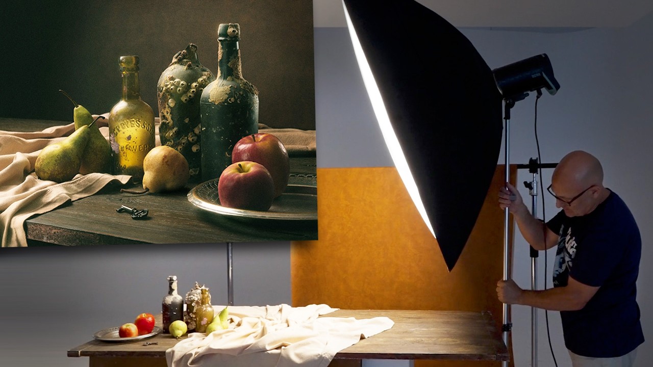
There is a particular kind of photographer who believes more gear equals better work. I was that photographer for a while. Early in my commercial career I was stacking lights, adding modifiers, filling every shadow, and wondering why my still life work felt flat and lifeless despite all the hardware pointed at it. What I eventually learned, the hard way, is that complexity hides ignorance. When you have four lights in a setup, you can mask a weak understanding of how light actually behaves. When you have one, there is nowhere to hide, and that is exactly where the education begins.
Watch the full tutorial on YouTube
In this Visual Education tutorial, photographer Karl Taylor walks through the complete process of building and lighting a Renaissance-style still life using a single light source, some mirrored card, and basic silver foil. No complex modifiers, no secondary flash heads, no enormous studio budget. What he demonstrates is something I keep coming back to in my own work: a disciplined, methodical approach to light placement that produces images that feel genuinely old and beautiful, not artificially produced. I sketched the whole setup into my lighting journal the first time I watched it, and I have referenced those notes more than once since.
The exercise is deceptively simple to describe and genuinely difficult to execute well, which is what makes it worth your time. Here is how to work through it yourself.
Step 1: Source Your Props with Intention
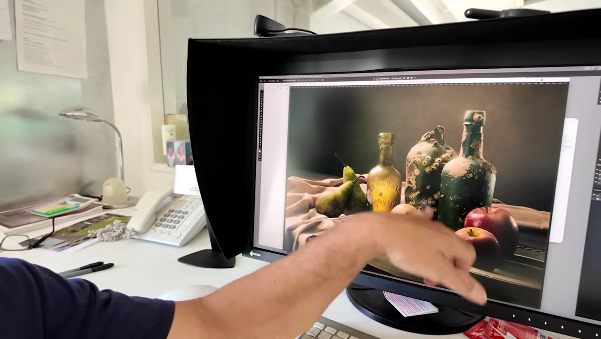 Karl Taylor holding up rustic bottles and a crumpled tablecloth
Before a single light gets switched on, the work begins at the charity shop or thrift store. Taylor’s approach to props is deliberate and budget-conscious. He used a large tablecloth purchased for around three pounds secondhand, a handful of barnacle-encrusted bottles with genuine texture and age, and handmade candles crafted to look waxy and historic. The principle here is that every prop should earn its place compositionally, not just look vaguely old.
Karl Taylor holding up rustic bottles and a crumpled tablecloth
Before a single light gets switched on, the work begins at the charity shop or thrift store. Taylor’s approach to props is deliberate and budget-conscious. He used a large tablecloth purchased for around three pounds secondhand, a handful of barnacle-encrusted bottles with genuine texture and age, and handmade candles crafted to look waxy and historic. The principle here is that every prop should earn its place compositionally, not just look vaguely old.
When you are sourcing your own objects, look for things with surface variation: rough textures, dried wax drips, aged glass, heavy fabric with deep folds. Smooth, modern surfaces reflect light predictably and cleanly, which works against the painterly effect you are after. Renaissance still life painters chose objects that caught and held light in complex, irregular ways, and you should do the same.
Step 2: Build a Composition That Circulates
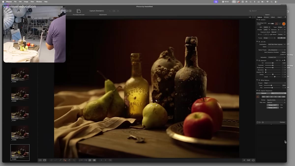
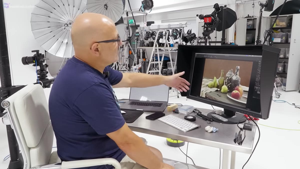 Live view on camera showing the arranged still life composition on the table
Taylor builds his composition around a deliberate visual flow, using what painters call a pyramid structure. The tallest element sits near the center-back, objects step down in height toward the front edges, and every line within the frame, including the folds of the fabric and the angle of a tipped-over pear, points inward toward the center of the image rather than out toward the edges.
Live view on camera showing the arranged still life composition on the table
Taylor builds his composition around a deliberate visual flow, using what painters call a pyramid structure. The tallest element sits near the center-back, objects step down in height toward the front edges, and every line within the frame, including the folds of the fabric and the angle of a tipped-over pear, points inward toward the center of the image rather than out toward the edges.
Set your camera on a tripod and shoot in live view while you arrange. The goal is to create a composition where the viewer’s eye enters the frame, travels around the elements, and never finds a natural exit point. A piece of crumpled fabric in the foreground works particularly well as a leading line. Move objects until the lines within the scene guide the eye in a continuous loop. This takes longer than most photographers expect, and that patience is the point.
Step 3: Start With the Wrong Light Position on Purpose
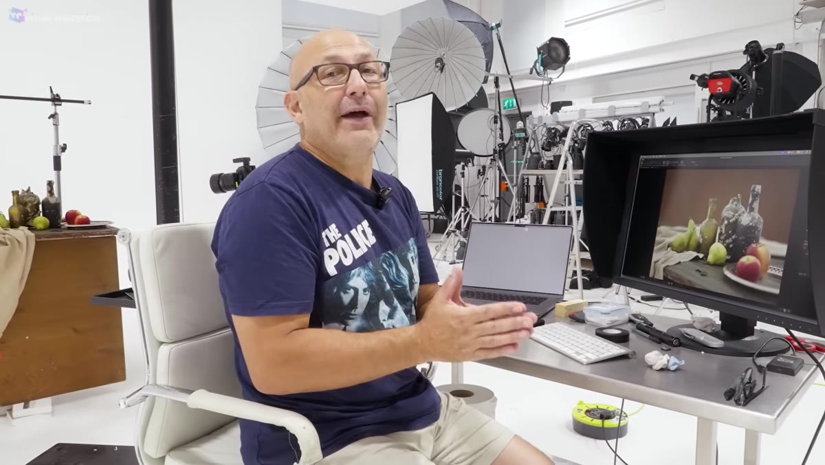 Single light positioned directly in front of the still life at 45 degrees
Taylor makes a move here that I genuinely respect as a teaching method. He places the light exactly where most people instinctively put it: front-on, roughly 45 degrees to the subject. Then he shows you what it looks like. Flat. Dull. Every texture in the scene is flattened out, and the bottles and fabric look like grocery store products rather than objects with history and weight.
Single light positioned directly in front of the still life at 45 degrees
Taylor makes a move here that I genuinely respect as a teaching method. He places the light exactly where most people instinctively put it: front-on, roughly 45 degrees to the subject. Then he shows you what it looks like. Flat. Dull. Every texture in the scene is flattened out, and the bottles and fabric look like grocery store products rather than objects with history and weight.
This step is not a mistake to skip past. Take your own test shots with the light in this default position and study them carefully. Understand what you are looking at when texture disappears. The highlight-to-shadow transition becomes too gradual, the surface of objects reads as smooth even when it is not, and the entire scene loses the sense of depth that makes old master paintings so compelling. You need to see the problem before you can understand the solution.
Step 4: Move the Light to Graze the Surface
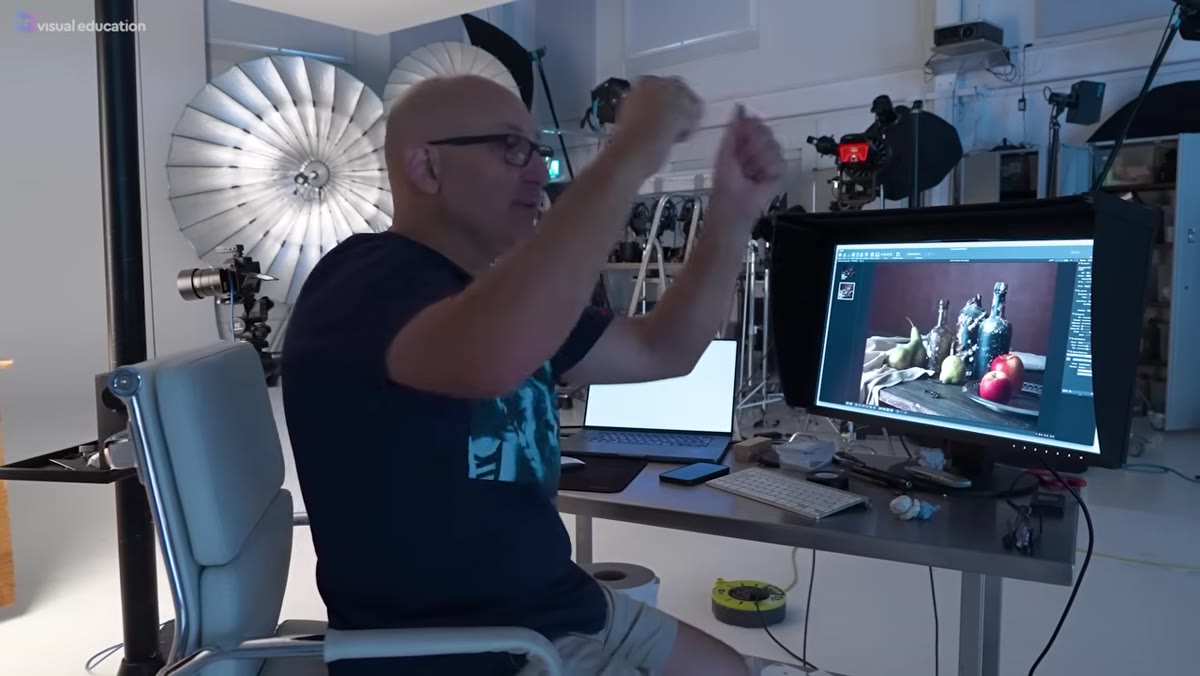 Light repositioned to a low, side angle raking across the tablecloth and props
The fix is to bring the light around to the side and lower it so it grazes across the surface of your subject at a steep angle. Taylor positions his key light to come in from the side, low enough that it rakes across the fabric and catches the texture of the tablecloth in a way that makes every fold look almost three-dimensional. This is the core lighting principle of the entire exercise: light that travels across a surface reveals texture, while light that hits a surface straight-on eliminates it.
Light repositioned to a low, side angle raking across the tablecloth and props
The fix is to bring the light around to the side and lower it so it grazes across the surface of your subject at a steep angle. Taylor positions his key light to come in from the side, low enough that it rakes across the fabric and catches the texture of the tablecloth in a way that makes every fold look almost three-dimensional. This is the core lighting principle of the entire exercise: light that travels across a surface reveals texture, while light that hits a surface straight-on eliminates it.
For speedlight users, a simple cold shoe bracket on a light stand is sufficient. You do not need a large modifier here. A relatively small, direct light source produces harder shadows, which is exactly what you want for this painterly effect. Move the light slowly, checking your live view or taking test shots at each position. Small changes in angle, even five or ten degrees, produce dramatically different results at this kind of oblique angle.
Step 5: Use Mirrors and Foil to Control the Shadow Side
 Mirrored card and silver foil positioned opposite the key light to bounce fill
With the key light raking in from one side, the opposite side of your composition will fall into deep shadow. Left alone, this can work beautifully in the old master style. But if the shadows are too dense, you lose detail in objects on the dark side of the frame. Taylor’s solution is elegant and costs almost nothing: pieces of mirrored card and crumpled silver foil positioned opposite the key light to bounce a small amount of light back into the shadows.
Mirrored card and silver foil positioned opposite the key light to bounce fill
With the key light raking in from one side, the opposite side of your composition will fall into deep shadow. Left alone, this can work beautifully in the old master style. But if the shadows are too dense, you lose detail in objects on the dark side of the frame. Taylor’s solution is elegant and costs almost nothing: pieces of mirrored card and crumpled silver foil positioned opposite the key light to bounce a small amount of light back into the shadows.
The crucial word here is small. You are not trying to fill the shadows evenly. You are trying to reveal just enough detail to keep the dark side of the frame readable while maintaining the contrast and drama that makes the image feel like a painting. Crumpled foil produces a softer, more irregular bounce than flat reflective card, which tends to feel more natural in this context. Adjust the angle and distance of your reflectors while watching your live view until the shadow side reveals texture without losing its depth.
What I Would Add From My Own Work
The tutorial focuses on still life, but the one-light-and-reflector principle Taylor demonstrates here transfers directly to product photography, which is a significant portion of my commercial work. When I first started shooting beauty and skincare products for editorial clients, I spent too long trying to build elaborate multi-light setups that I did not fully understand. The results were technically correct but visually inert.
The practice Taylor is prescribing, taking a single light and physically moving it through every possible position before you add anything else, is something I now do as standard when I encounter a new product or object I have not shot before. It takes twenty minutes and it tells you everything. I still keep a masking tape label on every light in my studio noting its default position for the previous job, so I know exactly what I am changing when I start the next one.
The single most important takeaway from this tutorial is not a specific light position or a particular foil technique. It is the habit of restriction. When you remove options, you are forced to understand the options you have left. One light, moved deliberately through every possible angle, teaches you more about how light physically behaves than any amount of reading or gear acquisition. Take that lesson into your next shoot, whatever you are photographing.
Watch the full tutorial on YouTube
Comments (1)
My workflow just got 10x faster. Not even kidding.
Leave a Comment