The Brief That Made Me Rethink Everything I Thought I Knew
A few months ago I was shooting a dual-campaign project for a skincare brand. Same model, same shoot day, two completely different product lines. One was a clinical, brightening serum. The other was a warm, indulgent overnight cream. The creative director wanted images that “felt like different worlds.” I nodded like I had a plan. I did not have a plan.
I ended up relighting from scratch between setups, burning nearly an hour and burning through the client’s patience along with it. The images were fine. But fine is not what you want on a shoot like that.
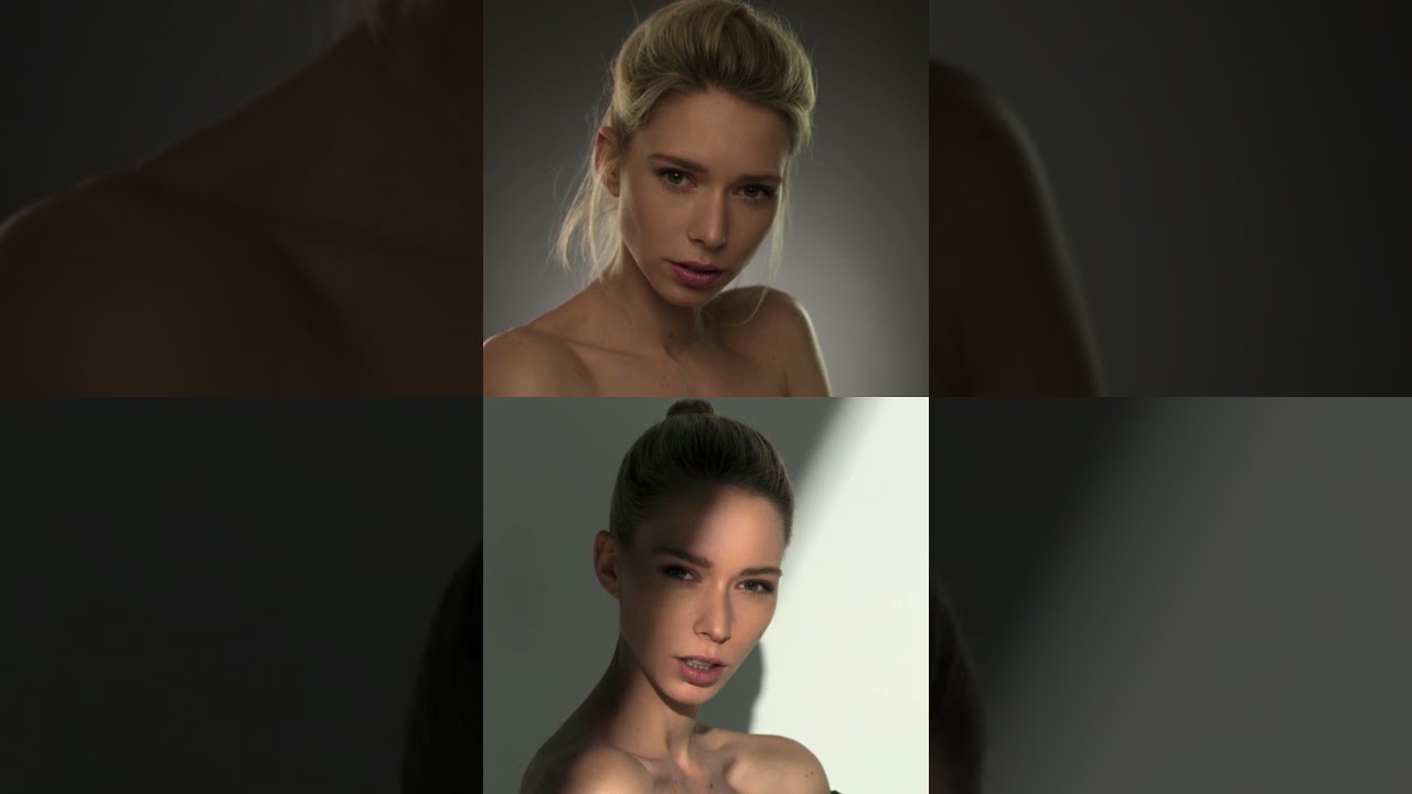
So when I came across this Visual Education tutorial, it hit differently than most lighting videos. Watch the full tutorial on YouTube and you’ll see immediately what caught my attention: two portraits of the same model, Deborah Frey, sitting side by side. Same person, same pose, same camera angle, nearly the same facial expression. And yet the two images feel like they were shot for completely different brands, different eras, maybe even different photographers. The variable that created that gap was light. Only light.
Why “Same Pose, Different Mood” Is a Real Professional Skill
Most lighting tutorials teach you how to build a setup. This one teaches you something harder: how to make a deliberate emotional choice with light, and then execute it cleanly.
The core argument in this tutorial is straightforward but easy to underestimate. Lighting is not just about exposure or technical correctness. It is about the story the shadow tells. A hard, directional source with strong contrast reads as dramatic, edgy, or high-fashion. A soft, wrapped, diffused source reads as approachable, commercial, or warm. Neither is better. Both are tools. The photographer’s job is to pick the right one before the model even sits down.
What makes the side-by-side format so effective as a teaching device is that it removes all the other variables. You cannot blame the model’s energy or the wardrobe or the retouching. The light is doing the work, and you can see it doing the work in real time.
Breaking Down the Two Setups
The tutorial contrasts two distinct lighting approaches on the same subject.
The first setup uses a softer, broader light source. The shadows fall gently, the transition from highlight to shadow is gradual, and the image has an overall sense of openness and warmth. This kind of wrap comes from a large modifier placed close to the subject. When I work this way in my own studio, I am usually running a large octabox somewhere between three and four feet from the face, slightly above eye level and angled down maybe 20 to 30 degrees. The key is the proximity. Moving a large source closer does not just increase brightness, it widens the apparent size of the source relative to the subject, which is what actually softens the shadow edge.
The second setup pulls in harder contrast. The light source is effectively smaller or more distant, the shadows have a sharper edge, and the image takes on weight and mood. This is the setup that communicates tension, drama, fashion edge. Getting there often means switching to a smaller modifier, or simply moving your existing source further back. You can also flag a large source to restrict its coverage, which is a move I use often when I want controlled drama without committing to a full gear swap mid-shoot.
The tutorial makes the point clearly: these are not accidents. Every shadow edge is a choice. Every ratio between your key and fill is a creative decision, not a technical default.
Where I Would Push This Further
The technique as presented works beautifully in a controlled studio environment with neutral or dark backgrounds. Where I have found it gets complicated is when the client wants a lifestyle or environmental feel, meaning lighter backgrounds, more ambient interaction.
In those situations, the background itself starts contributing light that bounces back onto the subject and softens your shadows whether you want it to or not. I have been in situations where I built what I thought was a punchy, high-contrast key setup and then watched the contrast collapse the moment we moved in front of a white seamless with a backlight on it. The solution is either to manage your background exposure independently and keep it darker, or to push your key-to-fill ratio even harder to compensate for the fill the environment is adding. I keep notes on this in my lighting journal now, shoot by shoot, because it is easy to forget how much a bright background silently eats your contrast.
The Ratio Is the Mood
This is the single thing I want you to take away from this tutorial, and from my own trial and error behind it. The emotional register of a portrait is not set by the model’s expression alone. It is set by the ratio between your key light and your fill. That ratio determines how deep the shadows go, how much dimension lives in the face, and ultimately what the viewer feels when they look at the image. Control the ratio and you control the story.
If you want to see both setups demonstrated visually with the actual before-and-after comparison, do yourself the favor of watching the original breakdown: Watch the full tutorial on YouTube. The side-by-side alone is worth three minutes of your time.
Comments
Leave a Comment