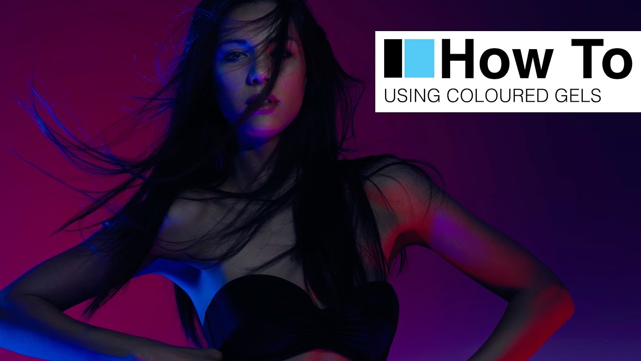
Every few months I’ll pull up a tutorial that makes me want to immediately rearrange my studio. This was one of those. In this Visual Education tutorial featuring photographer Carl Taylor, the entire approach flips the conventional logic of colored gel photography. Most photographers drop a gel on a background light and call it creative. Taylor builds a seven-light system where the gels are specifically designed to flood the shadows with color while clean white light handles the key and the face. The result is a saturated, high-fashion underwear shoot that looks more like a music video still than a standard studio portrait. Watch the full tutorial on YouTube
The reason this approach matters to me practically: I’ve spent years chasing color in studio work by adding gels to the main light. The problem is that gels on the key light fight with skin tones. You get muddy results unless you’re extremely precise with exposure, and even then the face reads as tinted rather than lit. Taylor’s method sidesteps that entirely. The key and face lights stay clean. Color lives in the shadows. The body becomes a canvas where the gels do the paintwork, and the face stays readable and sharp.
I sketched this setup into my lighting journal the same evening I watched it. What follows is how I’d walk a working photographer through replicating it.
Step 1: Plan Your Shadow Map Before You Touch a Light
 Seven lighting stands arranged across studio floor
Before a single light goes up, understand what you’re actually trying to do here. The whole system depends on knowing in advance where your shadows will fall on the body. Taylor uses this as the scaffolding for the entire design. The colored sources are not key lights, they are shadow fillers. If you don’t know where your shadows are landing, the gels have nowhere intentional to go. Rough out a diagram first. Decide which direction your key light is coming from, and mark where the body shadows will pool. Those shadow zones are your target.
Seven lighting stands arranged across studio floor
Before a single light goes up, understand what you’re actually trying to do here. The whole system depends on knowing in advance where your shadows will fall on the body. Taylor uses this as the scaffolding for the entire design. The colored sources are not key lights, they are shadow fillers. If you don’t know where your shadows are landing, the gels have nowhere intentional to go. Rough out a diagram first. Decide which direction your key light is coming from, and mark where the body shadows will pool. Those shadow zones are your target.
Step 2: Set a Tight, Clean Key Light for the Face
 Pico light with snoot and grid aimed at model’s face
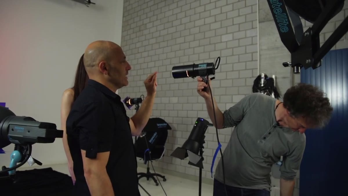
Taylor’s final key light choice is a Pico strobe with a snoot and an internal grid, mounted on a moveable stand. The snoot collapses the beam down to a narrow column of light, landing almost exclusively on the face. The grid tightens it further and cuts spill. This is important: the light should not be falling onto the chest or shoulders in any significant way. You want it clinical, specific, face-only. The reason you need someone to hand-hold or track this light during the shoot is that the model’s face position changes constantly, and a snooted source has almost no margin for drift. If your studio has an assistant, this is their primary job for the entire session.
Pico light with snoot and grid aimed at model’s face
Taylor’s final key light choice is a Pico strobe with a snoot and an internal grid, mounted on a moveable stand. The snoot collapses the beam down to a narrow column of light, landing almost exclusively on the face. The grid tightens it further and cuts spill. This is important: the light should not be falling onto the chest or shoulders in any significant way. You want it clinical, specific, face-only. The reason you need someone to hand-hold or track this light during the shoot is that the model’s face position changes constantly, and a snooted source has almost no margin for drift. If your studio has an assistant, this is their primary job for the entire session.
Step 3: Add a Broader Body Fill with a Gridded Beauty Dish
 Satellite Staro with grid positioned toward model’s body
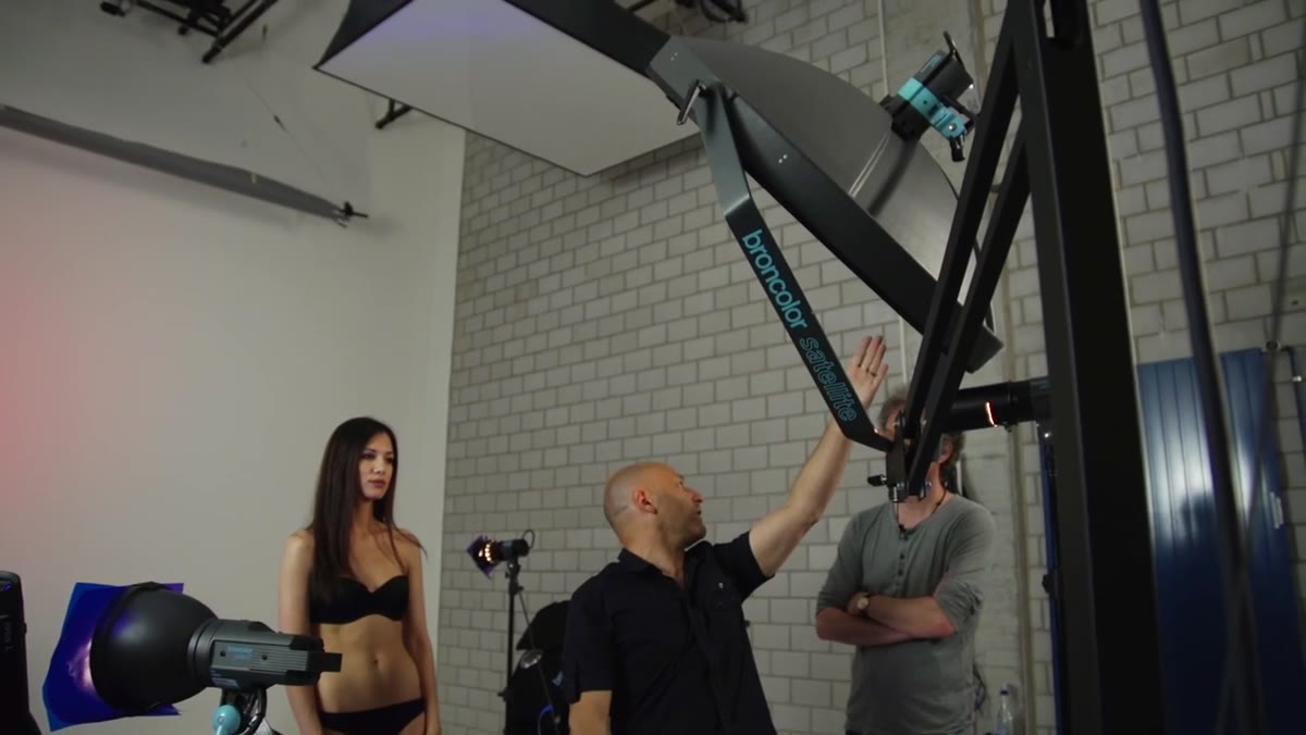
The second white-light source is a satellite Staro, which is a centrally-mounted dish modifier that sits between a true beauty dish and a softbox in its quality. Adding a grid to it keeps the spread controlled without going as narrow as the snoot. This light handles broad fill across the torso and creates the shadow structure that the gel lights will later color. Taylor notes that in testing, this source was initially too powerful as a key light, which is a calibration problem I’ve hit myself more times than I’d like to admit. Bring it down until it’s clearly subordinate to the face source. You want visible shadow fall-off across the body, not flat fill.
Satellite Staro with grid positioned toward model’s body
The second white-light source is a satellite Staro, which is a centrally-mounted dish modifier that sits between a true beauty dish and a softbox in its quality. Adding a grid to it keeps the spread controlled without going as narrow as the snoot. This light handles broad fill across the torso and creates the shadow structure that the gel lights will later color. Taylor notes that in testing, this source was initially too powerful as a key light, which is a calibration problem I’ve hit myself more times than I’d like to admit. Bring it down until it’s clearly subordinate to the face source. You want visible shadow fall-off across the body, not flat fill.
Step 4: Build the Colored Shadow Fill Using Bounced Gelled Lights
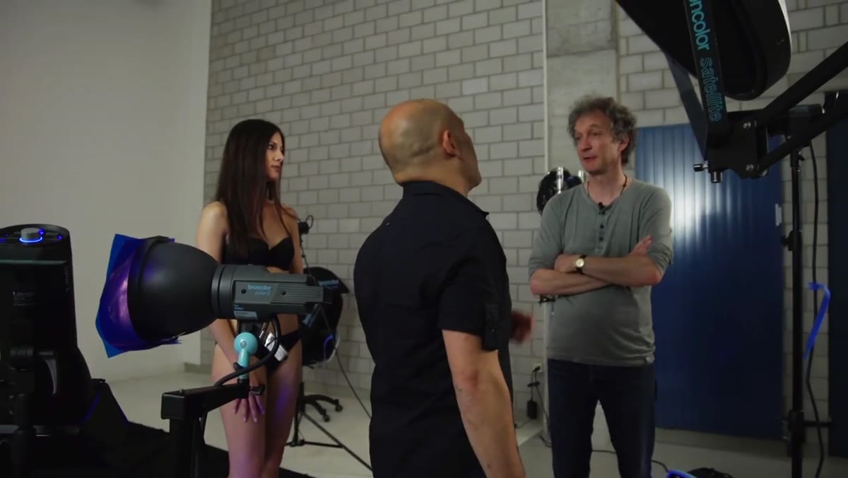 Blue gelled siros bouncing into silver reflector on floor
Here is where the setup earns its complexity. Taylor uses three separate colored lights, none of which point directly at the model. Each one fires into a silver reflector on the floor, and the reflected light wraps up and into the shadow areas on the body. Two of the sources carry blue gels, positioned to either side. A third carries a red gel. Bouncing through a silver reflector rather than hitting the subject directly gives the color a softer, more diffused quality. It also lets you control the intensity independently from each side. Silver reflectors are more specular than white, so the color reads with more punch. If you only have white foam core, the effect will be visibly softer. That may or may not suit your look.
Blue gelled siros bouncing into silver reflector on floor
Here is where the setup earns its complexity. Taylor uses three separate colored lights, none of which point directly at the model. Each one fires into a silver reflector on the floor, and the reflected light wraps up and into the shadow areas on the body. Two of the sources carry blue gels, positioned to either side. A third carries a red gel. Bouncing through a silver reflector rather than hitting the subject directly gives the color a softer, more diffused quality. It also lets you control the intensity independently from each side. Silver reflectors are more specular than white, so the color reads with more punch. If you only have white foam core, the effect will be visibly softer. That may or may not suit your look.
Step 5: Place Colored Background Lights to Blend on the Wall
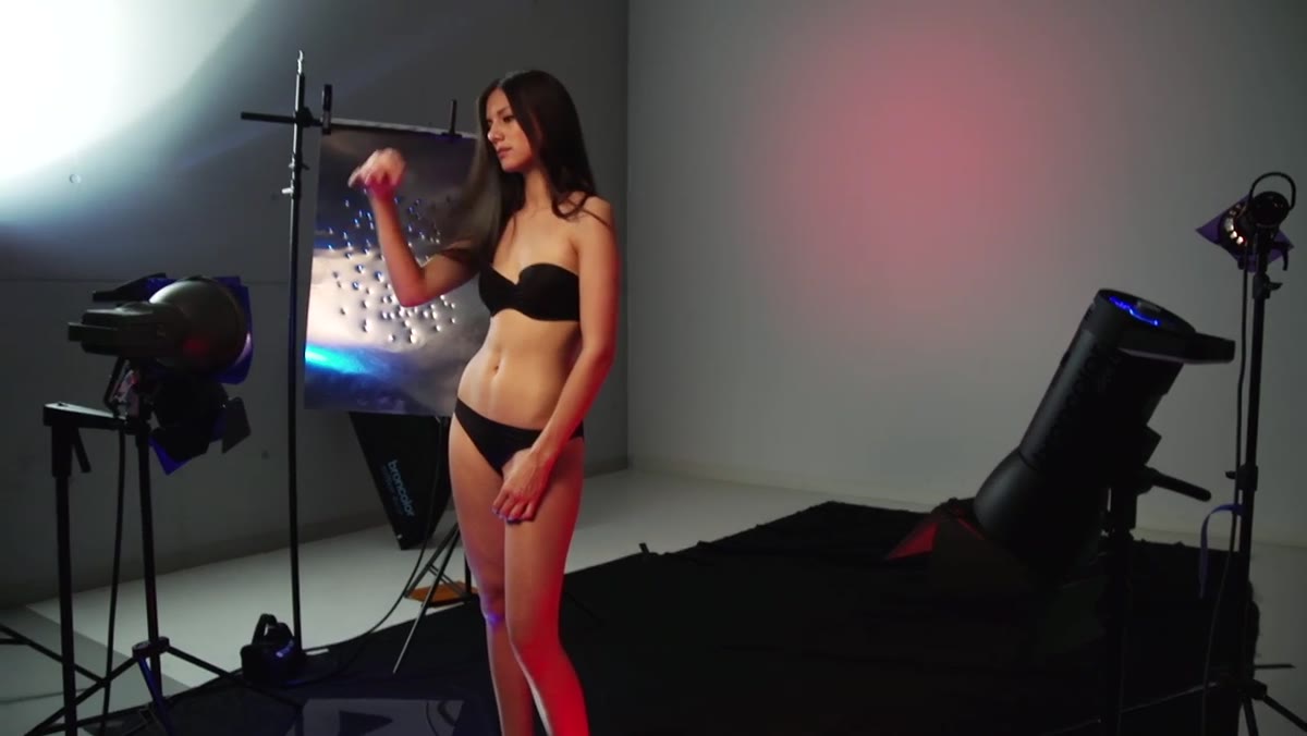 Red and purple gels illuminating background wall behind model
On the wall behind the model, Taylor adds two more gelled sources: one red, one purple. These are positioned to overlap slightly so the colors bleed into each other across the backdrop. The transition zone where they meet produces a gradient that reinforces the palette without requiring a printed or painted background. One thing worth noting: because blue and red light overlap to produce purple, the colors you’re throwing on the background will also echo in any area where your two main body-fill colors converge on the subject. That harmony is not accidental. It’s what keeps the whole image from looking chaotic.
Red and purple gels illuminating background wall behind model
On the wall behind the model, Taylor adds two more gelled sources: one red, one purple. These are positioned to overlap slightly so the colors bleed into each other across the backdrop. The transition zone where they meet produces a gradient that reinforces the palette without requiring a printed or painted background. One thing worth noting: because blue and red light overlap to produce purple, the colors you’re throwing on the background will also echo in any area where your two main body-fill colors converge on the subject. That harmony is not accidental. It’s what keeps the whole image from looking chaotic.
Step 6: Test, Lock Positions, and Track the Face Light During the Shoot
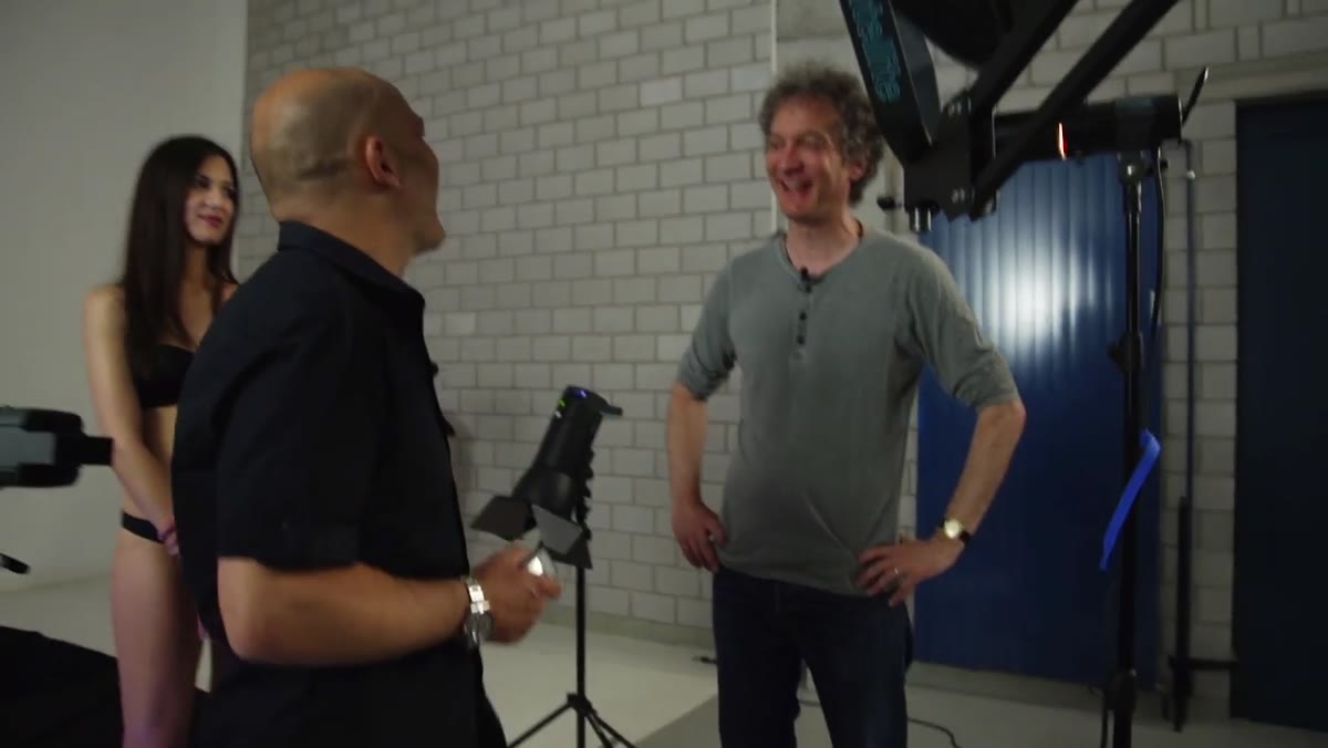 Assistant repositioning Pico light as model changes pose
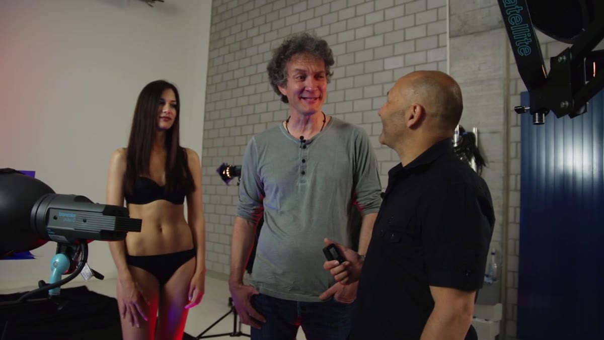
Taylor and his co-host agree before the shoot begins that the Pico light will be tracked by hand throughout. The model, Stenia, moves and turns freely while the assistant repositions the snoot to keep the beam on her face. This is a live choreography problem, not a set-it-and-forget-it solution. Before you fire a single frame, run the model through several test positions and practice moving the light with them. You will immediately discover how quickly the beam goes off-target. Mark the floor for rough position ranges if it helps. A wind machine on the hair adds movement without requiring additional lighting changes.
Assistant repositioning Pico light as model changes pose
Taylor and his co-host agree before the shoot begins that the Pico light will be tracked by hand throughout. The model, Stenia, moves and turns freely while the assistant repositions the snoot to keep the beam on her face. This is a live choreography problem, not a set-it-and-forget-it solution. Before you fire a single frame, run the model through several test positions and practice moving the light with them. You will immediately discover how quickly the beam goes off-target. Mark the floor for rough position ranges if it helps. A wind machine on the hair adds movement without requiring additional lighting changes.
What I’d Do Differently in My Own Studio
Seven lights is a significant investment in setup time, and I’d be lying if I said my first instinct wasn’t to simplify. If you’re running this with fewer sources, I’d consolidate to two gel positions (one blue each side) and drop the third colored body fill. You lose some of the red warmth in the deepest shadows, but the image stays coherent. The background lights are non-negotiable for me: without them, the backdrop reads as flat and the subject floats without context. The one thing I’d add that Taylor doesn’t mention is a test frame specifically to check where your gel colors are falling relative to the shadow map you drew in Step 1. Gel light in the wrong place looks like a mistake, not a choice.
The most important principle in this entire setup: color belongs in the shadows, not on the face. Once you commit to that, the rest of the lighting logic follows naturally, and the images stop looking like a gel was thrown on at the end as an afterthought.
Watch the full tutorial on YouTube to see the complete setup, the shoot in progress, and the final results.
Comments (3)
Just used this on a wedding shoot edit. Client was thrilled.
Simple but effective. Sometimes that's all you need.
Couldn't agree more. I've seen this make a huge difference in color grading work specifically.
Leave a Comment