Posing is the part of studio work I underestimated the longest. I spent years obsessing over light ratios, modifier choices, and color calibration, and then I’d get a family or a new mother in front of my camera and suddenly everything I’d built felt wobbly. The light was right. The exposure was right. The image still didn’t land. What I was missing wasn’t technical. It was structural. I didn’t have a posing framework. I had habits.
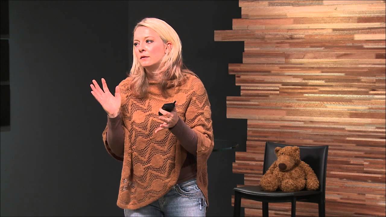
In this CreativeLive tutorial, Julia Kelleher lays out a posing system that is genuinely practical, built around six foundational concepts: lens choice, compression, camera angle, foreshortening, focal plane, and what she calls the rule of offset heads. Watch the full tutorial on YouTube before or after reading this, because seeing her work through these ideas with real subjects makes everything sharper. What I want to do here is break each concept down the way I wish someone had explained it to me early in my commercial work.
One thing she says at the start stuck with me: posing doesn’t have to be perfect, it has to elicit connection and avoid distraction. That’s the right hierarchy. When I’m shooting for a beauty brand versus shooting a family portrait, the priority is the same. Nothing in the frame should make the viewer’s eye snag on something uncomfortable. Posing is about removing friction between the viewer and the subject.
Step 1: Choose Your Lens Intentionally
 Side-by-side comparison of 85mm versus 50mm lens compression on same subject
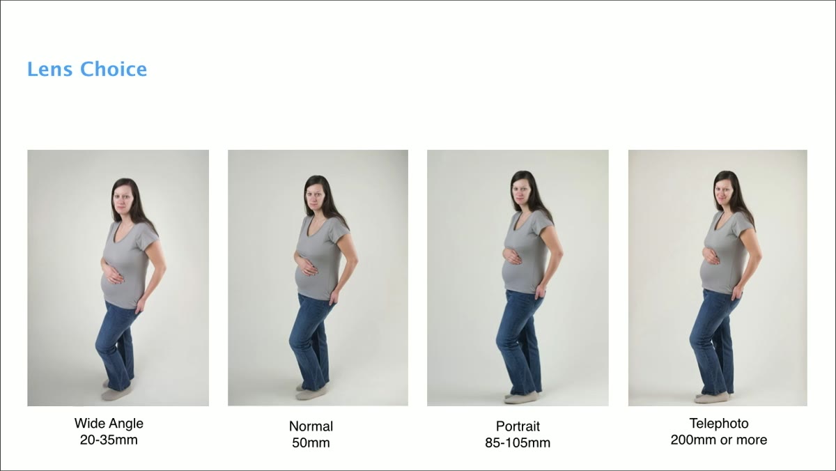
Lens choice is not a neutral decision. Kelleher demonstrates this with a clear side-by-side showing how an 85mm lens flatters a subject’s proportions compared to a 50mm. The subject didn’t move. The lens changed. On the 85mm, the hips read narrower, the shoulders read better, the overall shape is more proportional. This is compression at work.
Side-by-side comparison of 85mm versus 50mm lens compression on same subject
Lens choice is not a neutral decision. Kelleher demonstrates this with a clear side-by-side showing how an 85mm lens flatters a subject’s proportions compared to a 50mm. The subject didn’t move. The lens changed. On the 85mm, the hips read narrower, the shoulders read better, the overall shape is more proportional. This is compression at work.
The further you are from your subject with a longer focal length, the more the camera compresses depth. Things don’t balloon toward the viewer the way they do with wider glass. For studio portrait work, I default to 85mm or 105mm for exactly this reason. If you’re reaching for a 35mm to shoot a baby or a family, understand what you’re trading. Wide lenses distort, and distortion is rarely flattering unless you are using it deliberately for a specific effect.
Step 2: Understand What Compression Actually Does to a Body
 Closer crop showing nose distortion with wide-angle proximity
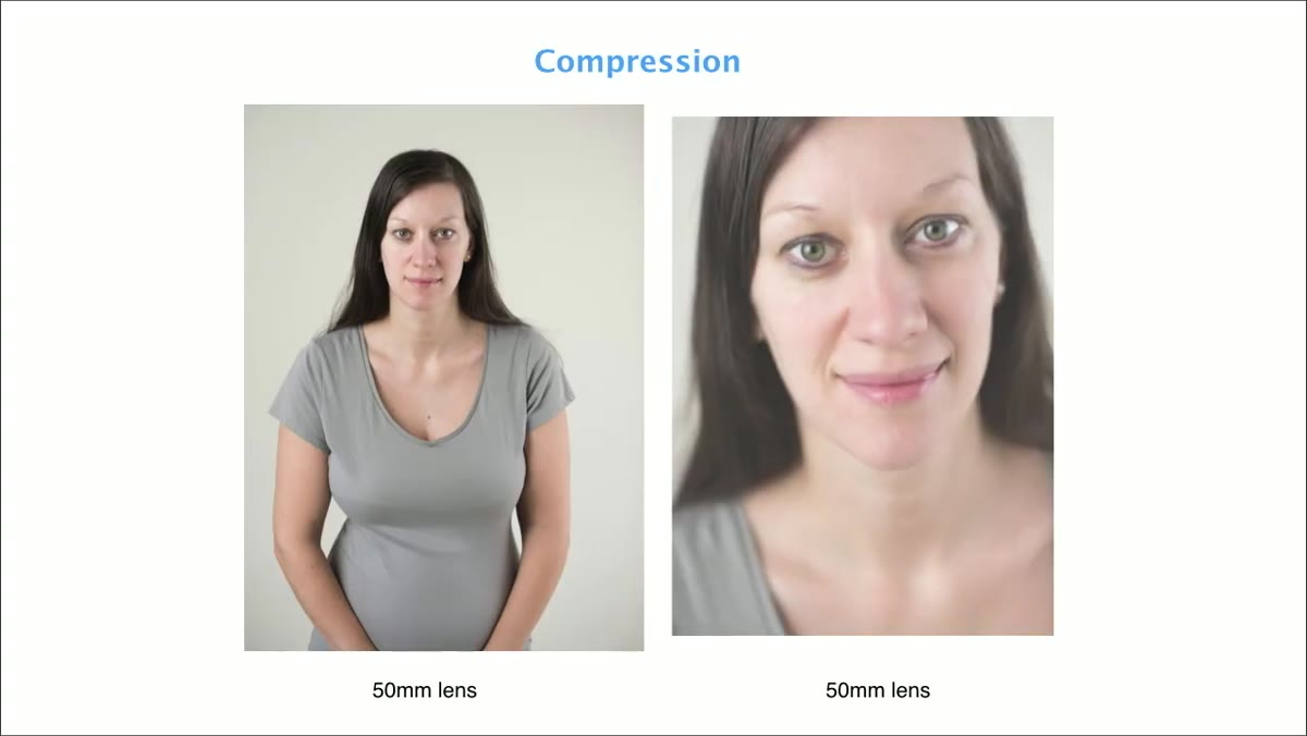
Compression is not just about focal length. It is about the relationship between your lens and your distance from the subject. Get close to someone with a wide-angle lens and anything nearest to the camera will look larger. Kelleher notes this can be used intentionally, for example in boudoir work where certain proportions are meant to be emphasized. But in most portrait contexts, especially with new mothers, it works against you.
Closer crop showing nose distortion with wide-angle proximity
Compression is not just about focal length. It is about the relationship between your lens and your distance from the subject. Get close to someone with a wide-angle lens and anything nearest to the camera will look larger. Kelleher notes this can be used intentionally, for example in boudoir work where certain proportions are meant to be emphasized. But in most portrait contexts, especially with new mothers, it works against you.
The practical rule: anything close to the camera looks big. So if you are crouched low and shooting up at a seated subject, their feet and knees are suddenly dominating the frame. Build the habit of thinking about what is physically closest to your lens before you fire a single frame.
Step 3: Control Camera Angle to Shape Perception of the Body
 Photographer on stool shooting slightly downward at subject
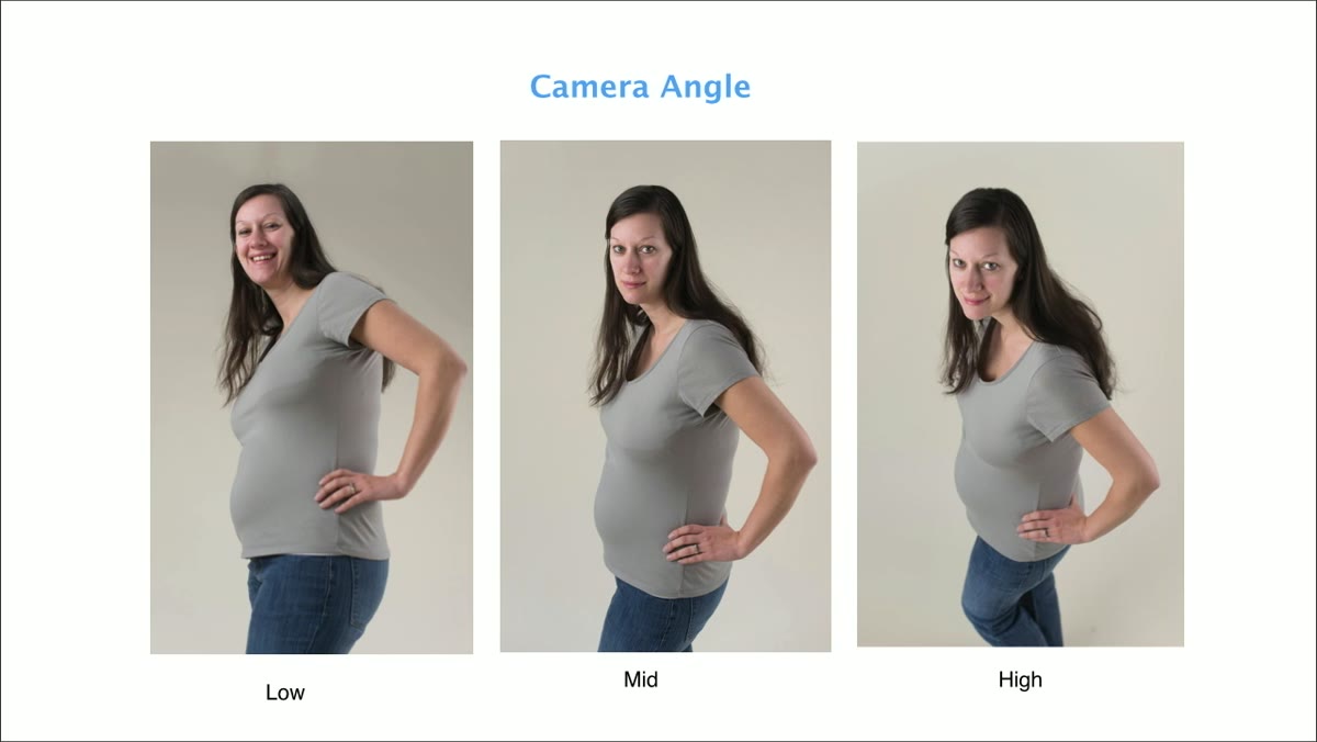
Camera angle is the single most consistently misused variable I see in portrait work, and Kelleher names it directly. Shooting from slightly above the subject, with the camera angled down, brings the face and chest closer to the lens. That makes those features read larger, which reads as more feminine in conventional portrait aesthetics. The hips, being further from the camera, read smaller.
Photographer on stool shooting slightly downward at subject
Camera angle is the single most consistently misused variable I see in portrait work, and Kelleher names it directly. Shooting from slightly above the subject, with the camera angled down, brings the face and chest closer to the lens. That makes those features read larger, which reads as more feminine in conventional portrait aesthetics. The hips, being further from the camera, read smaller.
Kelleher works from a stool in her studio specifically for this reason. I added a similar step stool to my kit years ago for the same purpose, and it has quietly improved my family portrait work more than any light modifier I’ve tested since. The change in angle is subtle, maybe 18 to 24 inches of height difference, but the effect on how a subject’s body reads in the final image is not subtle at all.
Step 4: Recognize and Correct Foreshortening
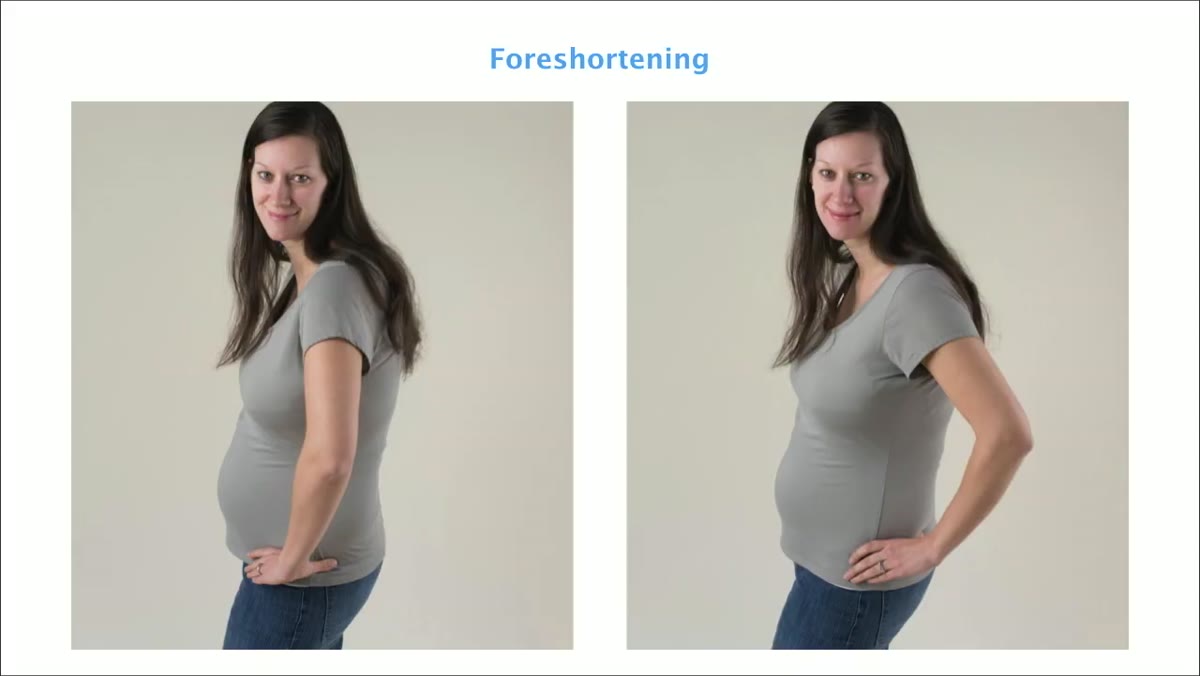 Elbow pointed directly at camera creating foreshortening effect
Foreshortening happens when a limb or body part is aimed directly at the lens. An elbow pointed toward the camera looks like almost nothing, just a small rounded shape floating at the edge of the frame. The arm appears to vanish. As soon as you rotate the subject so the arm travels across the frame instead of toward it, the full line of the limb is visible and the pose reads correctly.
Elbow pointed directly at camera creating foreshortening effect
Foreshortening happens when a limb or body part is aimed directly at the lens. An elbow pointed toward the camera looks like almost nothing, just a small rounded shape floating at the edge of the frame. The arm appears to vanish. As soon as you rotate the subject so the arm travels across the frame instead of toward it, the full line of the limb is visible and the pose reads correctly.
This is worth walking around your subject to check, especially when you’re shooting at a wide aperture and don’t have much depth to hide mistakes. Foreshortening shows up most on arms, legs, and feet. In commercial and editorial work, I’ve had to reshoot frames that looked fine in the moment but turned up foreshortened limbs during editing. Train yourself to check from your camera position before you shoot, not after.
Step 5: Manage Your Focal Plane With Groups
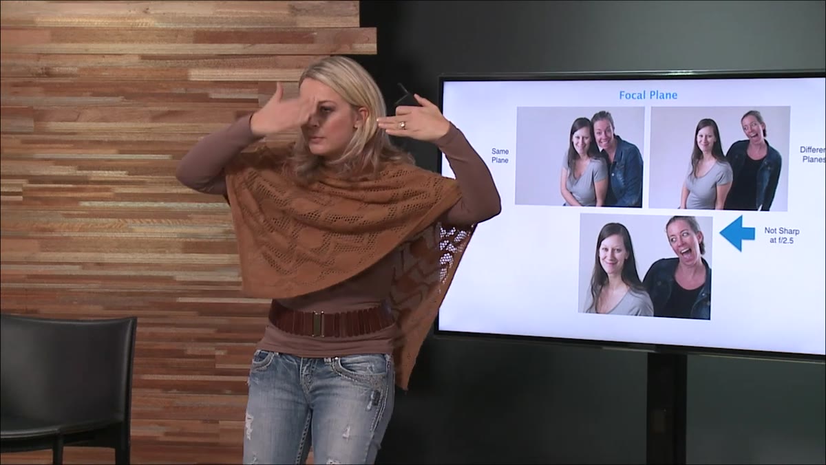 Two subjects at different depths demonstrating focal plane blur
When you shoot a group wide open, everyone needs to occupy roughly the same plane of focus. Kelleher demonstrates this with two subjects, one positioned just slightly behind the other, shot at f/2.5. The subject in front is sharp. The one even a foot further back is noticeably soft. At screen size it looks passable. Print it large and it’s a problem.
Two subjects at different depths demonstrating focal plane blur
When you shoot a group wide open, everyone needs to occupy roughly the same plane of focus. Kelleher demonstrates this with two subjects, one positioned just slightly behind the other, shot at f/2.5. The subject in front is sharp. The one even a foot further back is noticeably soft. At screen size it looks passable. Print it large and it’s a problem.
For families I typically work at f/4 to f/4.5 to give myself a workable depth of field. For solo subjects or newborns on a beanbag I’ll drop to f/1.6 or f/2 depending on the effect I want. The discipline is in arrangement: get everyone’s faces on the same focal plane before you think about anything else. Tilt heads, adjust spacing, and check your depth before you start worrying about expressions.
Step 6: Use the Rule of Offset Heads to Build Dynamic Groups
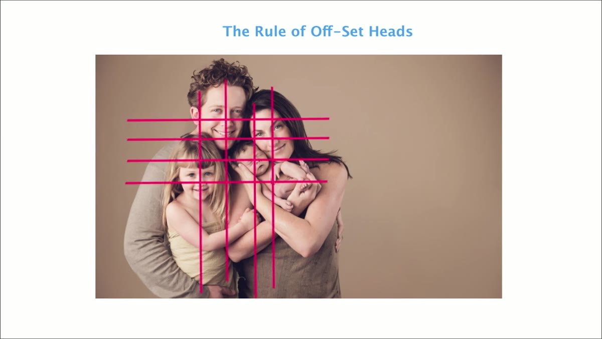 Group arrangement with heads positioned at varied triangle points
Kelleher’s rule of offset heads is straightforward: no two heads should sit on the same horizontal or vertical line within the frame. If you map out the positions of everyone’s noses, they should form a triangle or an irregular cluster, never a straight row. Heads stacked directly on top of one another or side by side at identical heights flatten the composition and make the image feel static.
Group arrangement with heads positioned at varied triangle points
Kelleher’s rule of offset heads is straightforward: no two heads should sit on the same horizontal or vertical line within the frame. If you map out the positions of everyone’s noses, they should form a triangle or an irregular cluster, never a straight row. Heads stacked directly on top of one another or side by side at identical heights flatten the composition and make the image feel static.
Think of it as triangulation. Any triangle shape works. What you want to avoid is any two noses landing on the same axis. This single principle, applied consistently, will do more for your group portrait compositions than most other posing advice I’ve encountered. It forces visual movement through the frame without requiring you to pose anyone dramatically differently.
What I’d Add From My Own Studio Work
Kelleher’s framework is clean and teachable, but I want to add one layer she doesn’t dig into here: these rules interact with each other, and sometimes they conflict. A flattering camera angle might put two subjects on slightly different focal planes. A tight triangle of heads might require one subject to foreshorten an arm. When that happens, the hierarchy matters. Focal plane first, always. An out-of-focus face in a group portrait is a fatal flaw. A slightly foreshortened elbow is a detail. Know which problems are structural and which ones you can fix in how you direct a pose or hide with a crop.
The most useful thing I did after working through this framework was to sketch a few of these principles in my lighting journal alongside my setup diagrams. Posing and lighting are not separate problems. How you pose a subject determines where shadows fall, how the light wraps the face, and whether your key light even reaches the right places. Treating them as one system is the shift that made my editorial work more consistent.
The core takeaway is this: posing is a technical discipline, not a feel. It has variables you can name, settings you can adjust, and mistakes you can learn to see before you fire the shutter. That’s what makes Kelleher’s approach worth studying.
Watch the full tutorial on YouTube to see these concepts demonstrated on real subjects in real time.
Comments
Leave a Comment