I keep a lighting journal. Every setup from every shoot gets a rough sketch with annotated distances, power settings, and modifier choices. I started it years ago after a disastrous editorial job where my background light was running 400K warmer than my key, and I didn’t catch it until the files hit my screen at 11pm. The client noticed before I could fix it in post. That journal now has over two hundred entries, and I’d say at least sixty of them involve gels in some form. Not because I’m chasing trendy looks, but because once you understand what gels actually do to light, you can’t unsee the problem they solve.
The Difference Between “Colored Light” and Controlled Color
Most photographers think of gels as a creative tool you pull out when you want a moody purple background or a punchy cyan rim. That’s a small part of the picture. Gels are fundamentally a color temperature management system, and treating them only as an aesthetic choice is like using a light meter only for dramatic effect.
When you shoot in a mixed-light environment, your strobes are sitting at roughly 5500K. Practical lamps, fluorescent overheads, or tungsten fixtures in the same frame might be sitting anywhere between 2700K and 5000K. Your camera’s white balance can only be set to one value. So you’re either sacrificing the accuracy of one light source or the other. Gels let you bring your strobe into agreement with the ambient. A CTO (color temperature orange) gel warms your strobe down toward tungsten. A CTB (color temperature blue) pushes it cooler. This isn’t creativity, it’s calibration.
The Gel Types Worth Keeping in Your Kit
I label every light in my studio with masking tape. The labels include the last gel color used on that head, which sounds obsessive until you’re forty-five minutes into a fashion shoot and your assistant asks which head had the quarter CTO. You want to know immediately.
Here’s what I actually stock and reach for:
Full CTO and half CTO are non-negotiable for any location work. When I’m shooting corporate portraits in conference rooms with overhead fluorescents, I’ll put a half CTO on my key, set my white balance to tungsten, and everything lands in the same color universe.
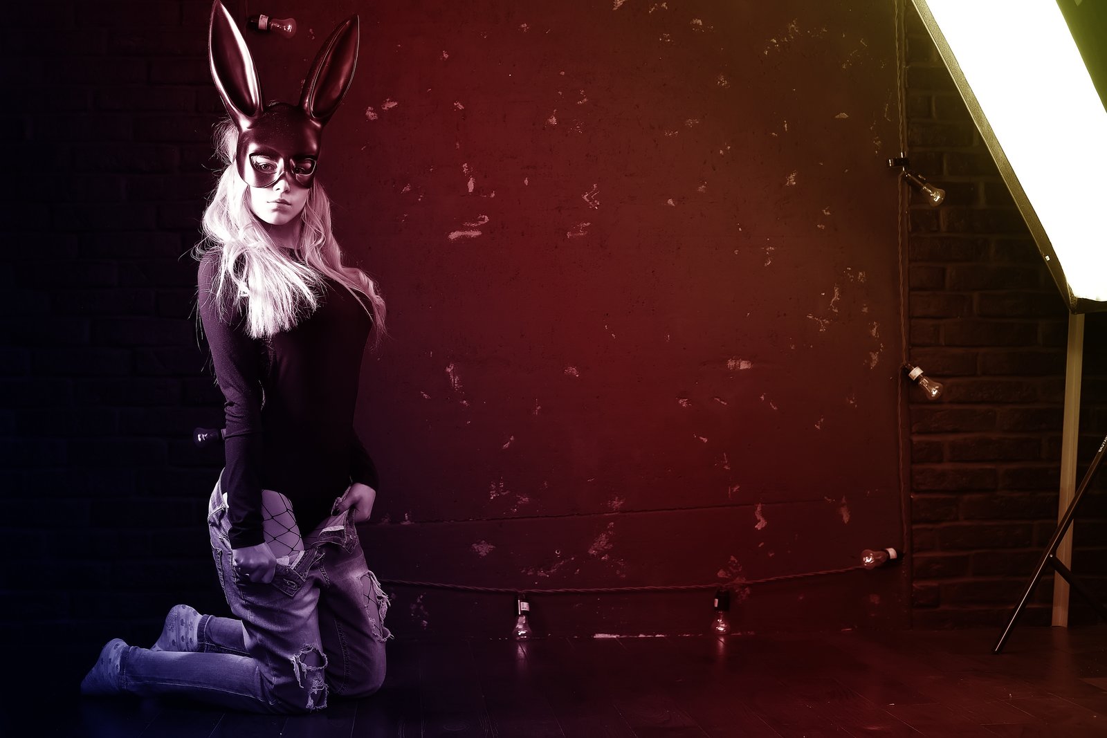
Primary colors, specifically Rosco and Lee brand gels, are what I use for creative background separation. Rosco 27 (Medium Red) and Rosco 80 (Primary Blue) are workhorses. A single gridded strobe at about 1/4 power with a Rosco 80 behind a subject on a white seamless will drop a clean, saturated blue field without bleeding color onto the subject, provided your ratios are correct.
Diffusion gels are underused. A quarter or half CTS (color temperature straw) on a rim light adds warmth that reads as golden hour even in a windowless studio. I’ve used this on beauty campaigns where the art director wanted “warm afternoon light” in December in Los Angeles.
A basic gel kit from Rosco or Lee runs between $30 and $80 for a sample swatch book, which is honestly all you need to start. Full sheets run $8 to $15 each and last years if you’re not leaving them on a hot modeling lamp.
How to Set Ratios When You’re Mixing Gel Colors
This is where most setups fall apart. Photographers dial in a great exposure for their subject and then just throw power at the gelled background light until it “looks right” on the back of the camera. That’s a recipe for inconsistency.
My process is sequential. I expose for the subject first, lock that in, then meter the background light separately. For a colored background to read with saturation, it needs to be at least one stop over the key exposure at the background surface. Two stops over gives you a deep, rich color. One stop under and the color looks muddy, especially with warmer hues.
If I’m using a Rosco 26 (Light Red) on a background strobe, I want my incident meter reading at the seamless to be at least f/8 when my subject exposure is f/5.6. I also close the barn doors or use a grid on that background head to keep colored light off the back of my subject’s shoulders, which is the first place contamination shows up and the last place people think to check.
The White Balance Decision That Changes Everything
Here’s the thing nobody tells you clearly: your in-camera white balance setting determines the entire feel of the final image when gels are involved, not just the neutrals.
If I’m using a Rosco 80 (Primary Blue) background light and I set my white balance to 5500K (daylight), the blue reads as a saturated, electric blue. If I shift that white balance warmer, to 7500K, that same gel reads as a softer, almost violet tone. The gel didn’t change. The light didn’t change. The white balance interpretation did.
I shoot tethered into Capture One on almost every studio job. I’ll do a white balance test frame before locking any gel setup, and I’ll pull it into the color wheel immediately to see how the hue is actually landing. What I see on a calibrated monitor at the shoot is what I’ll be looking at in retouching. This keeps me from making decisions on a camera LCD that I’ll regret at a workstation.
Starting With One Gel and Working Outward
If you’re new to this, don’t build a six-light gel setup for your first experiment. Put a single gridded strobe with a Rosco 26 or Rosco 80 behind your subject, pointed at your background. Set it two stops over your subject exposure. Shoot tethered if you can. Study how the color falls off at the edges, how it hits the seamless versus the floor, and what happens when you move the light closer or further from the background surface. Distance is a dial as much as power is.
Everything I know about gels came from treating each new piece of material the same way I treat any new modifier: I put it on a light the day it arrives and I run through its full range before it ever touches a paying job. The journal entry from that session is usually worth more than whatever I spent on the gel.
Comments
Leave a Comment