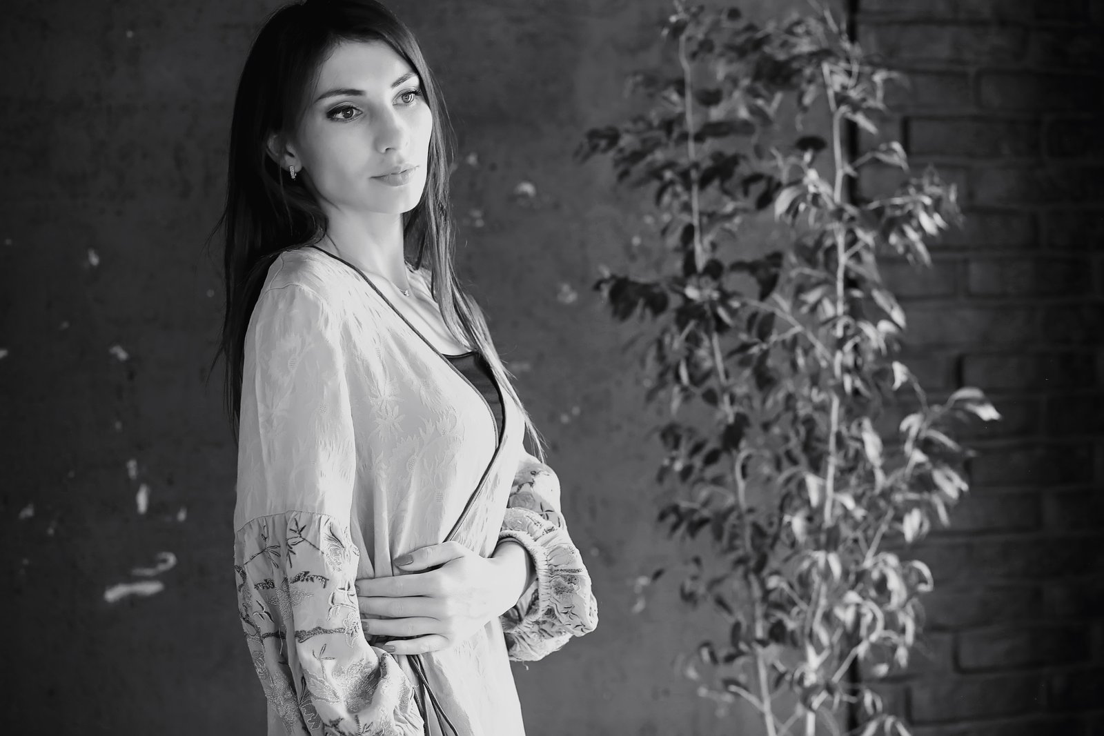
I had a fashion client last spring who kept describing the look she wanted as “editorial but with energy.” She showed me a mood board full of images that had one thing in common: none of them were lit with white light. Every single reference had at least one colored source in it, some subtle, some aggressive. I pulled two Lee filters from my gel kit, taped them to a pair of Godox AD600s, and within twenty minutes we had the shot. The client was thrilled. What she didn’t know is that I almost skipped gels entirely that morning because I was running behind.
That would have been a mistake. Gels are not a stylistic flourish you add when you feel like being creative. They are a precision tool for controlling the emotional temperature of an image, and understanding how to use them methodically separates photographers who get called back from photographers who get replaced.
What a Gel Actually Does to Your Light
A gel is a polyester sheet treated with colorfast dyes. When you place one over a strobe or continuous light, it filters the output by absorbing wavelengths outside its color range. A CTO (Color Temperature Orange) gel shifts your strobe from roughly 5600K down toward 3200K, mimicking tungsten. A CTB (Color Temperature Blue) does the opposite. Creative gels, the ones we’re talking about here, go further: deep reds, magentas, greens, cyan. They don’t just shift color temperature, they add color.
The important distinction is between additive and subtractive effects. When you gel one light and leave another ungelled, your camera’s white balance can only “correct” for one source at a time. The other becomes a color cast. That tension is exactly what creates visual interest. It’s physics, not magic, and once you understand that, you can engineer it deliberately.
Building a Gel Kit Worth Using
You do not need to spend a lot of money here, but you do need to buy from reliable sources. I keep two sets in the studio: a full Lee Filters swatch book (around $15, available from B&H or Adorama) for sampling and experimentation, and pre-cut gel sheets in my most-used colors from Rosco. The Rosco Strobist Collection runs about $25 for a pack of 20 labeled sheets sized for small flashes, and they hold up better under repeated heat cycles than cheaper alternatives I’ve tried.
For larger modifiers, I buy full 20x24-inch sheets from Rosco or Lee directly, at roughly $8-12 per sheet, and cut them to fit. I use gaffer tape to secure them, never scotch tape, which leaves residue on the modifier. I label every gel with a strip of masking tape on the corner so I know exactly what color I’m grabbing when I’m moving fast on set.
My most-used creative gels: Rosco #27 Medium Red, Rosco #71 Sea Green, Rosco #343 Deep Lavender, and Lee #119 Dark Blue. Those four colors can build almost any palette I need.
The Two-Light Gel Workflow That Actually Works
The setup I return to most often is a split-tone approach: one key light with a creative gel, one fill or background light with a complementary or contrasting color. The ratio I start at is 3:1, key to fill. The gelled key sits at roughly 45 degrees to the subject, flagged to avoid spill. The second gel goes on a strip box aimed at the background or used as a rim light.
I set my camera to a manual white balance, usually 5600K as a neutral baseline, and then I shoot a test frame. If the key is a warm red at 5600K, it reads as a saturated red. If I drop the white balance to 3200K, the red pulls toward orange and anything lit by the ungelled ambient or fill shifts blue. Both decisions are valid, they just produce different results, and you should choose one intentionally before you fire a single shot at your subject.
Exposure: I meter the key light first with a Sekonic L-308X, set my aperture to get the subject reading at f/8, then adjust the fill or background light independently. I do not guess at this. Gel density absorbs light, often between half a stop and one and a half stops depending on the color, so you must re-meter after adding the gel.
A Shoot That Taught Me to Commit to the Color
A few years ago I was testing gels for a beauty editorial spec shoot. I put a deep magenta gel (Rosco #332 Special Lavender) on the key light and then, mid-shoot, started second-guessing it. I dialed the power down to soften the effect, added a second ungelled fill to “balance it out,” and ended up with images that looked murky and indecisive. The color wasn’t bold enough to read as intentional and wasn’t neutral enough to disappear.
I went back through my lighting journal that night, and I had a note from a shoot two years earlier that said almost the same thing: half-measures with gels look like accidents. The next morning I went back to the studio, turned off the fill entirely, cranked the magenta key back up, and let the shadow side of the face go dark. Those were the frames I ended up keeping.
Matching Gels to Skin Tones Without Guessing
Not every color works equally well on every subject, and this is where photographers get in trouble. Cool colors, blues and greens, can flatten warm skin tones and read as sickly if you are not adding a rim or hair light in a warmer color to separate the subject from the effect. Warm gels, ambers and reds, tend to be more forgiving across a range of complexions but can look muddy on very light skin without adequate contrast.
My baseline rule: if the gelled light is cool, I add a small ungelled kicker at the back at half the power of the key to restore some warmth at the edges. If the gelled light is warm, I watch the shadows carefully and make sure they are not filling with a competing color cast from a bounced wall or ceiling.
Gels reward photographers who are willing to test, measure, and commit. Use them deliberately, meter after every change, and trust what the data tells you over what you think you remember from the last shoot.
Comments (1)
The before and after really sells it. Incredible difference.
Leave a Comment