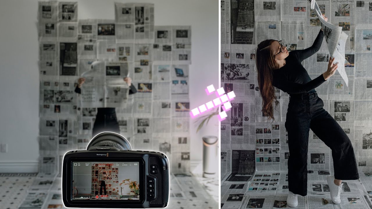
There is a particular kind of pressure that comes with a client who wants “something editorial” but has no budget for a location, no interest in renting a studio, and a two-day turnaround. I have been in that situation more times than I can count, and my default move has always been to fall back on what I can control: light and surface. What sits behind the subject matters almost as much as what falls on them, and when you cannot afford a seamless or a custom set build, you have to improvise. That is exactly the problem this tutorial addresses head-on.
In this Mango Street tutorial on transforming ordinary walls into creative backdrops, Rachel and Daniel demonstrate how to cover a wall and floor with newspaper to build a high-contrast, textured environment that reads as intentional rather than accidental. They add a projector and a prism on top of that foundation, which pushes the result from “resourceful” into “actually interesting.” I ran through this setup myself after watching, and what follows is a breakdown of each phase with the specifics you need to actually execute it.
Step 1: Commit to Full Coverage
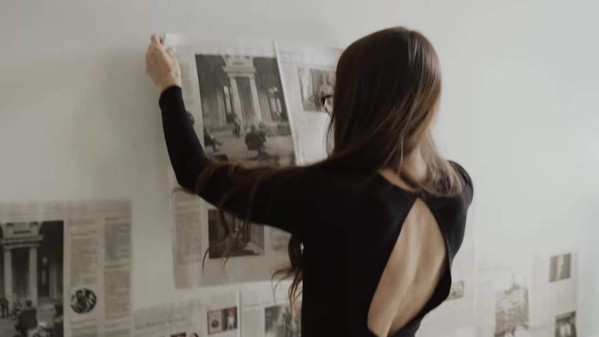 Wide shot of newspaper being taped across wall
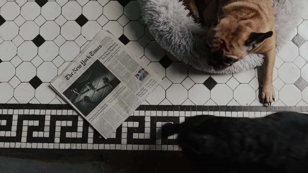
The instinct when covering a wall is to stop when it looks “mostly covered.” Resist that. Mango Street emphasizes shooting with a wide-angle lens, and a wide lens will find every gap. If you are working with a 35mm on a crop sensor, or a 24-28mm on full frame, you are going to see the corners, the floor transition, and the edges of your coverage zone. Tape newspaper across the entire shooting surface, including the floor out to at least four to five feet from the wall. Overlap your sheets by a few inches so the wall color does not bleed through the seams. Masking tape works on most painted walls without pulling the paint, but test a small patch first.
Wide shot of newspaper being taped across wall
The instinct when covering a wall is to stop when it looks “mostly covered.” Resist that. Mango Street emphasizes shooting with a wide-angle lens, and a wide lens will find every gap. If you are working with a 35mm on a crop sensor, or a 24-28mm on full frame, you are going to see the corners, the floor transition, and the edges of your coverage zone. Tape newspaper across the entire shooting surface, including the floor out to at least four to five feet from the wall. Overlap your sheets by a few inches so the wall color does not bleed through the seams. Masking tape works on most painted walls without pulling the paint, but test a small patch first.
Step 2: Choose a Lens That Shapes the Space
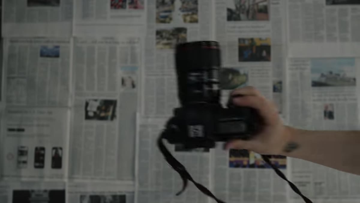 Camera and 35mm lens shown before shooting begins
The tutorial is shot entirely on a 35mm lens, and that choice is load-bearing, not incidental. A 35mm at moderate distance compresses the backdrop just enough to keep it readable while still giving the subject room to breathe within the frame. If you go wider than 24mm, the newspaper texture starts to distort at the edges and the room itself becomes the subject. If you go longer, say 85mm or beyond, you lose the environmental quality entirely and the backdrop just becomes a flat texture behind a portrait. For this technique, 35mm to 50mm is the functional range. Set your aperture between f/2.8 and f/4 if you want the backdrop to stay in focus alongside the subject. Stop down further and you lose the texture. Open up past f/2 and you lose the backdrop entirely.
Camera and 35mm lens shown before shooting begins
The tutorial is shot entirely on a 35mm lens, and that choice is load-bearing, not incidental. A 35mm at moderate distance compresses the backdrop just enough to keep it readable while still giving the subject room to breathe within the frame. If you go wider than 24mm, the newspaper texture starts to distort at the edges and the room itself becomes the subject. If you go longer, say 85mm or beyond, you lose the environmental quality entirely and the backdrop just becomes a flat texture behind a portrait. For this technique, 35mm to 50mm is the functional range. Set your aperture between f/2.8 and f/4 if you want the backdrop to stay in focus alongside the subject. Stop down further and you lose the texture. Open up past f/2 and you lose the backdrop entirely.
Step 3: Set Up Your Camera for Solo Shooting
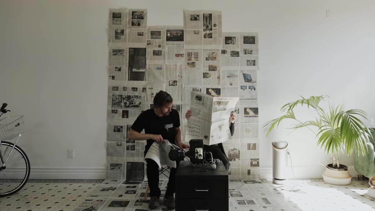 Camera mounted on tripod with self-timer or remote setup
Not everyone has a second shooter, and Mango Street is practical about this. A tripod is non-negotiable here because you will be firing the shutter remotely or on a delay while you step into the frame. Use your camera’s built-in interval timer or a dedicated remote app. Most mirrorless systems now have a companion phone app that allows live view and remote triggering, which is worth using because you can check framing without running back to the camera after every shot. Set a 2-second delay minimum to let any camera shake from pressing the shutter settle out. Manual focus on the spot where you will stand, use a stand-in object at that distance to confirm, then lock it.
Camera mounted on tripod with self-timer or remote setup
Not everyone has a second shooter, and Mango Street is practical about this. A tripod is non-negotiable here because you will be firing the shutter remotely or on a delay while you step into the frame. Use your camera’s built-in interval timer or a dedicated remote app. Most mirrorless systems now have a companion phone app that allows live view and remote triggering, which is worth using because you can check framing without running back to the camera after every shot. Set a 2-second delay minimum to let any camera shake from pressing the shutter settle out. Manual focus on the spot where you will stand, use a stand-in object at that distance to confirm, then lock it.
Step 4: Light the Scene Before You Introduce Effects
 Subject standing against newspaper-covered wall
The tutorial does not dwell on lighting specs, but I want to be direct about this: the backdrop only works if the light is clean. For this kind of high-contrast textured environment, a single large softbox or a bounced strobe at 45 degrees to the subject will hold detail in both the newspaper and the face without flattening everything. If you are working with natural light, position your subject so a window is at roughly 45 degrees to them. Avoid flat front lighting, it removes the texture from the newspaper and the whole effect collapses. The texture is the point. Let the light rake across it.
Subject standing against newspaper-covered wall
The tutorial does not dwell on lighting specs, but I want to be direct about this: the backdrop only works if the light is clean. For this kind of high-contrast textured environment, a single large softbox or a bounced strobe at 45 degrees to the subject will hold detail in both the newspaper and the face without flattening everything. If you are working with natural light, position your subject so a window is at roughly 45 degrees to them. Avoid flat front lighting, it removes the texture from the newspaper and the whole effect collapses. The texture is the point. Let the light rake across it.
Step 5: Project Text or Graphics Onto the Subject
 Projector casting words onto subject against newspaper wall
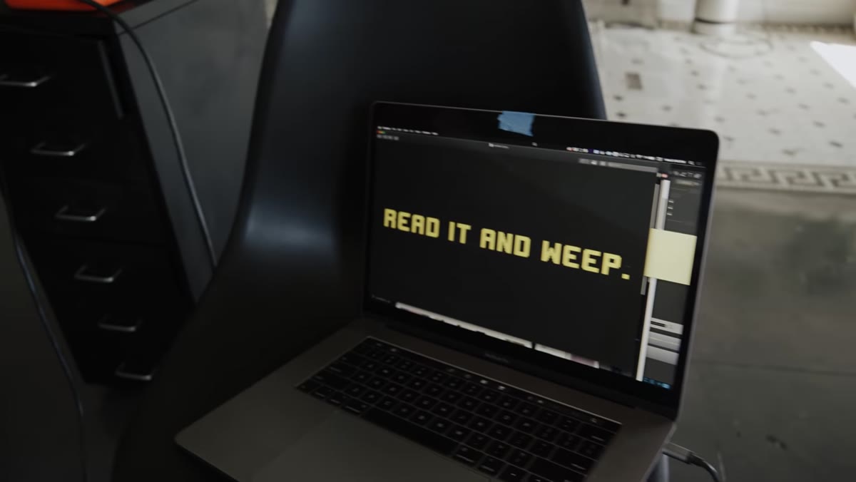
This is where the setup moves from DIY to deliberate. Mango Street uses a projector to cast text directly onto the subject. The mechanics are simple: dim the ambient light so the projection reads clearly, point the projector at your subject from roughly the same angle a key light would come from, and focus the projected image at the subject’s distance. What you project matters. Large bold type reads better in photos than fine detail. Words, numbers, or simple graphic shapes hold up at a range of exposures. Dial your ISO and shutter speed to balance the projection intensity with whatever ambient or strobe light you are using. This usually means shooting somewhere between ISO 400 and 1600 depending on your projector’s lumens output.
Projector casting words onto subject against newspaper wall
This is where the setup moves from DIY to deliberate. Mango Street uses a projector to cast text directly onto the subject. The mechanics are simple: dim the ambient light so the projection reads clearly, point the projector at your subject from roughly the same angle a key light would come from, and focus the projected image at the subject’s distance. What you project matters. Large bold type reads better in photos than fine detail. Words, numbers, or simple graphic shapes hold up at a range of exposures. Dial your ISO and shutter speed to balance the projection intensity with whatever ambient or strobe light you are using. This usually means shooting somewhere between ISO 400 and 1600 depending on your projector’s lumens output.
Step 6: Add a Prism for Lens Flare and Refraction
 Prism held in front of lens creating light refraction effect
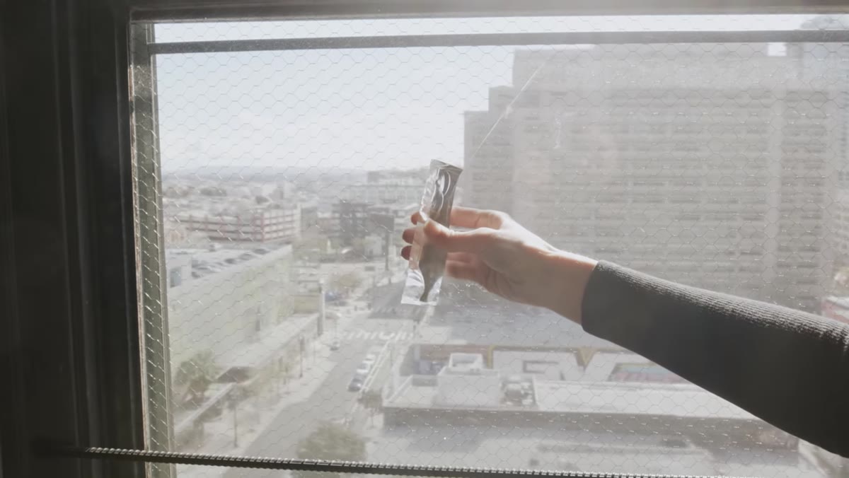
The final layer in the tutorial is a handheld prism placed in front of the lens. Hold it at the edge of the frame, partially obstructing the lens element, and rotate it until you see a refraction or flare in your live view. The effect is immediate and unpredictable, which is both its strength and its limitation. Shoot in bursts when you are experimenting with the prism because the sweet spot shifts constantly. Keep your shutter speed at 1/125 or faster so the slight hand movement does not blur the main subject. The prism does not need to be a photography-specific product. A cheap crystal prism from a craft store works.
Prism held in front of lens creating light refraction effect
The final layer in the tutorial is a handheld prism placed in front of the lens. Hold it at the edge of the frame, partially obstructing the lens element, and rotate it until you see a refraction or flare in your live view. The effect is immediate and unpredictable, which is both its strength and its limitation. Shoot in bursts when you are experimenting with the prism because the sweet spot shifts constantly. Keep your shutter speed at 1/125 or faster so the slight hand movement does not blur the main subject. The prism does not need to be a photography-specific product. A cheap crystal prism from a craft store works.
What I Would Do Differently in a Commercial Context
The Mango Street setup is genuinely effective as shown, but if I were bringing this into a paid shoot, I would add one thing: a hair light or a small rim light behind the subject. The newspaper backdrop has a lot of tonal information, and without separation, the subject can get absorbed into the texture, especially if they are wearing anything with a busy pattern. A small strobe with a grid, positioned behind the subject at roughly 45 degrees, gives you that edge definition. Keep it at about one stop below your key light so it reads as natural rather than theatrical.
I also keep a lighting journal where I sketch every setup I try, and this one is worth documenting properly because the projector angle changes the whole character of the image. A few degrees makes the difference between text that reads legibly on the subject and text that gets lost in shadow.
The most important thing this tutorial demonstrates is that a creative backdrop is a system, not a single element. Newspaper plus projection plus prism works because each layer adds information without competing with the others. Strip one out and the image still holds. Add all three and you get something that looks like it cost significantly more than the price of a newspaper.
Watch the full tutorial on YouTube to see the complete build from start to finish, including how Rachel moves within the space during the actual shoot.
Comments (2)
I tried this on a client project yesterday and the results were way better than expected.
I've been looking for exactly this kind of tutorial. Perfect timing.
Leave a Comment