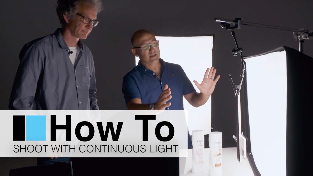
White products on white backgrounds. If you shoot e-commerce or commercial product work with any regularity, that sentence probably makes your eye twitch a little. It’s the kind of brief that sounds straightforward until you’re forty-five minutes into a shoot and your white bottle has completely dissolved into your white background. The edges are gone, the label looks flat, and the client is waiting.
I’ve been working through a lot of the broncolor LED material lately because I’ve been fielding more requests from smaller e-commerce clients who also want short video clips alongside their stills. That dual-use case is exactly what pushed me to take continuous LED lighting more seriously. In this Visual Education tutorial featuring Karl Taylor and Urs Recher, the two of them walk through a packshot setup using broncolor LED lights that is clean, logical, and solves the white-on-white problem without overcrowding the frame with modifiers. Watch the full tutorial on YouTube before or after reading this breakdown – both work.
What I appreciate about Karl’s approach here is that he thinks about lighting the way I try to: solve one problem at a time, and don’t add a light until you understand why you need it.
Step 1: Choose Continuous LED Over Flash for This Application
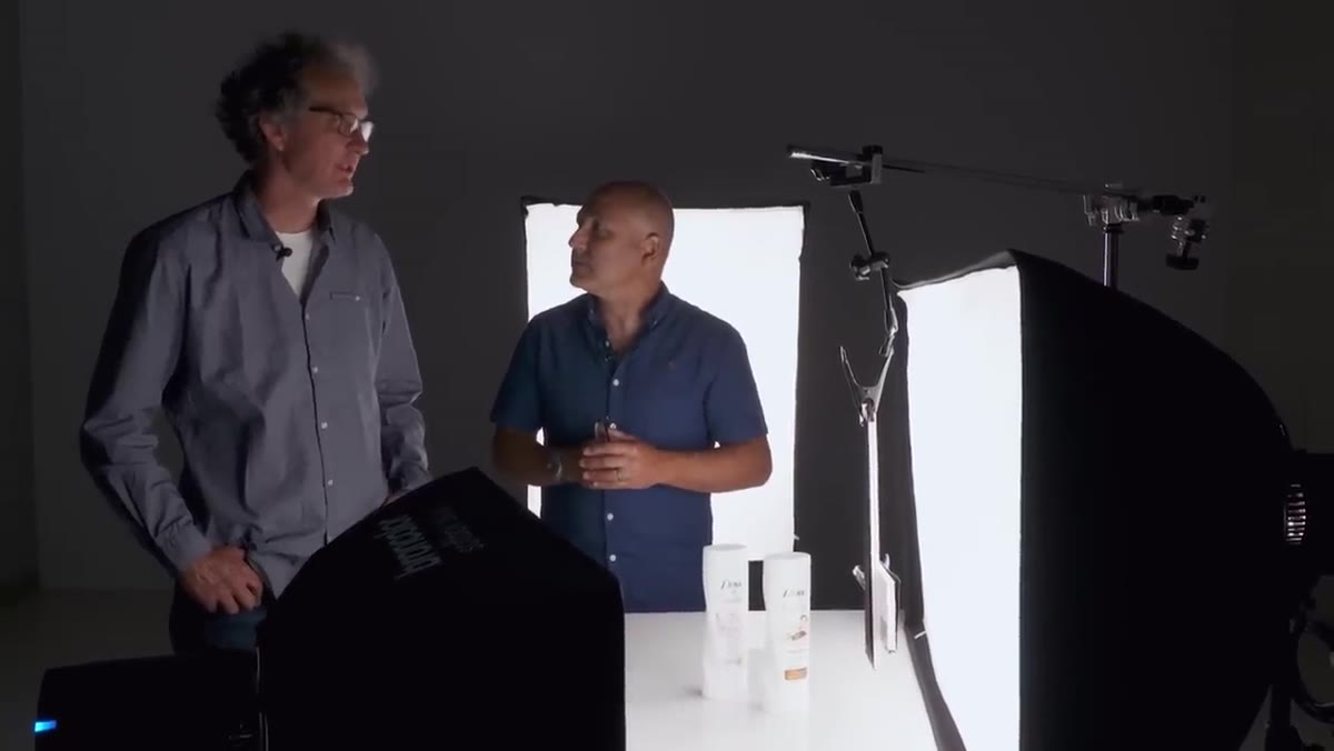
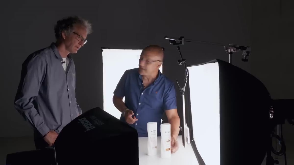
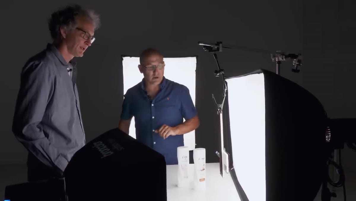
 Karl and Urs discussing broncolor LED lights in studio
The argument for continuous LED on a small packshot setup is more practical than philosophical. Flash gives you nothing to look at between shots – you are guessing at modifier placement and flagging positions until you chimney through enough frames. With continuous light, what you see with your eyes in the room is what registers on the sensor. That feedback loop speeds up the setup considerably, especially when you are dealing with reflective surfaces and transparent packaging where small shifts in light angle change everything.
Karl and Urs discussing broncolor LED lights in studio
The argument for continuous LED on a small packshot setup is more practical than philosophical. Flash gives you nothing to look at between shots – you are guessing at modifier placement and flagging positions until you chimney through enough frames. With continuous light, what you see with your eyes in the room is what registers on the sensor. That feedback loop speeds up the setup considerably, especially when you are dealing with reflective surfaces and transparent packaging where small shifts in light angle change everything.
The other reason matters for any studio that also shoots video: continuous light is continuous light. The same setup that photographs a skincare bottle well will also turn a 360-degree turntable spin into a polished video clip. For smaller e-commerce clients, that versatility justifies the investment.
Step 2: Set Color Temperature to 5600K
 broncolor LED panel showing color temperature controls
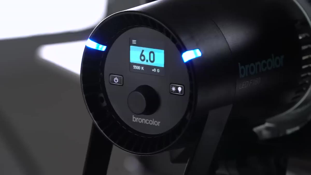
One of the persistent headaches with older continuous lighting – tungsten especially – was the color cast. You were correcting for 3200K constantly, either in-camera or in post, and mixed-light situations got messy fast. These broncolor LED panels run from 2800K all the way up to 6800K, which gives you the full range from candlelight warmth to cool overcast daylight.
broncolor LED panel showing color temperature controls
One of the persistent headaches with older continuous lighting – tungsten especially – was the color cast. You were correcting for 3200K constantly, either in-camera or in post, and mixed-light situations got messy fast. These broncolor LED panels run from 2800K all the way up to 6800K, which gives you the full range from candlelight warmth to cool overcast daylight.
For product work where accurate color rendering matters – cosmetics, food, anything with brand colors – set the panels to 5600K. That matches both daylight and studio flash, which means your white balance is consistent whether you’re shooting stills or video, and it matches what you’d get if you pulled daylight into the room. I set mine once at the start of a shoot and tape a small note on the back of each panel confirming it. Old habit.
Step 3: Use a Large Softbox as the Background
 90x120cm softbox positioned behind product as background
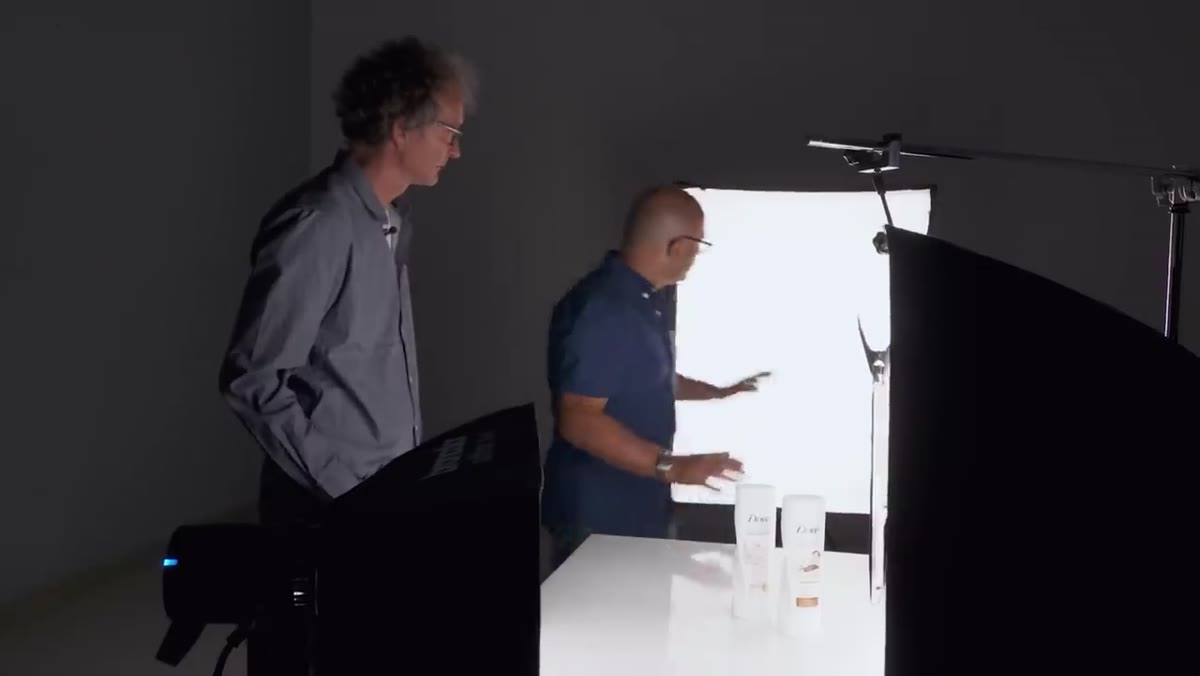
This is the move that makes the whole setup work, and it’s one I wish I had figured out earlier in my career. Instead of trying to light a white paper sweep or a white wall with a separate background light – which means juggling output ratios and evenness across a larger surface – Karl uses a 90 by 120 centimeter softbox face-on as the background itself.
90x120cm softbox positioned behind product as background
This is the move that makes the whole setup work, and it’s one I wish I had figured out earlier in my career. Instead of trying to light a white paper sweep or a white wall with a separate background light – which means juggling output ratios and evenness across a larger surface – Karl uses a 90 by 120 centimeter softbox face-on as the background itself.
The reason this works is that a quality softbox produces genuinely even, homogenous light across its entire face. Aim your camera at it from the front and you get a clean, pure white field with no hot spots or gradient falloff. For small product photography – bottles, jars, boxes – that softbox face is more than large enough to fill the frame behind the subject. It also means you can push it further back to increase or decrease how much it bleeds around the edges of the product without changing the output character of the light.
Step 4: Place the Main Key Light with a Horizontal Softbox
 6100 softbox positioned to side of white product bottle
The primary light on the product itself is a 6100 softbox oriented horizontally. The horizontal format is deliberate: it allows the softbox to wrap slightly behind the product, creating a subtle rim or backlight effect on the far edge while still delivering enough frontal coverage to illuminate the label and front face cleanly.
6100 softbox positioned to side of white product bottle
The primary light on the product itself is a 6100 softbox oriented horizontally. The horizontal format is deliberate: it allows the softbox to wrap slightly behind the product, creating a subtle rim or backlight effect on the far edge while still delivering enough frontal coverage to illuminate the label and front face cleanly.
Position it so the near edge of the softbox clears the product just enough to allow that backlighting. Too far back and you lose front detail. Too far forward and you flatten the form. I usually start with the softbox at roughly 45 degrees off the product axis and walk it back slowly until I see separation appear on the far edge.
Step 5: Add a Small Fill Softbox for Label Detail
 smaller 35x60cm softbox used as fill light on product
The secondary light in this setup is a 35 by 60 centimeter softbox, and its job is understated but important. It is not a glamour light. It is there to prevent the label from going muddy or underexposed as the main key light rakes across the product. Think of it as a shadow lifter, not a shaping light.
smaller 35x60cm softbox used as fill light on product
The secondary light in this setup is a 35 by 60 centimeter softbox, and its job is understated but important. It is not a glamour light. It is there to prevent the label from going muddy or underexposed as the main key light rakes across the product. Think of it as a shadow lifter, not a shaping light.
Keep the output lower than your key – probably one to two stops down depending on how much contrast you want on the form. Too much fill and you lose the three-dimensionality that makes the product look like a real object rather than a flat graphic.
Step 6: Flag the Near Edge with Black Velvet
 black velvet flag positioned beside white bottle to create edge shadow
Here is where white-on-white photography stops being a guessing game. A piece of black velvet positioned off to one side of the product – not touching it, but close – casts a shadow down the near edge of the bottle or jar. That shadow is your edge separation. Without it, the product and background merge and you lose the silhouette entirely.
black velvet flag positioned beside white bottle to create edge shadow
Here is where white-on-white photography stops being a guessing game. A piece of black velvet positioned off to one side of the product – not touching it, but close – casts a shadow down the near edge of the bottle or jar. That shadow is your edge separation. Without it, the product and background merge and you lose the silhouette entirely.
The height matters too. Karl raises the flag so it doesn’t cast shadow all the way to the bottom of the product. You want the lower portion of the label to stay open and lit so the text and branding read clearly. Raise or lower the flag until the shadow starts just above where your most important text lives.
What I’d Add From My Own Practice
I keep a lighting journal – nothing fancy, just a sketchbook where I draw out every setup from every commercial shoot with measurements and power ratios noted. The three-light LED packshot in this tutorial is one I’ve now sketched out and adapted a few times for transparent glass products where the background light bleeds through the subject in interesting ways.
One thing I’d test if you’re new to this configuration: shoot a frame with just the background softbox on, then just the key, then just the fill. Those three isolated frames tell you exactly what each light is contributing before you commit to the combined result. It slows you down by three minutes and saves you from chasing problems you can’t diagnose.
The single most important idea in this whole setup is using the softbox itself as the background. Once that clicks, a lot of other product lighting problems get simpler. Watch the full tutorial on YouTube to see Karl and Urs walk through it in real time.
Comments (1)
Printing this out and pinning it next to my monitor. That good.
Leave a Comment