
Group shots are the shoot I see photographers quietly dread more than any other. Clients assume they’re simpler than individual portraits. Less fuss, fewer variables. In reality they concentrate every technical problem into one frame: competing shadows, lens distortion, uneven exposure across multiple faces, and the uncomfortable social geometry of arranging people who don’t quite know where to stand. I’ve sketched the lighting setups from hundreds of shoots in my journal over the years, and group portraits fill more pages with crossed-out diagrams than anything else.
In this Visual Education tutorial, Karl Taylor works through the underlying geometry of group lighting in a way that finally makes the failure modes legible. Watch the full tutorial on YouTube before or after reading this. What Taylor does well is treat the problem spatially before reaching for any modifier or light stand. Most tutorials lead with gear. He leads with physics, and the difference shows.
The framework breaks into two fundamental decisions: where you position the camera relative to the group, and how you build light that covers the entire width of that group without creating cross-shadows. Get those two things right and almost everything else falls into place.
Step 1: Refuse the Bad Room
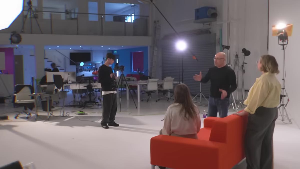 Karl Taylor with a wide group, camera too close
Before you touch a light stand, assess whether the space is even workable. Taylor is explicit about this, and I respect the directness: if a client wants to shoot a group of six to eight people in a small conference room, the correct answer is no. Not “we’ll make it work.” No.
Karl Taylor with a wide group, camera too close
Before you touch a light stand, assess whether the space is even workable. Taylor is explicit about this, and I respect the directness: if a client wants to shoot a group of six to eight people in a small conference room, the correct answer is no. Not “we’ll make it work.” No.
The problem is mathematical. A cramped room forces the camera into a position where a wide-angle lens is the only way to fit the group in frame. Wide-angle lenses introduce edge distortion that stretches people on the outer edges of the frame outward. They also exaggerate depth, which means anyone in the front row looks significantly larger than anyone in the back row. No amount of posing fixes a perspective problem baked in at the lens level. Find a larger room, rent a space, or move the shoot outside. That decision protects the final image more than any lighting trick will.
Step 2: Shoot Longer, Stand Further Back
 Diagram showing camera position close vs. far from group
The lens choice for group portraits should be driven by compression, not by convenience. Taylor recommends shooting at 80mm to 100mm and physically moving the camera further from the group to compensate for the tighter field of view. This is the direct solution to both distortion problems.
Diagram showing camera position close vs. far from group
The lens choice for group portraits should be driven by compression, not by convenience. Taylor recommends shooting at 80mm to 100mm and physically moving the camera further from the group to compensate for the tighter field of view. This is the direct solution to both distortion problems.
A longer focal length from a greater distance produces a flatter perspective plane. The people on the edges of your frame are no longer stretched. More importantly, the difference in apparent size between your front and back rows compresses dramatically. Someone standing two feet behind the front row no longer looks like a distant afterthought. Their head reads at a similar scale to the people in front. On a practical level, this also opens up more real estate to your left and right for positioning lights without them appearing in frame.
Step 3: Understand Why Cross-Lighting Fails on Groups
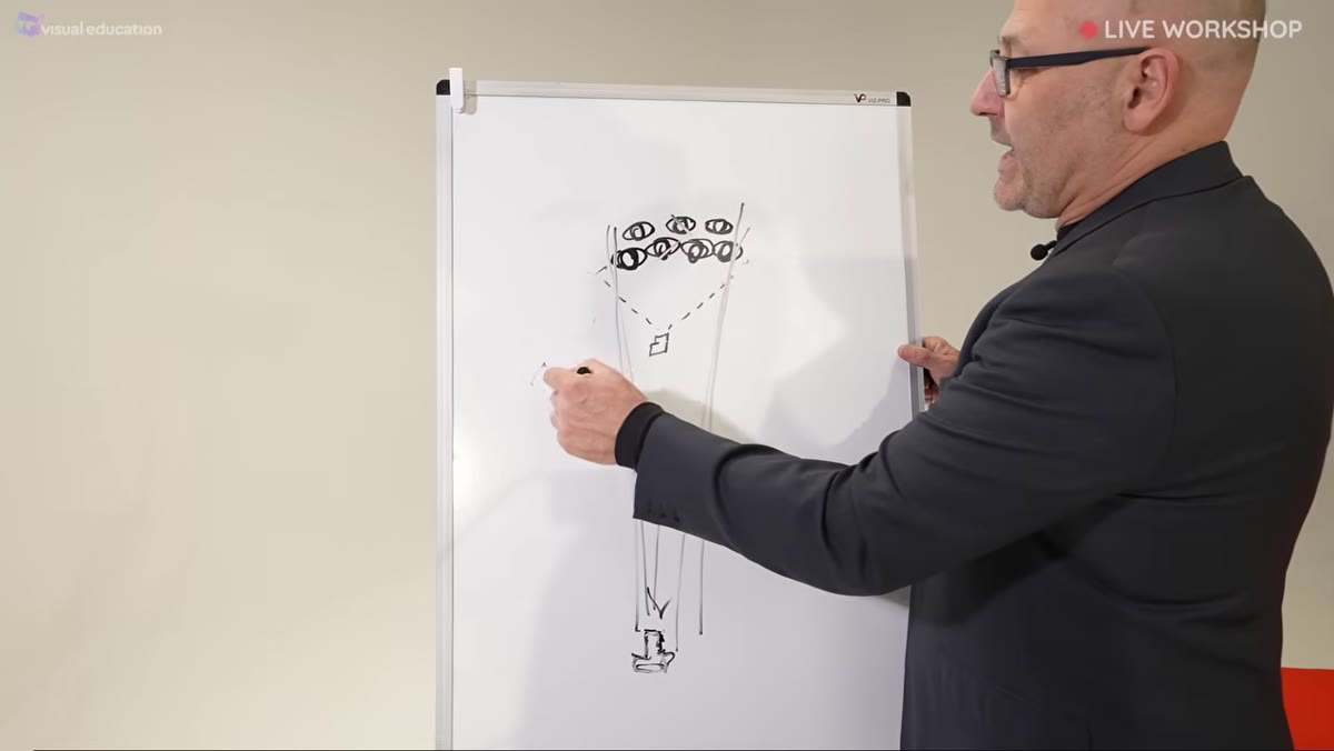 Aerial diagram showing two side lights and shadow zones
Taylor uses an overhead diagram to show why the instinctive two-light setup collapses on groups. The typical instinct is to place one light on the left side and one on the right, assuming they’ll meet in the middle and cover everyone evenly. They don’t.
Aerial diagram showing two side lights and shadow zones
Taylor uses an overhead diagram to show why the instinctive two-light setup collapses on groups. The typical instinct is to place one light on the left side and one on the right, assuming they’ll meet in the middle and cover everyone evenly. They don’t.
Each light casts shadows from the people it hits directly onto the people beside and behind them. The person in the center of the group, who should theoretically be covered by both lights, often ends up in a pocket of shadow created by the people flanking them. The light coming from the left can’t reach around the person blocking it. Same problem from the right. You end up with a frame where the edges are reasonably lit and the middle is muddy. The solution isn’t to add more lights pointed inward from steeper angles. That makes the cross-shadow problem worse.
Step 4: Build One Large, Unified Light Source
 Wide softbox or large modifier illuminating the full group
The fix Taylor demonstrates is conceptually simple but requires thinking about your light sources as a single unified field rather than individual units. The goal is to create one large light source that spans the full width of the group, positioned far enough back that it wraps around rather than rakes across the subjects.
Wide softbox or large modifier illuminating the full group
The fix Taylor demonstrates is conceptually simple but requires thinking about your light sources as a single unified field rather than individual units. The goal is to create one large light source that spans the full width of the group, positioned far enough back that it wraps around rather than rakes across the subjects.
In practical terms, this often means using the largest modifier you have, whether that’s a very wide softbox, a large octabox, or even bouncing into a broad reflective surface. The key metric is that the light source needs to appear large relative to the subjects from the camera’s point of view. A large source that’s too close to one end of the group will still fall off before it reaches the other end. Move the source further back, or if the group is very wide, consider positioning the light more centrally and at a greater distance to extend coverage. Taylor shows immediately how adding a properly placed background light in combination with the main source changes the image from flat to dimensional without introducing the shadow conflicts that plague the cross-light setup.
Step 5: Use Background Light to Separate the Group
 Before and after comparison showing background light addition
Once the main light is working, a background light does significant lifting. Without separation between the subjects and the background, the group can read as a flat mass, particularly with darker clothing. Taylor shows a direct comparison between the raw shot and the version with background illumination, and the difference in perceived depth is immediate.
Before and after comparison showing background light addition
Once the main light is working, a background light does significant lifting. Without separation between the subjects and the background, the group can read as a flat mass, particularly with darker clothing. Taylor shows a direct comparison between the raw shot and the version with background illumination, and the difference in perceived depth is immediate.
Position the background light so it’s even across the full backdrop width. A single head aimed at the center from directly behind the camera position works for narrower groups. For wider groups, two lights aimed from behind the camera at 45-degree angles toward the backdrop ensure even coverage without hot spots. Expose the background light independently of your main light and aim for roughly one stop brighter than the main, or match it depending on the mood you’re after.
What I’d Add From My Own Studio Work
I’ve shot enough corporate group portraits, anywhere from four people to thirty, to add one caveat Taylor doesn’t cover in depth: test your light spread before anyone is standing in it. When I’m setting up for a group, I use a piece of white foamcore held vertically and walk it across the full width of the group position, watching the light meter reading. I want to see no more than a one-third stop variance from one edge to the other. If the falloff is steeper than that, I adjust distance or modifier size before a single person is in position. It saves enormous time on the back end.
The other thing I’ve learned: label your lights before the shoot. I know how that sounds. But when a client is standing there and you’re troubleshooting a shadow at position four, knowing immediately which head is doing what without having to trace cables is worth every strip of masking tape.
The single most important principle from Taylor’s tutorial is this: group photography is a geometry problem first and a lighting problem second. Fix the spatial relationship between your camera and your subjects before you touch a single light. Everything downstream gets easier.
Watch the full tutorial on YouTube to see Taylor work through the live demonstration with an actual group and compare before-and-after results in real time.
Comments (3)
Solid advice. Especially the part about taking your time with it.
Simple but effective. Sometimes that's all you need.
Really solid breakdown. This pairs perfectly with the landscape work I've been writing about.
Leave a Comment