Every few weeks someone emails me asking which camera body I’m shooting with, or which prime lens I’d recommend for portrait work. I get it. Gear is tangible. You can read specs, compare prices, feel confident you’re making a measurable upgrade. But after nearly two decades shooting fashion, beauty, and corporate work out of my studio here in Los Angeles, I can tell you that the camera has never once been the reason a shot failed. The light, though. The light has failed me plenty.
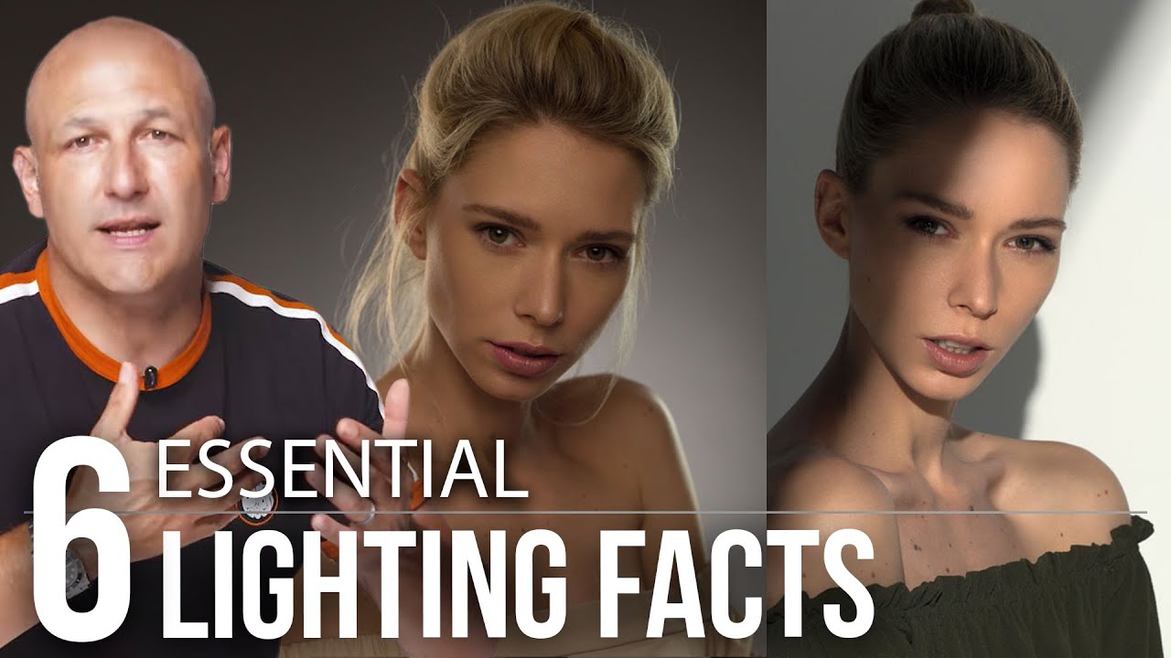
That’s why I kept coming back to this Visual Education tutorial on the six lighting fundamentals every photographer should understand. Watch the full tutorial on YouTube - it’s one of the cleaner breakdowns I’ve seen of concepts that most photographers either half-learn or skip entirely because they assume they already get it. The instructor’s framing stuck with me: don’t think you know light, know light. That’s not a motivational poster. That’s a diagnostic. Most of us are operating on assumptions we formed early and never pressure-tested.
What follows is my own walkthrough of those six principles, with notes from years of learning them the hard way on commercial sets where there’s no room to get it wrong.
Step 1: Understand What “Size” Actually Means for a Light Source
 Small light source casting sharp defined shadow edge
The size of your light source determines whether your shadows have hard, crisp edges or soft, gradual transitions. A small source, like a bare strobe or a snoot, produces sharply defined shadows. A large source, like a 5-foot octabox, wraps light around a subject and lets shadows fade out gradually. This sounds simple until you realize that size is relative to distance, not absolute. A 4-foot softbox 20 feet away from your subject is, from the subject’s perspective, a small light. It will behave like one and produce harder shadows than you might expect. When you’re placing a modifier, always think in terms of apparent size from the subject’s point of view, not the physical dimensions sitting in your gear closet.
Small light source casting sharp defined shadow edge
The size of your light source determines whether your shadows have hard, crisp edges or soft, gradual transitions. A small source, like a bare strobe or a snoot, produces sharply defined shadows. A large source, like a 5-foot octabox, wraps light around a subject and lets shadows fade out gradually. This sounds simple until you realize that size is relative to distance, not absolute. A 4-foot softbox 20 feet away from your subject is, from the subject’s perspective, a small light. It will behave like one and produce harder shadows than you might expect. When you’re placing a modifier, always think in terms of apparent size from the subject’s point of view, not the physical dimensions sitting in your gear closet.
The practical takeaway: move your light closer to increase apparent size and soften shadows. Pull it back to harden them. This is a free adjustment that costs nothing and changes the entire character of the image.
Step 2: Learn to Recognize and Control Hard vs. Soft Light
 Side-by-side comparison of hard and soft light on a face
Hard light and soft light aren’t just aesthetic choices. They’re storytelling tools. Hard light reveals texture aggressively. Skin pores, fabric weave, product surface details - all of it becomes visible under a small, undiffused source. That can be exactly what you want for editorial work or certain product categories. But on skin, hard light also creates specular highlights that can look harsh or clinical unless that’s your intention.
Side-by-side comparison of hard and soft light on a face
Hard light and soft light aren’t just aesthetic choices. They’re storytelling tools. Hard light reveals texture aggressively. Skin pores, fabric weave, product surface details - all of it becomes visible under a small, undiffused source. That can be exactly what you want for editorial work or certain product categories. But on skin, hard light also creates specular highlights that can look harsh or clinical unless that’s your intention.
Soft light does the opposite. It wraps, it flatters, it reduces contrast. The tradeoff is that it can flatten a face or make a product look dimensionless. The tutorial makes an important point here: you don’t have to choose one or the other for an entire image. It’s possible to layer hard and soft sources in a single frame - using a hard source to create graphic shadows while a soft source fills the scene. I’ve used this combination to give beauty shots a slightly surreal, almost painted quality. The hard source defines the structure. The soft source lifts the whole thing so it doesn’t turn muddy.
Step 3: Position Your Light with Intention
 Light moved to side position showing increased texture on subject
Where you place your light relative to your subject controls shadow direction, texture, and perceived mood. Frontal lighting - a source placed directly in line with the lens - flattens the subject. You get less shadow, less texture, and a softer overall look. It reads as commercial, approachable, clean. Move that same light 90 degrees to the side and suddenly you’re revealing every contour of a face or the surface grain of a product. Low and side lighting maximizes texture. Overhead lighting mimics harsh noon sun and, on faces, creates dramatic under-eye shadows that can read as aggressive or intense depending on the image.
Light moved to side position showing increased texture on subject
Where you place your light relative to your subject controls shadow direction, texture, and perceived mood. Frontal lighting - a source placed directly in line with the lens - flattens the subject. You get less shadow, less texture, and a softer overall look. It reads as commercial, approachable, clean. Move that same light 90 degrees to the side and suddenly you’re revealing every contour of a face or the surface grain of a product. Low and side lighting maximizes texture. Overhead lighting mimics harsh noon sun and, on faces, creates dramatic under-eye shadows that can read as aggressive or intense depending on the image.
What the tutorial addresses here that a lot of resources skip over: light direction has a strong subconscious effect on the viewer. We’re wired from the natural world to expect light from above. Anything that deviates from that - bottom lighting, extreme side angles - registers as unusual or unsettling. That’s useful if you want it. It’s a problem if you don’t know you’re doing it.
Step 4: Work With the Inverse Square Law, Not Against It
 Diagram illustrating light falloff at increasing distances
The inverse square law is the rule that explains why light falls off the way it does. Double the distance between your light and your subject, and you don’t get half the light. You get one quarter of it. This has two major implications for studio work. First, it means that moving a light a short distance when it’s already close to your subject makes a dramatic difference in exposure. Moving it when it’s already far away makes very little difference. Second, and this is the part the tutorial handles well: when a light is farther from your subject in a confined studio, more of that light bounces off the walls, ceiling, and floor. That bounce acts as fill, lifting the shadows and reducing overall contrast even though the source itself is technically smaller and harder at that distance. A light that should theoretically be harder ends up looking softer because the whole room is glowing. This is why large open studios and small white-walled rooms produce such different results from identical setups.
Diagram illustrating light falloff at increasing distances
The inverse square law is the rule that explains why light falls off the way it does. Double the distance between your light and your subject, and you don’t get half the light. You get one quarter of it. This has two major implications for studio work. First, it means that moving a light a short distance when it’s already close to your subject makes a dramatic difference in exposure. Moving it when it’s already far away makes very little difference. Second, and this is the part the tutorial handles well: when a light is farther from your subject in a confined studio, more of that light bounces off the walls, ceiling, and floor. That bounce acts as fill, lifting the shadows and reducing overall contrast even though the source itself is technically smaller and harder at that distance. A light that should theoretically be harder ends up looking softer because the whole room is glowing. This is why large open studios and small white-walled rooms produce such different results from identical setups.
Step 5: Recognize How the Color of Light Changes Everything
 Mixed color temperature sources showing warm and cool zones
Light has color, and when sources with different color temperatures mix in a single frame, the results can be beautiful or disastrous depending on whether you planned for it. Daylight from a window is much cooler (bluer) than a tungsten household bulb. Studio strobes are typically calibrated around 5500K, close to midday daylight, but many continuous lights sit warmer. If you’re mixing ambient light with flash, you need to understand which source is which color temperature and decide - consciously - how you want to handle it. You can use gels to bring sources into alignment, or you can lean into the contrast between warm and cool for creative effect.
Mixed color temperature sources showing warm and cool zones
Light has color, and when sources with different color temperatures mix in a single frame, the results can be beautiful or disastrous depending on whether you planned for it. Daylight from a window is much cooler (bluer) than a tungsten household bulb. Studio strobes are typically calibrated around 5500K, close to midday daylight, but many continuous lights sit warmer. If you’re mixing ambient light with flash, you need to understand which source is which color temperature and decide - consciously - how you want to handle it. You can use gels to bring sources into alignment, or you can lean into the contrast between warm and cool for creative effect.
I learned this one expensively on an early editorial shoot where I had strobes mixing with late-afternoon window light and didn’t account for the shift. The images came back with half the frame warm and half neutral, and it read as a mistake rather than an aesthetic decision. The rule I’ve followed ever since: if you’re mixing color temperatures, either control it or commit to it. Never accidentally let it happen.
Step 6: Use Contrast as a Creative Variable
 High contrast setup compared to low contrast fill-lit setup
Contrast in lighting isn’t just about whether an image looks bright or dark. It’s about the ratio between your lit areas and your shadow areas, and that ratio controls the emotional weight of an image. High contrast setups, where shadows go deep and the difference between highlights and shadows is large, read as dramatic, moody, or serious. Low contrast setups, where shadows are filled in and the tonal range is compressed, read as clean, soft, or commercial. The tutorial’s point here is that contrast is a deliberate choice, not a side effect. You control it by adjusting the power ratio between your key light and your fill, by choosing how reflective your set is, and by deciding whether shadows need detail or can go to black.
High contrast setup compared to low contrast fill-lit setup
Contrast in lighting isn’t just about whether an image looks bright or dark. It’s about the ratio between your lit areas and your shadow areas, and that ratio controls the emotional weight of an image. High contrast setups, where shadows go deep and the difference between highlights and shadows is large, read as dramatic, moody, or serious. Low contrast setups, where shadows are filled in and the tonal range is compressed, read as clean, soft, or commercial. The tutorial’s point here is that contrast is a deliberate choice, not a side effect. You control it by adjusting the power ratio between your key light and your fill, by choosing how reflective your set is, and by deciding whether shadows need detail or can go to black.
What I’d Add From the Studio Floor
The tutorial covers the technical framework cleanly, but there’s one thing I’d layer on top of all six of these principles: develop a physical intuition for light by sketching every setup you do. I keep a notebook specifically for lighting diagrams. After every shoot, while the set is still up, I draw out where every source was, what modifier was on it, how far it was from the subject, and what the power ratio looked like. Over time those sketches become a reference library. When a client asks for “something like what we did last spring,” I don’t have to guess. That habit has saved me more than once and it’s forced me to be precise about decisions I might otherwise make on autopilot.
The single most important idea across all six of these principles is this: every quality of light - its softness, its direction, its color, its contrast - is a variable you control. The photographers who work fastest and most confidently aren’t the ones with the most expensive gear. They’re the ones who can look at any light situation, identify exactly what’s happening, and adjust it deliberately.
Watch the full tutorial on YouTube to see the Visual Education breakdown with live demonstrations of each principle.
Comments
Leave a Comment