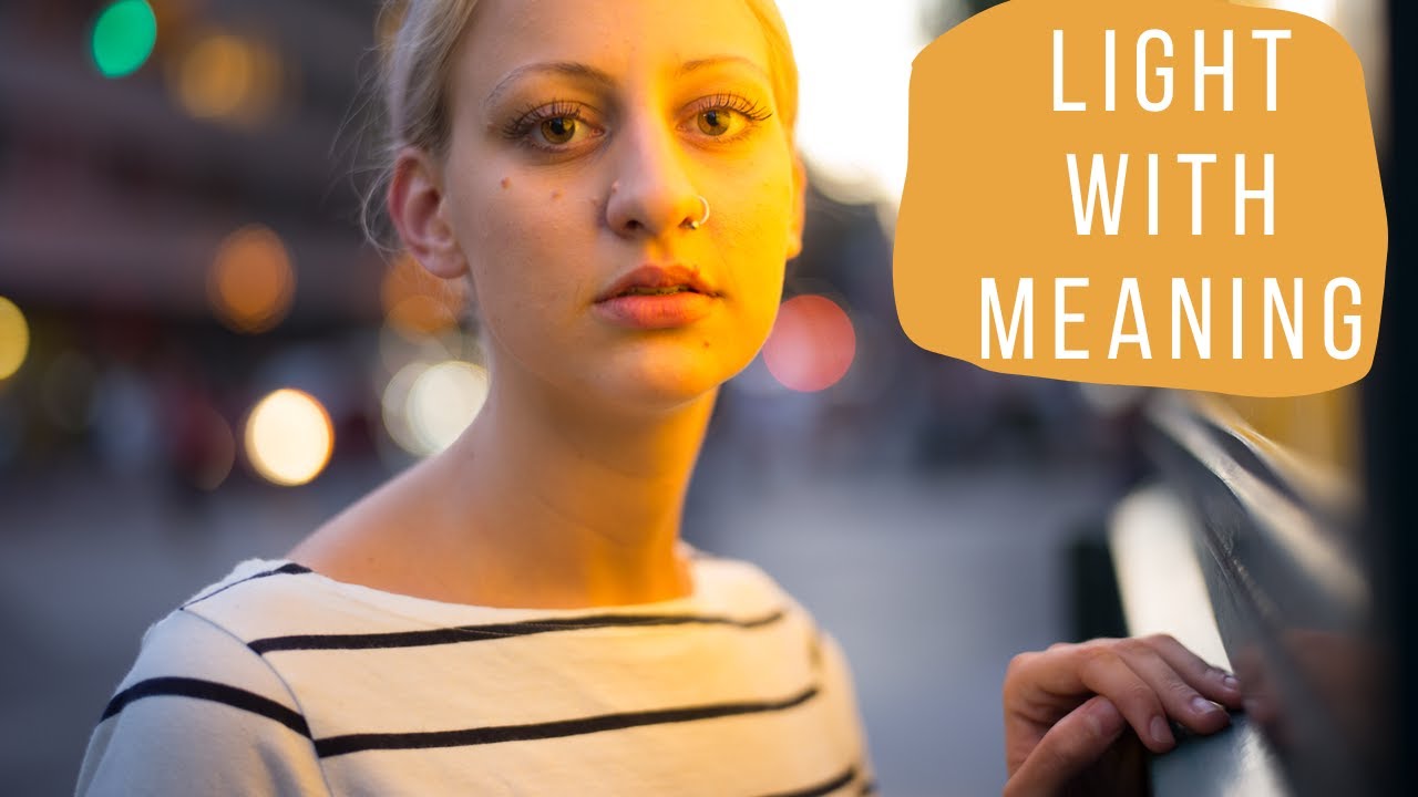
There’s a gap I see constantly in studio work, including my own early work, between technically correct light and light that actually means something. For years I defaulted to the big softbox close to the subject, fill card on the shadow side, maybe a hair light if the client wanted polish. The results were clean, flattering, and completely interchangeable with a thousand other photographers’ work. I’d go into Lightroom afterward and pile on color grading trying to rescue some personality from images that had none baked in from the start. That’s a workflow problem. It means the feeling was an afterthought.
Watch the full tutorial on YouTube
In this Daniel Norton Photographer tutorial, Norton draws a clear line between what he calls “pretty light” and “light with feeling,” and he makes a case that the second category is actually harder to execute well, which is exactly why it’s worth pursuing. His framework is simple: stop inventing moods in post, and start building them into your lighting setup by referencing real-world light sources. That reframe alone is worth the runtime. The rest of the video shows you how to actually do it.
Step 1: Recognize Which Mode You’re Defaulting To
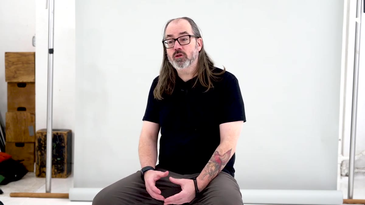 Daniel Norton describing soft, flattering window light setups
Before you touch a light stand, Norton wants you to audit your own habits. Most photographers gravitate toward soft, wrapping, forgiving light because it’s safe. Large modifier, close to the subject, slight angle, done. There’s nothing wrong with that for certain clients, but if that’s the only tool you reach for, your studio work will always feel like headshots regardless of what you’re trying to say.
Daniel Norton describing soft, flattering window light setups
Before you touch a light stand, Norton wants you to audit your own habits. Most photographers gravitate toward soft, wrapping, forgiving light because it’s safe. Large modifier, close to the subject, slight angle, done. There’s nothing wrong with that for certain clients, but if that’s the only tool you reach for, your studio work will always feel like headshots regardless of what you’re trying to say.
Ask yourself: am I lighting to flatter, or am I lighting to communicate? Norton’s point is that you need to consciously know which one you’re doing. If you’re lighting to flatter by default, you’ll never build the instincts required to light with intention.
Step 2: Pull Reference From Real-World Light Sources
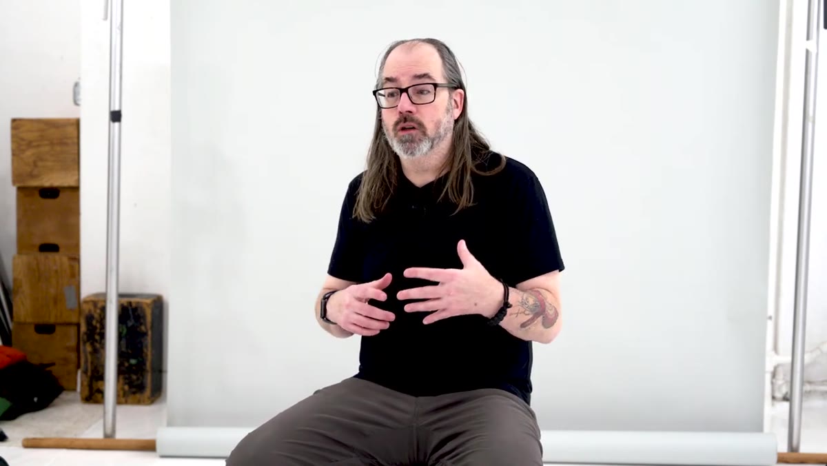 Norton describing neon light and street lamps at night concerts
This is the conceptual engine of the whole tutorial. Norton describes the experience of being at a concert, a carnival, or a night market, where the light is “wrong” by studio standards. It’s colored, directional, hard, backlit, unflattering in conventional terms. And yet when you pull out your phone and photograph your friend standing in it, the image has character.
Norton describing neon light and street lamps at night concerts
This is the conceptual engine of the whole tutorial. Norton describes the experience of being at a concert, a carnival, or a night market, where the light is “wrong” by studio standards. It’s colored, directional, hard, backlit, unflattering in conventional terms. And yet when you pull out your phone and photograph your friend standing in it, the image has character.
The instruction here is not to replicate those light sources exactly but to use them as emotional reference. What color is the light? What direction does it come from? How hard or soft is it? How does it fall across the face? Write these down or sketch them. I keep a lighting journal for exactly this reason. When I flip back through it, I can see which setups came from a specific memory or reference and which ones I just built on autopilot. The ones with a source behind them almost always hold up better.
Step 3: Embrace Shadows, Color, and “Wrong” Placement
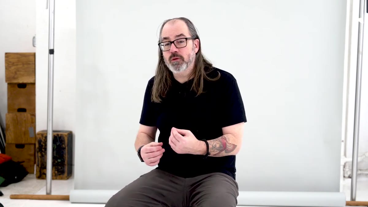 Norton discussing hidden eyes, no catch light, heavy backlighting
Norton specifically calls out lighting choices that would fail a traditional portrait critique: shadows covering the eyes, no catch light, heavy backlighting that pushes the subject toward silhouette. In a standard commercial workflow these are errors. In mood-driven work they can be the entire point.
Norton discussing hidden eyes, no catch light, heavy backlighting
Norton specifically calls out lighting choices that would fail a traditional portrait critique: shadows covering the eyes, no catch light, heavy backlighting that pushes the subject toward silhouette. In a standard commercial workflow these are errors. In mood-driven work they can be the entire point.
Practice placing your key light behind the subject. Let the rim dominate. Try a small, hard source positioned low and off to one side. Add a gel, even a subtle one. Notice how each choice changes what the image says rather than just how the subject looks. You’re not breaking rules carelessly here. You’re learning which rules to break and why.
Step 4: Use Color Intentionally, Not as a Post-Production Fix
 Norton referencing neon color and weird color in mood lighting
The worst version of mood lighting is a flat, neutral studio shot with a color grade slapped on in post. Norton’s approach reverses that sequence. The color should come from the light source itself: gels on your strobes or LEDs, practical lights with inherent color temperature variance, or mixing daylight and tungsten sources deliberately.
Norton referencing neon color and weird color in mood lighting
The worst version of mood lighting is a flat, neutral studio shot with a color grade slapped on in post. Norton’s approach reverses that sequence. The color should come from the light source itself: gels on your strobes or LEDs, practical lights with inherent color temperature variance, or mixing daylight and tungsten sources deliberately.
A warm practical lamp at 2700K mixed with a cooler key light at 5500K will give you a split that reads as location even in a bare studio. A single blue gel on a gridded spot behind the subject creates depth and mystery that no Lightroom preset can convincingly fake after the fact. Commit the color to the raw file. That’s where it has weight.
Step 5: Control Pupil Dilation to Change Eye Color Rendering
 Norton explaining constant light to contract pupils before flash exposure
This is the most technically specific technique in the tutorial and the one most photographers have never tried. In a dark studio with flash, the model’s pupils dilate wide, which washes out the color in the iris on the final image. Norton’s fix is to use a constant light source on the subject’s face before the flash fires. The sustained brightness causes the pupils to contract. Then, with the pupils small and the iris color rich, you kill the constant light and make the exposure with the flash.
Norton explaining constant light to contract pupils before flash exposure
This is the most technically specific technique in the tutorial and the one most photographers have never tried. In a dark studio with flash, the model’s pupils dilate wide, which washes out the color in the iris on the final image. Norton’s fix is to use a constant light source on the subject’s face before the flash fires. The sustained brightness causes the pupils to contract. Then, with the pupils small and the iris color rich, you kill the constant light and make the exposure with the flash.
The result is eyes with unusually saturated, vivid color, a quality that looks almost surreal but still photographic. One important note Norton includes: get your model’s permission before using this technique since you’re deliberately affecting how their eyes respond to light. Discuss it, explain what you’re doing, and make sure they’re comfortable. Beyond the ethics, a subject who understands the setup will be more relaxed and give you better expressions anyway.
What I’d Add From My Own Work
I’ve found that the hardest part of environment-inspired lighting isn’t the technical execution, it’s committing to the choice before you start shooting. There’s a strong pull to hedge, to set up your moody backlit rig and then add a softbox “just in case.” The softbox becomes the crutch, the moody setup becomes the experiment, and you end up with neither.
I label every light in my studio with masking tape before a shoot: key, fill, rim, practical. When I’m building an environment-inspired setup, I also label the intention: what real-world light source inspired this position or color. That label forces me to answer for every modifier I add. If a new light doesn’t serve the reference, it doesn’t go up. That discipline is what keeps the setup from drifting back into safe territory.
The single most important shift Norton is pushing here is this: decide what you want the image to feel like before you turn on a single light, and then build the setup to deliver that feeling rather than adjusting the feeling to match whatever your default setup produces. Your studio is not locked into producing one kind of light. It can feel like a neon-lit alley, a candlelit room, a blown-out midday sun. The modifier choices follow the intention, not the other way around.
Watch the full tutorial on YouTube
Comments
Leave a Comment