Every working photographer I know has a folder they don’t show clients. Mine is embarrassingly large. It’s full of shots where the light was close but the pose killed it, or the pose was solid but the background screamed louder than the subject. For years I treated these as separate problems to solve separately. What changed my thinking was watching experienced photographers critique work they’d never seen before, because the patterns they catch in the first five seconds are the patterns that actually matter.
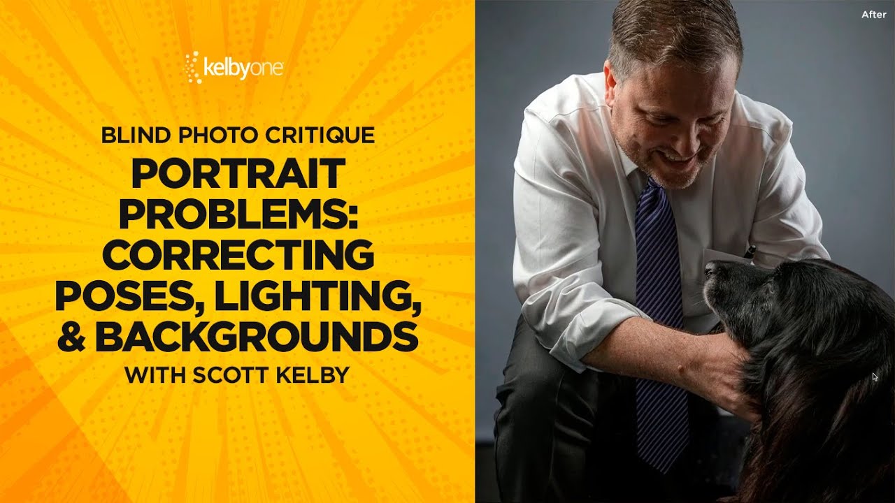
In this KelbyOne tutorial, Scott Kelby works through a blind photo critique, meaning he’s seeing each image cold, with no context from the photographer. Watch the full tutorial on YouTube. What makes it worth studying isn’t just the fixes he reaches for. It’s the order in which he diagnoses the problems. Pose comes first, almost every time. Then light. Then background. That hierarchy is something I now sketch into my lighting journal before every session, right next to the diagram.
The session covers outdoor portraits, studio setups, and one memorable image involving a dark dog that taught me something I should have already known about fill light and reflectance. Below is the breakdown, structured the way I’d want it explained to me.
Step 1: Evaluate the Pose Before You Touch Anything Else
 Unflattering portrait with subject leaning back
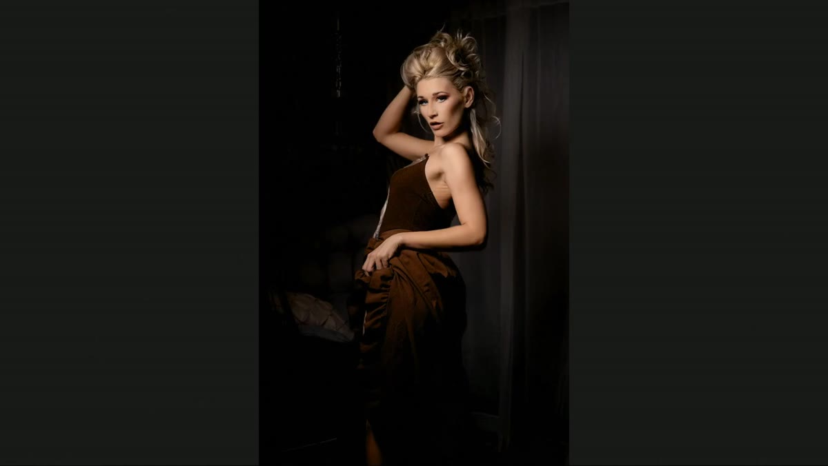
The first image Kelby pulls up gets diagnosed in under ten seconds: the pose is the problem. Specifically, the subject is leaning back rather than forward, which pushes the stomach toward the camera and creates a silhouette that flatters almost no one. Before evaluating exposure, color, or sharpness, ask whether the body language is working. A technically perfect exposure on a bad pose is still a bad portrait.
The correction here doesn’t even require a reshoot. Kelby reaches for the crop tool and reframes the image to eliminate the unflattering portion of the body entirely. In Lightroom, that’s as simple as pressing C for the crop tool, toggling the aspect ratio lock off with X, and pulling the frame up until the problem area disappears. A tighter head-and-shoulders composition rescued what was otherwise a throwaway frame.
Step 2: Watch for Shadows Created by the Subject’s Own Hands
 Hand casting shadow across subject’s face
The second critique image has a different but equally avoidable problem: the subject’s hand is positioned close enough to her face that it’s throwing a shadow directly across her features. Combined with a hot corner on one side of the frame, the lighting reads as uncontrolled even though the base exposure isn’t terrible. Kelby’s point is that no amount of post-processing fixes a shadow cast by a limb that shouldn’t have been there.
When I’m directing, I make a habit of checking the shadow pattern on the subject’s face before I shoot a single frame. If someone’s hand is near their chin or cheek, I look at where the key light is falling and whether that hand is going to interrupt it. Repositioning a hand an inch can eliminate a shadow entirely. This is also a good reason to shoot tethered if you can: problems like this are invisible at arm’s length but obvious on a larger screen.
Step 3: Brighten a Dark Face Using a Targeted Brush in Lightroom
 Lightroom brush tool being applied to subject’s face
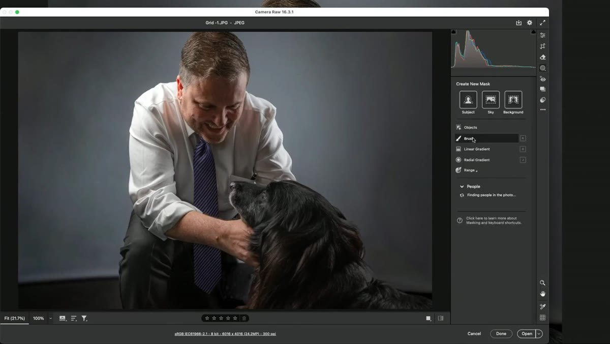
The third image is a portrait of a man with a dark dog. The subject’s face reads significantly darker than the surrounding scene, and Kelby identifies why immediately: dark surfaces don’t reflect light back onto nearby faces. A dark-furred dog pressed against someone’s chest is essentially a light absorber on one side of their face, and if you didn’t place a fill card or secondary source to compensate during the shoot, you’ll need to do it in post.
The fix is a targeted adjustment in Lightroom using the Masking brush (or the People mask if the face is clearly defined). Paint across the face only, then lift the Exposure slider in small increments, somewhere around plus 0.3 to 0.6 depending on the original exposure. The goal isn’t to make the face match the brightest part of the frame. It’s just to bring it back into a natural-looking tonal relationship with the rest of the scene. Kelby does a before-and-after side-by-side comparison that makes the difference immediately obvious.
Step 4: Identify a Blown Background as a Composition Problem, Not Just a Technical One
 Outdoor portrait with severely overexposed background
Moving into the outdoor portraits, the dominant issue shifts from pose to background. One image has a background so overexposed that it competes with the subject for the viewer’s eye. Kelby’s diagnosis is precise: a blown background doesn’t just look bad, it actively redirects attention away from the person you’re photographing. There’s also a dapple of direct sunlight landing on the subject’s hair that adds to the visual noise.
In-camera, the fix is straightforward. Move the subject away from whatever is causing the background to blow out, or position yourself so a darker area of the environment sits behind them. If you’re already in post, Lightroom’s sky and background masking tools can recover some of this, but the results depend heavily on how much highlight detail was retained. Shooting with this in mind from the start saves significant time later.
Step 5: Use Lens Blur or Depth of Field to Separate Subject from Background
 Lens blur being applied to bright outdoor background
For the portrait with the horse, Kelby acknowledges that the image has potential. The outfit reads well and the subject’s pose is actually working. The background, again, is the limiting factor. He applies Lightroom’s Lens Blur tool as a post-capture solution to create separation between the subject and the environment.
The more reliable version of this fix happens before you press the shutter. Moving the subject closer to your camera position while simultaneously increasing the distance between the subject and the background produces natural depth of field falloff that no plugin fully replicates. For outdoor work I shoot this way almost by reflex now: close focus distance, subject pulled forward, background pushed back. The ratio of subject-to-background distance matters more than the aperture in most cases.
What I’d Add from My Own Experience
Kelby’s critiques focus on rescue, which is the right frame for a tutorial. But the more useful application is using these three failure categories, pose, light quality, and background, as a pre-shoot checklist rather than a post-shoot repair list. I keep a laminated card in my camera bag that lists exactly these three items. Before I call “first look” on a setup, I read the card.
The background issue comes up more than any other in my commercial work, especially on location. A client’s office or storefront almost never has a background that reads cleanly at the focal length they want. I now arrive thirty minutes early specifically to walk the space and find the two or three positions where the background is manageable. It’s not glamorous work, but it’s the difference between delivering a portrait and delivering an excuse.
The single most transferable thing from this tutorial is Kelby’s diagnostic order: pose first, light second, background third. If you reverse that sequence and try to fix the background before addressing a bad pose, you’re decorating a structural problem. Get the pose right, then check the light on the face, then evaluate what’s happening behind the subject.
Watch the full tutorial on YouTube to see Kelby work through each image in real time, including the before-and-after comparisons that make the Lightroom corrections much easier to understand at a glance.
Comments
Leave a Comment