There’s a particular kind of envy I feel when I walk into a studio that someone built entirely on their own terms. Not the petty kind. The motivating kind. I felt it watching this studio tour from The Portrait System, featuring Brisbane-based newborn photographer Kelly Brown of Little Pieces Photography. Watch the full tutorial on YouTube
I’ve spent years in rented studios, shooting in spaces designed for someone else’s workflow. The lighting positions were wrong for my preferred setups, the walls were the wrong color, the ceiling height was never quite enough. Kelly’s story, and more importantly her studio, is a blueprint for how a photographer can build a space that reflects exactly how they work. The decisions she made at every stage of her build are worth unpacking, because they’re not decorative choices. They’re functional ones with direct consequences for image quality, client experience, and revenue.
What strikes me most is that Kelly didn’t start here. She started in a car. That progression matters.
Step 1: Understand Why the Build Progression Itself Is a Strategy
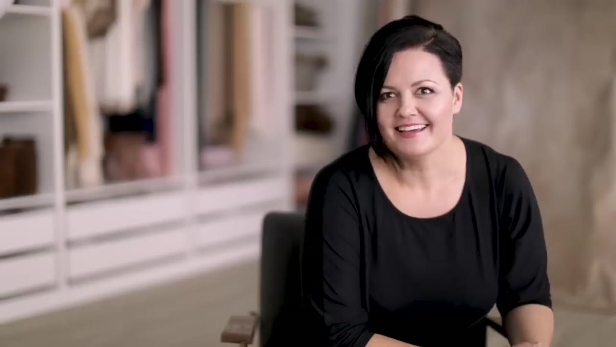 Kelly describing years of traveling to client homes with gear
Kelly spent roughly four years traveling to clients’ homes, loading and unloading gear for every single shoot. Before you dismiss that as just a backstory detail, think about what that actually costs: setup time, breakdown time, drive time, physical wear on equipment, and the impossibility of controlling your environment. She then moved into a small home studio, around six meters by four meters. That’s tight for newborn work, but it was hers.
Kelly describing years of traveling to client homes with gear
Kelly spent roughly four years traveling to clients’ homes, loading and unloading gear for every single shoot. Before you dismiss that as just a backstory detail, think about what that actually costs: setup time, breakdown time, drive time, physical wear on equipment, and the impossibility of controlling your environment. She then moved into a small home studio, around six meters by four meters. That’s tight for newborn work, but it was hers.
The lesson here isn’t “get a bigger space as fast as possible.” It’s that each stage forced her to understand exactly what she needed before she built the next thing. By the time she converted her double garage, she already knew which constraints mattered and which ones she could live with. By the time she purchased and built out the standalone building, she had years of hard data about how she actually worked. If you’re currently shooting in a spare room or lugging gear to locations, write down every single friction point. That list is your future studio’s blueprint.
Step 2: Design the Space to Be Divided Without Compromise
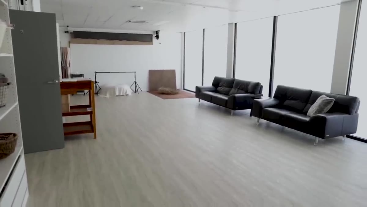 Concertina doors dividing the main shooting space into Studio One and Studio Two
The central architectural decision in Kelly’s main shooting area is the concertina door system that splits one large room into two fully functional studios. What makes this worth examining closely is the detail that the doors clamp directly to the floor with no track running across the middle. That matters. A floor track creates a trip hazard, a cleaning problem, and a visual line that interrupts your shooting space. It’s the kind of thing that sounds minor until you’ve caught a light stand wheel in a floor groove mid-session.
Concertina doors dividing the main shooting space into Studio One and Studio Two
The central architectural decision in Kelly’s main shooting area is the concertina door system that splits one large room into two fully functional studios. What makes this worth examining closely is the detail that the doors clamp directly to the floor with no track running across the middle. That matters. A floor track creates a trip hazard, a cleaning problem, and a visual line that interrupts your shooting space. It’s the kind of thing that sounds minor until you’ve caught a light stand wheel in a floor groove mid-session.
Two studios from one room means Kelly can shoot in one space while a client is being prepared or while props are being staged in the other. For photographers moving toward higher-volume work or collaborative shoots, this flexibility is worth planning for early. You don’t need to build it immediately, but leaving the option open in your floor plan costs nothing. Retrofitting it later costs a lot.
Step 3: Use Natural Light as a Primary Source, Not a Supplement
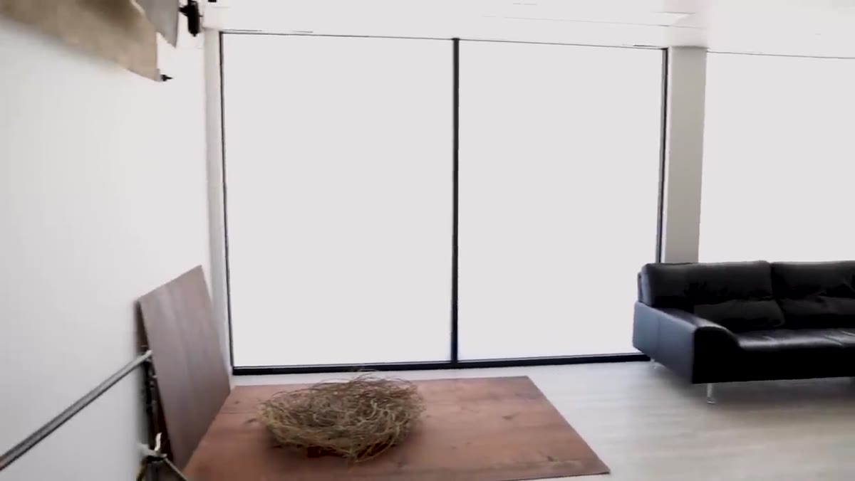 Wide shot showing large windows flooding the main studio with natural light
The amount of natural light in Kelly’s studio is immediately visible when the shooting space is revealed. Large windows bring in broad, soft daylight that works particularly well for newborn photography, where the goal is usually warmth and gentleness rather than drama. Natural light at this volume isn’t a backup for when your strobes feel like too much. It’s the foundation.
Wide shot showing large windows flooding the main studio with natural light
The amount of natural light in Kelly’s studio is immediately visible when the shooting space is revealed. Large windows bring in broad, soft daylight that works particularly well for newborn photography, where the goal is usually warmth and gentleness rather than drama. Natural light at this volume isn’t a backup for when your strobes feel like too much. It’s the foundation.
I’ve worked in studios where natural light was treated as a problem to be controlled. Blackout blinds on every window, all artificial from the start. That approach gives you consistency across all hours of the day, but it also strips the space of something that clients respond to on an emotional level. Kelly’s studio feels like a place you’d want to spend time in. That’s not accidental. When clients are relaxed, they photograph better. For newborn work especially, where you’re often waiting for a baby to settle, the ambient quality of the space does real work for you.
Step 4: Display Your Work at Museum Standard, Everywhere
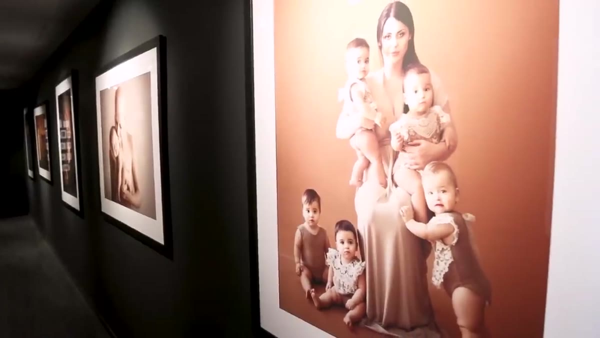 Framed archival prints hung gallery-style along the studio walls
Kelly’s walls are hung with her own work, printed and framed to archival museum-grade standards. This isn’t decoration. Every print on that wall is a sales tool and a proof-of-concept running simultaneously. A parent walking into that space sees, immediately and without being told, exactly what the finished product looks like. The framing quality communicates the value of the investment before anyone has said a word about pricing.
Framed archival prints hung gallery-style along the studio walls
Kelly’s walls are hung with her own work, printed and framed to archival museum-grade standards. This isn’t decoration. Every print on that wall is a sales tool and a proof-of-concept running simultaneously. A parent walking into that space sees, immediately and without being told, exactly what the finished product looks like. The framing quality communicates the value of the investment before anyone has said a word about pricing.
I keep a lighting journal where I sketch every setup from every shoot, and one thing I’ve noticed over years of client sessions is that people buy what they can see and touch. Digital previews on a screen are abstract. A 24-inch archival print in a deep frame hanging at eye level is not abstract. If you’re selling wall art and your studio walls are bare, you are making your own job harder. Print your best work. Frame it properly. Hang it where clients spend time.
Step 5: Let Your Awards Cabinet Do Visible Work
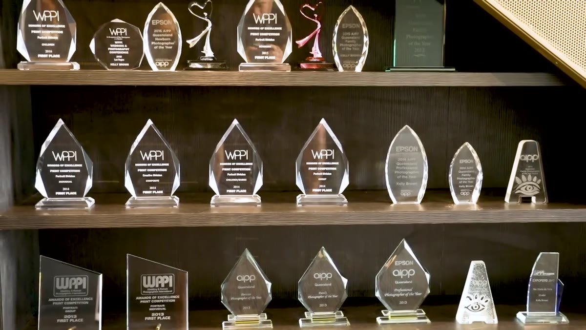 Close-up of Kelly’s awards cabinet filled with competition trophies
Kelly has competed in photography print competitions for years, and the resulting awards cabinet is prominent in her studio. Sue Bryce, who hosts the tour, notes that her own awards collection doesn’t match Kelly’s at this point. The point isn’t to brag. The point is that industry recognition displayed in a client-facing space answers the question “why should I trust this photographer” without the photographer ever having to say anything defensive or self-promotional.
Close-up of Kelly’s awards cabinet filled with competition trophies
Kelly has competed in photography print competitions for years, and the resulting awards cabinet is prominent in her studio. Sue Bryce, who hosts the tour, notes that her own awards collection doesn’t match Kelly’s at this point. The point isn’t to brag. The point is that industry recognition displayed in a client-facing space answers the question “why should I trust this photographer” without the photographer ever having to say anything defensive or self-promotional.
Competition entries also force a kind of creative discipline that regular client work doesn’t. When you’re shooting for a judge rather than a brief, you push into territory you’d otherwise avoid. Kelly describes competition season as her annual creative stretch, the place where she steps outside her comfort zone on purpose. That mindset produces better work across the board, not just in the competition entries.
What I’d Add From My Own Experience
Kelly’s studio is built entirely around her specialty and her client experience, and that coherence is what makes it work. Everything in the space serves newborn portrait photography specifically. The natural light is ideal for it. The divided studio structure suits it. The gallery wall showcases it.
The mistake I see most often in studio builds is trying to make a space that does everything. A space that does everything usually does nothing particularly well. When I set up a lighting configuration for a shoot, I label every light with masking tape, position and modifier both, so the logic of the setup is visible at a glance. The same discipline applies to space design. Know exactly what you’re optimizing for and make every decision serve that purpose. Flexibility is useful, but specificity is what produces great work.
The single most important thing Kelly Brown’s studio tour demonstrates is that a professional space is not a reward you get after you’ve made it. It is one of the tools you use to make it. Every upgrade she made, from her car to a small room to a garage to a standalone building, was a decision to take her own work seriously before anyone else had to.
Watch the full tutorial on YouTube and pay close attention to how Kelly describes each stage of the build. The technical details of the space matter, but the decision-making process behind them is the real instruction.
Comments (1)
Simple but effective. Sometimes that's all you need.
Leave a Comment