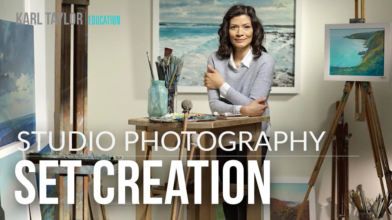
Every commercial photographer hits the same wall eventually. The client wants a living room. Or a doctor’s office. Or an artist’s studio. And your budget doesn’t stretch to a location scout, a permit, and a half-day of travel. For years, I dealt with this by shooting on location and fighting whatever the space gave me in terms of light, color temperature, and geometry. It was a constant compromise. Then I started building my own sets in-studio and realized I’d been making my life unnecessarily hard.
In this Visual Education tutorial on studio set construction and lighting, the approach is exactly what I wish someone had shown me a decade ago: two walls, a handful of props, and a deliberate lighting plan that does more storytelling than any location ever could. What makes it worth studying isn’t just the final image. It’s the logic behind each decision, from how the walls are constructed to why a grazing Fresnel on a painting reads as atmosphere instead of decoration.
The set in the video is dressed as an artist’s studio, but the same bones get reused as a hallway, a clinical space, and a living room within the same shoot day. That kind of versatility is the whole argument for building rather than renting. Let me walk through how it actually comes together.
Step 1: Build a Two-Wall Corner With a Mobile Frame System
 Mobile wall panel with painted sides shown in studio
The foundation here is a mobile wall panel, the kind that rolls and can be repositioned quickly. The key insight is painting each side a different color. That single decision doubles the number of looks you can pull from one piece of infrastructure without repainting between setups. You simply flip the wall and reverse the set. A second, fixed frame with a window cut into it gets attached at a right angle using L-brackets and a batten across the top. That junction is where a real room corner lives photographically, and once you have it, the camera can’t tell the difference.
Mobile wall panel with painted sides shown in studio
The foundation here is a mobile wall panel, the kind that rolls and can be repositioned quickly. The key insight is painting each side a different color. That single decision doubles the number of looks you can pull from one piece of infrastructure without repainting between setups. You simply flip the wall and reverse the set. A second, fixed frame with a window cut into it gets attached at a right angle using L-brackets and a batten across the top. That junction is where a real room corner lives photographically, and once you have it, the camera can’t tell the difference.
The window cutout isn’t decorative. It’s a practical light port, and I’ll come back to that. The structural investment here is minimal, but the return on versatility is enormous.
Step 2: Lay Floorboards and Add Contextual Props
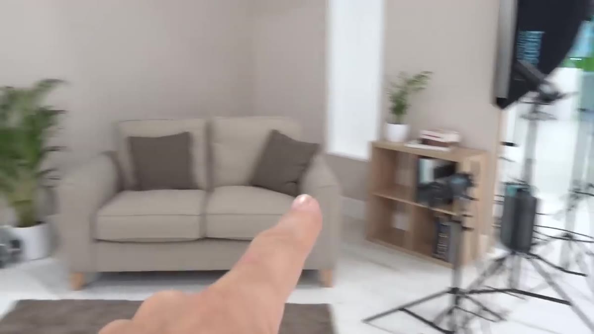 Floorboards and props placed in front of wall panels
A bare wall corner reads as a set. Add a strip of floorboards and it starts reading as a room. The tutorial uses just a few boards, enough to establish the floor plane and anchor the subject in a believable space. Props do the rest of the contextual work, in this case paintings borrowed specifically for the artist-studio look.
Floorboards and props placed in front of wall panels
A bare wall corner reads as a set. Add a strip of floorboards and it starts reading as a room. The tutorial uses just a few boards, enough to establish the floor plane and anchor the subject in a believable space. Props do the rest of the contextual work, in this case paintings borrowed specifically for the artist-studio look.
The lesson I take from this is to think about props not as decoration but as light targets. Each object you introduce can either absorb light and flatten the scene or catch light and create depth. Paintings on a wall are particularly useful because a light grazing across them at a low angle creates texture and the illusion of age, which reads as authenticity on camera.
Step 3: Establish Your Key Light on the Subject
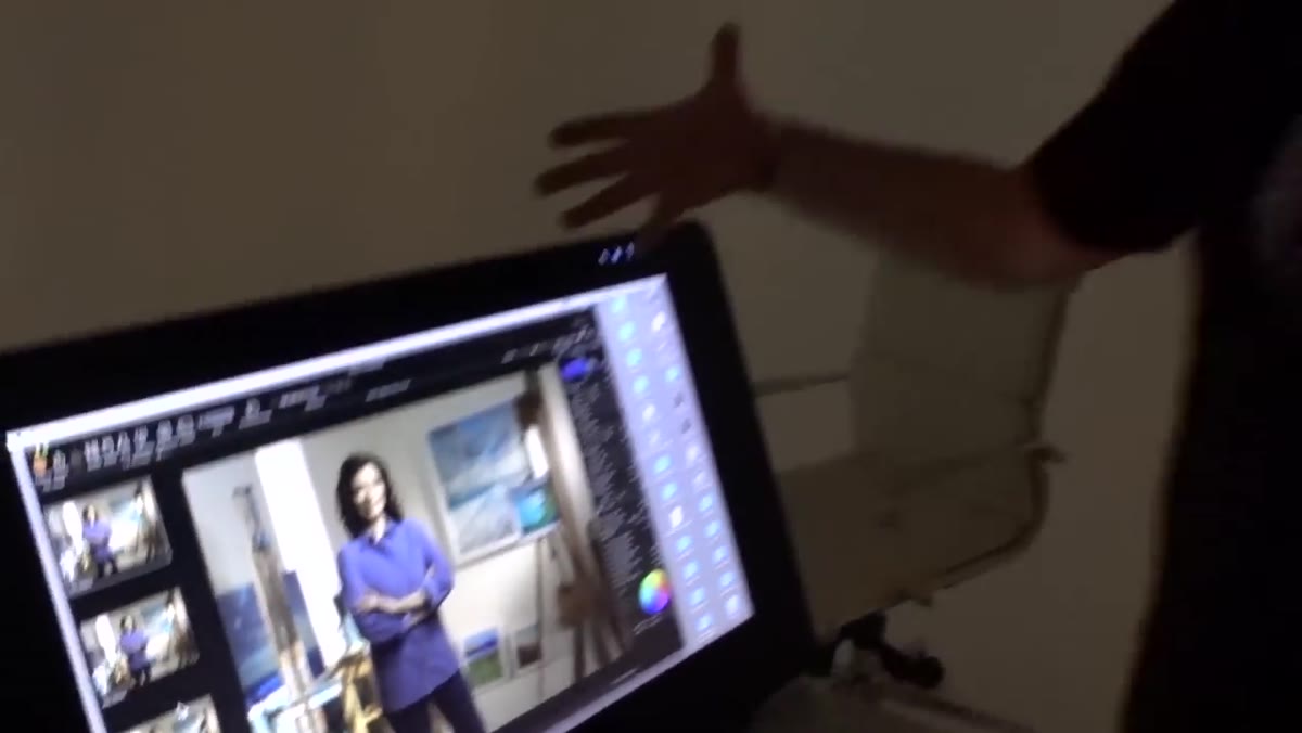 PAR 133 positioned as main light on the model
The main light on the subject is a PAR 133. PAR cans produce a harder, more directional beam than a softbox, which suits this kind of environmental portrait where you want the subject to feel lit by the room rather than by studio equipment. The quality of the light suggests a practical source, a window or an overhead fixture, without looking artificial.
PAR 133 positioned as main light on the model
The main light on the subject is a PAR 133. PAR cans produce a harder, more directional beam than a softbox, which suits this kind of environmental portrait where you want the subject to feel lit by the room rather than by studio equipment. The quality of the light suggests a practical source, a window or an overhead fixture, without looking artificial.
Placement matters more than modifier choice here. Position it so the light direction is consistent with whatever practical source you’ve implied in the scene. If your window is camera-right, your key needs to come from that side or the whole illusion collapses.
Step 4: Graze the Background With a Fresnel and a Warm Gel
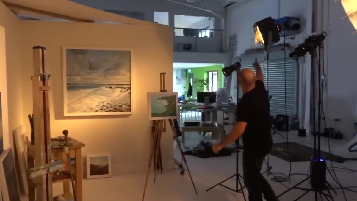 Fresnel light grazing the paintings on the background wall
A large Fresnel positioned to graze across the painted wall and the borrowed artwork does two things simultaneously. It creates texture on the wall surface, which separates it from a flat painted backdrop, and it warms the scene through a slight warming gel on the fixture. The warmth is subtle enough to read as natural interior light rather than a filtration choice.
Fresnel light grazing the paintings on the background wall
A large Fresnel positioned to graze across the painted wall and the borrowed artwork does two things simultaneously. It creates texture on the wall surface, which separates it from a flat painted backdrop, and it warms the scene through a slight warming gel on the fixture. The warmth is subtle enough to read as natural interior light rather than a filtration choice.
Grazing means the light source is nearly parallel to the surface it’s hitting, raking across it at a very low angle. Move the light even slightly toward perpendicular and you lose the texture entirely. I’ve gotten into the habit of marking the stand position with tape on my studio floor once I find the right angle, a trick that’s saved me more than once when a light gets nudged during a wardrobe change.
Step 5: Use Projection Attachments to Simulate Window Light
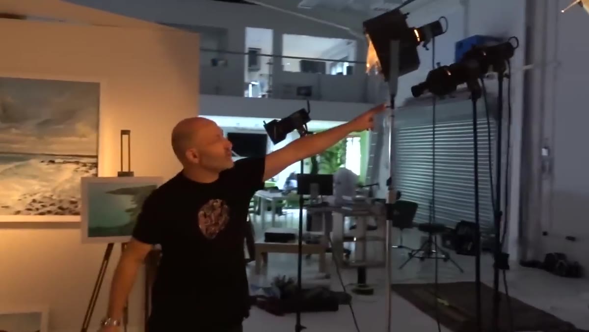 Two projection attachment lights creating window light patches
Two lights fitted with projection attachments throw rectangular patches of light across the set that read unmistakably as sunlight coming through a window. This is one of the more underused tools in commercial studio work. A projection attachment, sometimes called a gobo head or pattern projector, lets you cast a shaped pool of light rather than a broad wash. The result looks like practical light from an architectural source, not a strobe.
Two projection attachment lights creating window light patches
Two lights fitted with projection attachments throw rectangular patches of light across the set that read unmistakably as sunlight coming through a window. This is one of the more underused tools in commercial studio work. A projection attachment, sometimes called a gobo head or pattern projector, lets you cast a shaped pool of light rather than a broad wash. The result looks like practical light from an architectural source, not a strobe.
The key is feathering the edges. Hard, perfectly defined rectangles can look mechanical. Slightly soft edges, achieved by adjusting the focus on the attachment or introducing minor diffusion, make the window simulation convincing.
Step 6: Add an Edge Light and a Foreground Element for Depth
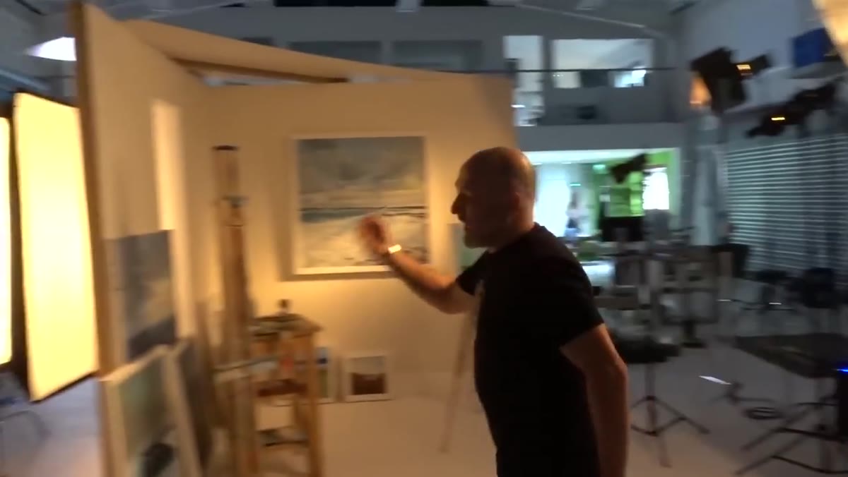 Edge light on model and foreground element with Fresnel
An edge light on the subject separates them from the background and creates the three-dimensionality that flat studio shots often lack. In this setup, there’s also a foreground element with its own Fresnel, introduced specifically to create slight occlusion. Something in the near foreground, partially in frame, gives the image a feeling of being observed from within the space rather than staged in front of it. It’s a small addition that shifts the image from portrait to scene.
Edge light on model and foreground element with Fresnel
An edge light on the subject separates them from the background and creates the three-dimensionality that flat studio shots often lack. In this setup, there’s also a foreground element with its own Fresnel, introduced specifically to create slight occlusion. Something in the near foreground, partially in frame, gives the image a feeling of being observed from within the space rather than staged in front of it. It’s a small addition that shifts the image from portrait to scene.
A second softbox feeds through the cut window in the wall, adding fill from a motivated direction. Every light in this setup has a reason that connects back to the fictional physics of the room. That’s what makes it work.
When the Set Outlives the Shoot
The thing I’d add from my own experience is that a well-built set panel pays for itself across multiple shoots, but only if you document it. After every setup I build, I sketch the lighting diagram in my lighting journal and note which wall configuration I used. When a client comes back six months later needing something similar, I can rebuild it in an hour instead of starting from scratch. The walls in this tutorial were cycled through at least four different set identities in a single day. That kind of efficiency doesn’t happen by accident. It happens because the infrastructure was designed for flexibility from the start.
The single most important takeaway from this tutorial is that believability comes from internal consistency, not from complexity. Every light in that setup is motivated by a fictional source the viewer accepts as real. Get that logic right and you can build a convincing world from two painted walls and a bag of props. Get it wrong and no amount of expensive gear will save you.
Watch the full tutorial on YouTube to see the complete setup in action, including how the finished frames look on the Hasselblad.
Comments
Leave a Comment