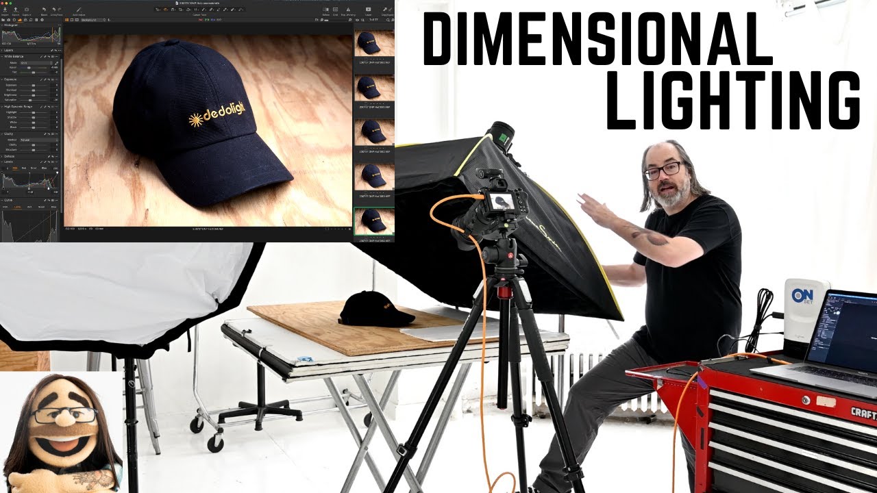
Still life and product work has a reputation for being straightforward. One light, white background, done. And sure, that approach gets the job done for basic e-commerce. But the moment a client wants something that feels tactile, something that makes a viewer want to reach out and pick up the object, flat lighting becomes the enemy. I run into this constantly. A beauty brand will ask for a shot that “pops off the page,” and what they’re really asking for is dimensionality, shadow, a sense that the product exists in physical space rather than floating in a void.
That’s exactly what Watch the full tutorial on YouTube by Daniel Norton addresses in his tutorial on simple, dimensional lighting for still life. Norton is a working commercial photographer based in New York, and his approach here is refreshingly practical. He’s not chasing drama. He’s solving a specific problem: how do you take a textured object, in his case a hat, and make it look like it’s sitting on a surface in the real world rather than pasted onto one? The answer involves two lights, one modifier choice that most people overlook, and a compositional instinct that applies well beyond hats.
Step 1: Choose Your Camera and Understand Its Limits
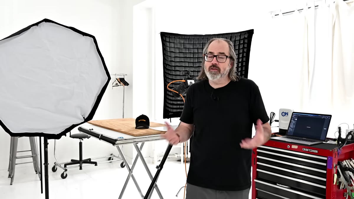 Camera and lens setup described while standing at shooting position
Norton shoots this on a Nikon Z6 II with a 24-120mm lens. He’s transparent about the tradeoff: for high-volume print catalog work, you’d want more megapixels. For web and standard commercial use, a 24-megapixel body is more than sufficient. The principle he emphasizes is histogram management. Whatever body you’re using, keep your tonal spread wide. A crunched histogram, especially on APS-C sensors at anything above base ISO, starts costing you detail in the shadows and highlights where texture lives.
Camera and lens setup described while standing at shooting position
Norton shoots this on a Nikon Z6 II with a 24-120mm lens. He’s transparent about the tradeoff: for high-volume print catalog work, you’d want more megapixels. For web and standard commercial use, a 24-megapixel body is more than sufficient. The principle he emphasizes is histogram management. Whatever body you’re using, keep your tonal spread wide. A crunched histogram, especially on APS-C sensors at anything above base ISO, starts costing you detail in the shadows and highlights where texture lives.
For still life work I almost always shoot tethered at base ISO, and Norton’s logic here reinforces why. Flash keeps ISO low, low ISO keeps the histogram honest, and an honest histogram means you’re capturing the full character of the surface you’re shooting. With product work, the surface is often the point.
Step 2: Set Up Your Two-Light Rig
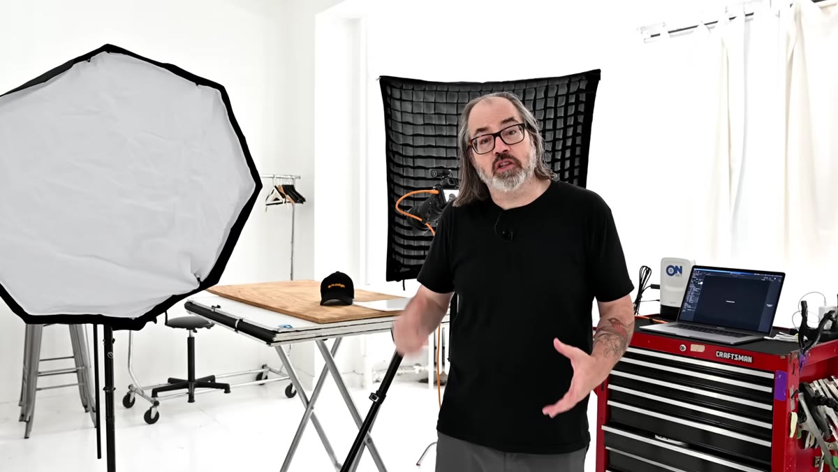
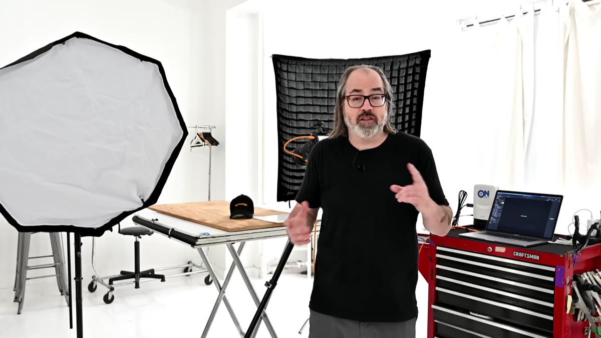 Two Profoto B10 strobes positioned with softbox modifiers
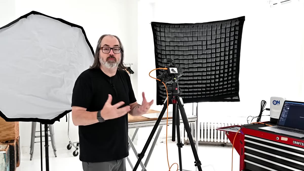
Norton runs two Profoto B10 units, each rated at 250 watt-seconds. The key light goes into a three-foot parabolic octabox (a Glow ParaPop). The second light, which is where the real technique lives, goes into a 40-inch square softbox fitted with a grid. Both are compact, manageable modifiers. Nothing in this setup requires a large studio footprint, which is worth noting if you’re working in a tight space.
Two Profoto B10 strobes positioned with softbox modifiers
Norton runs two Profoto B10 units, each rated at 250 watt-seconds. The key light goes into a three-foot parabolic octabox (a Glow ParaPop). The second light, which is where the real technique lives, goes into a 40-inch square softbox fitted with a grid. Both are compact, manageable modifiers. Nothing in this setup requires a large studio footprint, which is worth noting if you’re working in a tight space.
The grid on that square softbox is doing specific work. Without it, a softbox spills light broadly across the frame, wrapping around the subject and filling in shadows. That fill is useful for portraits. For still life, it’s often the enemy of depth. The grid contains the light, directing it with more intention and letting the shadow side of your subject breathe.
Step 3: Position the Key Light
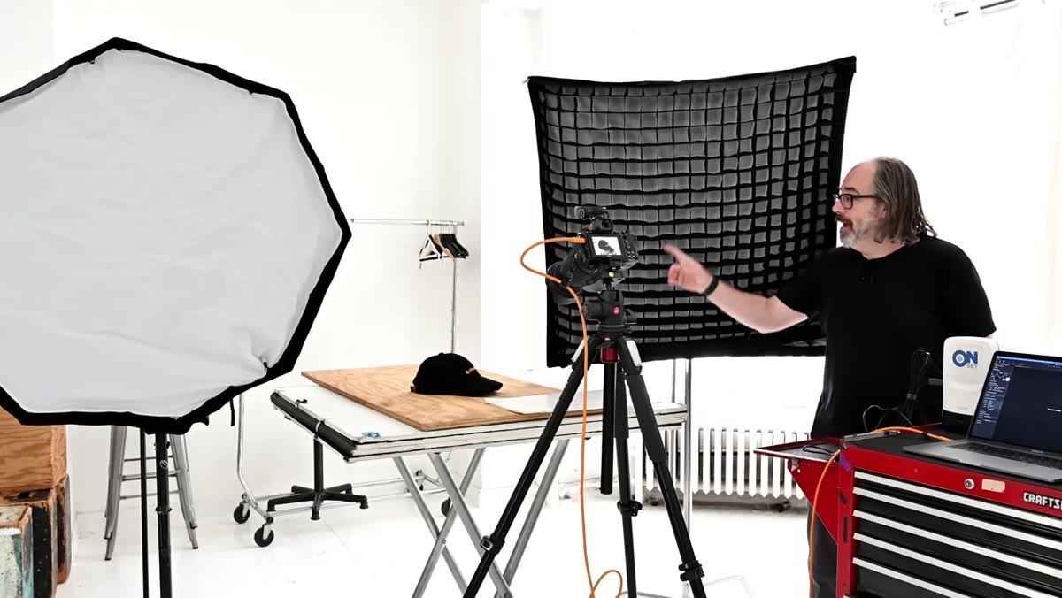 Key light positioned to camera left, angled toward the subject
The octabox serves as the key light. Norton positions it to one side of the subject at a height and angle that creates a natural-looking fall-off across the hat’s surface. The parabolic shape of the modifier produces a slightly more specular quality than a flat-faced softbox, which means it draws out texture rather than washing over it. For any object with surface detail, that specularity matters.
Key light positioned to camera left, angled toward the subject
The octabox serves as the key light. Norton positions it to one side of the subject at a height and angle that creates a natural-looking fall-off across the hat’s surface. The parabolic shape of the modifier produces a slightly more specular quality than a flat-faced softbox, which means it draws out texture rather than washing over it. For any object with surface detail, that specularity matters.
The general principle: your key light angle determines where your shadows fall, and your shadow placement determines how three-dimensional the object reads. Light coming from too far front flattens everything. Light coming from too far to the side can make the subject look dramatic but lose readable detail on the facing surface. A 45-degree-ish position is a reliable starting point, but I always adjust based on the object’s specific texture and shape. I keep a lighting journal and the note I keep rewriting is: the key light is a question you ask the object.
Step 4: Use the Gridded Softbox as a Controlled Fill
 Gridded 40-inch square softbox, grid attachment visible on front
The second light with the grid goes on the opposite side, functioning as a fill. But because the grid narrows the beam, it’s a restrained fill. You’re not flooding the shadow side with light. You’re nudging it, adding just enough information so the shadows read as shadow rather than as pure black voids. The difference in your final image is the difference between dimensional and flat versus dimensional and muddy.
Gridded 40-inch square softbox, grid attachment visible on front
The second light with the grid goes on the opposite side, functioning as a fill. But because the grid narrows the beam, it’s a restrained fill. You’re not flooding the shadow side with light. You’re nudging it, adding just enough information so the shadows read as shadow rather than as pure black voids. The difference in your final image is the difference between dimensional and flat versus dimensional and muddy.
Norton’s setup shows that you don’t need a reflector card, a third light, or anything complicated. A gridded modifier gives you fill with control. Dial the power lower than your key and use the grid to keep it from spilling onto your background. That separation between subject lighting and background lighting is what gives you a sense of depth in the frame.
Step 5: Compose for the Viewer’s Perspective
 Hat positioned on wooden surface, camera at approximate eye level
Norton places the hat on a piece of wood to suggest environment, then sets his camera height to approximate what you’d see if you were standing at a table looking down at the object. This sounds obvious but it’s easy to get wrong. A camera angle that’s too high makes the product look like a diagram. Too low and you lose the sense that it’s sitting on a surface. The goal is that the viewer feels like they could reach in and pick it up.
Hat positioned on wooden surface, camera at approximate eye level
Norton places the hat on a piece of wood to suggest environment, then sets his camera height to approximate what you’d see if you were standing at a table looking down at the object. This sounds obvious but it’s easy to get wrong. A camera angle that’s too high makes the product look like a diagram. Too low and you lose the sense that it’s sitting on a surface. The goal is that the viewer feels like they could reach in and pick it up.
He also makes a point about text orientation: the beginning of any word or label on the product should face the camera. It’s a reading direction instinct. Viewers process text left-to-right, and if the end of the word is leading into frame, the eye follows it away from the image. Small detail, real consequence.
One More Thing: The Grid Is Worth Owning Separately
I want to add something Norton touches on but that I think deserves more weight. If you already own a softbox and you’re not using a grid with it for product work, buy the grid before you buy another modifier. I spent years adding lights to solve problems that a grid on an existing light would have fixed in ten minutes. The grid is not an accessory. For still life and product photography, it’s a fundamental tool. I label mine with masking tape the same way I label every light in my studio, because on a shoot with multiple modifiers in play, knowing instantly which light has the grid saves time and saves shots.
Norton’s two-light approach works because it’s based on logic rather than gear accumulation. A controlled key that finds the texture, a restrained fill that preserves the shadow, and a camera angle that puts the viewer in the scene. Those three things produce images that read as professional regardless of what brand name is on your flash.
The single thing to take away from this tutorial: the grid turns a fill light into a precise instrument. Without it, you’re managing light with a broad stroke. With it, you’re making decisions.
Watch the full tutorial on YouTube to see Norton walk through the full setup and compare the shots before and after he dials in the lighting.
Comments (2)
Simple but effective. Sometimes that's all you need.
This is the kind of content that keeps me coming back.
Leave a Comment