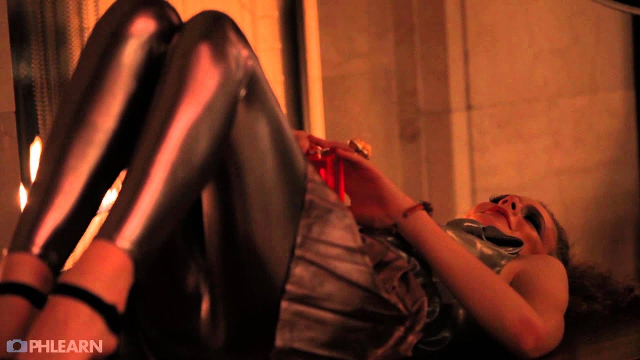
Every location shoot I walk into, I do the same thing before I touch a single piece of gear. I stop at the door and I look for the light that’s already there. Not the light I brought. The light that exists. Most photographers I know do the opposite. They walk in with a plan built in the parking lot and spend the next hour trying to force that plan onto a space that doesn’t want it. I’ve done it. It costs you time, it costs you money, and it costs you shots.
In this Aaron Nace (PHLEARN) tutorial, Aaron breaks down a fashion shoot inside what looks like a dimly lit restaurant with fireplaces, booth seating, and wall-mounted safe deposit boxes. On paper, that’s a nightmare. In practice, Aaron turns every single one of those elements into a lighting asset. Watching it, I kept sketching setups into my lighting journal because the decision-making process he’s demonstrating is exactly the workflow I try to teach my own assistants.
What follows is my breakdown of his approach, step by step, with the technical specifics you need to actually replicate it.
Step 1: Audit the Location for Its Best Existing Features
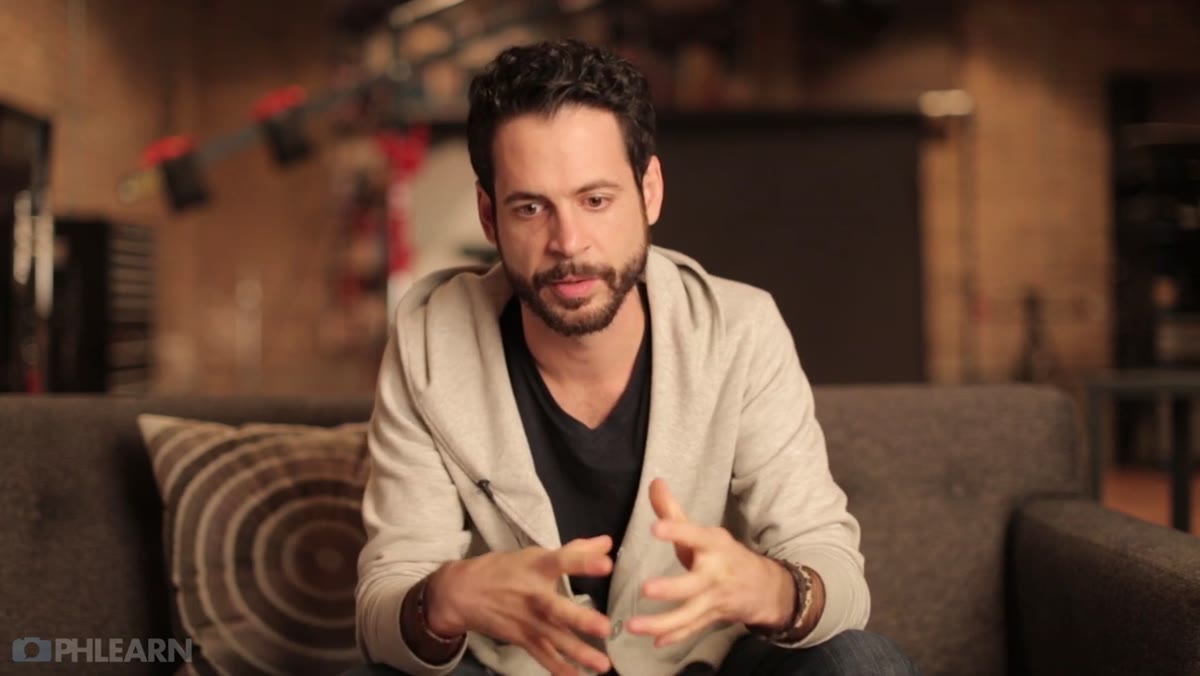
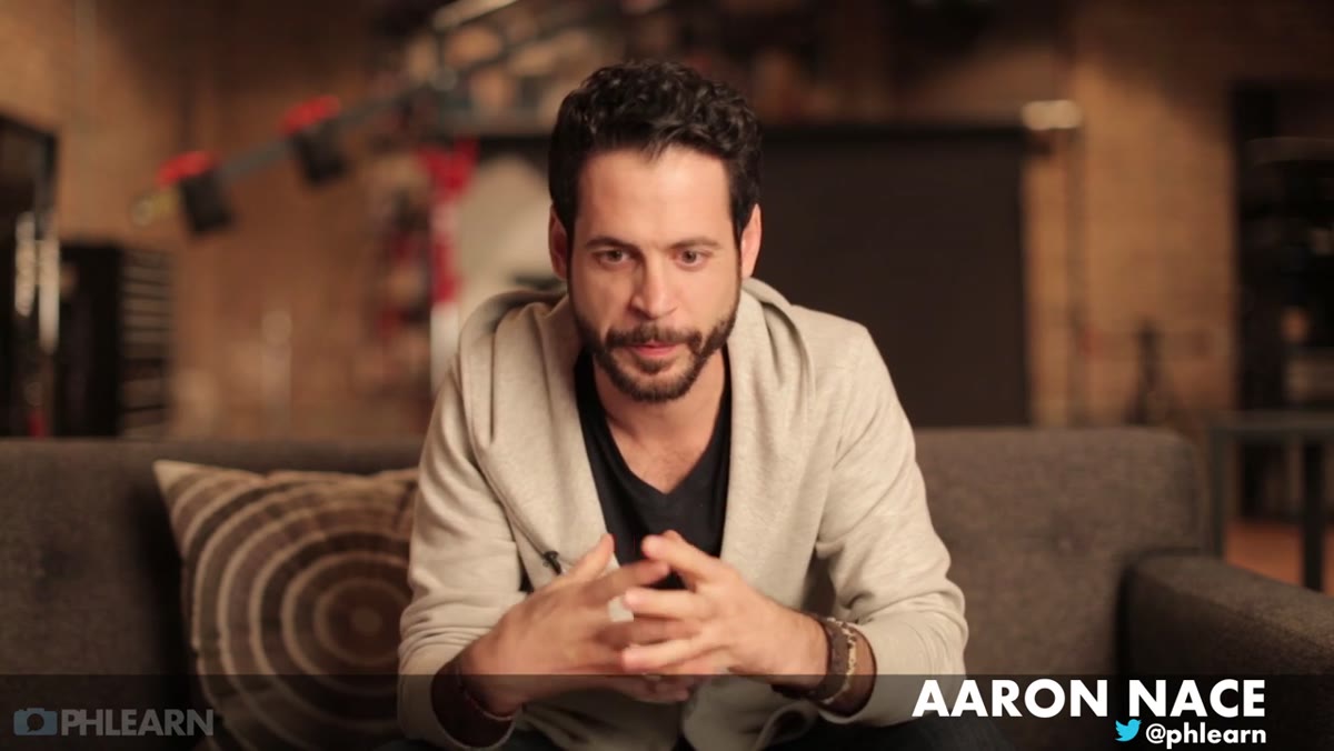 Aaron assessing the restaurant location before setting up lights
Before you pull a light stand out of your bag, walk the entire space and ask one question: what is visually interesting here, and what kind of light is already on it? In Aaron’s case, that meant noticing the accent lighting on a row of safety deposit boxes mounted to the wall. That kind of wall wash lighting is common in restaurants and bars and most photographers ignore it completely. Instead, treat it as a practical. It adds depth, it creates detail in your background, and it tells a story about the space. Write down or photograph every light source in the room, note its color temperature roughly, and decide which ones are worth preserving in the exposure.
Aaron assessing the restaurant location before setting up lights
Before you pull a light stand out of your bag, walk the entire space and ask one question: what is visually interesting here, and what kind of light is already on it? In Aaron’s case, that meant noticing the accent lighting on a row of safety deposit boxes mounted to the wall. That kind of wall wash lighting is common in restaurants and bars and most photographers ignore it completely. Instead, treat it as a practical. It adds depth, it creates detail in your background, and it tells a story about the space. Write down or photograph every light source in the room, note its color temperature roughly, and decide which ones are worth preserving in the exposure.
Step 2: Position Your Subject to Interact With Ambient Practicals
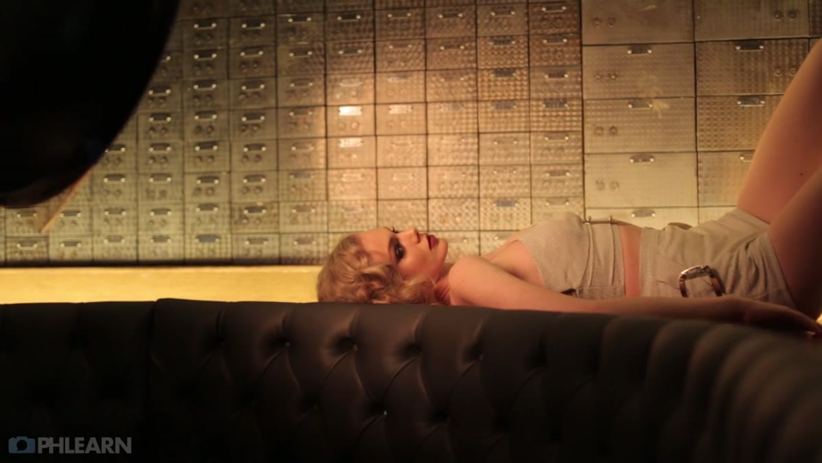
 Subject positioned behind restaurant booth with accent lighting below
Once you’ve identified your practicals, you need to physically place your subject in relationship to them. Aaron’s subject was positioned in the booth area, specifically to take advantage of low-mounted lights beneath the seating. This is a posing and lighting decision happening simultaneously. The light was coming up from below, which is dramatic and a little unusual, and he wanted that quality preserved in the final image. Getting your subject close enough to a practical that it actually registers on their face or body requires you to think about distance and falloff, not just direction. Move your subject closer to a practical and the effect intensifies. Move them back and it disappears into the ambient.
Subject positioned behind restaurant booth with accent lighting below
Once you’ve identified your practicals, you need to physically place your subject in relationship to them. Aaron’s subject was positioned in the booth area, specifically to take advantage of low-mounted lights beneath the seating. This is a posing and lighting decision happening simultaneously. The light was coming up from below, which is dramatic and a little unusual, and he wanted that quality preserved in the final image. Getting your subject close enough to a practical that it actually registers on their face or body requires you to think about distance and falloff, not just direction. Move your subject closer to a practical and the effect intensifies. Move them back and it disappears into the ambient.
Step 3: Dial In a Balanced Exposure Between Ambient and Strobe
 Camera settings being adjusted for slow shutter and low strobe power
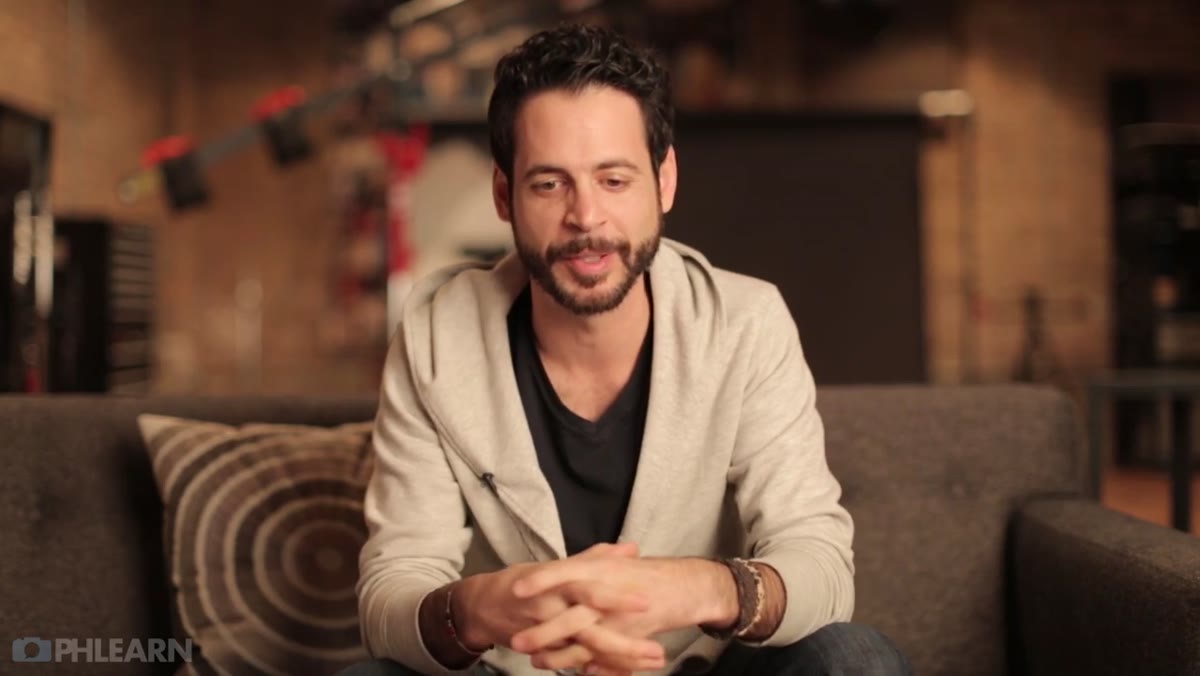
This is where most photographers either blow out their practicals with strobe or underexpose the ambient trying to freeze motion. The fix is methodical. Start by setting your shutter speed long enough that the ambient light registers clearly on the sensor. In Aaron’s situation, with low-wattage restaurant lighting in a deliberately dim room, that meant a noticeably slow shutter speed and a bump to ISO. Once the ambient is exposed correctly by itself, introduce your strobe at low power and test. Your strobe should fill the subject without overpowering the practical. Think of it as adding strobe power in small steps until the subject is properly lit but the ambient glow behind and beneath them is still visible. Motion blur is the risk with a slower shutter, so the subject needs to hold position during the exposure. Brief them on this before you shoot. Clear communication cuts reshoot time considerably.
Camera settings being adjusted for slow shutter and low strobe power
This is where most photographers either blow out their practicals with strobe or underexpose the ambient trying to freeze motion. The fix is methodical. Start by setting your shutter speed long enough that the ambient light registers clearly on the sensor. In Aaron’s situation, with low-wattage restaurant lighting in a deliberately dim room, that meant a noticeably slow shutter speed and a bump to ISO. Once the ambient is exposed correctly by itself, introduce your strobe at low power and test. Your strobe should fill the subject without overpowering the practical. Think of it as adding strobe power in small steps until the subject is properly lit but the ambient glow behind and beneath them is still visible. Motion blur is the risk with a slower shutter, so the subject needs to hold position during the exposure. Brief them on this before you shoot. Clear communication cuts reshoot time considerably.
Step 4: Use Color to Tie the Wardrobe to the Background
 Red-gelled light casting color across the background and vault doors
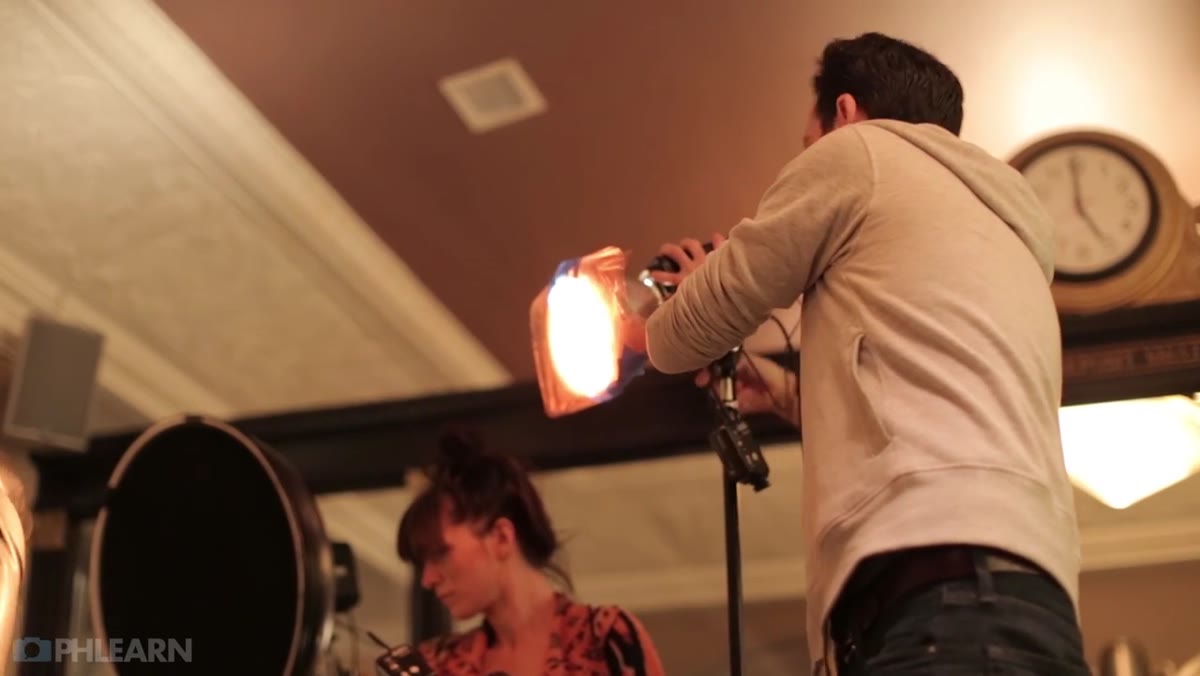
This is the technique I find myself recommending most often to photographers who shoot fashion and can’t figure out why their wardrobe isn’t reading on camera. If a piece of clothing has a strong color, echo that color somewhere in the background. Aaron’s subject wore a red scarf with metal accents. His solution was to place a bare bulb light with two layers of red gel approximately 20 feet to camera left, angled to wash the back wall. The result was a subtle red ambient glow that showed up on the metallic surfaces of the deposit box doors and created a visual connection between the foreground subject and the background environment. Two layers of gel deepened the saturation. One layer of red gel reads as warm. Two layers reads as intentionally red. Test both and see which one your background can absorb without looking like a nightclub.
Red-gelled light casting color across the background and vault doors
This is the technique I find myself recommending most often to photographers who shoot fashion and can’t figure out why their wardrobe isn’t reading on camera. If a piece of clothing has a strong color, echo that color somewhere in the background. Aaron’s subject wore a red scarf with metal accents. His solution was to place a bare bulb light with two layers of red gel approximately 20 feet to camera left, angled to wash the back wall. The result was a subtle red ambient glow that showed up on the metallic surfaces of the deposit box doors and created a visual connection between the foreground subject and the background environment. Two layers of gel deepened the saturation. One layer of red gel reads as warm. Two layers reads as intentionally red. Test both and see which one your background can absorb without looking like a nightclub.
Step 5: Maximize Compositional Geometry Before You Block the Shot
 Three fireplaces visible as Aaron plans how to frame the subject
When Aaron arrived at the fireplace wall, he had three separate fireplaces to work with. A standing subject would only allow him to include one in frame, and the composition would feel unresolved. His solution was to change the orientation of the subject entirely. Laying the subject down allowed her to span across all three fireplaces horizontally, turning the architecture into a frame rather than a background. This is a compositional principle worth keeping in your toolkit: if the location has repeating elements, find the camera angle or subject position that lets you use all of them, not just one. Vertical compositions favor a single strong subject element. Horizontal compositions favor environment. Fireplaces are environment. Use them accordingly.
Three fireplaces visible as Aaron plans how to frame the subject
When Aaron arrived at the fireplace wall, he had three separate fireplaces to work with. A standing subject would only allow him to include one in frame, and the composition would feel unresolved. His solution was to change the orientation of the subject entirely. Laying the subject down allowed her to span across all three fireplaces horizontally, turning the architecture into a frame rather than a background. This is a compositional principle worth keeping in your toolkit: if the location has repeating elements, find the camera angle or subject position that lets you use all of them, not just one. Vertical compositions favor a single strong subject element. Horizontal compositions favor environment. Fireplaces are environment. Use them accordingly.
Step 6: Add Reflective Surfaces to Multiply Practical Light
 Reflective surface placed on floor to mirror fireplace light
With the subject horizontal near the fireplaces, Aaron introduced a slightly reflective surface to the floor in front of her. This created a mirrored reflection of the fire, effectively doubling the visual presence of the light source without adding a single additional strobe or gel. In a dark environment, a reflection of a warm practical reads as genuine firelight, not a trick. Materials worth testing for this effect include white foam board, acrylic sheeting, or even a dark fabric that catches specular highlights. Each gives you a different quality of reflection. Foam board scatters. Acrylic mirrors. Dark fabric suggests rather than defines. Choose based on how literal you want the reflection to look.
Reflective surface placed on floor to mirror fireplace light
With the subject horizontal near the fireplaces, Aaron introduced a slightly reflective surface to the floor in front of her. This created a mirrored reflection of the fire, effectively doubling the visual presence of the light source without adding a single additional strobe or gel. In a dark environment, a reflection of a warm practical reads as genuine firelight, not a trick. Materials worth testing for this effect include white foam board, acrylic sheeting, or even a dark fabric that catches specular highlights. Each gives you a different quality of reflection. Foam board scatters. Acrylic mirrors. Dark fabric suggests rather than defines. Choose based on how literal you want the reflection to look.
What I’d Add From My Own Experience
Aaron’s approach to color gelling is correct, and I’d push it one step further. Before I gel any light on a fashion shoot, I pull a swatch of the garment’s dominant color and hold it next to my gel sample book. Color on a monitor and color in your hand are different things. I’ve gelled a light to match what I thought was a burgundy top and ended up with a magenta cast that needed two hours of correction in post. Now I match physically before I shoot. It’s a 30-second habit that has saved me more time in Lightroom than I care to calculate.
The core idea here is straightforward but easy to miss in the pressure of a live shoot: the location is already doing half the lighting work, if you let it. Your strobes are there to support what exists, not to overwrite it. That shift in thinking changes how you pack, how you scout, and how you direct your subject once you’re on set.
Watch the full tutorial on YouTube and pay particular attention to how Aaron sequences his decisions. Location first. Ambient second. Strobe third. Color last. That order matters.
Comments (2)
This is the kind of content that keeps me coming back.
Solid advice. Especially the part about taking your time with it.
Leave a Comment