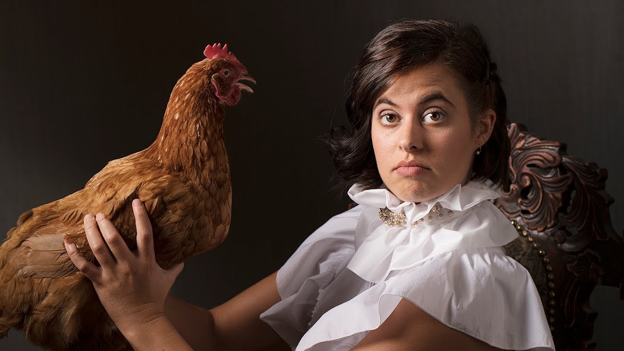
There’s a specific problem that comes up in studio work more often than I’d like to admit: a client shows up wearing something that fights your lighting plan before you’ve fired a single frame. Two subjects, one in white, one in black, and you’re supposed to make them look cohesive in a dark, dramatic portrait. The temptation is to throw more light at it and hope the camera sorts it out. It never does. What you actually need is a lighting logic that sidesteps the problem entirely, and that’s exactly what J.P. Morgan demonstrates in this tutorial from The Slanted Lens. Watch the full tutorial on YouTube
The setup here is a baroque-inspired, low key double portrait, two people with contrasting outfits, thrones, a Pomeranian, and yes, a live chicken. The novelty aside, the lighting problem is completely real and the solution is transferable to any studio situation where you need drama without losing your subjects in the dark. I’ve sketched this one into my lighting journal already.
What Morgan works out, and what I want to unpack step by step, is how to build a low key image that handles tonal contrast in clothing by concentrating light on faces and letting everything else fall where it wants. It’s disciplined lighting, and once you see the logic, it changes how you approach the whole category.
Step 1: Build a Background With Depth, Not Just Darkness
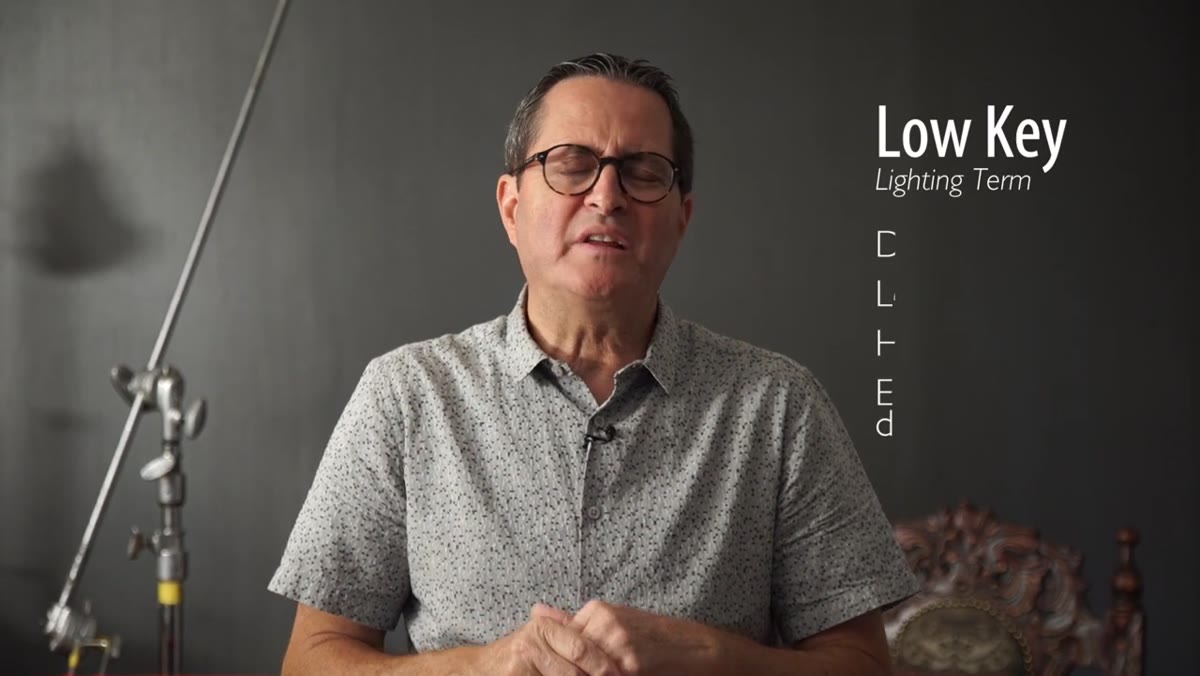 Textured painted studio wall with visible brushstroke depth
A flat dark backdrop is just a void. Morgan’s team painted their wall in two stages: a base coat of blue, followed by a dark gray applied with a broom in vertical strokes. The broom drags unevenly, leaving the blue visible underneath in places. The result is a wall that has actual visual texture without being distracting, something that reads as depth rather than emptiness once the light hits it.
I’ve done a version of this with a sponge roller over a base coat, and the principle is the same. You want the background to feel like a place, not a cutout. For low key work especially, a textured dark background holds the image together in a way that seamless paper simply cannot.
Step 2: Position Rim Lights on Both Sides to Separate Subjects From Background
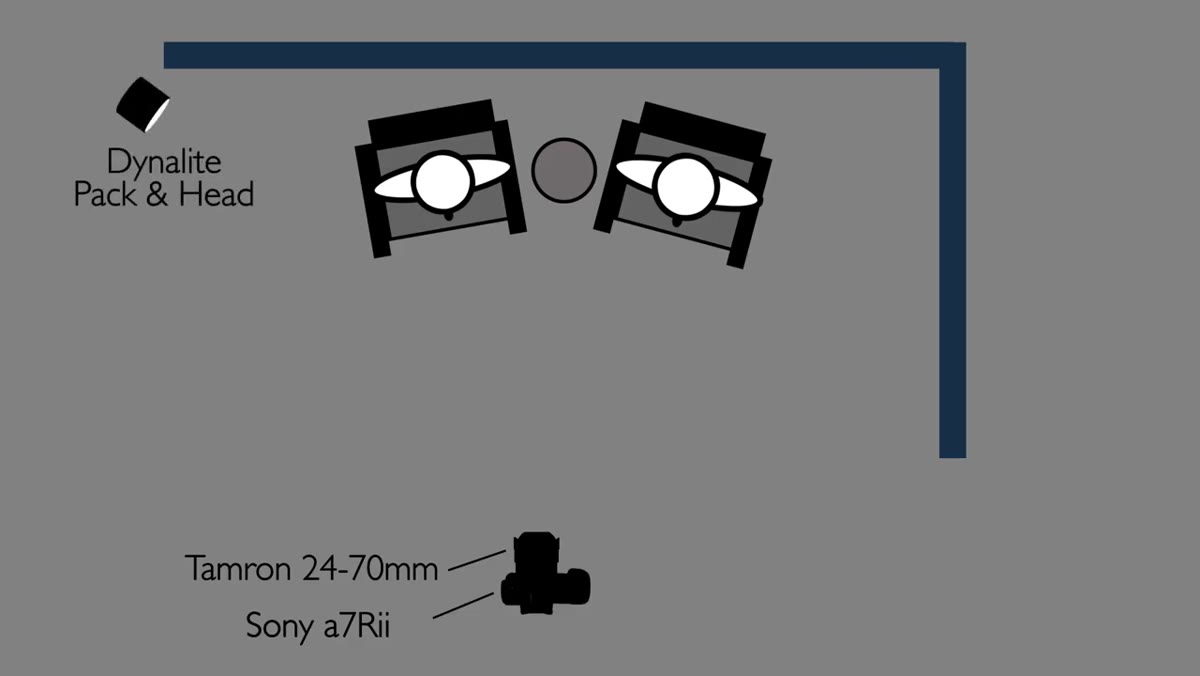 Two rim lights placed left and right behind subjects
With the dark background in place, the first lighting question is separation. If you just point a key light at your subjects against a dark wall, they’ll start to merge into it, especially in areas where their clothing matches the background tonally. Morgan places rim lights on both the left and right sides of the frame, behind the subjects, aimed back toward camera.
The key word here is subtle. These are not the theatrical rim lights that blow out shoulders. They’re dialed down just enough to draw a clean edge around each person and pull them off the background. I label my rim lights separately on my setup sheets precisely because it’s easy to let them creep up in power during a shoot. Set them, check the edge definition, and leave them alone.
Step 3: Use a Gridded Octadome as Your Key Light, Aimed at Faces Only
 Octadome with grid positioned centrally in front of subjects
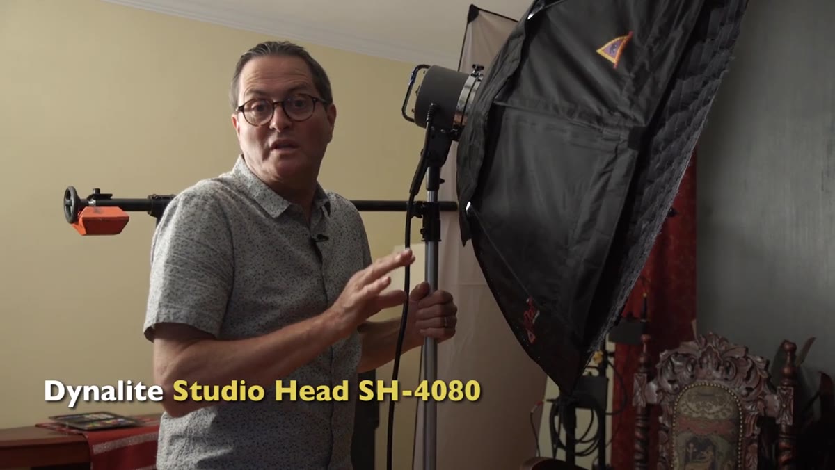
The main light here is an octadome placed centrally in front of the subjects, with a grid attached. The grid is doing two jobs: controlling spill so light doesn’t bleed onto the background, and concentrating the output so it pools on the faces rather than flooding the whole frame. Morgan tilts the octadome slightly upward to get coverage across both subjects without widening the beam too far.
This is the move that solves the contrasting-outfit problem. You’re lighting faces, not clothing. When the light is shaped this tightly, a white shirt and a black shirt both just live in the same shadow, and your eye goes straight to the people. A bare octadome in this situation would have been a disaster, washing light across the whole scene and making the tonal difference between outfits a constant battle.
Step 4: Add a Separate Grid for Any Subject Getting Underlit
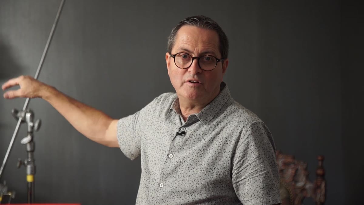 Grid spot aimed at left subject’s face for fill correction
With two subjects sharing one key light, one person will almost always be favored over the other depending on their position. In this case, the subject on the left was receiving slightly less light than her counterpart. Morgan’s fix is a separate grid aimed specifically at her face to open it up just enough to balance the pair.
This is not a fill light in the traditional sense. It’s a corrective accent, placed at an angle that still produces Rembrandt-style shadow structure rather than flattening her face. The Rembrandt triangle stays intact, the balance between subjects improves, and the overall mood doesn’t shift. A grid is doing the heavy lifting here. Without it, you’re either over-lighting one face or accepting an imbalance.
Step 5: Kill the Background Lights and Let Darkness Work for You
 Monitor showing background lights turned off, deeper shadow result
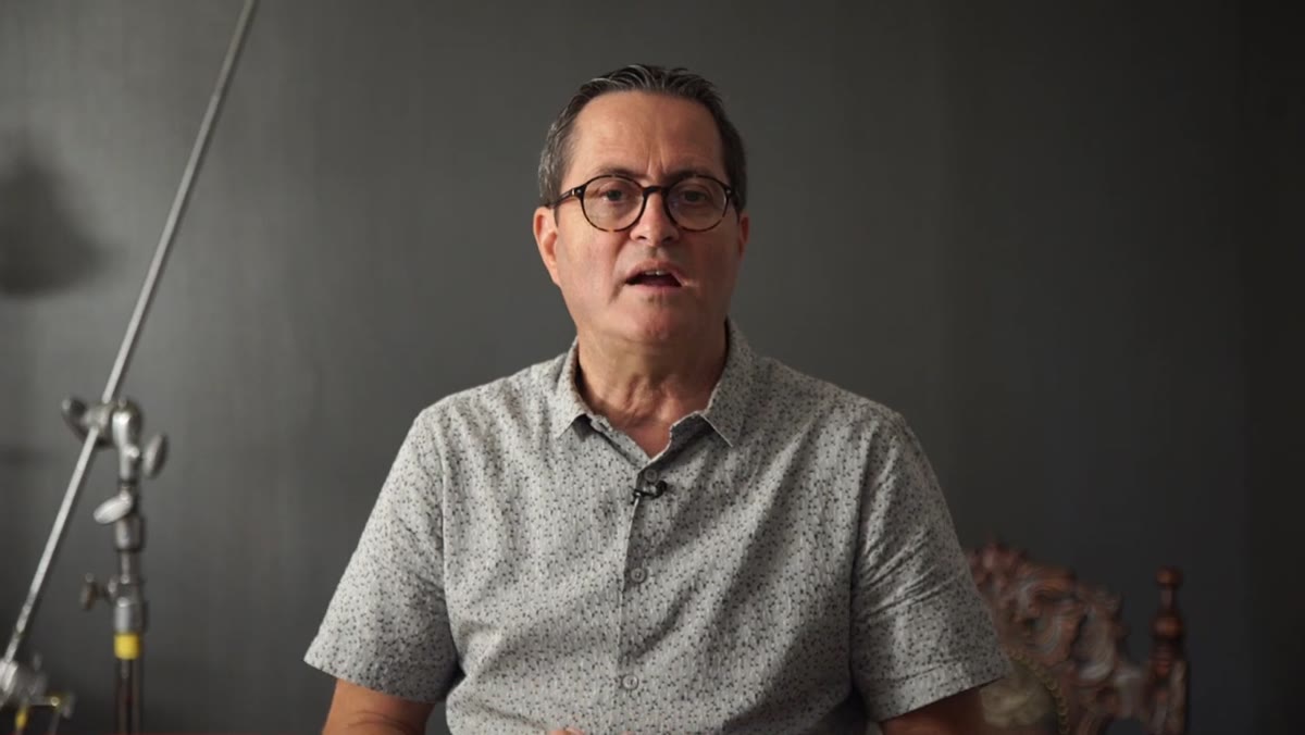
Morgan mentions that lights were initially rigged to illuminate the background and were ultimately switched off entirely. This is worth dwelling on. The instinct in studio work is to use every light you’ve rigged. If you put it up, it should do something. But background lights in a low key setup can undercut the whole mood by making the scene read as lit rather than found.
When those lights came off, the background dropped into shadow and the painted texture became something the eye could suggest rather than read literally. The subjects’ faces became the clear point of focus. Sometimes the best lighting decision is subtraction, not addition.
Step 6: Shift to Solo Portraits With Even More Aggressive Rembrandt Positioning
 Single subject under tightly gridded key light, strong shadow side visible
After the group shot, Morgan moves each subject individually and rebuilds the light for maximum Rembrandt contrast. The octadome is repositioned and the angle increases so the shadow side of the face is deeper and the transition from light to dark is faster. The goal is a high-contrast look where light hits the near side of the face, produces the classic triangular catch light under the eye on the shadow side, and then falls away quickly.
For solo portraits in this style, I typically work at about a 45-degree angle from the subject’s face and raise the light to slightly above eye level. The falloff is what makes it feel painterly rather than just shadowy. If the shadow side still has too much ambient fill, the effect goes flat. Use the grid to kill that spill and trust the darkness.
What I’d Add: Watch Your Background Exposure Separately
Every time I run a setup like this, I check the background exposure independently before I bring subjects in. Meter the background at the position of the wall, note the reading, then meter the face position. I want the background sitting at least two stops under the face value. If it’s closer than that, the darkness feels accidental rather than intentional, and no amount of retouching fixes accidental.
A textured wall at minus-two looks rich. The same wall at minus-half-a-stop looks like a lighting mistake. It’s a small habit, but it’s the difference between a portrait that reads as controlled and one that just reads as dark.
The single most important idea in this tutorial is that low key lighting is about where light is not, as much as where it is. Rim the subjects, pool the key light on faces with a grid, and then let everything else fall into shadow. The clothing contrast, the background, the depth of the scene - all of it resolves when you stop trying to light the whole frame and start lighting only what matters.
Watch the full tutorial on YouTube to see the complete setup in action, including the solo portrait sequence and the final images with both subjects.
Comments
Leave a Comment