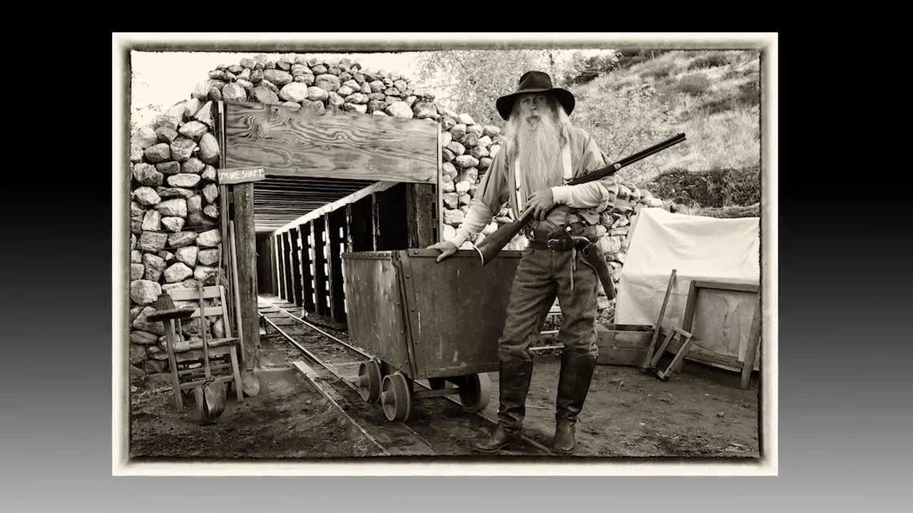
Most photographers I know treat black and white as a finishing move. You shoot in color, decide the image feels moody, desaturate it in Lightroom, and call it done. I did the same thing for years until a few bad editorial conversions made me realize I wasn’t thinking about light the right way. When you pull color out of an image, you lose the thing most photographers rely on to create separation and visual interest. What’s left is only tonal contrast – highlights, shadows, and the relationship between them. That changes how you have to light from the very beginning.
Watch the full tutorial on YouTube
In this The Slanted Lens tutorial, Jay P. Morgan takes a crew to an actual mine shaft location and works through a series of setups that illustrate exactly how to build contrast deliberately for black and white. What I appreciate about his approach is that it isn’t abstract. Each setup has a clear lighting logic, and you can follow the reasoning step by step. Below I’ve broken down the core techniques from the video with enough detail that you can apply them on your next shoot without needing to pause every thirty seconds.
Step 1: Shoot RAW and JPEG Simultaneously – Set JPEG to Monochrome
 Camera settings shown, RAW plus JPEG monochrome mode selected
Set your camera to record RAW plus JPEG at the same time, and dial the JPEG picture style to monochrome. The RAW file captures full color data you can process either way in post. The monochrome JPEG gives you a live black and white preview on the back of the camera while you’re shooting. This matters more than it sounds. Reviewing a color image on set and trying to mentally convert it to black and white is unreliable. Seeing the actual monochrome output in the moment lets you make lighting and wardrobe decisions based on real tonal information rather than guesswork. I keep both files during the shoot and make my final processing call later – but that JPEG preview has saved me from committing to flat, low-contrast setups I would have otherwise missed.
Camera settings shown, RAW plus JPEG monochrome mode selected
Set your camera to record RAW plus JPEG at the same time, and dial the JPEG picture style to monochrome. The RAW file captures full color data you can process either way in post. The monochrome JPEG gives you a live black and white preview on the back of the camera while you’re shooting. This matters more than it sounds. Reviewing a color image on set and trying to mentally convert it to black and white is unreliable. Seeing the actual monochrome output in the moment lets you make lighting and wardrobe decisions based on real tonal information rather than guesswork. I keep both files during the shoot and make my final processing call later – but that JPEG preview has saved me from committing to flat, low-contrast setups I would have otherwise missed.
Step 2: Establish Ambient Exposure First, Then Evaluate Flatness
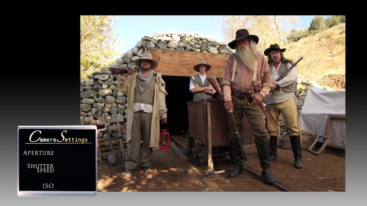 Wide shot of mine shaft with ambient-only exposure, flat tonal result
Before any artificial light goes up, get a clean ambient reading. In the tutorial, the working exposure is f/10 at 1/50 second, ISO 160, with a silk diffusion panel overhead to create open shade across the scene. Convert that ambient frame to black and white and study it honestly. In this case the result is flat – the tones across the subjects and background are too similar, and there’s nothing pulling the eye. This step isn’t a failure, it’s a diagnostic. You’re identifying exactly what the image is missing so you know what the lights need to do. Flat ambient with no separation means your added lights need to create hard contrast, not just add exposure.
Wide shot of mine shaft with ambient-only exposure, flat tonal result
Before any artificial light goes up, get a clean ambient reading. In the tutorial, the working exposure is f/10 at 1/50 second, ISO 160, with a silk diffusion panel overhead to create open shade across the scene. Convert that ambient frame to black and white and study it honestly. In this case the result is flat – the tones across the subjects and background are too similar, and there’s nothing pulling the eye. This step isn’t a failure, it’s a diagnostic. You’re identifying exactly what the image is missing so you know what the lights need to do. Flat ambient with no separation means your added lights need to create hard contrast, not just add exposure.
Step 3: Add a Deep Background Light to Create Depth
 Light positioned inside the mine shaft, creating highlight at the tunnel end
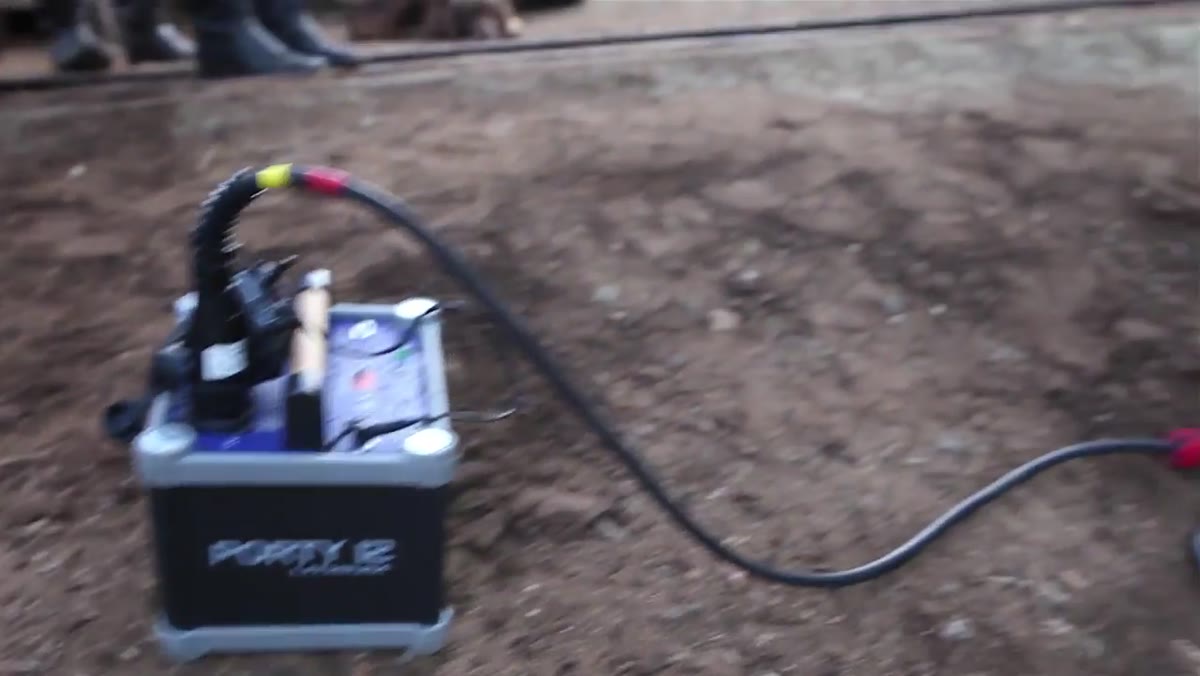
The first light placed is a Helios strobe pack inside the mine shaft, running at 1/2200 watt-seconds. Its job isn’t to illuminate the subjects. It’s to put a bright highlight at the far end of the tunnel, creating a sense of depth and visual direction that pulls the viewer’s eye through the frame. In black and white, depth comes from tonal separation across planes – the background, midground, and foreground all need to read as distinct values. A glowing background light accomplishes this without touching your subjects at all. I’ve used a similar technique in studio work by simply placing a bare strobe behind a translucent background panel. The physics are the same regardless of the location.
Light positioned inside the mine shaft, creating highlight at the tunnel end
The first light placed is a Helios strobe pack inside the mine shaft, running at 1/2200 watt-seconds. Its job isn’t to illuminate the subjects. It’s to put a bright highlight at the far end of the tunnel, creating a sense of depth and visual direction that pulls the viewer’s eye through the frame. In black and white, depth comes from tonal separation across planes – the background, midground, and foreground all need to read as distinct values. A glowing background light accomplishes this without touching your subjects at all. I’ve used a similar technique in studio work by simply placing a bare strobe behind a translucent background panel. The physics are the same regardless of the location.
Step 4: Light Your Subjects with a Soft Box for Rim and Fill
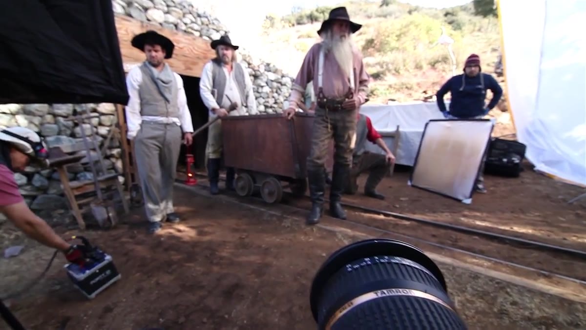
 Medium soft box positioned camera left, highlights visible on subjects’ faces
A medium soft box placed camera left adds highlights to each figure in the frame. This is the light that separates the subjects from the background and gives their faces and clothing readable texture. In a black and white image, texture is one of your primary tools – it’s how a viewer’s eye distinguishes surfaces that might otherwise blend together. Keep the soft box angled so it skims across the subjects rather than flooding them evenly. You want falloff. Light that diminishes as it travels across a figure creates the tonal gradient that reads as form in black and white.
Medium soft box positioned camera left, highlights visible on subjects’ faces
A medium soft box placed camera left adds highlights to each figure in the frame. This is the light that separates the subjects from the background and gives their faces and clothing readable texture. In a black and white image, texture is one of your primary tools – it’s how a viewer’s eye distinguishes surfaces that might otherwise blend together. Keep the soft box angled so it skims across the subjects rather than flooding them evenly. You want falloff. Light that diminishes as it travels across a figure creates the tonal gradient that reads as form in black and white.
Step 5: Dress for Tonal Separation, Not Color Contrast
 Comparison showing subject in red shirt versus lighter shirt in black and white
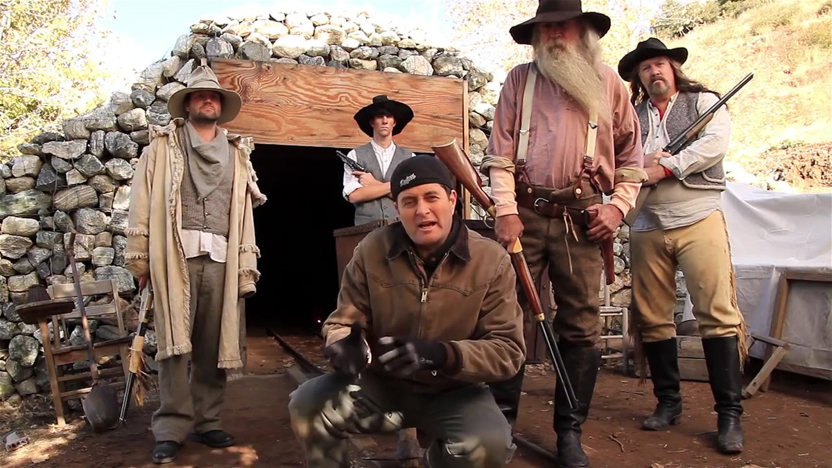
This is the step most photographers skip entirely because they’re not thinking in grayscale from the start. During the shoot, one subject is wearing a red shirt. In color it contrasts fine against the background. Converted to black and white, red maps to a very dark value – nearly black – so the shirt merges with the shadows and the figure loses definition. The solution is to swap him into a lighter colored shirt that converts to a mid or light gray. This is also why I keep a lighting journal with color swatch notes from past shoots. Certain colors that look distinct in person collapse into identical tonal values on the sensor. If you’re planning a black and white shoot, pull out a grayscale reference and think about every element in the frame in terms of light, medium, and dark values rather than hue.
Comparison showing subject in red shirt versus lighter shirt in black and white
This is the step most photographers skip entirely because they’re not thinking in grayscale from the start. During the shoot, one subject is wearing a red shirt. In color it contrasts fine against the background. Converted to black and white, red maps to a very dark value – nearly black – so the shirt merges with the shadows and the figure loses definition. The solution is to swap him into a lighter colored shirt that converts to a mid or light gray. This is also why I keep a lighting journal with color swatch notes from past shoots. Certain colors that look distinct in person collapse into identical tonal values on the sensor. If you’re planning a black and white shoot, pull out a grayscale reference and think about every element in the frame in terms of light, medium, and dark values rather than hue.
Step 6: Use Background Contrast to Control Emphasis
 Two subjects shown – one silhouetted against bright background, one lit against dark
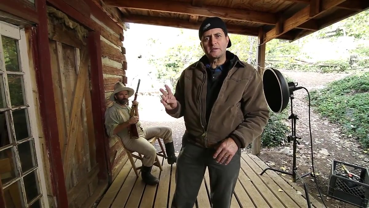
The final setup in the tutorial demonstrates a technique that I think of as split-plane contrast. One subject is placed against a blown-out bright background, rendering him as a near-silhouette. The second subject is positioned against a dark area of the environment, and a beauty dish with a grid is placed camera right to light only his face. The result is a frame where your eye bounces between a dark shape on a light field and a lit face on a dark field – which is essentially a Rembrandt-style compositional principle applied across two figures simultaneously. The grid on the beauty dish is doing critical work here. Without it, the light would spill onto the background and kill the shadow contrast you’re building.
Two subjects shown – one silhouetted against bright background, one lit against dark
The final setup in the tutorial demonstrates a technique that I think of as split-plane contrast. One subject is placed against a blown-out bright background, rendering him as a near-silhouette. The second subject is positioned against a dark area of the environment, and a beauty dish with a grid is placed camera right to light only his face. The result is a frame where your eye bounces between a dark shape on a light field and a lit face on a dark field – which is essentially a Rembrandt-style compositional principle applied across two figures simultaneously. The grid on the beauty dish is doing critical work here. Without it, the light would spill onto the background and kill the shadow contrast you’re building.
What I’d Add From My Own Work
The tutorial doesn’t address color temperature matching between the ambient and the strobe, which can create an ugly mix even in black and white if the tones shift in unexpected ways during conversion. I learned this the hard way on an early editorial shoot where tungsten practicals in the background clashed with daylight-balanced strobes on my subjects. Even in grayscale, mismatched color temperatures can create muddy midtones that no amount of contrast adjustment fixes cleanly. Whenever I’m mixing light sources, I shoot a test frame and convert it immediately to check for muddiness before I commit to the setup. Takes thirty seconds and has saved me more than once.
The single most important idea in this whole tutorial is one that deserves to be written on a wall somewhere: in black and white, contrast is not a slider you push in post – it’s a decision you make with your lights before you take the picture. Plan for tonal separation at the moment of capture and the conversion almost takes care of itself.
Watch the full tutorial on YouTube – the location and practical lighting conditions make it worth seeing in motion.
Comments
Leave a Comment