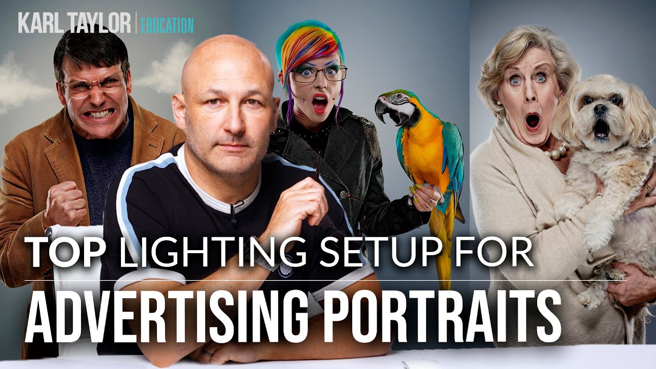
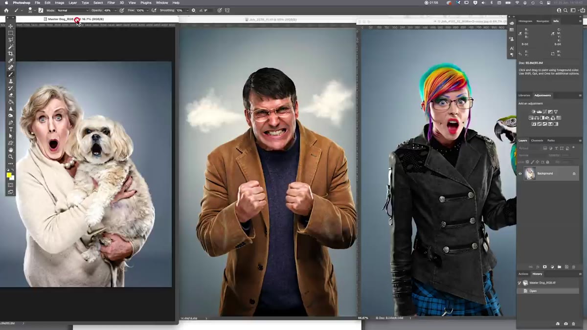
There’s a specific problem that comes up on multi-day commercial campaigns that nobody talks about enough: consistency. Not the creative kind - the technical kind. You shoot the first subject on a Tuesday, the second three weeks later, and the third two months after that. If your lighting setup isn’t locked down and repeatable, the images will never sit together in a layout without looking like they came from three different photographers. I’ve been burned by this. The fix isn’t complicated, but it requires building a setup that’s almost algorithmic - same modifiers, same distances, same power ratios every time.
That’s exactly why I keep returning to the four-point setup that Visual Education breaks down in this tutorial. The tutorial uses a real advertising campaign as its case study - a series of portraits built around expressions of shock, surprise, and anger - and walks through how a single, diagrammed setup produced consistent, punchy results across images shot months apart. Every element of this rig has a job. Nothing is ambient fill that crept in by accident. If you shoot commercial portraits or editorial headshots in a controlled studio environment, this is worth studying carefully.
I pulled out my lighting journal while watching this and sketched the whole thing. Here’s how it breaks down.
Step 1: Set Your Background and Camera Position
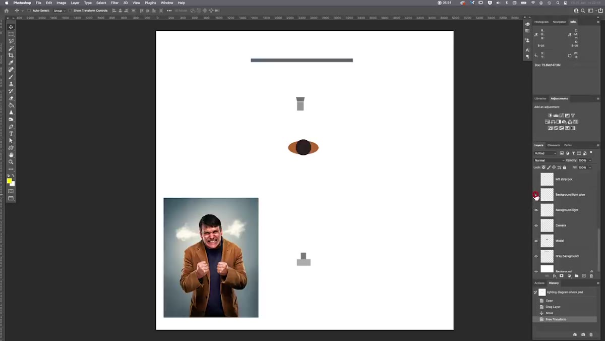
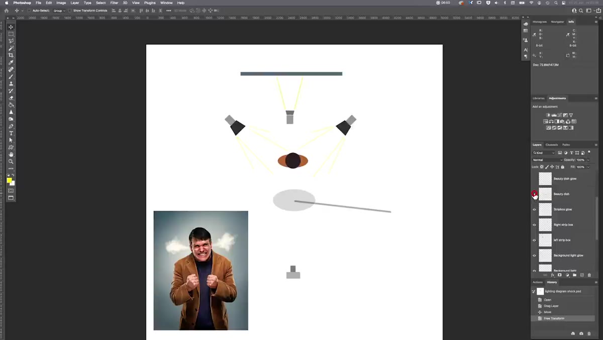
 Plan view lighting diagram with model and gray background paper
Start with a nine-foot gray paper roll - dark gray specifically. The tutorial uses colorama, which is my preferred brand as well. Position your camera directly in front of the subject, perfectly centered. Symmetry is structural here, not aesthetic. The entire four-point setup is built on a mirrored axis, and if your camera drifts off-center you’ll misread the edge lighting balance when you review your test shots. Lock your tripod, square your framing, and don’t touch it.
Plan view lighting diagram with model and gray background paper
Start with a nine-foot gray paper roll - dark gray specifically. The tutorial uses colorama, which is my preferred brand as well. Position your camera directly in front of the subject, perfectly centered. Symmetry is structural here, not aesthetic. The entire four-point setup is built on a mirrored axis, and if your camera drifts off-center you’ll misread the edge lighting balance when you review your test shots. Lock your tripod, square your framing, and don’t touch it.
Step 2: Place the Background Light
 Background light positioned behind subject creating gradient glow
The first light isn’t on your subject at all - it’s on the background. A standard 70-degree angle reflector works here, aimed at the backdrop so the light fans out and creates a soft circular glow behind where your subject’s torso and head will sit. The goal is a gradient: brighter in the center where the light hits directly, feathering off naturally toward the edges. This glow is what separates the subject from the background and gives the final image that lit-from-within quality you see in high-end advertising work. Don’t overthink the power level - just set it so the center of the glow is noticeably brighter than the edges of your paper, without blowing out to pure white.
Background light positioned behind subject creating gradient glow
The first light isn’t on your subject at all - it’s on the background. A standard 70-degree angle reflector works here, aimed at the backdrop so the light fans out and creates a soft circular glow behind where your subject’s torso and head will sit. The goal is a gradient: brighter in the center where the light hits directly, feathering off naturally toward the edges. This glow is what separates the subject from the background and gives the final image that lit-from-within quality you see in high-end advertising work. Don’t overthink the power level - just set it so the center of the glow is noticeably brighter than the edges of your paper, without blowing out to pure white.
Step 3: Add the Two Edge Lights (Strip Boxes, Either Side)
 Two strip boxes positioned at 45-degree angles behind the subject on each side
This is where the setup gets its definition. Place a 30x120cm strip box - tall and narrow - on the left side of the subject, angled in from behind at roughly 45 degrees. Mirror it exactly on the right side. Both lights should be set to equal power. The strip boxes are positioned toward the rear of the subject, not beside them, so the light skims across the edges rather than wrapping to the front. What you’re creating is rim lighting that outlines the shoulders, the sides of the jacket or clothing, the edges of the face, and - if the subject’s hands are in frame - each side of the fingers and knuckles. When it’s dialed in correctly, the subject appears to be physically separated from the background, almost three-dimensional. Even power on both sides is non-negotiable. Any imbalance and the symmetry collapses.
Two strip boxes positioned at 45-degree angles behind the subject on each side
This is where the setup gets its definition. Place a 30x120cm strip box - tall and narrow - on the left side of the subject, angled in from behind at roughly 45 degrees. Mirror it exactly on the right side. Both lights should be set to equal power. The strip boxes are positioned toward the rear of the subject, not beside them, so the light skims across the edges rather than wrapping to the front. What you’re creating is rim lighting that outlines the shoulders, the sides of the jacket or clothing, the edges of the face, and - if the subject’s hands are in frame - each side of the fingers and knuckles. When it’s dialed in correctly, the subject appears to be physically separated from the background, almost three-dimensional. Even power on both sides is non-negotiable. Any imbalance and the symmetry collapses.
Step 4: Mount the Key Light - a Silver Beauty Dish on a Boom
 Silver beauty dish on boom arm positioned above and in front of subject
The key light here is a 70cm silver beauty dish, and the silver interior is doing specific work - it produces a more concentrated, slightly harder light than a white beauty dish would. Mount it on a boom arm so you can position it overhead and in front of the subject without a stand leg appearing in your frame. The boom placement also lets you angle the dish downward onto the face, which mimics the direction of natural overhead light and sculpts the cheekbones, nose, and brow in a way that a flat frontal light never will.
Silver beauty dish on boom arm positioned above and in front of subject
The key light here is a 70cm silver beauty dish, and the silver interior is doing specific work - it produces a more concentrated, slightly harder light than a white beauty dish would. Mount it on a boom arm so you can position it overhead and in front of the subject without a stand leg appearing in your frame. The boom placement also lets you angle the dish downward onto the face, which mimics the direction of natural overhead light and sculpts the cheekbones, nose, and brow in a way that a flat frontal light never will.
 Beauty dish angled downward toward subject’s face at 45 degrees
Set it at roughly 45 degrees to the subject, about a meter to a meter and a half from the head. Height should put it slightly above eye level - not dramatically high, just enough that the light is coming down at a natural angle. The silver interior means this modifier produces a concentrated hot spot in the center that falls off at the edges, giving you punch on the face without flooding the whole frame with flat light. This is the light that makes the subject look like they belong in a campaign rather than a corporate headshot folder.
Beauty dish angled downward toward subject’s face at 45 degrees
Set it at roughly 45 degrees to the subject, about a meter to a meter and a half from the head. Height should put it slightly above eye level - not dramatically high, just enough that the light is coming down at a natural angle. The silver interior means this modifier produces a concentrated hot spot in the center that falls off at the edges, giving you punch on the face without flooding the whole frame with flat light. This is the light that makes the subject look like they belong in a campaign rather than a corporate headshot folder.
Step 5: Balance the Four Lights as a System
 Final lit portrait showing edge lighting, facial punch, and background glow together
Once all four lights are placed, the real work begins. The strip boxes and the beauty dish need to be balanced against each other so neither overpowers the other. The edge lights should be visible and defined - you want to see the rim along the face and clothing clearly - but the beauty dish on the front needs to hold its own so the face reads with confidence. If the rim lights are too strong relative to the key, the subject starts to look backlit and the face goes muddy. If the beauty dish is too strong, the rim lights disappear and you lose the three-dimensional separation. Shoot a test frame, pull it up, and look at the edge of the jaw and the highlight on the cheekbone together. They should feel like equals.
Final lit portrait showing edge lighting, facial punch, and background glow together
Once all four lights are placed, the real work begins. The strip boxes and the beauty dish need to be balanced against each other so neither overpowers the other. The edge lights should be visible and defined - you want to see the rim along the face and clothing clearly - but the beauty dish on the front needs to hold its own so the face reads with confidence. If the rim lights are too strong relative to the key, the subject starts to look backlit and the face goes muddy. If the beauty dish is too strong, the rim lights disappear and you lose the three-dimensional separation. Shoot a test frame, pull it up, and look at the edge of the jaw and the highlight on the cheekbone together. They should feel like equals.
What I’d Add From My Own Experience
The setup in this tutorial assumes a fairly neutral gray background, which is forgiving. Where I’ve had to adapt this rig is on shoots with darker skin tones, where the silver beauty dish at that distance can read slightly harsh without a diffusion sock over the front. I keep a spare diffuser clipped to my modifier cart specifically for this. I also label the distance from the beauty dish to the subject’s nose on a piece of masking tape stuck to the boom arm itself. Sounds obsessive, but when you’re rebuilding this setup six weeks later for a follow-up shoot, that measurement is the difference between matching your original frames or spending forty minutes in test shots trying to find it again. Repeatability doesn’t happen by memory. It happens by documentation.
The single most important idea in this tutorial is that a setup doesn’t have to be complicated to be professional - it has to be consistent and intentional. Four lights, each with a defined role: background glow for separation, dual strips for edge definition, beauty dish for facial punch. That’s the whole system. Master those four relationships and you have a rig you can deploy on any advertising portrait brief with confidence.
Watch the full tutorial on YouTube to see the lighting diagrams and the final campaign images side by side - the before-and-after of each light being added is worth watching more than once.
Comments
Leave a Comment