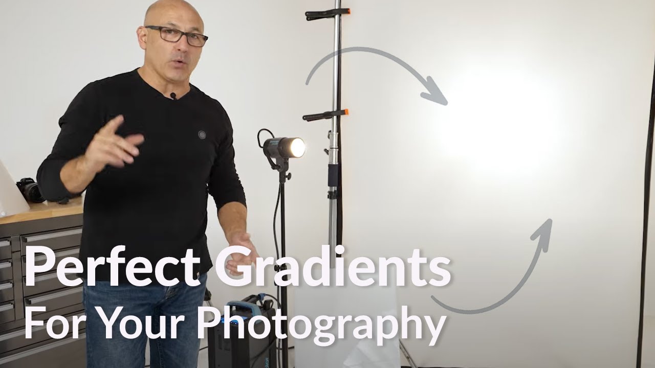
There is a specific kind of failure mode that haunts product photographers, and I say this from experience: you set up a perfectly good softbox, you fire the strobe, and the reflection staring back at you from that lipstick tube or watch case looks like a fluorescent office ceiling. Flat, rectangular, utterly charmless. The surface of a glossy product does not behave like skin or fabric. It behaves like a mirror, and a mirror shows you exactly what you pointed at it. Point a softbox at it, get a softbox back. The fix is not a different softbox. The fix is a different category of light altogether, one built around gradient rather than uniformity.
That is precisely what Kyle Taylor from Visual Education addresses in this tutorial on diffusion material. Watch the full tutorial on YouTube before or after reading this breakdown. Taylor runs through the theory cleanly and demonstrates three distinct diffusion tools, and I want to walk you through each one with enough detail that you can put them to work in your own studio immediately.
The core concept worth locking in before anything else: a softbox is designed to produce a homogeneous panel of light, consistent edge to edge. That is its job. Gradient lighting does the opposite on purpose. It creates a hot center that rolls off toward the edges, giving glossy surfaces a glow rather than a stamp. These are not better and worse versions of the same tool. They are different tools for different surfaces.
Step 1: Understand Why Glossy Surfaces Demand a Different Approach
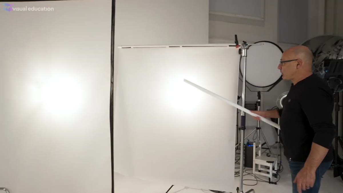 Kyle explaining the graduation effect on glossy product surfaces
When you photograph a matte subject, the light scatters in all directions and your camera picks up a diffuse, soft result regardless of your light source shape. Glossy surfaces work by specular reflection, meaning the camera sees an actual image of your light source mapped onto the product. The shape of your modifier becomes the shape of the highlight. That is why the gradient approach matters here and almost nowhere else. Knowing which category your subject falls into before you set up a single light is the fastest way I know to avoid a wasted half-day.
Kyle explaining the graduation effect on glossy product surfaces
When you photograph a matte subject, the light scatters in all directions and your camera picks up a diffuse, soft result regardless of your light source shape. Glossy surfaces work by specular reflection, meaning the camera sees an actual image of your light source mapped onto the product. The shape of your modifier becomes the shape of the highlight. That is why the gradient approach matters here and almost nowhere else. Knowing which category your subject falls into before you set up a single light is the fastest way I know to avoid a wasted half-day.
Step 2: Start with Flexible Diffusion Rolls for Framed Setups
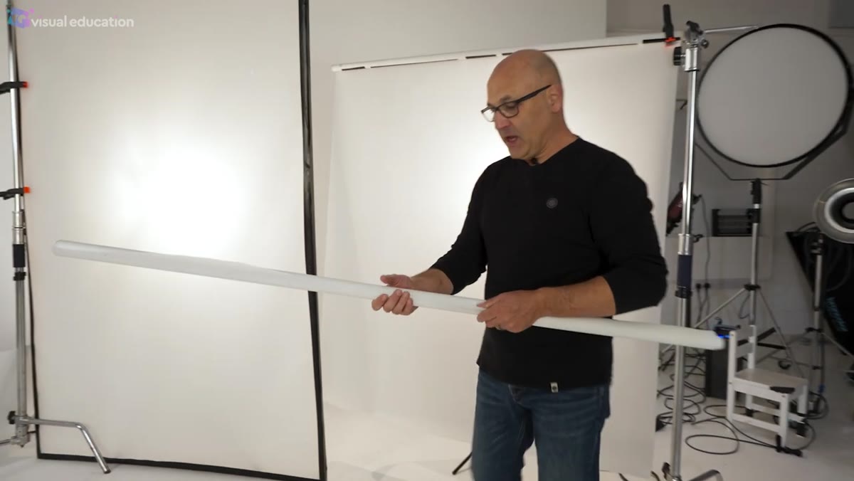 Kyle holding a roll of Lee 216 diffusion material
The entry point into gradient lighting is a roll of diffusion material, the kind used in film and television for decades. Taylor works with Lee 216 as his standard and Lee 400 Lux when he needs something more durable and heavy-duty. Both come in rolls 1.5 meters wide, with narrower options available. The material is light, inexpensive, and cuts to any size you need.
Kyle holding a roll of Lee 216 diffusion material
The entry point into gradient lighting is a roll of diffusion material, the kind used in film and television for decades. Taylor works with Lee 216 as his standard and Lee 400 Lux when he needs something more durable and heavy-duty. Both come in rolls 1.5 meters wide, with narrower options available. The material is light, inexpensive, and cuts to any size you need.
In practice, you have two options for deploying it. The first is to clip a length of the roll to a grip rod mounted on a C-stand and let it hang. This works for vertical placement and gets you up and running fast. The second, which Taylor recommends for serious production work, is to build simple timber frames, essentially stretched rectangles of wood, over which you staple or tape the diffusion. A rigid frame lets you lay the material horizontally above a product and shoot down through it, which a hanging roll simply cannot do. I keep three sizes of timber frame in my studio and reach for them on nearly every cosmetics job I take on.
Step 3: Place the Light Source at Varying Distances to Control Gradient Intensity
 Light moved away from acrylic sheeting showing gradation roll-off
The strength of the gradient you get through any diffusion material is not fixed. It is a function of distance between your light source and the back of the diffusion panel. Move the light close, and the hotspot is tight and intense with a sharp fall-off. Pull the light back, and the gradient smooths out into a wider, more even glow. This is one of the most useful variables in the whole technique because it requires no additional gear, just repositioning.
Light moved away from acrylic sheeting showing gradation roll-off
The strength of the gradient you get through any diffusion material is not fixed. It is a function of distance between your light source and the back of the diffusion panel. Move the light close, and the hotspot is tight and intense with a sharp fall-off. Pull the light back, and the gradient smooths out into a wider, more even glow. This is one of the most useful variables in the whole technique because it requires no additional gear, just repositioning.
When I am building a setup, I start with the light close and walk it backward until the reflection in the product surface reads as a natural, luxurious highlight rather than a visible fixture. I do this by looking at the product on my tethered screen, not in the viewfinder. The difference between a good gradient and a flat rectangle is often just thirty centimeters of distance adjustment.
Step 4: Use Acrylic Sheeting for Small or Jewelry-Scale Subjects
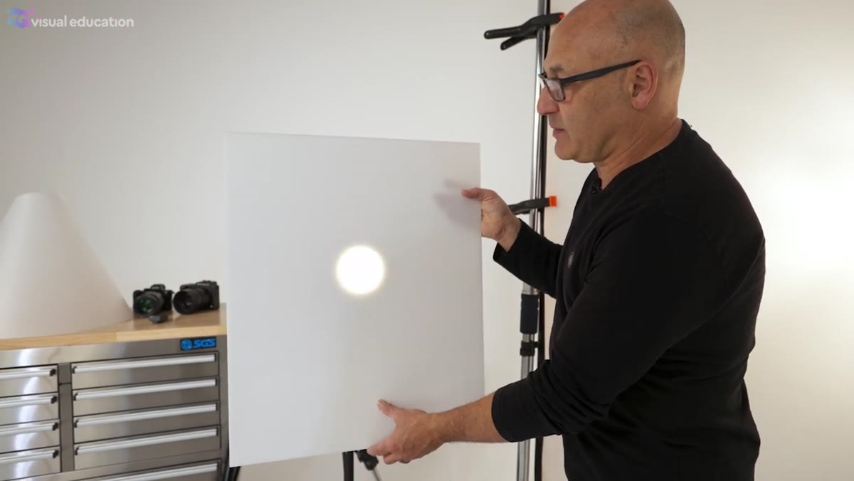
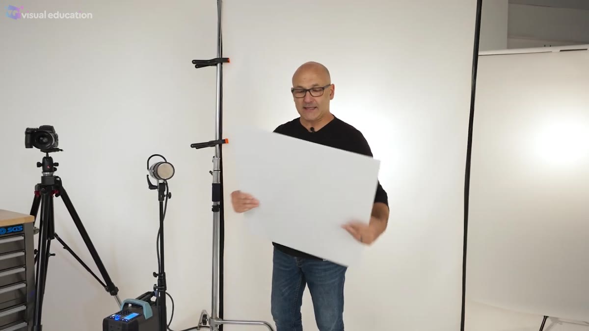 Opal acrylic sheet demonstrating gradient through translucent material
Acrylic sheeting, sold as Plexiglass in the United States, is the rigid version of this same idea. Taylor uses 4mm opal acrylic, a semi-transparent white sheet that transmits and diffuses simultaneously. The advantage over flexible diffusion rolls is precision placement. You can set a sheet of acrylic 5 centimeters above a ring or a perfume bottle and control exactly where the gradient lands on the product. That kind of fine placement with a fabric roll is cumbersome at best.
Opal acrylic sheet demonstrating gradient through translucent material
Acrylic sheeting, sold as Plexiglass in the United States, is the rigid version of this same idea. Taylor uses 4mm opal acrylic, a semi-transparent white sheet that transmits and diffuses simultaneously. The advantage over flexible diffusion rolls is precision placement. You can set a sheet of acrylic 5 centimeters above a ring or a perfume bottle and control exactly where the gradient lands on the product. That kind of fine placement with a fabric roll is cumbersome at best.
The gradient behavior is identical to fabric diffusion: closer light gives tighter, more contrast-y gradients, further light gives smoother fall-off. I cut my acrylic sheets in several sizes and store them vertically in a rack along one wall of my studio. They are labeled, naturally, with the dimensions on a strip of masking tape across the top edge.
Step 5: Consider a Light Cone for Fully Reflective 360-Degree Subjects
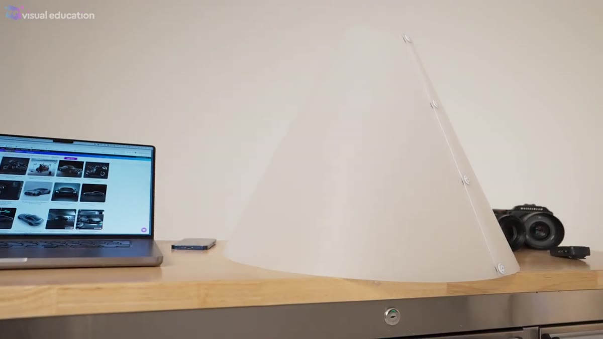 Light cone demonstrated with product placed inside for 360 coverage
The light cone is the most specialized tool in this category. Taylor developed this product with Flatworld, and the premise is straightforward: instead of directing light at a subject from outside, you place the subject inside a cone made from diffusion plastic and fire your lights through the cone walls. The result is effectively 360-degree gradient lighting with no hard reflections from any angle.
Light cone demonstrated with product placed inside for 360 coverage
The light cone is the most specialized tool in this category. Taylor developed this product with Flatworld, and the premise is straightforward: instead of directing light at a subject from outside, you place the subject inside a cone made from diffusion plastic and fire your lights through the cone walls. The result is effectively 360-degree gradient lighting with no hard reflections from any angle.
This is the tool I reach for when a product has significant reflective surface area on multiple sides, highly polished metal objects, crystal, or watch cases being the most common examples in my work. The material Taylor uses in the cone diffuses more smoothly than standard acrylic, producing a softer, more continuous glow. You photograph from above, shooting straight down through the open top of the cone.
My Extension: Build a Graduated Lighting Cheat Sheet for Your Specific Subjects
After watching Taylor’s breakdown and cross-referencing it with my own lighting journal entries, I built myself a one-page reference that maps subject material to diffusion tool. Matte acrylic products: flexible roll in a timber frame, light at 60cm. Polished cosmetics: opal acrylic sheet, 10-15cm from product surface, light at 40cm. Jewelry with complex geometry: light cone, two sources at 45 degrees. Having those starting points written down cuts my setup time significantly and keeps me from wandering through trial and error on tight deadlines. I keep a photo of this cheat sheet in the same lighting diagram app I use on set. Fifteen minutes building your own version of this will pay back on your next product job.
The single most important thing Taylor’s tutorial crystallized for me is this: diffusion is not one technique. A softbox diffuses. Acrylic diffuses. A fabric roll diffuses. But they produce fundamentally different results because the point of gradient lighting is controlled non-uniformity, and understanding that distinction determines whether your product shot looks like a catalog image or an advertisement.
Watch the full tutorial on YouTube to see Taylor demonstrate the gradient fall-off in real time. Seeing the light move across those surfaces makes the distance relationship between source and diffusion panel click in a way that text alone does not fully deliver.
Comments
Leave a Comment