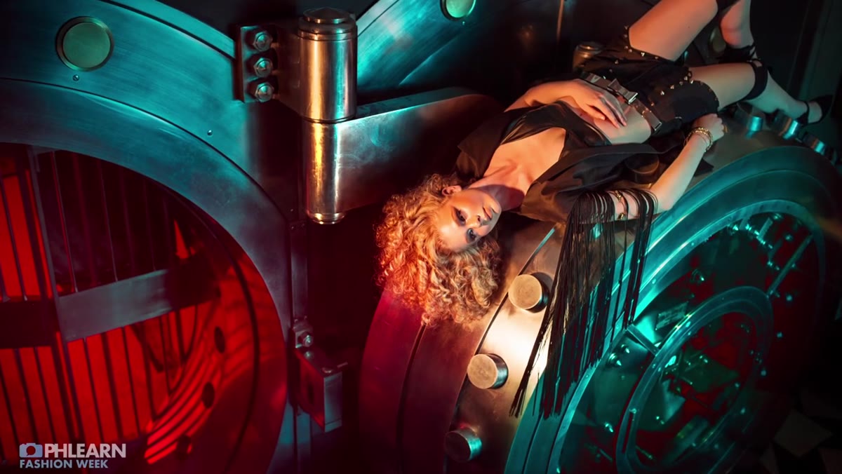
Every few months I pull out my lighting journal and flip back through old setups. Some of them make me cringe. Some of them remind me that the best lighting problems get solved before the model ever walks onto the set. The high-fashion vault shoot that Aaron Nace (PHLEARN) breaks down in his tutorial sits firmly in the second category. It’s a tight, purposeful lighting plan built around a location’s existing character, and watching it laid out step by step answered a question I’ve wrestled with on editorial jobs for years: how do you introduce color into a shot without making the skin look like a Halloween costume?
Watch the full tutorial on YouTube
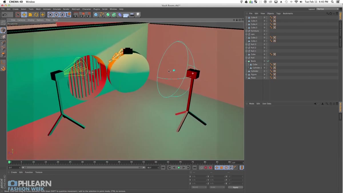
The answer, as Nace demonstrates, is a three-light system where two lights handle the environment and one light handles the subject. That separation of purpose is what makes the whole thing work. I’ve seen photographers throw gels everywhere and wonder why the result looks like a nightclub bathroom. The discipline here, assigning each light a specific job, is what keeps a complex setup from collapsing into noise.
Step 1: Read the Location Before You Touch a Light Stand
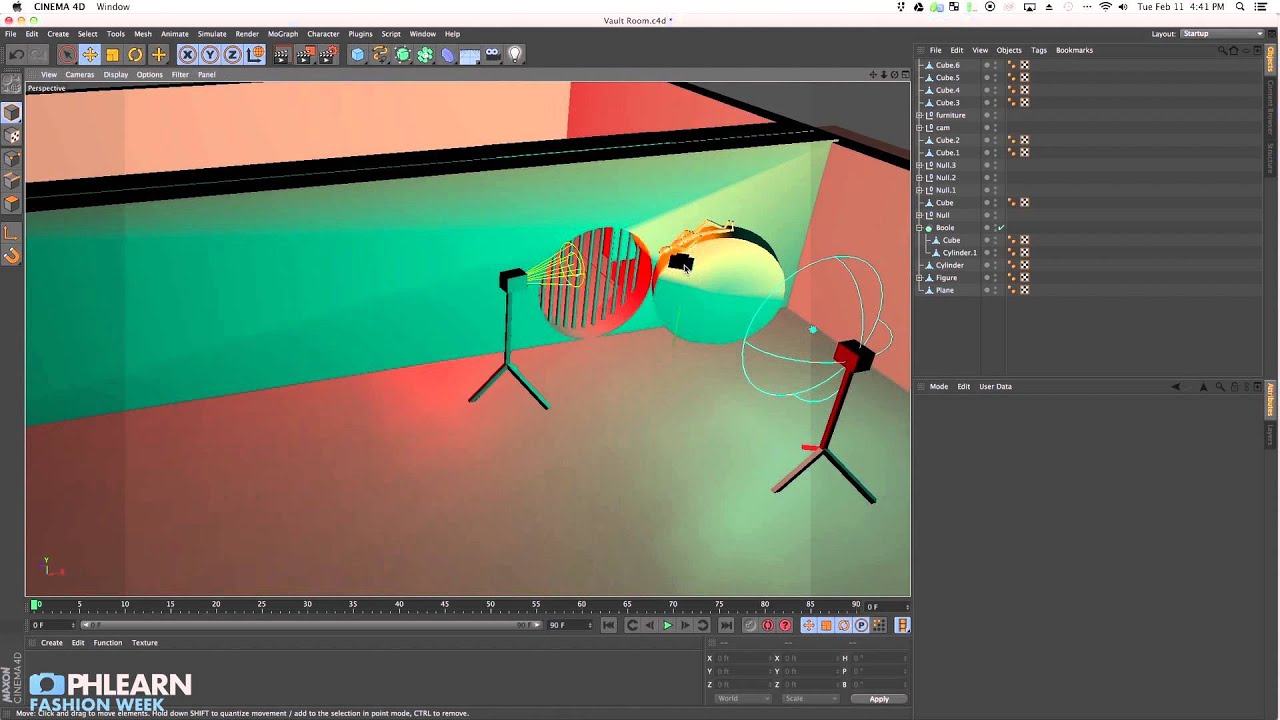
 Vault interior with metal surfaces and barred door
Before a single strobe fires, Nace walks the space and identifies its two most useful physical features: the highly reflective metal surfaces that will pick up and distribute colored light, and the barred door that will cast hard, graphic shadows. This is the actual first step, and most people skip it.
Vault interior with metal surfaces and barred door
Before a single strobe fires, Nace walks the space and identifies its two most useful physical features: the highly reflective metal surfaces that will pick up and distribute colored light, and the barred door that will cast hard, graphic shadows. This is the actual first step, and most people skip it.
When I arrive at an unfamiliar location I do the same thing I do back home in my studio. I tape a label on my notepad, not the lights yet, and write down what the room is already doing. Reflective walls behave like free fill cards. Strong architectural lines suggest where shadows will land. The location isn’t just a backdrop. It’s a participant in the exposure.
Step 2: Establish the Color Story First, Then Build the Lighting Around It
 Discussion of red and turquoise gel color pairing
Nace decided on a red-and-turquoise pairing before positioning a single head. Red in the background, turquoise as fill in the main space. These are near-complementary colors and they create visual tension without becoming chaotic, especially in a metallic, industrial environment where the color reads as intentional rather than accidental.
Discussion of red and turquoise gel color pairing
Nace decided on a red-and-turquoise pairing before positioning a single head. Red in the background, turquoise as fill in the main space. These are near-complementary colors and they create visual tension without becoming chaotic, especially in a metallic, industrial environment where the color reads as intentional rather than accidental.
The location matters here. Nace is direct about this: heavy color gels make sense in industrial or abstract settings because the environment sells the premise. Outdoors in natural light, a turquoise fill looks wrong. Inside a metal vault, it looks designed. If your color choices need the location to justify them, make sure you’ve picked the right location first.
Step 3: Place Your Background Light in a Separate Room at Half Power, Bare Bulb
 Description of bare bulb red gel light in far room
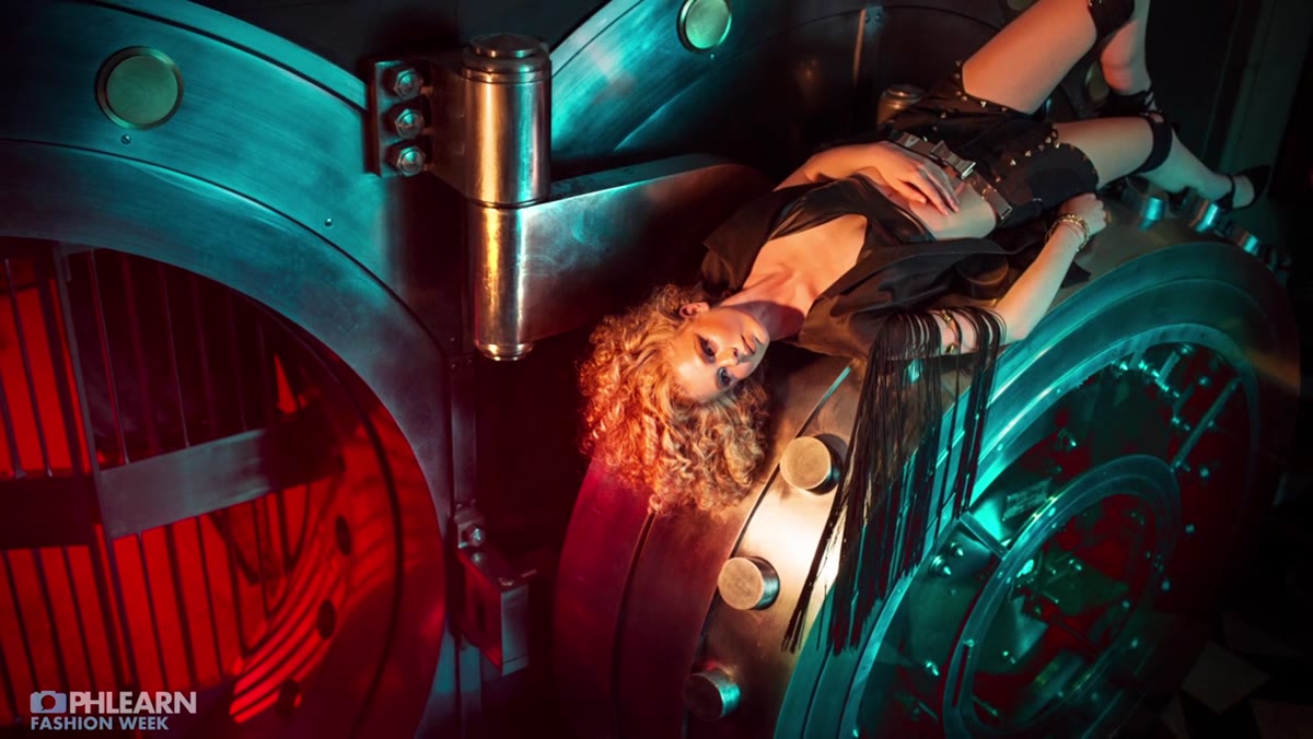
The first strobe goes into an entirely different room from the camera and subject. It runs bare bulb, no modifier, with two cuts of red gel stacked over the head, and fires at roughly half power. The distance and the bare bulb configuration together do two things: they saturate the background room with a deep red wash, and they throw hard, defined shadows from the vault bars across the floor and lower frame.
Description of bare bulb red gel light in far room
The first strobe goes into an entirely different room from the camera and subject. It runs bare bulb, no modifier, with two cuts of red gel stacked over the head, and fires at roughly half power. The distance and the bare bulb configuration together do two things: they saturate the background room with a deep red wash, and they throw hard, defined shadows from the vault bars across the floor and lower frame.
Two cuts of gel rather than one is worth noting. A single cut of red often reads as warm orange in a photograph. Stacking two cuts pushes it into a richer, more saturated red that holds its character even after the image is processed. I keep a gel swatch book in my kit for exactly this reason. One cut is a tint. Two cuts is a statement.
Step 4: Add Turquoise Fill via a Parabolic Reflector, Gels Taped to the Front
 Turquoise gel taped to parabolic reflector, 10 feet from subject
The second light brings the turquoise into the main shooting space. Nace fires it into a parabolic reflector with the gel taped directly to the reflector’s face, not over the strobe head. The light sits roughly ten feet back from the subject. At that distance, the turquoise-tinted output wraps across all the metallic surfaces in the room without being so close that it flattens the subject with flat, directionless fill.
Turquoise gel taped to parabolic reflector, 10 feet from subject
The second light brings the turquoise into the main shooting space. Nace fires it into a parabolic reflector with the gel taped directly to the reflector’s face, not over the strobe head. The light sits roughly ten feet back from the subject. At that distance, the turquoise-tinted output wraps across all the metallic surfaces in the room without being so close that it flattens the subject with flat, directionless fill.
Taping the gel to the parabolic rather than the head is a practical move I’ve adopted in my own kit. When the gel is at the head, the heat from the modeling light degrades it faster and the color can shift over a long shoot. At the reflector face, there’s less heat exposure and you can pull the gel off for a quick comparison shot without breaking down the modifier. Gaffer tape, not masking tape, for this one. You want it to hold.
Step 5: Introduce a CTO Gel on the Key Light to Anchor the Skin Tone
 Third light with CTO gel aimed at subject’s face
Here is the part that most gel tutorials never get to. Red and turquoise are visually interesting together, but neither color is flattering to human skin. Without correction, the subject’s face absorbs both competing color casts and looks either sickly or alien. Nace brings in a third light aimed specifically at the subject, fitted with a CTO (color temperature orange) gel. CTO shifts the output toward warm, skin-friendly light that counteracts the cooler turquoise fill and separates the subject from the background environment.
Third light with CTO gel aimed at subject’s face
Here is the part that most gel tutorials never get to. Red and turquoise are visually interesting together, but neither color is flattering to human skin. Without correction, the subject’s face absorbs both competing color casts and looks either sickly or alien. Nace brings in a third light aimed specifically at the subject, fitted with a CTO (color temperature orange) gel. CTO shifts the output toward warm, skin-friendly light that counteracts the cooler turquoise fill and separates the subject from the background environment.
This is the move that makes the whole setup editorially usable rather than just technically interesting. The background tells the color story. The key light tells the human story. Those are two different jobs and they require two different solutions.
What I’d Do Differently on a Commercial Job
In an editorial context with creative freedom, Nace’s approach is nearly ideal as described. On a commercial beauty shoot, where the client’s primary concern is product and skin, I’d pull the key light in tighter and add a small flag to keep the CTO spill off the reflective surfaces in the background. The last thing you want is warm light contaminating the cool turquoise wash you worked to build. I’d also bracket the gel density on the background light, one cut and two cuts, because the difference in saturation can swing significantly between the monitor on set and the final delivered file.
I learned the hard way on an early editorial shoot that what looks controlled on a preview screen can look entirely different in a calibrated CMYK proof. Now I shoot a test frame with a color checker card every time I introduce gels. Ten seconds of setup saves an hour of post-production.
The single biggest idea in this tutorial is that each light has exactly one job. The background light creates color and shadow. The fill light spreads that color through the environment. The key light protects the subject from both. When you assign jobs that clearly, a three-light setup stops feeling complicated and starts feeling systematic.
Watch the full tutorial on YouTube to see the actual frames and the final image from the shoot. The result makes the logic even clearer than the explanation.
Comments
Leave a Comment