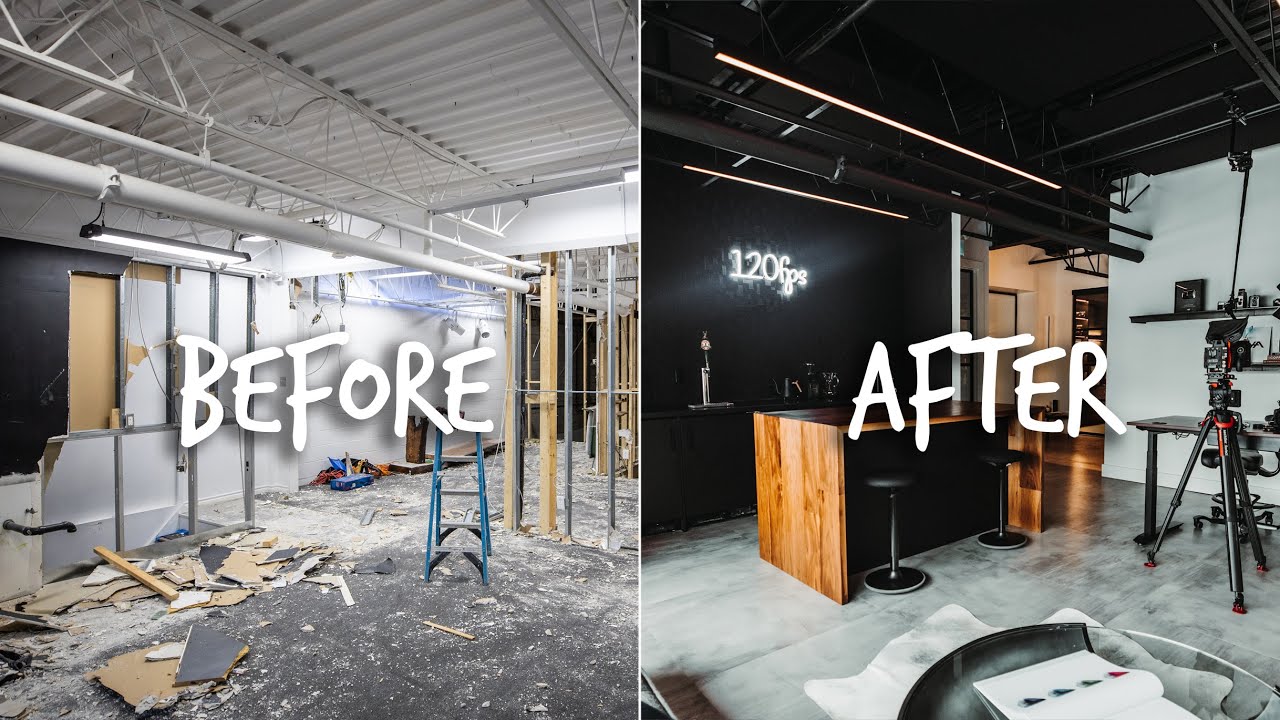
I’ve been shooting in studios for nearly two decades, and the question I get asked almost as often as “what modifier did you use?” is “how did you set up your space?” It sounds like a soft question, but it isn’t. The way a studio is designed determines how efficiently you shoot, how clients feel when they walk in, and whether the room inspires or drains you by 3pm. So when Peter McKinnon dropped a full walkthrough of his YouTube HQ and creative studio, I watched it twice. Not because it’s a gear tour, but because it’s a rare honest look at how a working creative actually builds and iterates on a professional space. Watch the full tutorial on YouTube
What struck me most was that McKinnon doesn’t present a finished, perfect showroom. He talks about what he tried, what didn’t work, and what he changed. That’s exactly the kind of studio thinking I find useful. My own LA studio has gone through four significant layout changes in six years. The first version was optimized for the way I thought I’d work. Every version since has been optimized for the way I actually work. McKinnon’s tour gets at that distinction in a way most studio content skips entirely.
Here’s what I pulled from the walkthrough, translated into decisions you can apply to your own space.
Step 1: Make a Statement at the Entry Point
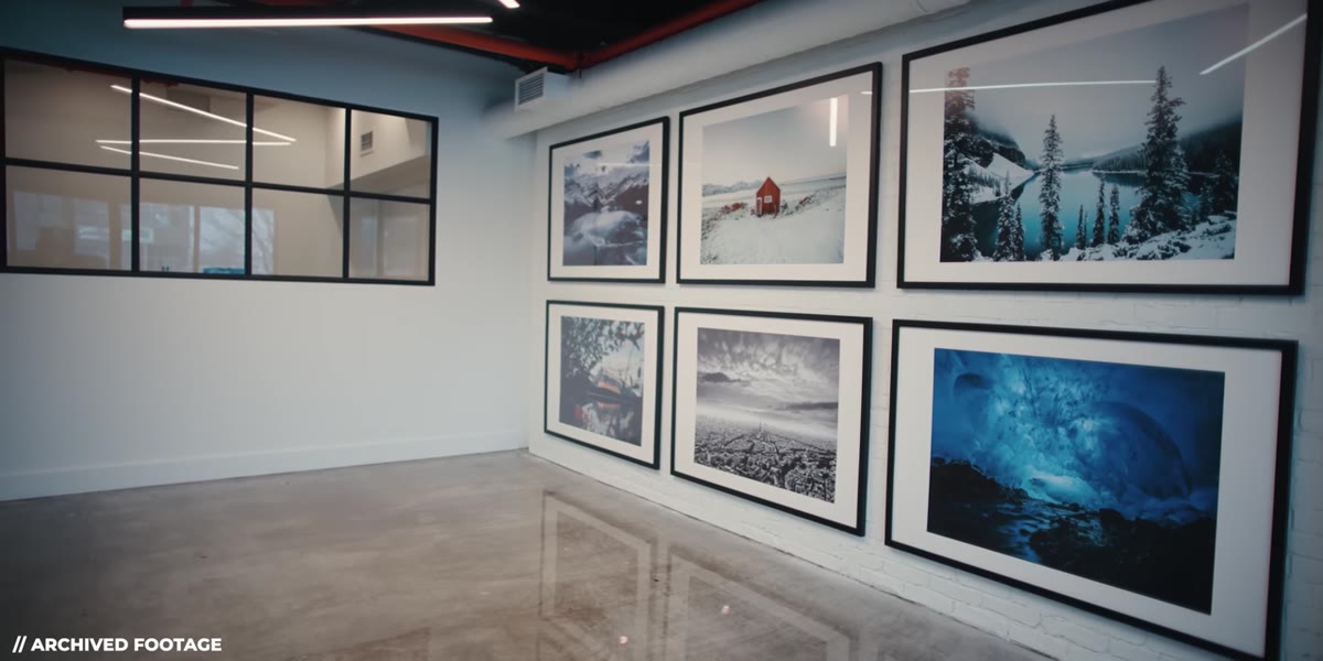 Peter gesturing toward a wall covered floor-to-ceiling with prints
The first thing McKinnon addresses is the entry wall, and he’s deliberate about it. Rather than hanging a handful of prints at eye level, he covered the entire wall with photography. He credits a collaborator for pushing him to go all-in rather than play it safe with a few frames spread across the space. The result is something that reads more like a gallery than an office, and it lands differently on clients and visitors.
Peter gesturing toward a wall covered floor-to-ceiling with prints
The first thing McKinnon addresses is the entry wall, and he’s deliberate about it. Rather than hanging a handful of prints at eye level, he covered the entire wall with photography. He credits a collaborator for pushing him to go all-in rather than play it safe with a few frames spread across the space. The result is something that reads more like a gallery than an office, and it lands differently on clients and visitors.
I’ve done something similar in my studio, though mine is more curated by format. All large prints go on the north wall, all square crops on the east. The point isn’t decoration. It’s communication. When a new client walks in and sees your work at scale, printed, framed, and committed to, it does more for your credibility than any portfolio PDF ever will. Print your work. Put it somewhere people have to look at it.
Step 2: Display Work in the Format That Shows It Best
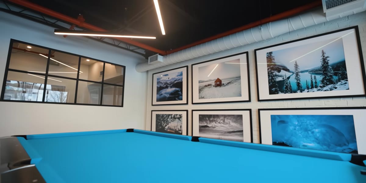 Close view of black and white concert prints hanging on the bathroom wall
McKinnon singles out a set of black and white concert photographs as two of his favorite pieces in the entire studio. The point he makes, almost offhand, is that black and white concert photography looks exceptional when printed. This isn’t nostalgia. It’s a practical observation about contrast, grain, and tonal range translating to physical media in a way that screens compress.
Close view of black and white concert prints hanging on the bathroom wall
McKinnon singles out a set of black and white concert photographs as two of his favorite pieces in the entire studio. The point he makes, almost offhand, is that black and white concert photography looks exceptional when printed. This isn’t nostalgia. It’s a practical observation about contrast, grain, and tonal range translating to physical media in a way that screens compress.
For studio photographers, this applies directly to how you think about client presentation. If you shoot beauty or fashion work with strong directional light and clean backgrounds, your images will almost always print better than they display on a calibrated monitor. I learned this painfully early in my career when a client saw their campaign images for the first time on a cheap conference room projector and thought something was wrong with the color. Now I bring printed samples to every presentation meeting. The material is always more convincing than the screen.
Step 3: Design the Room You’ll Actually Use, Not the Room You Think You Should Have
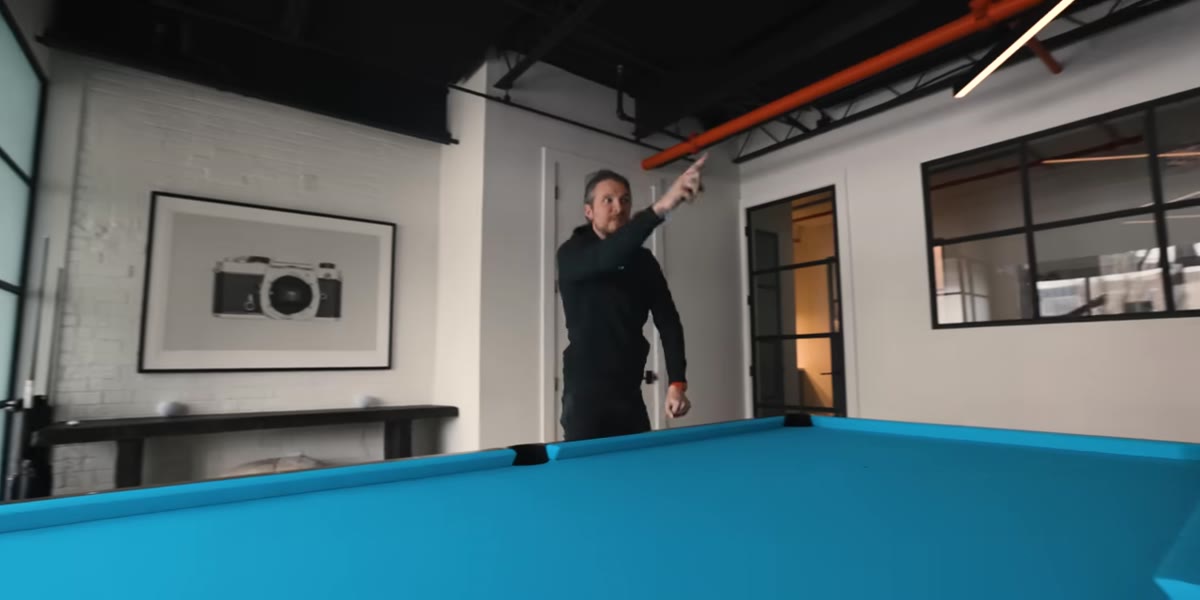 McKinnon explaining the decision to replace a lounge with a pool table
This is the most honest moment in the tour. McKinnon describes setting up a beautifully designed lounge area, professionally furnished and styled. It looked immaculate. Nobody used it. They were afraid to sit on the furniture. So he replaced it with a pool table.
McKinnon explaining the decision to replace a lounge with a pool table
This is the most honest moment in the tour. McKinnon describes setting up a beautifully designed lounge area, professionally furnished and styled. It looked immaculate. Nobody used it. They were afraid to sit on the furniture. So he replaced it with a pool table.
That sounds like a joke, but it’s serious studio thinking. A space that nobody uses is a failed space, regardless of how good it looks in photographs. I spent two years with a client lounge in my studio that functioned as overflow storage. Eventually I admitted that my clients don’t want to sit in a lounge. They want to see the shooting area. I knocked down the wall between the two rooms and gained 200 square feet of usable shooting space. The studio immediately started working better. Ask yourself honestly: what are the rooms or corners of your space that you’re maintaining for appearances rather than function?
Step 4: Give Collaborative Spaces a Clear Purpose
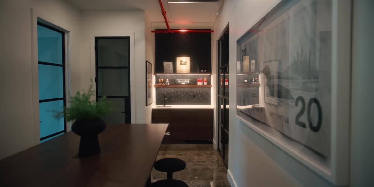 Wide shot of the boardroom with the large standing height table
McKinnon’s boardroom is built around a large standing-height table from Fully, which can be adjusted up and down. He’s candid that very little formal business happens there, but the space exists for a reason. Having a surface large enough to spread out prints, look at contact sheets together, or run a post-production review changes how collaborative work happens.
Wide shot of the boardroom with the large standing height table
McKinnon’s boardroom is built around a large standing-height table from Fully, which can be adjusted up and down. He’s candid that very little formal business happens there, but the space exists for a reason. Having a surface large enough to spread out prints, look at contact sheets together, or run a post-production review changes how collaborative work happens.
In my studio, the equivalent is a large light table I keep near the editing station. It’s where I lay out proof prints during retouching review and where art directors can sit with me during color grading sessions. The physical surface matters. Looking at images together on a single monitor creates a hierarchy. Spreading material on a shared table creates a conversation. If you do any collaborative work, a dedicated horizontal surface for reviewing physical or printed material is worth prioritizing.
Step 5: Curate Meaningful Objects, Not Just Aesthetic Ones
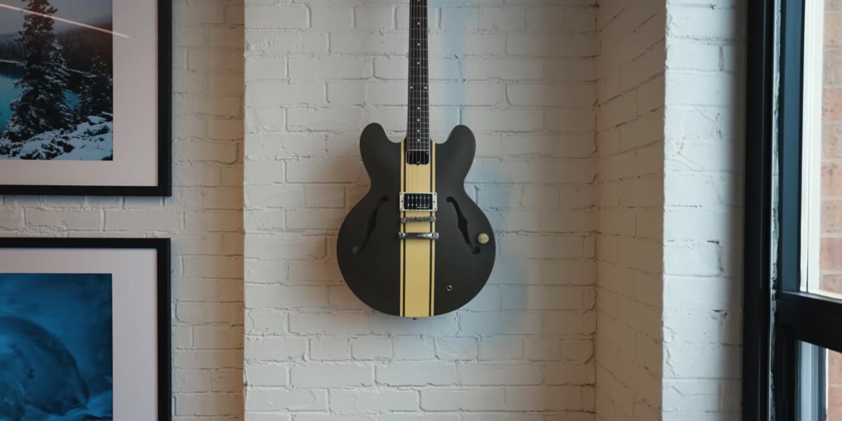 McKinnon pointing to a guitar on the wall, explaining its personal significance
McKinnon hangs a guitar on his studio wall, and the reason matters. It’s connected to a documentary project he’s shooting, to a musician he admires, and to a friendship. It’s not a prop. It’s a reference point that keeps a long-term project present in the room where he works every day.
McKinnon pointing to a guitar on the wall, explaining its personal significance
McKinnon hangs a guitar on his studio wall, and the reason matters. It’s connected to a documentary project he’s shooting, to a musician he admires, and to a friendship. It’s not a prop. It’s a reference point that keeps a long-term project present in the room where he works every day.
I keep a small section of my studio wall that I think of as a working wall. It holds lighting diagrams from shoots I want to revisit, a few tear-outs from editorial work I’m studying, and one print from a shoot I’m particularly proud of. It’s not decorative. It’s functional in the way a chef’s mise en place is functional. The things on that wall influence what I think about while I’m setting up a shoot. Surround yourself with things that push your work forward, not just things that look good in a behind-the-scenes video.
What I’d Add From My Own Experience
McKinnon’s studio is built for video production as much as photography, and that shapes some of his choices around acoustics and layout. For a dedicated photography studio, I’d push one step further on the print wall concept. Don’t just display finished work. Put up prints from shoots that didn’t go the way you planned. I have two prints on my wall that represent technical failures I corrected mid-shoot. They’re there because seeing them regularly reminds me of the specific adjustments I made under pressure. A studio should teach you as much as it showcases you.
The single most useful takeaway from McKinnon’s tour is simple: build the space around how you work, then keep changing it until it fits. A studio isn’t a finished product. It’s an ongoing decision about what kind of work you want to make and what environment makes that work easier. Watch the full walkthrough and pay attention to how often McKinnon mentions something he changed or replaced. That iteration is the real lesson.
Watch the full tutorial on YouTube
Comments (2)
Just subscribed. If the rest of your content is this good, I'm in.
The tip about what peter mckinnons studio hq was the missing piece for me. Thank you.
Leave a Comment